In this post is a collection of 10 jQuery Responsive Demos you may find very interesting! Help yourself and check them out.. Enjoy! ;) Also see:
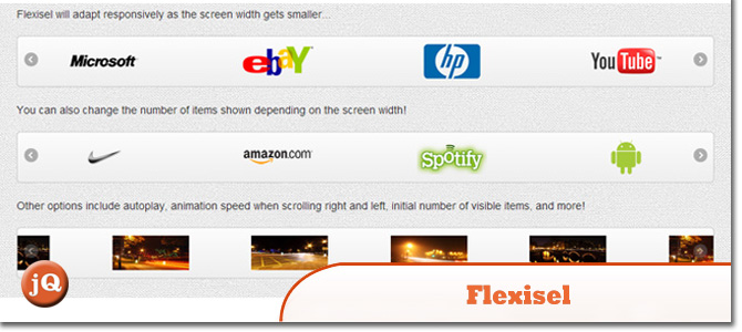
1. Flexisel
The responsive image carousel with options specifically available for adapting the carousel for mobile and tablet devices.
 Source + Demo
2. Animated Responsive Image Grid
Cycling through a set of images in a responsive grid.
 Source + Demo
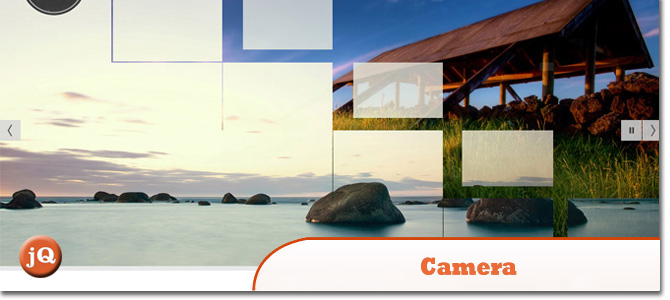
3. Camera slideshow
Is an open source project, based on Diapo slideshow. A free jQuery slideshow with many effects and transitions…
 Source + Demo
4. Isotope
An exquisite jQuery plugin for magical layouts. Enables filtering, sorting, and dynamic layouts.
 Source + Demo
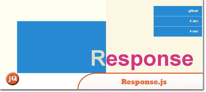
5. Response.js
A jQuery plugin that provides tools for building performance-optimized, mobile-first responsive websites. Its breakpoint sets use HTML5 data attributes to dynamically swap markup based on breakpoints so that rich content can be served progressively.
 Source + Demo
6.LAYERSLIDER 5
A premium multi-purpose slider for creating image galleries, content sliders, and mind-blowing slideshows with must-see effects. It uses cutting edge technologies to provide the smoothest experience that’s possible, and it comes with more than 200 preset 2D and 3D slide transitions.
 Source + Demo
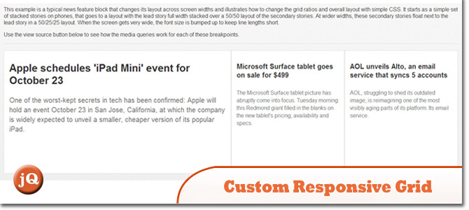
7. Custom responsive grid
It’s easy to extend the basic grid styles into a custom responsive layout by using CSS media queries to adjust the layout and design across various screen width breakpoints.
 Source + Demo
8. Elastislide
A Responsive Image Carousel
 Source + Demo
9. Jssor Slider
Is responsive touch swipe javascript slider, Responsive Web Design (RWD) is a new web design approach aimed at crafting sites to provide an optimal viewing experience-easy reading and navigation with a minimum of resizing, panning, and scrolling-across a wide range of devices (from desktop computer monitors to mobile phones).
 Source + Demo
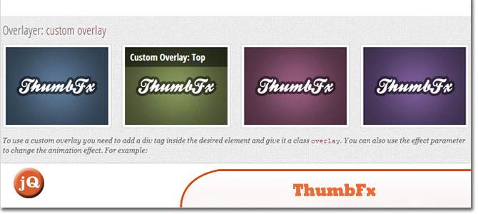
10. ThumbFx
Responsive jQuery & HTML5 Thumbnail Effects
 Source + Demo
Frequently Asked Questions about jQuery Responsive Demos
What is a jQuery responsive demo?
A jQuery responsive demo is a demonstration of how jQuery, a fast, small, and feature-rich JavaScript library, can be used to create responsive web designs. Responsive web designs are those that automatically adjust and adapt to different screen sizes, ensuring that the website or web application looks good and functions well on all devices, from desktop computers to smartphones. jQuery responsive demos typically include examples of various features and functionalities, such as sliders, carousels, navigation menus, and more.
How can I use jQuery to create a responsive slider?
Creating a responsive slider with jQuery involves using the jQuery slider plugin. This plugin allows you to create a slider that can contain images, text, videos, or any other type of content. You can customize the appearance and behavior of the slider using various options and methods provided by the plugin. For example, you can set the speed of the slide transitions, the direction of the slide movement, the pause time between slides, and more. You can also add navigation controls and pagination indicators to the slider.
What are some examples of jQuery responsive demos?
There are many examples of jQuery responsive demos available on the internet. These demos showcase a wide range of features and functionalities that can be achieved with jQuery. Some examples include responsive image sliders, responsive navigation menus, responsive grid layouts, responsive forms, responsive tables, and more. These demos can serve as a great source of inspiration and learning for web developers and designers.
How can I make my jQuery demo responsive?
Making your jQuery demo responsive involves using CSS media queries in conjunction with jQuery. Media queries allow you to apply different styles to different devices based on their screen size, resolution, and other characteristics. You can use jQuery to manipulate the DOM and add, remove, or change elements and their properties based on the current screen size. This way, you can ensure that your demo looks good and functions well on all devices.
Can I use jQuery UI for creating responsive designs?
Yes, you can use jQuery UI to create responsive designs. jQuery UI is a curated set of user interface interactions, effects, widgets, and themes built on top of the jQuery JavaScript Library. It provides a powerful and flexible framework for creating interactive and responsive user interfaces. However, it’s important to note that while jQuery UI provides many useful features and functionalities, it does not include built-in support for responsive design. This means that you will need to use CSS media queries or other techniques to make your jQuery UI designs responsive.
What are the benefits of using jQuery for responsive design?
jQuery offers several benefits for responsive design. First, it simplifies the process of creating interactive and dynamic web content. Second, it provides a wide range of plugins and extensions that can enhance the functionality and appearance of your website or web application. Third, it has a large and active community of developers who can provide support and assistance. Finally, jQuery is compatible with all modern web browsers, ensuring that your responsive designs will work well on all devices.
Are there any limitations or drawbacks to using jQuery for responsive design?
While jQuery offers many benefits for responsive design, it also has some limitations and drawbacks. One potential issue is performance. jQuery is a relatively large library, and loading it can slow down your website or web application, especially on mobile devices with slower internet connections. Another potential issue is compatibility. While jQuery is compatible with all modern web browsers, it may not work correctly on older browsers or on certain mobile devices. Finally, while jQuery simplifies many aspects of JavaScript programming, it also abstracts away some of the underlying details, which can make it harder to understand and troubleshoot issues.
Can I use jQuery Mobile for creating responsive designs?
Yes, you can use jQuery Mobile to create responsive designs. jQuery Mobile is a touch-optimized web framework for smartphones and tablets. It provides a unified user interface system that works across all popular mobile device platforms. jQuery Mobile includes many features and functionalities that are specifically designed for mobile devices, such as touch events, page transitions, and responsive layouts. However, it’s important to note that while jQuery Mobile is a powerful tool for mobile development, it may not be the best choice for all projects, especially those that require a high level of customization or performance.
How can I learn more about jQuery and responsive design?
There are many resources available for learning about jQuery and responsive design. These include online tutorials, video courses, books, and more. You can also learn by experimenting with jQuery responsive demos and studying the source code. Additionally, you can participate in online forums and communities where you can ask questions, share your work, and learn from other developers.
Can I use jQuery with other JavaScript libraries or frameworks for responsive design?
Yes, you can use jQuery with other JavaScript libraries or frameworks for responsive design. jQuery is designed to be flexible and compatible with other technologies. For example, you can use jQuery with Bootstrap, a popular front-end framework for developing responsive and mobile-first websites. You can also use jQuery with Angular, React, Vue, and other JavaScript frameworks. However, it’s important to note that while using jQuery with other libraries or frameworks can enhance your capabilities, it can also increase the complexity of your code and potentially lead to conflicts or compatibility issues.
 Sam Deering
Sam Deering has 15+ years of programming and website development experience. He was a website consultant at Console, ABC News, Flight Centre, Sapient Nitro, and the QLD Government and runs a tech blog with over 1 million views per month. Currently, Sam is the Founder of Crypto News, Australia.


