I’ve been too lazy with doing the websites to play with HDTV, but looks like I gotta do it now. But that will have to wait until Monday as wifey is off from work and has a bunch of “honey do’s” to do around the house…
1 Like
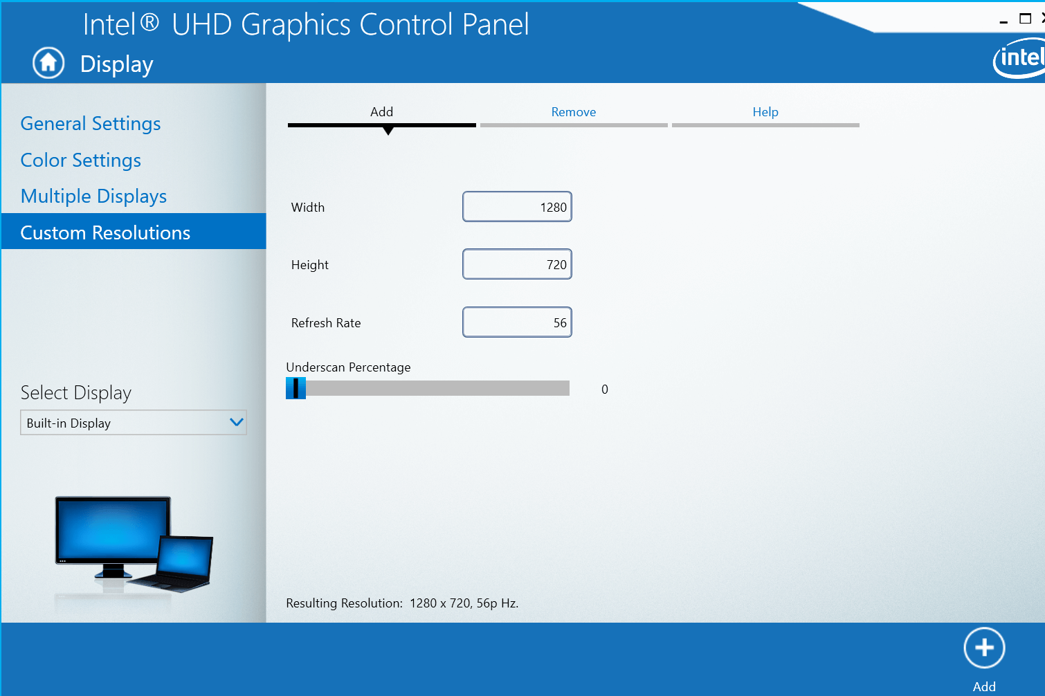
My monitor now matches the laptops. End of problem.
I adjusted my “underscan percentage” to 1% to fix it.
https://cdn.windowsreport.com/wp-content/uploads/2019/06/Intel-Graphics-Control-Panel.png
Extremely pleased the way the website looks now. Now to implement it to my other two galleries, then to add a couple more after that. Was lazy this past week leading up to America’s 4th of July… family BQ. Doing some work around the house etc.
2 Likes
Okay, another question.
I’d like to have my main featured photo at the top when you take the mouse cursor outside the photo for it to take up the whole screen, especially the blurred part. It’s not doing it even though I tried changing the size in the header “style” area and in the body, image size. I had increased the image size several times all the way up past 1920 pixels but no change.
As for the gallery photos, they can stay the same.
See screenshots.
What I’d like it to look like, filling the whole screen:

But this is the widest I can get the blurred screen:


The blurred image does take up the whole screen in my example.
You need to remove the contain from the default view and only apply contain in the hover.
/* background image to cover viewport */
.bodybg:after {
	content: "";
	position: fixed;
	z-index: 0;
	left: 0;
	right: 0;
	top: 0;
	bottom: 0;
	background: no-repeat 50% 50%;
	background-size: cover; /* Use cover here not contain */
  background-image:url(0818170631b_HDRb_NR-975px.jpg);/* fallback*/
	filter: blur(7px);
	transition: .5s ease;
}


  @media (min-width:1250px) and (any-hover: hover) {
		.bodybg:hover + .wrap{opacity:0;}

	.bodybg:hover:after {
		filter: blur(0px);
   	background-size: contain;
	}
  etc...
...
You only want to use the value contain when the picture is not blurred and then it will maintain its aspect ratio and not be cropped. We talked about this in one of the posts above I think 
1 Like
There were so many, I guess I missed it. Sorry.
This does the trick! The opening home page now looks like it should.
You need to remove the fallback background image or ise the variable after it like this.
html {
	--body-bg: url(2017-MtAdams_TahklakhLake_Sunrise-1920px.jpg);
}
/* background image to cover viewport */
.bodybg:after {
	content: "";
	position: fixed;
	z-index: 0;
	left: 0;
	right: 0;
	top: 0;
	bottom: 0;
	background: no-repeat 50% 50%;
	background-size: cover; /* Use cover here not contain */
  background-image:url(2017-MtAdams_TahklakhLake_Sunrise-1920px.jpg);/* fallback*/
	background-image: var(--body-bg);
  filter: blur(7px);
	transition: .5s ease;
}
Otherwise the body image will not change when a small image is clicked.
2 Likes
Yes this thread is too unwieldy now and has changed topics a few times so I will close it.
If you have a new issue then post a new topic with an appropriate title and will be much easier to follow.
3 Likes