How to fadeout the play svgs

It’s not 0deg to bottom, just 0 deg.

And why are you throwing all those numbers at it? I’m not sure the linear-gradient can handle that type of scale. Simpler numbers will work better (pixel perfection isn’t possible…)

body {
   background: linear-gradient(0deg, white 6px, red 1px);
}

How do I do this?

That’s what this creates:

body {
   background: linear-gradient(to right, white 0, white 72px, red 72px, red 74px, white 74px, white 108px, red 108px, red 110px, white 110px, white 144px, red 144px, red 146px, white 146px, white 180px, red 180px, red 182px, white 182px, white 216px, red 216px, red 218px, white 218px, white 252px, red 252px, red 254px, white 254px, white 288px, red 288px, red 290px, white 290px, white 360px);
}

First of all, use the appropriate gradient display…repeating-linear-gradient is the most appropriate approach…this doesn’t work in fiddle, but that looks to be an error in the jsfiddle renderer because it works everywhere else…

This will repeat the pattern every 25 pixels. 0-23 will be white, 23-25 will be red. Want larger red stripe? Adjust the 23 accordingly.

body {
background: repeating-linear-gradient(white, white 23px, red 23px, red 25px);
}

1 Like

I don’t want the lines to repeat themselves.

How come with vertical there is no issue: https://jsfiddle.net/kt26pf8b/1/

I’m able to make 7 lines spaced out however I want them.

This worked: https://jsfiddle.net/97sn12xa/

.lines {
width: 640px;
height: 361px;
   background: linear-gradient(to bottom, white 0, white 72px, red 72px, red 74px, white 74px, white 108px, red 108px, red 110px, white 110px, white 144px, red 144px, red 146px, white 146px, white 180px, red 180px, red 182px, white 182px, white 216px, red 216px, red 218px, white 218px, white 252px, red 252px, red 254px, white 254px, white 288px, red 288px, red 290px, white 290px, white 360px);
   background-size: 640px 361px;
}

How do I add a % to this so that the lines stay? https://jsfiddle.net/q8a3gts0/2/

As I understand, background size is not needed and % would be added to transparent parts, which I don’t know the math on how to do that.

This tells me 72px is 450% which does not work in the code.

Assuming font-size should be 16, maybe a different number?

What should font-size be set at?

360 font-size?

font-size means the height.

Then it is 360

https://nekocalc.com/px-to-percentage-converter

.fence {
  position: absolute;
  left: 0;
  right: 0;
  top: 0;
  bottom: 0;
  background: linear-gradient(to bottom, transparent 0, transparent 72px, red 72px, red 74px, transparent 74px, transparent 108px, red 108px, red 110px, transparent 110px, transparent 144px, red 144px, red 146px, transparent 146px, transparent 180px, red 180px, red 182px, transparent 182px, transparent 216px, red 216px, red 218px, transparent 218px, transparent 252px, red 252px, red 254px, transparent 254px, transparent 288px, red 288px, red 290px, transparent 290px, transparent 360px);
  background-size: 640px 361px;
}

Before:

When the window gets smaller the lines fall.

After:

Update: I did it here, but, the lines are not staying at 2px.

I don’t think I was supposed to change all of them to %

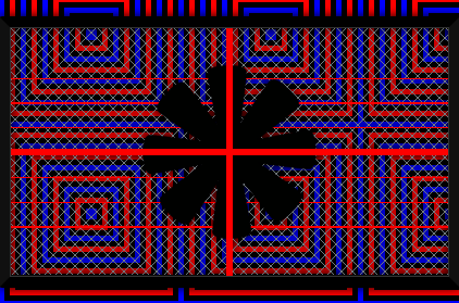
I am not sure how this would be done.

https://jsfiddle.net/1j8wqxeL/1/

.fence {
  position: absolute;
  left: 0;
  right: 0;
  top: 0;
  bottom: 0;
  background: linear-gradient(to bottom, transparent 0, transparent 20%, red 20%, red 20.556%, transparent 20.556%, transparent 30%, red 30%, red 30.556%, transparent 30.556%, transparent 40%, red 40%, red 40.556%, transparent 40.556%, transparent 50%, red 50%, red 50.556%, transparent 50.556%, transparent 60%, red 60%, red 60.556%, transparent 60.556%, transparent 70%, red 70%, red 70.556%, transparent 70.556%, transparent 80%, red 80%, red 80.556%, transparent 80.556%, transparent 100%);
  background-size: 177.778% 100%;
}

Which px values from here should be added back?

background: linear-gradient(to bottom, transparent 0, transparent 72px, red 72px, red 74px, transparent 74px, transparent 108px, red 108px, red 110px, transparent 110px, transparent 144px, red 144px, red 146px, transparent 146px, transparent 180px, red 180px, red 182px, transparent 182px, transparent 216px, red 216px, red 218px, transparent 218px, transparent 252px, red 252px, red 254px, transparent 254px, transparent 288px, red 288px, red 290px, transparent 290px, transparent 360px);

I changed red to px values, that did not work. https://jsfiddle.net/hngrey2L/1/

  background: linear-gradient(to bottom, transparent 0, transparent 20%, red 72px, red 74px, transparent 20.556%, transparent 30%, red 108px, red 110px, transparent 30.556%, transparent 40%, red 144px, red 146px, transparent 40.556%, transparent 50%, red 180px, red 182px, transparent 50.556%, transparent 60%, red 216px, red 218px, transparent 60.556%, transparent 70%, red 252px, red 254px, transparent 70.556%, transparent 80%, red 288px, red 290px, transparent 80.556%, transparent 100%);
  background-size: 177.778% 100%;
}

Am I able to do that similar to this?

  background:
      repeating-linear-gradient(green,green 2px,  transparent 2px,transparent 10%);

How would I do that with this code: https://jsfiddle.net/h6v53e0g/

Where the lines stay at 2px.

I believe I already gave you my preferred method which can be adjusted like this.

.fence{
  position: absolute;
  left: 0;
  right: 0;
  top: 20%;
  bottom: 20%;
  background:
    repeating-linear-gradient( green,green 2px,  transparent 2px,transparent 16.5%);
}

I’m not into chasing pixel perfection for something like that anyway.

(unless you really want the lines to get bigger and smaller with screen size).

How would that be done in regards to the cross?

That doesn’t stay the same size when the window gets bigger and smaller.

At most, I am finding that 1 line is off by 1px from the other line.

As the window gets bigger and smaller, those lines don’t stay the same size.

https://jsfiddle.net/dsche93b/

.cross::before,
.cross::after {
  content: "";
  background: blue;
}

.cross::before

/*horizontal*/
  {
  position: absolute;
  left: 0;
  top: 0;
  bottom: 0;
  right: 0;
  margin: auto;
  /*width: 100%;*/
  /*height: 10px;*/
  height: 2.778%;
 /* clip-path: circle(29% at center);*/
}

.cross::after
/*vertical*/
  {
  position: absolute;
  left: 0;
  top: 0;
  bottom: 0;
  right: 0;
  margin: auto;
  /*width: 10px;*/
  width: 1.563%;
  /*height: 100%;*/
  /*clip-path: circle(51% at center);*/
}

Also, would using a gradient be better to do the cross, or no?

px values:

background: linear-gradient(to right, transparent 0, transparent 315px, red 315px, red 325px, transparent 325px, transparent 640px),
  
   linear-gradient(to bottom, transparent 0, transparent 175px, red 175px, red 185px, transparent 185px, transparent 640px);

Converted to % https://jsfiddle.net/8nf12sz3/

Same with this one.

At most, I am finding that 1 line is off by 1px from the other line.

.cross {
  position: absolute;
  left: 0;
  right: 0;
  top: 0;
  bottom: 0;
  background: linear-gradient(to right, transparent 0, transparent 49.219%, red 49.219%, red 50.781%, transparent 50.781%, transparent 100%),
    linear-gradient(to bottom, transparent 0, transparent 48.611%, red 48.611%, red 51.389%, transparent 51.389%, transparent 177.778%);
}

If you want the cross to stay at an exact px width then I would use a fixed pixel width and absolutely overlay it using :before and :after for each line.

.cross {
  position: absolute;
  left: 0;
  right: 0;
  top: 0;
  bottom: 0;
}

.cross:before,
.cross:after{
  content:"";
  position:absolute;
  top:0;
  bottom:0;
  right:0;
  left:0;
  pointer-events:none;
  width:10px;
  margin:auto;
  background:blue;
}
.cross:after{
  width:auto;
  height:10px;
}
1 Like

Why is, or, how come pointer-events:none; is added to it?

Because if you were to stick anything clickable in that whole panel the cross might obscure it and stop you clicking it even though it appears to only be a few pixels wide it actually covers the whole area. If you were to stick a video under the cross then depending on stacking context you wouldn’t be able to click the video. The cross is just essentially eye candy so lets not stop it affecting anything in the future.

You always need to think ahead and don’t just get by with what you have now. That’s a problem with a lot of your demos in that you don’t think enough in advance.

2 Likes

I found out I could improve the % code using only this.


.cross::before,
.cross::after {
  content: "";
  position: absolute;
  left: 0;
  top: 0;
  bottom: 0;
  right: 0;
  margin: auto;
  background: blue;
}

.cross::before
/*horizontal*/
  {
  /*width: 100%;*/
  /*height: 10px;*/
  height: 2.778%;
 /* clip-path: circle(29% at center);*/
}

.cross::after
/*vertical*/
  {
  /*width: 10px;*/
  width: 1.563%;
  /*height: 100%;*/
  /*clip-path: circle(51% at center);*/
}

I’ve given you similar code many times. Look at the code I posted for the cross in post #115.

The element is placed over the whole area using the four co-ordinates (top, bottom, left, right all at zero). That means if you then give a width or a height to the element you can centere vertically and horizontally by just using margin:auto; You don’t need to work any positions out as the browser will centre it for you.

Regarding the percentage value as I said before you are in the hands of the browser whether it rounds it up or down and it doesn’t always do this consistently.

margin: auto; is being used on here. I don’t understand what you mean.

This would be changed to what?

So,
the code originally looked like this.

.cross::before,
.cross::after {
  content: "";
  background: blue;
}

.cross::before {
  position: absolute;
  left: 0;
  top: 0;
  bottom: 0;
  right: 0;
  margin: auto;
  height: 2.778%;
}

.cross::after {
  position: absolute;
  left: 0;
  top: 0;
  bottom: 0;
  right: 0;
  margin: auto;
  width: 1.563%;
}

Then I changed it to this:

How else would this be written, I don’t understand?

.cross::before,
.cross::after {
  content: "";
  position: absolute;
  left: 0;
  top: 0;
  bottom: 0;
  right: 0;
  margin: auto;
  background: blue;
}

.cross::before{
  height: 2.778%;
}

.cross::after{
  width: 1.563%;
}

No that’s fine.

I was just commenting that I had showed you how to do that a number of times.

1 Like

If I used an inline svg for the cross, it would most likely stay at the same size on page resize, right?

SVGs probably scale better but there is no guarantee that there may be rounding errors still. It’s one of those things you need to test. Just create a standalone svg demo and test it out.

I did this if I wrote it right: https://jsfiddle.net/1v69hab3/

.cross {
  position: absolute;
  left: 0;
  right: 0;
  top: 0;
  bottom: 0;
}
      <svg class="cross" width="100%" height="100%" viewBox="0 0 640 360">
        <line x1="0" y1="180" x2="640" y2="180" stroke="red" stroke-width="10" />
        <line x1="320" y1="0" x2="320" y2="360" stroke="red" stroke-width="10" />
      </svg>

anti-aliasing issue, I don’t think that can be removed.

1 Like