So I made updates to the markup in preparation for the animation, and I have changed the two different submission stages from forms into fieldsets. It’s quite different.
-If I set absolute positioning on the submissionform fieldset, I am able to see the form sitting nicely in its spot vertically, but I am unable to center it nor do I think absolute positioning is going to be good for the responsive/fluid design.
-When I shrink the browser window, the form inputs and their labels change to sitting on top of each which is good/favorable, but I need to manage the point at which that happens so it stays within the .signupbox graphics. Is another media query in order?
-The form submit/reset buttons (inputs) need to be pushed upward. It doesn’t want to move upward because up above it, I have hidden the label and input field for the AI / Bot / Spam catcher honeypot.
-The form needs to be centered.
Trying to tackle this on my own… getting stuck. I updated the files at the new test page.
edit: styles for these form elements begins at line 220, homepage.css
It’s good to see that you’re not waiting for slow-poke here.
I’ve not looked at the code, yet, but you seem to be doing very well.
Some off-the-wall thoughts. As you code the new boxes, remember that you can set an unneeded box to {display:none} to hide it until it is needed (like we did the menus). Just remember that the boxes are being swapped and cannot occupy the same space at the same time. Hide one, restore one, if possible. If impractical, then absolute positioning may be necessary, and that carries a different set of concerns, as you know.
I’m still dabbling with the graphics in the signupbox, but not very quickly.
Well, check the new test site . That looks to be like exactly what needs to happen and will work easily, and I have just the right J/S code for that. Now, I just need to finish styling the menu. Can’t figure out why it won’t get centered. It also doesn’t need to take up that much vertical space.
Also, if you’re wondering what the field with the label reading “For spam purposes, please answer:” is for- PHP generates a string of adding two numbers (e.g. What is 5 + 3?)
Looking at the signupbox. Try something old… replace the new graphics for the signupbox with the older graphics (with the less desirable colors). They should be in one of the folders in your dropbox. Tell me if that solves the centering problem. If it does, then add another 300px to the top of the left, center, and right pieces and that should temporarily fix the centering and layout issues. I say temporarily because the colors need to be changed to suit your prefs (and that’s what I’ve been dabbling with).
I changed the images back to the old ones, but you knew that wouldn’t center anything. I think we can finish the graphics after or even while we code the form inputs. Are you thinking of changing the graphics a bunch?
Not really. I am probably not looking at the same thing that you are. Give me the tag and classname of the container that is not centering. That should put me in the ballpark .
I guess you didn’t restore the original graphics to the latest test site. Would you mind doing that temporarily?
I don’t know yet how the container structure for the graphics might change. Still experimenting.
Usually, my “bright ideas” turn out fairly well. This one may not, though. So far, no joy.
The fieldset is centered perfectly, but the contents are not.
In your current layout I see what doesn’t work for you… what you don’t want.
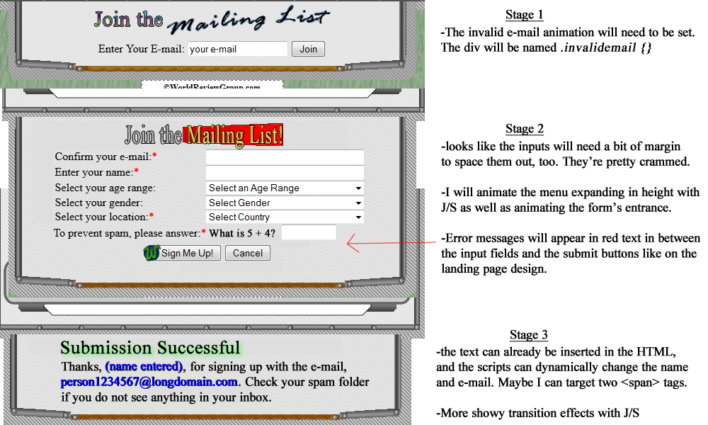
It would help if you could create an accurate image (PSD or whatever you use) showing how you want the form arranged on a normal monitor. I’m not sure how you want the elements aligned, with the understanding that the alignments will change at narrow widths to an over/under relationship.
EDIT - 3:40 am
Proof of concept of background images in signup area successfully demonstrated. No jaggies in diagonal pattern; easy to change colors. It’s not “cheap”, though; it may require 4-5 additional divs.
Awesome! Well, after you get some beauty sleep , maybe you will decide whether or not it’s worth the additional divs. The landing page form has 9 divs, too. I think it sounds worth it. My .signupbox graphics still look uneven, uncentered in relation to the bars and dark BG. I do still have the “jaggies” from those wretched diagonal lines. These would be the last divs at this stage in my design, I believe. I’m nearly finished with my goals for this home page (for now, for a while).
If you benefit from an editable .png, I uploaded it here.
This should help demonstrate the ideas I have for what this form will be. I can post it at my J/S thread as I work my way through my animation/form validation scripts. My extra cost is having to make a second set of scripts to handle the home page form.
There are new images that replace several “old” images. I believe only the necessary graphics are in the styles folder in the dropbox. The old images have been tossed out (with a couple of exceptions).
Added 6 divs in .footbox instead of 5. The 6th (and 7th, and 8th, and 9th) because I think it/they will be handy when you swap content. You can delete whatever you don’t need. My admonition about the number of divs that might be added was not for my benefit, it was for yours. I’m still stinging over the destruction of the wide menus because you were counting divs.
Comments in the CSS explain how to change the background images that determine the colors in .footbox. At the moment, I have left the 2 segments with the original colors in place. Swap comment marks to change to your new colors. FYI, I prefer your original colors because I feel that they distignuish the signup area from the main content area. For some reason, it appeals to my sense of order that everything not flow together in a mash.
homepage7d.css contains the CSS for .footbox (.signupbox). The other 2 stylesheets DO contain mods, so don’t toss them aside.
You may want to create a new version of .mailinglist.gif as a native .png, not a conversion, with full dithering to transparency around the text and without adding any .gif style “transition” pixels that blend into a fixed background color. IMO, that would look crisper and better. It wouldn’t hurt to add a couple of pixels of height between the wide and narrow vews, too.
The logographic.png in the header is rather large bytewise. There are techniques for compressing .pngs that can save a good percentage of bytes. I don’t have the references in front of me at this moment so consider that a project for later, unless someone else pitches in.
In the “free advice” category, always create and save your images in whatever raw format your graphics program uses, then you can save copies as .png or .gif and retain the best appearance.
EDIT: 16:50 EST
I just replaced 4 images in the dropbox with taller versions:
signupCenter.png
signupCenter-orig.png
signupLeft.png
signupRight.png
In post #94, it looks like the “Join the Mailing List” image is a bit wider than the .gif and pseudo-.png that I have. Have you made a new version of that image as a native .png? If so, please send it to me. If not, can you please send me the text portion without the red megaphone. I would like to give the megaphone smooth edges instead of jaggies (works best with a native .png). I’m not sure how you made the red gradient, but I’ll play around and see how close I can come to your colors. Of course, you can probably do this much better than I can.
Also, the code that I have for that form includes a line that says <label for="aicatcher" class="aicatcher">Please leave this field blank:</label>
That label doesn’t appear in your example drawings. What should be done with it?
Awesome! Files updated. Please note the HTML content that I have added in. I also added a red text shadow to the “Not Recommended” box, or more formally, .rightwing targeting h3.redshadow .
The colors still don’t really match on the sign up box as a whole (it’s a little darker like originally), but I don’t care at all. It looks fine, and it’s reserved for the only form on the site, so it may as well look a little different.
I believe I did widen that image text when I made my proof of concept images. I’ll make it bigger and add the link to the modified image. The red gradient on it is next to pointless.
The mailing list image is now a .png, but I didn’t necessarily see any improvement, whereas the box looks much crisper now. I don’t know how to perform dithering. I thought that was up to the Fireworks’ software exportation wizard.
I planted the form content into the .signupstep2 div and removed it from display:none. I have not been able to “find” it yet.
I thought I explained above how to change the colors to your new choice (and why I left the old colors in place for a few more minutes).
In the following sections of code, do you see TWO properties in each selector that begin with background and call similarly named images? …one of which is commented out? Swap backgrounds to swap the colors.
I know of several people who use Fireworks and they swear by it, so I’ll guess that the problem you are having is one of inexperience. Perhaps you can visit the graphics topic and find some information there.
In short, one cannot readily convert a .gif to a .png. The .png inherits the .gif’s CLUT (Color LookUp Table) so you end up with little more than a bloated .gif.
To make the new “L” shaped end images, I drew them anew as native .pngs.
Oops. I’m simply overlooking these comments so far…
Makes sense- the .signupwrapper contains serves as the outer box, and then .signupbox is set up to contain the rest.
I’m going with the matching colors, but I can switch it up as I see fit. Cool.
I uploaded larger versions of the 2nd mailing list image with the red megaphone [here] and here without a gradient.1
I can see the 2nd form sprawled out on the page now.

