
Of Music and Television
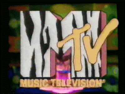
Back in the days when the ‘TV’ part of ‘MTV’ was what made it cool, the music channel was definitely one of the cool kids on the block. With its provocative messages, it became the 80’s symbol of musical rebellion and THE channel to get your daily dose of rock ‘n’ roll.
It was truly refreshing, alternative and revolutionary for its times.
One of the factors that helped give MTV its position in pop culture was its iconic logo design.
As it is with the Apple logo or New York Yankees logo, the MTV brand came to not only represent a logo, but a whole movement.
More than 33 years after MTV and its logo, launched on August 1, 1981, at 12:01 AM, it remains visually powerful and iconic — although MTV gave their logo a makeover in 2010, which I am not going to go into in this post (but some probably might know my opinion already).
Looking back, it was the creator of MTV’s logo, Frank Olinsky, gave the logo its heart and soul, injecting MTV’s fresh, irreverent values into the brand. It was Frank who gifted MTV its ‘chameleon’ ability to constantly re-invent itself around some core design elements.
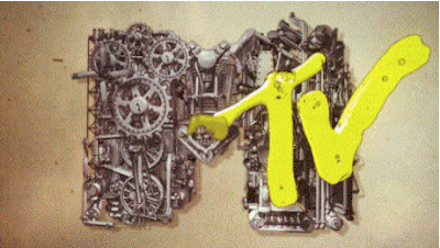
LEGO has taken a similar approach in recent years, mostly as an outro for their toy commercials. Depending on the theme of the toy, the LEGO logo has a fitting animation at the end of the commercial.
While they might not be as wildly creative as that original MTV logo, they always show impressive consistency in the way it is used.
Today I want to look at how Mozilla branding team went about fusing their values into their brand.
Open Source Lizards
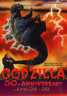
photo: GODZILLA’s 50th
On February 23, 1998, Netscape Communications created the project called Mozilla (blending the original code name of the Netscape Navigator browser “Mosaic” with “Godzilla”)
With that name, it would only make sense to have a lizard as a mascot. And, specifically a Tyrannosaurus Rex. Its purpose was to communicate strength, determination and fearlessness.
It seems however, that these messages weren’t what users were looking for in a browser logo. On the contrary, in a survey made some years ago, most were frightened of the dinosaur, or at least didn’t recognize it as a positive mascot.
It was later announced that the dinosaur would be removed from official Mozilla communication channels. It would however not become extinct, as the Mozilla community, for whom the dino symbolized a much more important movement, stuck with familiar lizard.
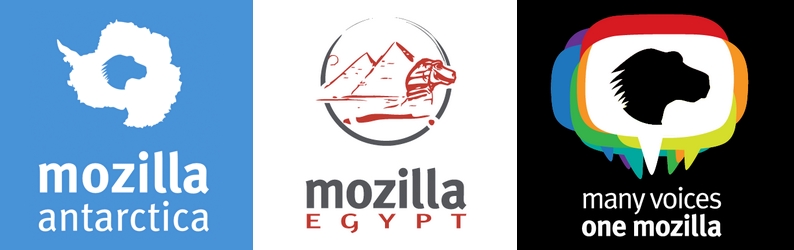
The result was the silhouette of the dino, used in so many logos of various local Mozilla communities (before you wonder, yes there seems to be a Mozilla Antarctica community)
Free font or not free font?
Apart from seemingly scary dinosaurs, the Mozilla wordmark communicated another uncertainty – thought this time an ideologically dilemma, rather than visual.
For years, the FF Meta font family has been Mozilla’s standard, until Open Sans was created in 2010.
The difference? Open Sans is a free and open source font family, meaning that it’s allowed to be modified and used anywhere where the Apache license allows it. As a highly professional font family, it challenged the cliche of free fonts, which were infamous for not being well crafted.
Although Open Sans won ground in most of Mozilla’s communications, FF Meta was still heavily used for Headers and the Mozilla wordmark. As insignificant as this might seem, using a proprietary font to represent the brand of a huge Open Web and Open Source supporter, didn’t gel with Mozilla’s core values. It created a dischord.
The first steps to change this were introduced in 2013, with the launch of Mozilla’s web based operating system, Firefox OS. Accompanying the user experience of Firefox OS, Fira Sans, a humanist sans-serif typeface was commissioned. To align in with the Mozilla vision, it also needed to be completely open and licensed under user friendly licenses.
Of course, it would help if the new font had stylistic similarities to the FF Meta font (used in the Mozilla logo wordmark).
And who better suited to this job than the creator of FF Meta itself?
Yes, Erik Spiekermann revisited FF Meta to come up with its open alternative, Fira Sans. It was (and still is) praised as one of the most qualitative open fonts nowadays.
Visualising openness
With the Mozilla Public License (MPL) and Creative Commons licenses, Mozilla has ensured that all content can be shared freely with minimal restrictions.
Yet visually, there was still a footprint of the past in Mozilla. Small, yet very widespread.
The Logo
Mozilla’s wordmark was originally designed using of the FF Meta font, making it the last piece of the puzzle on this endeavour. With a new CEO and new goals for the coming years, visual identity was among the list of things bound to change.
It was also found that Mozilla didn’t fully represent its values and community efforts to its full extent with a static wordmark. It was decided that the community deserved more.
MTV’s approach was definitely an inspiration for Mozilla here. Representing the contributions and activity of Mozilla contributors on various channels in the visual brand is a pretty nifty way to tackle this. Most mainstream users of Mozilla products will probably not delve too much into this branding message, but is that really needed?
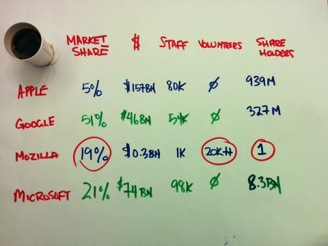
As neatly described in a quick sketch, unlike other companies, Mozilla is powered primarily by volunteers, rather than employees – in fact, over 20k contributors. Keeping that in mind, a big part of the brand needs to serve the community too, which in such a manner is unique.
While the goal was to have a living brand based on open values and assets, the rebranding process was also transparent and open, having various communication channels where people could voice their opinion and watch the brand taking shape.
You can have a look at the Mozilla Creative Team’s blog where the steps have been well documented.
Fira Sans has been used as the base for the new wordmark, turning the mozilla brand into a fully open brand, without losing its distinctiveness.
Are your values visual yet?
Obviously, this rebranding process might not be suitable for all brands, but it might be worth having a look at the overall strategy and thinking process behind.
 Elio Qoshi
Elio is a open source designer and founder of Ura Design. He coordinates community initiatives at SitePoint as well. Further, as a board member at Open Labs Hackerspace, he promotes free software and open source locally and regionally. Elio founded the Open Design team at Mozilla and is a Creative Lead at Glucosio and Visual Designer at The Tor Project. He co-organizes OSCAL and gives talks as a Mozilla Tech Speaker at various conferences. When he doesn’t write for SitePoint, he scribbles his musings on his personal blog.