So, 2013 has come and gone, along the way ushering in as many new trends, as it has seen out. Although the concept of simplicity in design is never truly out of fashion, it has arguably assumed an even more central role in web design, as a primary method to make websites and their content accessible on the largest array of devices. While ‘skeumorphism’ — designing real-world characteristics into digital interfaces — has become increasingly viewed as a design faux-pas, the ‘Flat Design’ movement continued to gain design mindshare. This last trend marked a general preference towards minimalism, flat color and a major emphasis on high quality typography. Of course, typography has long been a dominant element in modern graphic design. Indeed, type selection, combined with a sense of color and proportion, is perhaps the single surest method to distinguish high quality design from the crowd. So, with that in mind, let’s have a look at some of the new fonts that ready to go mainstream in 2014. Of course, creating a top five was no easy task — there were many fonts that came under serious consideration — but we have ultimately had to cull our selection to the following.
Our Top 5 Best New Fonts for 2014 are:
Urge Text
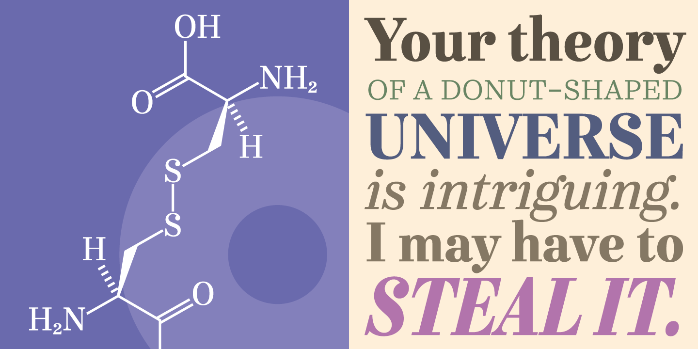 Dave Rowland, the font designer, defined it as a “half-italics” one. Indeed, the top part of the letters have a natural italic form while the lower glyphs are inspired by the Roman style.
The font family is composed by six different weights, all them have both light and bold styles, standard ligatures, case sensitive forms and automatic fractions. Urge text is definitely a font that is adaptable to different typographical scenarios and it shouldn’t be missing on your computer.
You can find the font here: Purchasing the whole font pack will set you back about $240, but that’s a lot of font for your money.
Dave Rowland, the font designer, defined it as a “half-italics” one. Indeed, the top part of the letters have a natural italic form while the lower glyphs are inspired by the Roman style.
The font family is composed by six different weights, all them have both light and bold styles, standard ligatures, case sensitive forms and automatic fractions. Urge text is definitely a font that is adaptable to different typographical scenarios and it shouldn’t be missing on your computer.
You can find the font here: Purchasing the whole font pack will set you back about $240, but that’s a lot of font for your money.
Nocturno
 Nocturno is a font designed for chic and highly stylish texts and headlines, and it is characterized by effective proportions and large openings that make the font highly legible.
The presence of contrasts between slopes, widths, shapes and weights gives us the possibility to use the type both for positive and negative texts.
Nocturno can be downloaded from the Typonine site, prices vary from 6€ to 369€ according to the kind of license you want to buy (single weights are available for 70€).
Nocturno is a font designed for chic and highly stylish texts and headlines, and it is characterized by effective proportions and large openings that make the font highly legible.
The presence of contrasts between slopes, widths, shapes and weights gives us the possibility to use the type both for positive and negative texts.
Nocturno can be downloaded from the Typonine site, prices vary from 6€ to 369€ according to the kind of license you want to buy (single weights are available for 70€).
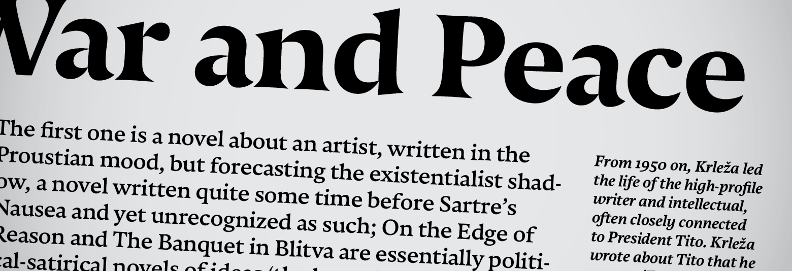
Quadon
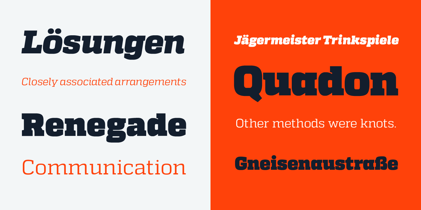 Quadon is a font created by German designer, Rene Bieder. It was designed to create a link between the past, represented by the use of serif fonts, and the present, embodied by the new trend of using sans-serif fonts. It appears as modern, light and flexible and, thanks to the open and large shapes, it can be read with little effort.
Quadon comes with nine different weights, each one with its own italics, and it has also several alternative glyphs that make the font highly customizable; thus it can be used for various design aims.
Here’s the font download page, The pack sells for $250, which I think is a great investment for such a versatile font.
Quadon is a font created by German designer, Rene Bieder. It was designed to create a link between the past, represented by the use of serif fonts, and the present, embodied by the new trend of using sans-serif fonts. It appears as modern, light and flexible and, thanks to the open and large shapes, it can be read with little effort.
Quadon comes with nine different weights, each one with its own italics, and it has also several alternative glyphs that make the font highly customizable; thus it can be used for various design aims.
Here’s the font download page, The pack sells for $250, which I think is a great investment for such a versatile font.
Trend Hand Made
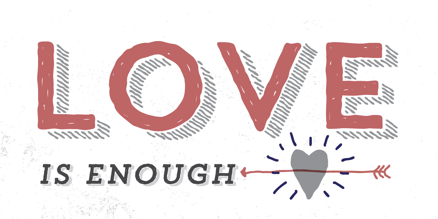 Trend Hand Made is a font created by design duo Daniel Hernandez and Paula Nazal Selaive, who say they designed this typeface after much ‘observation, search and study of global trends’.
The creators want to express the pure beauty of fashion and style, beginning with a sans slab font. Sure, there’s a touch of hipster here, but that’s not a bad thing. For $159, you can make Trend Hand Made yours — a fitting reward for good, distinctive work.
Trend Hand Made is a font created by design duo Daniel Hernandez and Paula Nazal Selaive, who say they designed this typeface after much ‘observation, search and study of global trends’.
The creators want to express the pure beauty of fashion and style, beginning with a sans slab font. Sure, there’s a touch of hipster here, but that’s not a bad thing. For $159, you can make Trend Hand Made yours — a fitting reward for good, distinctive work.
Voyage
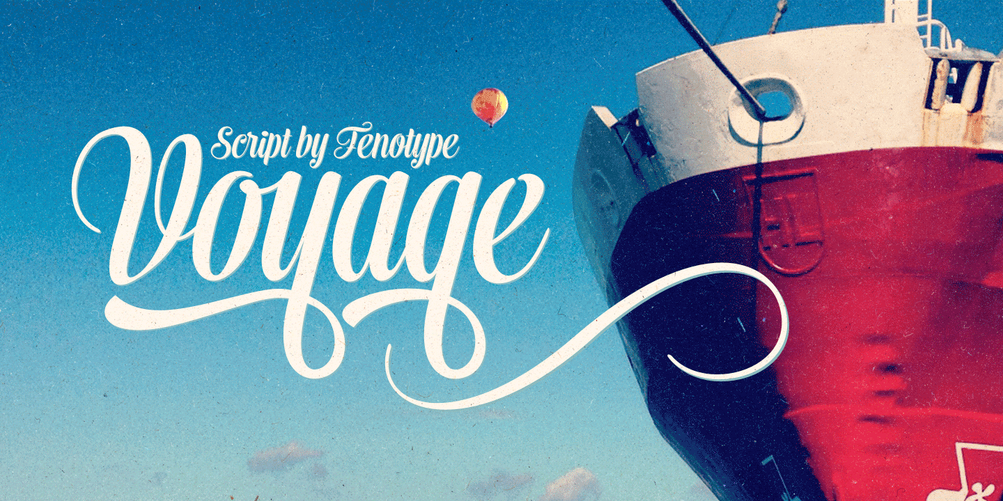 This font created by Emil Karl Bertell is a plain and friendly one that seems to create a bridge with the past and old typefaces. It is elegant, classy and decorous and can thus be used for different purposes, from advertising to book covers to headlines.
Voyage is packaged with two weights, plus a set of ornaments. Wondering where to get this font? It can be easily downloaded at this link and I think it’s a steal at $50.
This font created by Emil Karl Bertell is a plain and friendly one that seems to create a bridge with the past and old typefaces. It is elegant, classy and decorous and can thus be used for different purposes, from advertising to book covers to headlines.
Voyage is packaged with two weights, plus a set of ornaments. Wondering where to get this font? It can be easily downloaded at this link and I think it’s a steal at $50.
Frequently Asked Questions about Top New Fonts
What makes a font considered as one of the best new fonts?
A font is considered one of the best new fonts based on several factors. These include readability, versatility, uniqueness, and how well it fits with current design trends. The font should be easy to read in various sizes and on different devices. It should also be versatile enough to be used in a variety of contexts, from web design to print media. Uniqueness is another important factor, as it helps the font stand out from the crowd. Lastly, the font should align with current design trends to ensure it is relevant and appealing to modern audiences.
How can I download and install these new fonts?
Downloading and installing new fonts is a straightforward process. Most font websites provide a download link for each font. Once downloaded, you can install the font by opening the file and clicking on the ‘Install’ button. Some operating systems may require you to manually add the font to your font library. Always ensure you respect the licensing agreement of the font, as some are free for personal use but require a license for commercial use.
Can I use these fonts for commercial purposes?
Whether you can use a font for commercial purposes depends on its licensing agreement. Some fonts are free for both personal and commercial use, while others require you to purchase a license for commercial use. Always check the licensing agreement before using a font for commercial purposes to avoid legal issues.
What are some popular applications of these top new fonts?
These top new fonts can be used in a variety of applications. They are suitable for web design, print media, branding, advertising, and more. Their versatility makes them a great choice for any design project.
How do these top new fonts compare to classic fonts?
These top new fonts offer a fresh and modern alternative to classic fonts. While classic fonts are timeless and widely used, these new fonts provide unique and innovative design options. They are designed to meet the needs of modern design trends and offer a unique aesthetic that can help your design stand out.
Are these fonts compatible with all devices and operating systems?
Most modern fonts are designed to be compatible with all major devices and operating systems. However, it’s always a good idea to check the compatibility of a font before downloading and installing it.
How can I pair these fonts with other fonts?
Pairing fonts is an art in itself. A good rule of thumb is to pair a serif font with a sans-serif font to create contrast. You can also pair fonts from the same family or that share similar characteristics. Experimenting with different font pairings can lead to unique and interesting design results.
What are the trends in font design for 2023?
Font design trends for 2023 include a move towards more organic and hand-drawn fonts, as well as bold, oversized fonts. Minimalist and clean fonts are also expected to remain popular.
How can I keep up with new font releases?
Keeping up with new font releases can be done by following font websites and design blogs, subscribing to design newsletters, and participating in design communities. These resources often feature new font releases and provide valuable insights into the latest design trends.
What are some examples of successful uses of these top new fonts?
These top new fonts have been successfully used in a variety of design projects. Examples include website design, branding, advertising campaigns, and print media. Their versatility and unique design characteristics make them a popular choice among designers.
 Simone Sala
Simone is a graphic designer who loves technology, design and who is always looking for new trends and innovative concepts. He also likes to give tips and to share his knowledge with other tech-lovers.


