

Key Takeaways
- The CSS3 border-radius property can be set using a slash syntax to specify different values for horizontal and vertical radii, enabling the creation of elliptical shapes. The first value before the slash sets the horizontal radius, and the value after the slash sets the vertical radius.
- The slash syntax can also be used to set specific vertical and horizontal radius values for each corner of an element, offering a greater degree of control over the element’s shape. This syntax is particularly beneficial when creating more complex or asymmetrical rounded corners.
- The slash syntax for CSS3 border-radius property should be used when you want the vertical and horizontal radius values on a single corner to differ from one another. It can also be employed to change radius values via scripting, potentially opening the door for interesting animations using transitions or keyframe-based animations.
What could I possibly say about the CSS3 border-radius property that hasn’t been said before? Well, I can’t claim that anything I’ll be saying in this article will be completely new to anyone who regularly reads articles covering front-end technologies.
Sometimes, however, the apparent simplicity of a particular CSS3 property might blind us to the fact that there can be a whole lot more going on than we think.
That’s exactly what this short article will help to establish—specifically in relation to the border-radius property.
But don’t worry—I’ll go through this carefully, covering some border-radius basics first, to ease into the discussion.
Before I get into the meat of things, I’m happy to announce that I’ve recently had the privilege of co-authoring an exciting new book project published by SitePoint. It’s called HTML5 and CSS3 for the Real World and is scheduled for a late May launch. Naturally, border-radius will be covered in that upcoming book, but I thought it would be nice to expand on that topic here and provide a little extra for those interested in delving into some of the finer points associated with this property.
Basics of border-radius
border-radius is a pretty simple property to use, and has 100% support across all modern browsers, and is even supported in quite a few earlier browser versions. Here’s how the syntax looks in its most basic shorthand form:
#element {

  border-radius: 10px;

}
That will put a 10px radius (i.e., a rounded edge) on each corner of the targeted element. If you want to specify a different value for each corner, you can do this:
#element {

  border-radius: 10px 5px 20px 16px;

}
The values start with the top-left and move clockwise.
Just like the margin and padding properties you can, of course, omit one or two values and the existing values will be used to determine the omitted ones:
#element {

  border-radius: 10px 5px 20px;

}
In that last example, although I’ve omitted the value for the bottom-left corner, the bottom-left corner will inherit its radius value from the one specified for top-right (the second value). Similarly, if you omitted the third and fourth values, then the third value (bottom-right) would inherit from the first (top-left).
Finally, you can also declare each corner individually using longhand syntax, like this:
#element {

  border-top-left-radius: 10px;

  border-top-right-radius: 5px;

  border-bottom-right-radius: 20px;

  border-bottom-left-radius: 16px;

}
Pretty simple. And I’ll bet you already knew all of that, didn’t you?
Now, let’s bring in a little complexity so we can really get to know this CSS3 property.
Different Values for Horizontal and Vertical Radii
Because the standard way of declaring the border-radius values (discussed above) has become so widespread, you may not be aware of an alternative syntax for this property.
Take a look at the following code example:
#element {

  border-radius: 55px / 25px;

}
When I first saw that style of syntax, with the slash in between the two values, my first reaction was: That can’t be right! But it is. Here’s how the spec explains it:
“If values are given before and after the slash, then the values before the slash set the horizontal radius and the values after the slash set the vertical radius. If there is no slash, then the values set both radii equally.”
Below is an image of what the element looks like with the above syntax, and with dimensions of 200px by 200px and a gray background. Bear in mind, a CSS3-capable browser would be required to see the HTML rendition.

The slash-based syntax might be a difficult thing to wrap your mind around, so let’s examine how the syntax relates to what’s happening to the shape of the corners on that element.
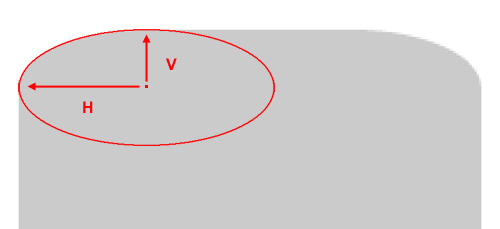
In the above image, I’ve blown up the element and placed an ellipse into the corner so that the upper curve of the ellipse overlaps the rounded corner as closely as possible. A “radius”, according to the dictionary definition is “a straight line extending from the center of a circle or sphere to the circumference or surface.”
According to the spec, the values you give the border-radius property “define the radii of a quarter ellipse that defines the shape of the corner of the outer border edge.” Thus, if you add the full ellipse (as I’ve done above), you’ll see exactly how the radii are calculated. In the image, I’ve drawn arrows indicating the horizontal and vertical radii (marked with “H” and “V”).
Keep in mind that because of pixelation (in the original and the blown up version), this can’t be an exact science; that would be something more appropriate when dealing with vector-based shapes.
Other Horizontal/Vertical Radii Options
Of course, the slash-based syntax is not just limited to two values; if you wish, you can set specific vertical and horizontal radius values for each corner of the element.
The syntax from above can alternatively be expressed like this:
#element {

  border-radius: 55px 55px 55px 55px / 25px 25px 25px 25px;

}
The values before the slash represent the horizontal radii for the top-left, top-right, bottom-right, and bottom-left corners, respectively. The values after the slash represent the vertical radii for those same corners, in that order.
And of course, similar to the traditional syntax, you can omit one or two values from before or after the slash, and the missing values will inherit from the existing ones.
You also have the option to declare different vertical and horizontal radii using the longhand syntax for each corner. So if we wanted to use longhand syntax to create the same shape from above, we would do this:
#element {

  border-top-left-radius: 55px 25px;

  border-top-right-radius: 55px 25px;

  border-bottom-right-radius: 55px 25px;

  border-bottom-left-radius: 55px 25px;

}
Notice that this time there is no slash used. In this case, the two space-separated values on each line represent the horizontal and vertical radii, respectively, for the given corner.
When Should This Syntax Be Used?
It should be noted that this syntax to target vertical and horizontal radius values for each corner would only be used if you want the vertical and horizontal radius values on a single corner to differ from one another. That means you would not need to use this syntax if you want equal horizontal and vertical radius values for each corner.
Significantly, you could also employ this syntax when changing radius values via scripting. Thus, when used appropriately, this could open the door for some interesting animations using transitions or keyframe-based animations.
So in most—if not all—cases, you can stick to the traditional syntax, and only use the syntax described here if you want one or more nonsymmetrical rounded corners.
Even so, this information should be enough for you to want to experiment a little further with this otherwise well-known CSS3 property.
Let me know what you come up with.
Frequently Asked Questions (FAQs) about CSS3 Border Radius with Slash Syntax
What is the significance of using slash syntax in CSS3 border-radius?
The slash syntax in CSS3 border-radius is used to create elliptical borders. It allows you to specify two values for the border-radius property, separated by a slash (/). The first value sets the horizontal radius, and the second value sets the vertical radius. This syntax is particularly useful when you want to create more complex shapes or add a unique touch to your web design elements.
How does the CSS3 border-radius property with slash syntax differ from the regular border-radius property?
The regular border-radius property in CSS3 allows you to create rounded corners by specifying a single radius value. On the other hand, the border-radius property with slash syntax lets you specify two different values for the horizontal and vertical radii, enabling you to create elliptical shapes. This gives you more flexibility and control over the appearance of your web elements.
Can I use percentages with the CSS3 border-radius slash syntax?
Yes, you can use percentages with the CSS3 border-radius slash syntax. When you use percentages, the radius is calculated as a percentage of the corresponding dimension (width for horizontal radius, height for vertical radius) of the border box.
Is the CSS3 border-radius property with slash syntax supported by all browsers?
The CSS3 border-radius property with slash syntax is widely supported by all modern browsers, including Chrome, Firefox, Safari, and Edge. However, it may not be supported by older versions of these browsers or by Internet Explorer.
How can I create a circle using the CSS3 border-radius property?
To create a circle using the CSS3 border-radius property, you need to set the border-radius to 50%. This will make the horizontal and vertical radii equal to half the width and height of the element, respectively, creating a perfect circle.
Can I use different units for the horizontal and vertical radii in the CSS3 border-radius slash syntax?
Yes, you can use different units for the horizontal and vertical radii in the CSS3 border-radius slash syntax. For example, you can specify the horizontal radius in pixels and the vertical radius in percentages.
What happens if I only specify one value in the CSS3 border-radius slash syntax?
If you only specify one value in the CSS3 border-radius slash syntax, that value will be used for both the horizontal and vertical radii, creating a circular border.
Can I use the CSS3 border-radius property with slash syntax on images?
Yes, you can use the CSS3 border-radius property with slash syntax on images. This can be a great way to add a unique touch to your images or to create circular images.
How can I create a semi-circle using the CSS3 border-radius property?
To create a semi-circle using the CSS3 border-radius property, you need to set the border-radius to 50% and then hide half of the element using the overflow property.
Can I animate the CSS3 border-radius property?
Yes, you can animate the CSS3 border-radius property using CSS animations or transitions. This can create interesting effects, such as a button that changes shape when hovered over.