Ratchet is a framework for building mobile applications and prototypes quickly using simple HTML, CSS and JS components. In my last post, Ratchet – Prototyping Mobile Apps Easily, we looked at steps for getting started with Ratchet framework.
We also looked at how to place important components like Title bar, Table views, Chevrons, Toggles and Ratchicons on a single screen.
In this article, we will learn how to create multiple screens in a single applications and load them using Ratchet’s push.js script.
What is push.js?
push.js is a section of JavaScript code that comes pre-loaded in Ratchet’s default JS file ratchet.js. There’s no external downloadable file needed. It connects various HTML pages in a Ratchet app through AJAX.
There are two big advantages of using AJAX powered push.js in a mobile app prototype: quicker interactivity with the server and it gives a feeling of a single page application.
Developers can use Ratchet to create mobile applications and then use softwares like PhoneGap to convert them to iOS and Android apps. Hence, push.js can help developers quickly fetch data from the servers and display them on the screen.
The App
In this article, we are going to create a news feed application known as “SitePoint’s World News“.
I know it doesn’t exist but it would be good if SitePoint considered it. ;)
Here’s a list of features which this app is going to have.
- The homescreen will host a list of news items.
- Each news item will be linked to another screen to display the news article.
- The ability to get back to the homescreen with a back button on the title bar.
- Each news items can have a settings screen.
- A sharing popover to share news items.
Apart from just checking out the usage of push.js, we will also try out some cool features it has. Of all the features listed above, push.js will be used only in feature number 2, i.e. the loading a different page. It may look a simple and small usage of push.js, but it is necessary to understand what it does.
For the first feature, we will be using Ratchet’s Table view with chevrons component. We will list various dummy news items with a related image. The 3rd feature is about adding a left arrow to the application’s top bar icon with a link to the homescreen.
We will be creating a modal component for the settings screen. This screen will have a table view with toggles components to represent each setting item.
The last feature, a sharing option, will be achieved using Ratchet’s popover component.
Let’s get started
Download Ratchet from its official website, goratchet.com. Extract its content into a working folder and create a new file called index.html in it. Or download the final code from github. This page is going to be the first screen of our application.
Next, we need to put Ratchet’s recommended HTML markup inside this HTML page. In case you don’t remember the important meta tags and the basic structure of a Ratchet HTML page, you can always find them here.
The index.html page should now contain the following markup:
<!DOCTYPE html>
<html>
  <head>
    <meta charset="utf-8">
    <title>SitePoint’s World News</title>

    <!-- Sets initial viewport load and disables zooming  -->
    <meta name="viewport" content="initial-scale=1, maximum-scale=1, user-scalable=no, minimal-ui">

    <!-- Makes your prototype chrome-less once bookmarked to your phone's home screen -->
    <meta name="apple-mobile-web-app-capable" content="yes">
    <meta name="apple-mobile-web-app-status-bar-style" content="black">
    <meta name="mobile-web-app-capable" content="yes">

    <!-- Include the compiled Ratchet CSS -->
    <link href="css/ratchet.css" rel="stylesheet">

    <!-- Include the compiled Ratchet JS -->
    <script src="js/ratchet.js"></script>
  </head>
  <body>

  <header class="bar bar-nav">
    <h1 class="title">SitePoint’s World News</h1>
  </header>

  <div class="content">

  </div>
  </body>
</html>
I have changed the page’s title to SitePoint’s World News and have removed all the content that was inside the .content div in the basic template.
As discussed in my previous article on Ratchet, every Ratchet page should have two important components: the top bar and the contents section.
The top bar should be a <header> element with classes: .bar and .bar-nav whereas the contents section should have a class .content.
Refer to my previous article for steps to run a Ratchet application. There are various options available.
Our goal is to fill the contents section with some dummy news content. I have shamelessly picked up some news items from the Google News page to give a realistic feeling to the app.
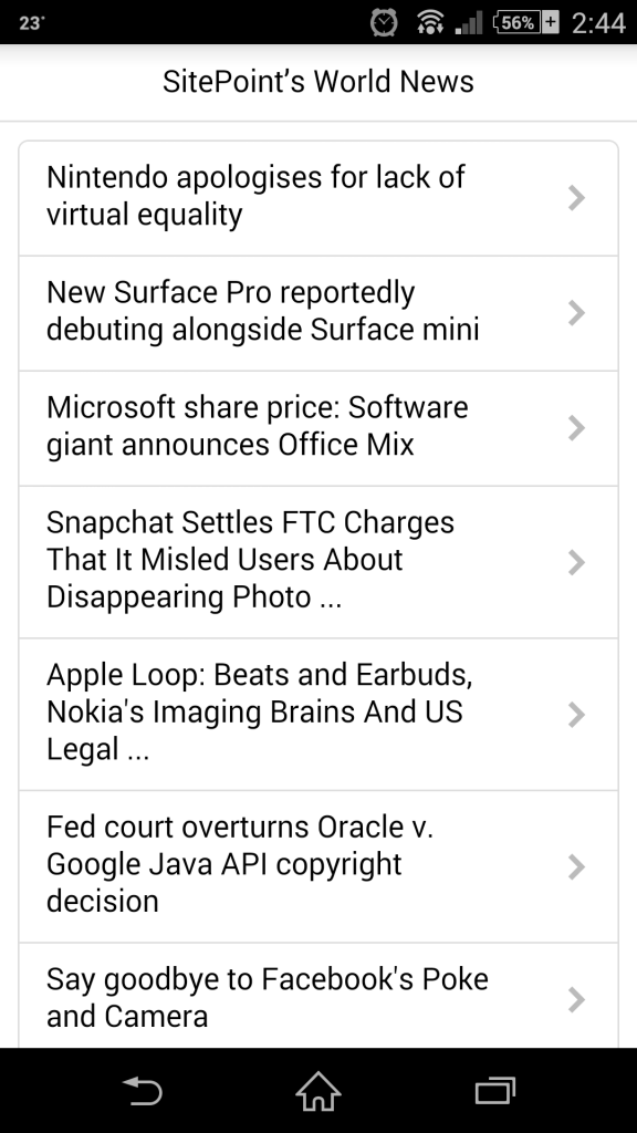
To create a list of news items, we will be using “Table view with chevrons” HTML component of Ratchet. So let’s go ahead and place the following markup inside the .content div.
<div class="card">
    <ul class="table-view">
      <li class="table-view-cell">
        <a class="navigate-right" href="#">
            Nintendo apologises for lack of virtual equality
        </a>
      </li>
      <li class="table-view-cell">
        <a class="navigate-right" href="#">
            New Surface Pro reportedly debuting alongside Surface mini
        </a>
      </li>
      <li class="table-view-cell">
        <a class="navigate-right" href="#">
      Microsoft share price: Software giant announces Office Mix
        </a>
      </li>
      <li class="table-view-cell">
        <a class="navigate-right" href="#">
            Snapchat Settles FTC Charges That It Misled Users About Disappearing Photo ...
        </a>
      </li>
      <li class="table-view-cell">
        <a class="navigate-right" href="#">
            Apple Loop: Beats and Earbuds, Nokia's Imaging Brains And US Legal ...
        </a>
      </li>
      <li class="table-view-cell">
        <a class="navigate-right" href="#">
            Fed court overturns Oracle v. Google Java API copyright decision
        </a>
      </li>
      <li class="table-view-cell">
        <a class="navigate-right" href="#">
            Say goodbye to Facebook's Poke and Camera
        </a>
      </li>
      <li class="table-view-cell">
        <a class="navigate-right" href="#">
            Ford recalls Escape, C-Max and more vehicles to fix safety issues
        </a>
      </li>
      <li class="table-view-cell">
        <a class="navigate-right" href="#">
            Chrysler recalls 780000 minivans over window switch
        </a>
      </li>
    </ul>
  </div>
The table view is a <ul> element with .table-view class. Each <li> element in a table view should have a class .table-view-cell. Here, I have used an <a> element with class .navigate-right for each news item. The class .navigate-right outputs a right arrow at the right side of each .table-view-cell element.
Our screen till now should like this:
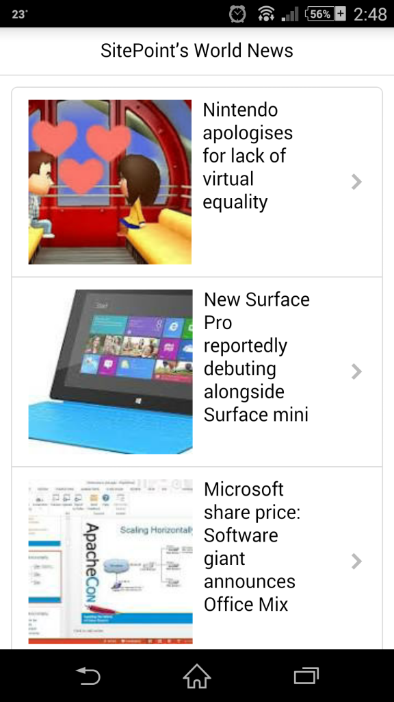
It’s almost ready. We need to place an image item beside each item. This image item has to be placed inside each <a> element to represent the corresponding news image. Here’s the mark up for the image:
<img class="media-object pull-left" src="images/img1.jpeg">
The image should have class media-object to identify it as a Ratchet media component. I have used the class .pull-left to make the image left aligned with respect to the news headline. Go ahead and place the image tag inside each item in your markup. We should get a screen that looks like below.
Now it is time to create another HTML page which will be used to display a complete news article. Create another file in the same working folder called article.html.
We will put the same basic HTML template from Ratchet in this page. So, the markup article.html should be:
<!DOCTYPE html>
<html>
  <head>
    <meta charset="utf-8">
    <title>Post's Title</title>

    <!-- Sets initial viewport load and disables zooming  -->
    <meta name="viewport" content="initial-scale=1, maximum-scale=1, user-scalable=no, minimal-ui">

    <!-- Makes your prototype chrome-less once bookmarked to your phone's home screen -->
    <meta name="apple-mobile-web-app-capable" content="yes">
    <meta name="apple-mobile-web-app-status-bar-style" content="black">
    <meta name="mobile-web-app-capable" content="yes">

    <!-- Include the compiled Ratchet CSS -->
    <link href="css/ratchet.css" rel="stylesheet">

    <!-- Include the compiled Ratchet JS -->
    <script src="js/ratchet.js"></script>
  </head>
  <body>

  <header class="bar bar-nav">
    <a class="icon icon-left-nav pull-left" href="index.html"></a>
    <h1 class="title">Post's Title</h1>
  </header>

  <div class="content">
  </div>
  </body>
</html>
Everything looks the same, except an additional link in the <header> element. I have used Ratchet’s Ratchicons to create a left icon inside the top bar. This icon is generated using the classes .icon and .icon-left-nav. An additional class .pull-left is used to place the icon to the left most side of the top bar. Since, this icon is a link element, let’s put index.html as its target. Hence, whenever this is clicked it will take us back to the homescreen.
Let’s put some content inside the .content div to represent the article.
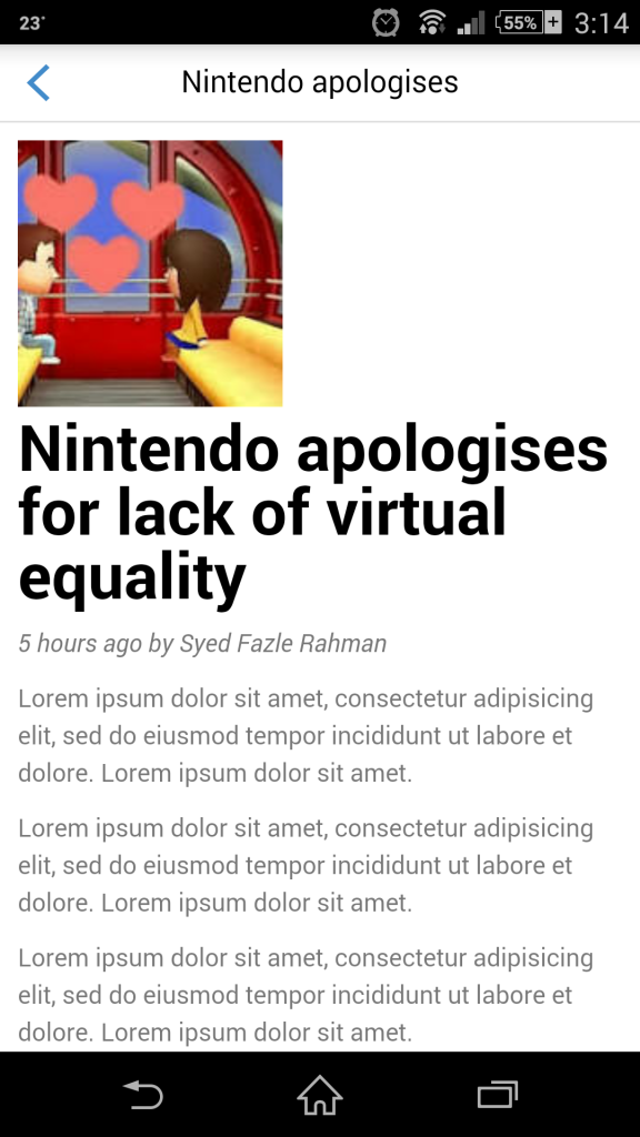
<div class="content-padded">
<img class="media-object" src="images/img1.jpeg">
<h1>Nintendo apologises for lack of virtual equality</h1>
<p><i>5 hours ago by Syed Fazle Rahman</i></p>
<p>Lorem ipsum dolor sit amet, consectetur adipisicing elit, sed do eiusmod tempor incididunt ut labore et dolore. Lorem ipsum dolor sit amet.</p>
<p>Lorem ipsum dolor sit amet, consectetur adipisicing elit, sed do eiusmod tempor incididunt ut labore et dolore. Lorem ipsum dolor sit amet.</p>
<p>Lorem ipsum dolor sit amet, consectetur adipisicing elit, sed do eiusmod tempor incididunt ut labore et dolore. Lorem ipsum dolor sit amet.</p>
<p>Lorem ipsum dolor sit amet, consectetur adipisicing elit, sed do eiusmod tempor incididunt ut labore et dolore. Lorem ipsum dolor sit amet.</p>
<p>Lorem ipsum dolor sit amet, consectetur adipisicing elit, sed do eiusmod tempor incididunt ut labore et dolore. Lorem ipsum dolor sit amet.</p>
<p>Lorem ipsum dolor sit amet, consectetur adipisicing elit, sed do eiusmod tempor incididunt ut labore et dolore. Lorem ipsum dolor sit amet.</p>
The class .content-padded is used to create some padding between the screen and the content. I have placed an image representing the news item, the title of the news item using <h1> tag and some dummy text using multiple <p> tags to represent the news content.
The article.html should look like below.
Now that we have 2 pages ready, let’s link them. This is where we will actually use push.js functionality.
Open index.html again. We will change the href attribute value of the first news item to article.html. By default, all the links in Ratchet applications are push.js powered links. This means they will fetched using AJAX.
Ratchet looks for .bar and .content divs in both the current page and the newly fetched page. It then updates those divs in the old page with the contents of the new page. Hence, anything placed outside .bar and .content divs in the newly fetched page, will be ignored.
In our case, it will update the top header bar and the .content div of the index.html page with the contents of corresponding components of article.html page. Hence, we will see an updated top bar and the news article instead of a list of news items.
Go ahead and click on the first news item in the homescreen, you will see the news article being loaded. Click the back button on the top bar, it should take you back to the homescreen.
Let’s add some transitions while changing the screen through push.js. The transitions are applied to the application by adding a custom attribute called data-transition to the link <a> elements. This attributes takes three different values: fade, slide-in, or slide-out. Let’s add a slide-in effect to the first news item in the homescreen as shown below:
<a class="navigate-right" href="two.html" data-transition="slide-in">
  <img class="media-object pull-left" src="images/img1.jpeg">
    Nintendo apologises for lack of virtual equality
</a>
Also add a slide-out effect to the back button in the article.html page.
<a class="icon icon-left-nav pull-left" href="index.html" data-transition="slide-out"></a>
Go ahead and run your application again. You should see a slide-in effect while fetching a new page and a slide-out effect while returning back. These effects may look slightly different as per the theme included in the Ratchet application. An iOS platform transition is applied when using the iOS theme and Android platform transition is applied in the Android theme.
That’s it. Our application is almost ready with the basic features. There’s still 2 more features that needs to be achieved: the sharing options and the settings screen on the news article. Since these options will be available only on the second screen, we will create them inside article.html.
The sharing option is a popover that appears from the top bar with long list of social network options. We will be using Ratchet’s popover component to create it. Let’s reopen article.html. The markup for a popover component goes like this:
<div id="popover" class="popover">
<header class="bar bar-nav">
  <h1 class="title">Share this</h1>
</header>
<ul class="table-view">
  <li class="table-view-cell">Facebook</li>
  <li class="table-view-cell">WhatsApp</li>
  <li class="table-view-cell">Google+</li>
  <li class="table-view-cell">Tweet</li>
  <li class="table-view-cell">Pinterest</li>
  <li class="table-view-cell">Reddit</li>
  <li class="table-view-cell">Pocket</li>
  <li class="table-view-cell">Email</li>
</ul>
Each popover should have a header and a body portion. The header is used to give a title to the popover. Just like application’s top bar, this header should also have the classes: .bar and .bar-nav. Next, we will use Ratchet’s table-view component to list out the set of sharing networks. Here comes the biggest question! Where should I place this popover’s markup?
As stated above, since article.html will be fetched using push.js only the contents present inside top bar and .content div will be pulled. Hence, the above popover markup should be placed just above </div> of .content div.
Popovers are one of the hidden components of Ratchet. This means, they will be visible only when triggered. Hence, we need a handler which will trigger the popover.
Place an sharing icon beside the title of the article in <header> component of article.html. This icon will be our handler to trigger the sharing popover. The markup for the top bar of article.html should now be:
<header class="bar bar-nav">
<a class="icon icon-left-nav pull-left" href="index.html" data-transition="slide-out"></a>
<h1 class="title">Nintendo apologises <a class="icon icon-share" href="#popover"></a></h1>
The href attribute of the handler should contain the ID of the target popover. Here the value is #popover. The sharing icon is a Ratchicon which is made displayed using the classes icon and icon-share. Let’s go and check it working in our application. It should look like below.
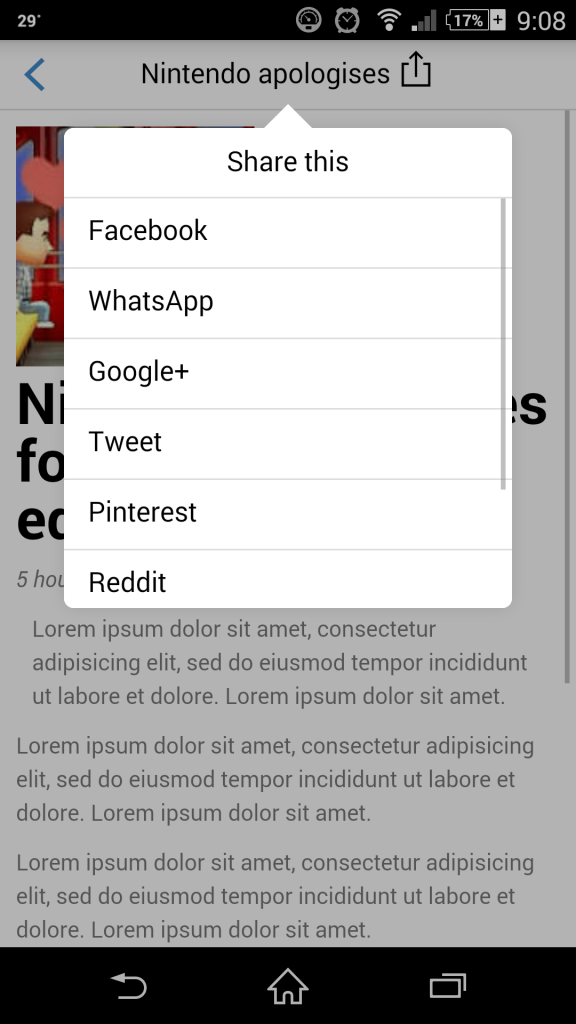
Amazing! Isn’t it? We didn’t have to write a single line of CSS and JS for that popover. Kudos to the Ratchet team.
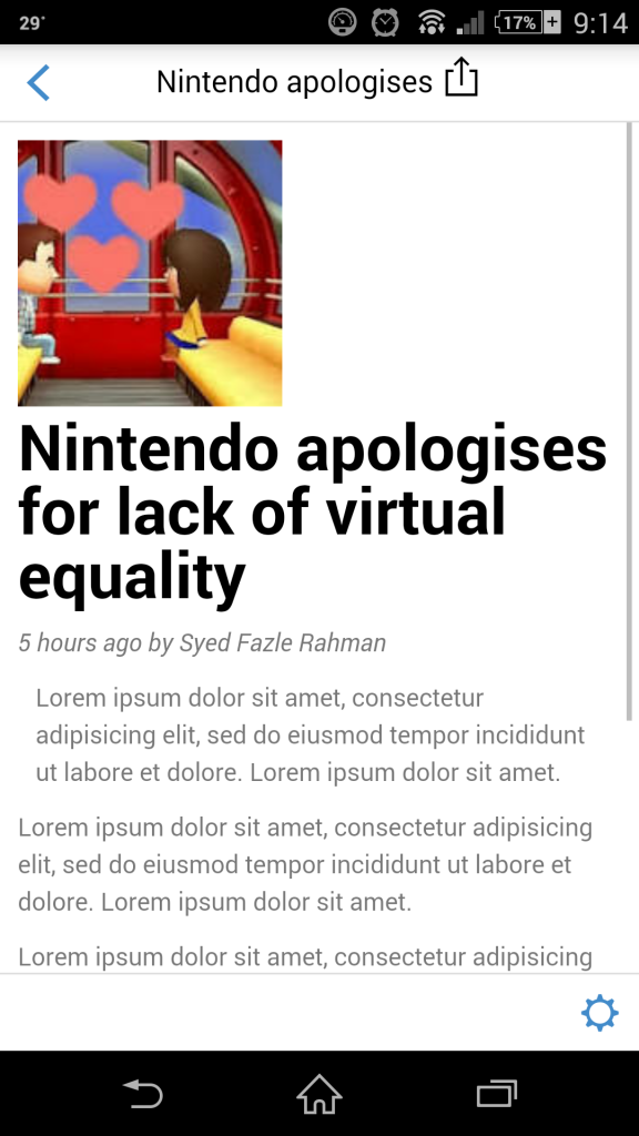
It’s time to create a settings screen. This screen will be a Ratchet modal. Just like popovers, modals are also invisible by default. They have to be triggered in order to make them visible. Let’s create a floating bottom bar in the article.html screen. We will place a settings icon in it which will be the handler to trigger the modal screen.
To create a floating bar, add the following markup just below the markup of the popovers.
<div class="bar bar-standard bar-footer">
<a class="icon icon-gear pull-right" href="#myModalexample"></a>
Floating bars are visible by default. I have placed a gear icon to represent the settings button. Its’ href attribute contains the ID of the modal component which will create soon. The article.html screen will now look like this:
The markup for a modal component is as follows:
<div id="myModalexample" class="modal">
<header class="bar bar-nav">
  <a class="icon icon-close pull-right" href="#myModalexample"></a>
  <h1 class="title">Settings</h1>
</header>

<div class="content">
  <ul class="table-view">
  <li class="table-view-cell">
    Don't show such articles
    <div class="toggle">
      <div class="toggle-handle"></div>
    </div>
  </li>
  <li class="table-view-cell">
    Lorem Ipsum Setting 1
    <div class="toggle active">
      <div class="toggle-handle"></div>
    </div>
  </li>
  <li class="table-view-cell">
    Lorem Ipsum Setting 2
    <div class="toggle">
      <div class="toggle-handle"></div>
    </div>
  </li>
</ul>
</div>
Just like a popover component, a modal also has a header area and a .content area. The heading area is used to give a title to the modal. In the contents area, I have used “Table view with toggles” component of Ratchet. Hence, the user can toggle a particular settings item as per his requirements.
The modal screen looks like below:
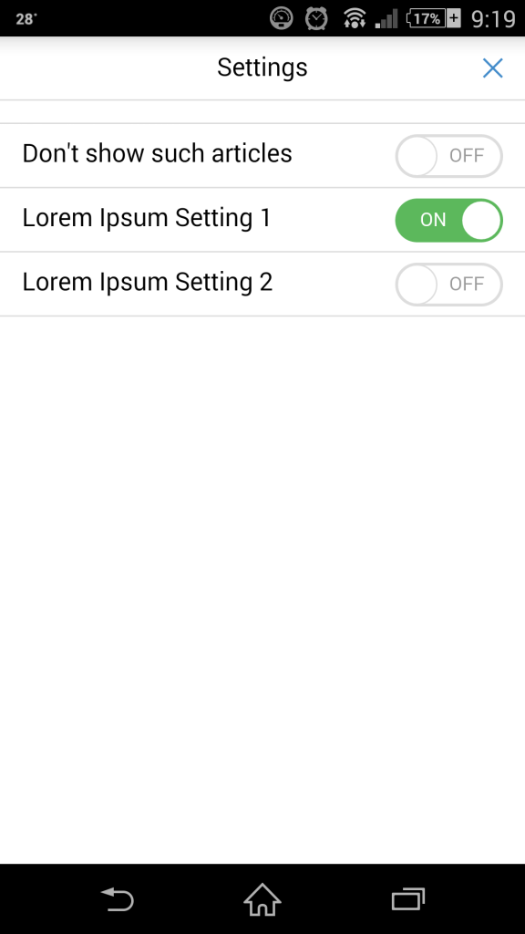
The markup for modal component should also be placed inside the .content div of article.html page.
Preventing push.js
If you want some links in your application should not use push.js, you can use data-ignore custom attribute with value as push in such link elements.
Eg:
<a href="http://www.sitepoint.com" data-ignore="push">SitePoint<a>
The above link will redirect you from the app to the target URL.
Conclusion
Finally we have a basic news feed application using Ratchet. It has the features that are normally found in most native applications. We were able to create a high fidelity application just by using HTML, CSS and JS technologies. If this prototype is integrated using frameworks like PhoneGap, it can become a fully fledged hybrid application and be used with iOS and Android devices as a native application.
Hopefully, you have enjoyed creating this dummy application as much as I did. I am looking forward to empowering such applications using AngularJS, ExpressJS and MongoDB and make it a fully functional application. If you have any queries related to this topic, you can tweet me directly using my twitter handle (@fazlerocks) or leave a comment below. I will be glad to answer them.
Frequently Asked Questions about Ratchet’s Push.js for Mobile App Prototyping
How does Ratchet’s Push.js differ from other JavaScript libraries?
Ratchet’s Push.js is a unique JavaScript library specifically designed for mobile app prototyping. Unlike other libraries, it allows developers to create multiple screens within a single HTML document, making it easier to prototype mobile applications. It also supports native-like transitions between screens, enhancing the user experience. However, it’s important to note that Push.js is not a full-fledged mobile development framework. It’s primarily used for prototyping and may not have all the features required for full-scale app development.
Can I use Ratchet’s Push.js for web development?
While Ratchet’s Push.js is primarily designed for mobile app prototyping, it can be used in web development to some extent. For instance, you can use it to create multi-screen prototypes for responsive web designs. However, it may not be suitable for complex web applications due to its limited features and functionality.
How do I install and use Ratchet’s Push.js?
To install Ratchet’s Push.js, you need to download the Ratchet package from its official website or use a package manager like npm or Bower. Once installed, you can include the Push.js script in your HTML document and start using its functions. The Push.js API is quite straightforward and easy to use, even for beginners.
What are the main features of Ratchet’s Push.js?
Ratchet’s Push.js offers several key features that make mobile app prototyping easier and more efficient. These include native-like screen transitions, AJAX navigation, and the ability to create multiple screens within a single HTML document. It also supports custom events and has a simple, easy-to-use API.
Can I use Ratchet’s Push.js with other JavaScript libraries or frameworks?
Yes, you can use Ratchet’s Push.js with other JavaScript libraries or frameworks. However, you need to ensure that there are no conflicts between the libraries or frameworks you’re using. It’s also important to note that Push.js is not a replacement for full-fledged mobile development frameworks. It’s primarily used for prototyping and may not have all the features required for full-scale app development.
Is Ratchet’s Push.js suitable for large-scale mobile app development?
Ratchet’s Push.js is primarily designed for mobile app prototyping, not for large-scale app development. While it offers several useful features for prototyping, it may not have all the features and functionality required for developing complex mobile applications. For large-scale app development, you might want to consider using a more robust mobile development framework.
How does Ratchet’s Push.js handle screen transitions?
Ratchet’s Push.js uses CSS3 transitions to create native-like screen transitions. When you navigate from one screen to another, Push.js automatically applies the appropriate transition, giving the impression of a native mobile app. You can also customize these transitions to suit your needs.
What kind of custom events does Ratchet’s Push.js support?
Ratchet’s Push.js supports several custom events that you can use to enhance your mobile app prototypes. These include events like ‘push’, ‘pop’, and ‘slide’, which are triggered when the user navigates between screens. You can listen for these events and execute custom code when they occur.
Can I use Ratchet’s Push.js for Android app prototyping?
Yes, you can use Ratchet’s Push.js for Android app prototyping. It’s a platform-agnostic library, which means it works on any platform that supports HTML, CSS, and JavaScript. However, keep in mind that Push.js is not a full-fledged mobile development framework and may not have all the features required for full-scale Android app development.
Is Ratchet’s Push.js free to use?
Yes, Ratchet’s Push.js is free to use. It’s an open-source library, which means you can use it for both personal and commercial projects without any cost. However, if you find it useful, consider contributing to its development or donating to the developers to support their work.
 Syed Fazle Rahman
Web Designer with over 6 years of experience, including user experience and front end development. Currently, CEO and Co-Founder of Hashnode, a network of software developers. Has published two books: Jump Start Bootstrap and Jump Start Foundation for SitePoint Premium.