SitePoint Podcast #153: Mobile First with Luke Wroblewski

Share this article

Episode 153 of The SitePoint Podcast is now available! This week our regular interview host Louis Simoneau (@rssaddict) interviews Luke Wroblewski (@lukew), author of Mobile First by A Book Apart about what it means to design for mobile first, and why that is a winning approach for web designers.

Download this Episode

You can download this episode as a standalone MP3 file. Here’s the link:

  • SitePoint Podcast #153: Mobile First with Luke Wroblewski (MP3, 28:46, 27.6MB)


Episode Summary

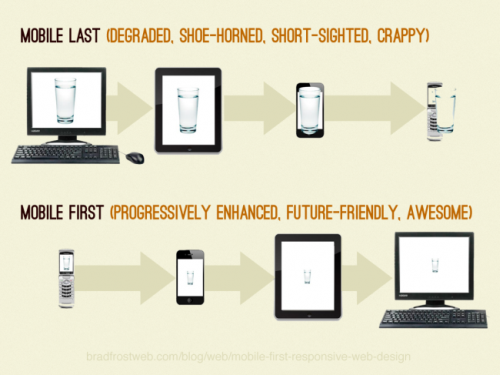
Louis and Luke cover how you design for mobile platforms first and how this can provide a real ‘focus’ to the content and layout which benefits the design for all platforms.

Browse the full list of links referenced in the show at http://delicious.com/sitepointpodcast/153.

Interview Transcript

Louis: Hello and welcome to another episode of the SitePoint Podcast. Today on the show I’m very happy to have with us on the program Luke Wroblewski who’s an interaction designer and author based in the United States; hi, Luke.

Luke: Hey, how you doing?

Louis: Good, good, how are you?

Luke: Great.

Louis: So I wanted to have you on the show for some time now, I tried to get in touch with you a bit end of last year and finally managed to work out a schedule, and you’ve been pretty busy with conferences because you’re latest book came out at the end of last year.

Luke: Yeah, that was around October I believe on A Book Apart.

Louis: Right. And so this is a book called Mobile First, and this is an idea you’ve been talking about for some time even before the book came out.

Luke: Yeah, several years now actually.

Louis: Right. And I guess it’s maybe reaching a more critical mass point now with mobile.

Luke: Yeah, absolutely, it’s several years ago back in 2008, 2009 timeframe there were very few people who took it very seriously, but now I think it’s almost the exact opposite in that there are very few people that aren’t giving it some attention.

Louis: Right. So we’ll have a lot of opportunity to talk about Mobile First and what you mean by that in detail, but we could start by just sort of defining what you mean when you say Mobile First, and that’s the name of the book, and that’s the idea you’ve been throwing out for some time. What exactly does that mean?

Luke: Yeah, so it’s pretty simple, basically it means working on the mobile version of your software products first. Traditionally we’ve sort of done it the opposite way, we do the desktop/laptop versions, if you will, and then mobile if teams thought about it at all, it was a significant afterthought.

Louis: Right, and so obviously this comes at a good time, and like we were saying before, mobile is exploding in growth now, so we can sort of see why teams would want to start doing more mobile, but, what do you see is really the advantage above and beyond just getting access to that traffic, because you could get access to that traffic by doing mobile second, right.

Luke: Hmm-mm.

Louis: So what are the other reasons you suggest that people should go with mobile first.

Luke: Yeah, so there’s essentially three pieces to the reasons why, one you touched on which is just this crazy growth we’re having, and I think people will begin to operate differently, for example, in Japan, Mixi, largest social network there, 85% of their traffic comes from mobile now, whereas 4 ½ years ago it was 14%. So you start to really prioritize things differently when 85% of your traffic is coming from a particular channel, and a number of the largest websites worldwide are how hitting that inflection point as well, so, Facebook 425 million out of 845 million total users now on mobile, Twitter’s around 55% mobile, and so you’re seeing this happen with a number of companies; I believe YouTube in the next year or two predicts they’re going to have a majority of traffic on mobile as well. And so when that happens that becomes a pretty easy prioritization. And for the companies that that hasn’t happened to you yet, you know if you look at Facebook and Twitter as sort of lead indicators, since these are the largest websites on the Internet, their overall traffic patterns start to reflect the overall Internet at some point, and so if you look at them as lead indicators then it’s likely to happen to you at some point as well.

The other two reasons are the natural constraints of mobile, just sort of the human factors of having a portable device that has to fit in your pocket, so the screen has to be small, it has to work with spotty network connections so you can use it everywhere, it’s generally used with the fingers which are less precise pointing instruments because it makes sense to turn the entire screen into an interactive surface since it has to be portable and small, so all those constraints together are really good for overall design and ultimately business because they force you to prioritize and focus on the stuff that matters; there’s just not room for 50 navigation links like you have on a desktop web experience, there’s not bandwidth to waste on downloading huge images that provide no value. You have to get down to your core essence in order to actually make something usable on mobile.

And the third piece is while there’s all these constraints, there’s also a lot of opportunities, and those opportunities come from the very unique capabilities that mobile has in that the average Smart Phone today can do a lot more than your desktop or laptop, it knows where you are up to ten meters of precision, it knows the direction you’re facing from a digital compass, it has things like ambient light sensors, it knows like how close it is to other devices through things like Bluetooth, and so all these capabilities together add up for a much richer tapestry of options, if you will; you’re not just counting on things like page layout and a mouse and keyboard input, you have a lot of other things at your disposal. And if you start with mobile first, not only do you have this sort of constraint to keep you focused, but you also have all this opportunity of these new interactions, that you can use, which you wouldn’t have if you looked at other devices first.

Louis: Right. But I can imagine for a lot of designers those two factors would kind of play against each other, because some people might get carried away with all of the new capabilities and sort of lost part of the focus that they gained as a result of this restricted screen space and all of that.

Luke: Yeah, I think it’s a different kind of gain/loss I mean, right, it’s still a visible interface, and that visible interface still has a set number of pixels within which to work.

Louis: Right.

Luke: So that’s really more around information density/UI complexity. Where now it definitely is possible for you to go crazy and push all the complexity to like, you know, you can only shake the phone three times to get it to do something, or turn it to the left, and you go overboard on the capabilities, you can certainly do that. But I don’t think necessarily those capabilities alleviate some of the constraints that come with the device, right, it’s like both things are present, the constraints are there and the capabilities are there.

Louis: Right. And this is something that obviously designers and interaction designers and people who think about this a lot have been evangelizing for a long time the idea of really prioritizing what’s important and not cluttering websites. But I guess in your view now that there’s a business case for developing for mobile you can push that agenda more effectively to business stakeholders.

Luke: Yeah, I mean there’s actual physical constraints now, right.

Louis: Right.

Luke: Before you could say, oh, just add another link, there’s room (laughter), now there physically isn’t room, so you sometimes have to have those hard conversations, right.

Louis: Yeah.

Luke: Like, look, I’d love to add your 15th feature, but where’s it gonna go, it can’t go in here, there’s just no room. And somebody once gave me the metaphor that desktop websites or just sort of traditional websites are kind of like carp in a bathtub, that is, if you keep feeding it it’ll continue to grow to fill the amount of space it has available.

Louis: Yep.

Luke: And same sort of thing, you know, these things keep getting filled and filled until there’s no room left, and then some poor sap shows up there from a Google search or a Twitter link or something and they’re just overwhelmed by the sheer volume of choice and content, and ultimately they end up doing nothing.

Louis: Right. So when you say mobile first, if a team is developing a website, say, and they start with the mobile version, and then how do you expand out from that into the desktop version without necessarily, well, preserving the benefits you’ve gained from that constraint? Like what’s the process that you use or that you’d recommend for making that evolution from the mobile into say the desktop version.

Luke: Yeah, I’d make the prioritization conversation that has to happen in order to fit things on mobile devices explicit, right, I’d involve people and I’d write it down, and I don’t think the prioritization of what services or information you’re providing for your customers changes just because the screen changed.

Louis: Right.

Luke: So your core value is the same across whatever device people are using to access your service. And once you get agreement on that and you write it down and everybody’s sort of signed off, then keep using that, right, don’t just toss it aside and say, okay, that was only the mobile thing, like make — sort of abstract that out from the mobile design process and have it be this is the prioritization of what we do and why, right, and that applies everywhere. And then when you move, when you get more into the tactical bits, and that’s sort of at the strategic high-level, when you get more into the tactical bits, Ethan Marcotte who coined the phrase “Responsive Web Design,” sort of put that philosophy together, has recently been talking about layout as an enhancement; I think that’s a nice way to think about it, which is if you get more screen space available to you in a different situation, well, that’s an opportunity to enhance your core value offering, right, it’s not an opportunity to change your core value and offering, it’s an opportunity to make it a bit better with some additional maybe features or information or whatever you can bring to bear on a larger screen.

Louis: Right. Obviously that’s a big shift for a lot of web designers and people who’ve been in this industry for a while. Everyone has this mentality of when you start to design a website you work out a layout and you work out a grid, and people have been thinking in this way for a long time. So, how do you think that the transition is going, do you see like a lot of smaller agencies are moving as rapidly as they could be to mobile, or is it still something that people struggle with.

Luke: I think it’s something that people are very interested in now, so the demand is there. I think it’s something that a lot of people don’t have deep experience in yet because they can’t, right, I mean the sort of modern mobile web instantiation is, I don’t know, like three or four years old, meaning having very capable web browsers on sophisticated mobile devices, so not a lot of people have experience with it, so what they tend to do is bring over what they knew from their previous modes of operations to this new form of media, right. And anytime you do that, whether it’s the transition from radio to TV, or the transition from, I don’t know, cinema to TV, whatever types of adjustment we’re talking about, the general tendency is for people to copy what they know, and then gradually try a few new things until finally they really figure out what works in that new space. And so we are at the early stage of that transition, and I think you have a few spot examples of people really figuring out what mobile’s great at and nailing it, but that’s definitely not the norm yet.

Louis: Right. So what are some examples in your mind of people that have done a great job with this, some inspiration?

Luke: Sure, so as a comparison point I like to compare like Flickr’s mobile web experience to Instagram’s mobile web experience.

Louis: Right.

Luke: So Flickr is something that grew up on the desktop Internet, and when you go their mobile website the whole thing is just filled with menus, and you have a whole bunch of choices, and you go in submenus, and it’s very reflective of taking all the stuff they had on the desktop and condensing it down to fit on these smaller screens. Whereas Instagram, which a service that went from zero users to 12 million in 12 months with just an IOS app, they made it all about the speed at which you can take a photo, make it look okay and share it, right, which is things that these devices are great at; you snap a picture, you want to get it out to some people, you want it to look good, they made that as fast as they possibly could, and they continue to work on making it faster. They also don’t start the experience with a whole bunch of navigation menus and things like that; they just fill the page with a stream of photos. And that aligns, again, with how people use devices, because you’re kind of bored, you want to see some interesting things, you pop it up, bam, there’s a bunch of photos, you just flick your finger and you’re looking at a whole bunch of cool things.

Louis: Right.

Luke: And so I think they’ve aligned with how people use these devices and tried to really work within the constraints and the capabilities of them, and I think it’s paid off tremendously.

Louis: Right. And so in that sense we’re looking at something which is on the one hand a mobile application which was developed natively; and Flickr’s mobile experience is largely through a mobile website.

Luke: Although they did have a couple iterations of apps as well.

Louis: Right. I guess my question was going to be how do you feel on that sort of interplay, you know, a lot of agencies are at a point where they kind of have to decide whether they want to specialize in doing mobile web or doing native development, and likewise any kind of a client who’s looking at a new mobile presence has to make that decision as well. What’s your take on when that’s a good idea or which of those choices to go for?

Luke: Yeah, I think it boils down to what your primary goal is for that effort. So the mobile web experience still remains the best way to provide access across all the platforms; it isn’t currently the best way to necessarily tap into what the devices can do, right, you are not going to get full potential of all of the capabilities of a decent Smart Phone right now inside the web browser, for that you have to build things natively. That said, if you build natively you’re not going to get the advantage of being on every single platform since every platform has a decent web browser now.

Louis: Right.

Luke: So there’s pros and cons, and what I think the emergent strategy is will create the mobile web experience for access, so people following email links, people following social network links, just people opening their web browser and doing a search can have a decent experience in the browser, and then we’re gonna use native applications when we really think the technology can be — can make our core offering either faster, easier or different from what we can do in the browser, and if that’s compelling enough then we’ll go invest the time and effort into making a native app.

Louis: Right. So you kind of see a well-designed mobile web presence as sort of a baseline that’s a requirement just because, again, as you said, email links or links from various sources, when it pops open on the device you want that to be a good experience that gives the user a clear vision of what your product is about.

Luke: Yep. And then the other sort of sad reality of native apps is it takes a lot of work to get that download from people, and just because you get that download doesn’t mean you’re going to have ongoing use, right. The magic number as I’ve heard it in a number of studies is around seven apps, which is how many apps people use regularly on their phone.

Louis: Right.

Luke: And then you have a whole slew of like 25% of the apps people download only get opened once and never get opened again, and only a quarter of them get opened more than 11 times, that means everybody else is just sitting there in the in-between zone, right.

Louis: Right.

Luke: And so it’s a lot of development time and effort just to get one open after you’ve worked so hard to get them to download it. Whereas on the websites people will access links all the darn time, in fact, they go to 24 different websites a day on a Smart Phone.

Louis: Right. So you brought up a lot of stats in that answer, and I guess that’s a big part of your approach to this kind of design is to really drill down into the numbers and figure out what people are actually doing, is that accurate?

Luke: I think you have to have an awareness of what you’re dealing with, otherwise you’re flying a bit blind, and it’s very possible for people to have these romantic notions of I’ll build a native app and everything will be great, right, whereas the reality of it — and, you know, these numbers I think they just help to illustrate the point, because if I were to ask the average person about their usage of native applications on their Smart Phone they would all tell me the same kind of story, right, which is there’s a couple apps I use all the time, and then there’s a whole bunch that just sit there and I never use them; you sort of don’t need stats to say that because everybody’s doing it anyhow, but it does help make it more visible what’s really going through the data.

Louis: Right. And it also prevents the sort of rationalization, you know, oh, I might only use seven apps, but our app people are gonna want to use, whereas if you actually have the data it’s a little bit harder to come out against it.

Luke: Yeah, it’s not just you, right.

Louis: (Laughs)

Luke: It’s kind of the general use of these things.

Louis: And do you take that approach when starting a new project to do a lot of research and get a lot of data about, for example, the website’s existing users or things like that before you even launch into thinking about what the approach is?

Luke: I think it helps to be as informed as possible. It’s very easy to come up with solutions for things, I think it’s a lot harder to actually take the time to understand the problems thoroughly; the more you understand the problem the more the right solution sort of emerges naturally.

Louis: Right.

Luke: But most people are likely just to go jump right into answers, right, and so I like to have as much of a handle on the problem as possible rather than just getting into answers right away.

Louis: Right. You talked a little bit earlier about Ethan Marcotte’s Responsive Web Design strategy, and that’s definitely gotten a lot of attention in the web design community in the past say year or so, and you’ve talked a little bit about the tradeoffs of that, and you’ve also talked about a strategy that incorporates some elements of server side code into a responsive technique, do you want to talk a bit about that?

Luke: Sure. So I’m not one of these people who thinks there’s only one way to do things, and I know Ethan isn’t either, so we both believe that there’s a time and place for everything, whereas other folks kind of jump the gun, if you will, and say this is the only way to do everything. I think it comes from, you know, especially in Responsive Web Design, if you’re a front-end web developer it’s a very tempting solution for you because it uses what you know already, and if you’re uncomfortable with the server then, yeah, Responsive Web Design sounds amazing to you because you never have to touch a server. But the reality is there’s certain things that each does well, and that’s probably more important, meaning it’s probably more important to understand what each one is good at and take advantage of it rather than clinging to the one that fits in with your world view. And the way I’ve been kind of trying to help people through that — because the other thing to look it, if you look at all the largest web companies out there, currently they’re not using Responsive Web Design; they’re all optimizing things with separate templates, right.

Louis: Yep.

Luke: And so you kind of say, hmm, well why are they doing that? And part of what I’ve been trying to make sure people understand is some of the reasons why they would do that, right, and when you understand those reasons then you can say, okay, well that makes sense for me or it doesn’t make sense for me. And the big thing that a separate approach gives you is the ability to optimize like hell for any particular device class, you know, your downloads, your interactions, even things like the markup source order, URL structure, all that, if you’re gonna say, hey, this is this particular type of device and serve something different then you get to optimize like crazy. But you do have to, and this is kind of the hard part of it, you have to know what device is hitting you so you can serve the right thing, and if you’re wrong you can come up with problems. Whereas Responsive Web Design you can’t necessarily optimize as strongly because you’re serving the same stuff to everything, and you’re basically saying hey device you figure out where you are and use what you need from all the stuff I’m giving you.

Louis: Right. So your approach, or the approach that you’ve talked about a little bit of Responsive Web Design with a server side element, kind of tries to bridge the gap between those two approaches.

Luke: Yeah, so it tries to do a bit of the things that are good, it uses the adaptive layouts and images and media queries aspect of a Responsive Web Design to adjust from a layout perspective, screen size perspective, but then it uses the server for where you want to optimize specific components. So let’s say you want to send small images down to mobile devices, and you want to send the big images to large screen devices or widescreen TV type devices, that’s the piece that you would put on a server and use device detection to change, but for layout you’d still use the same Responsive Web Design techniques.

Louis: And so that’s doing the device detection on the server side, you’re not using JavaScript to suss things out and then request the resources?

Luke: Yeah, no, they’re using it on the server side, and the general idea is send the device only what it needs as opposed to asking the device to take everything and then figure out what it should show or shouldn’t show or how it should show it using things like JavaScript.

Louis: Right. So are you generally opposed to the idea of doing this kind of JavaScript detection, or is it just something you don’t prefer as much?

Luke: I’m not as religious about it as other people are, there are some people who are very anti-user agent string detection, I understand some of the problems with it for sure. With the kind of combined approach of Responsive Web Design plus the server side stuff, which I call the REST, Responsive Web Design plus server side components, you’re doing it at a component level so there’s less potential to do bad, you’re not gonna totally go redirect and change the entire UI, you’re going to just adjust some pieces of it.

Louis: Right.

Luke: And there’s failsafes, meaning you put in some safe defaults so that if you are wrong you’re not going to destroy things, right.

Louis: Right.

Luke: You’re just going to maybe get a smaller image, and the default is going to be a safe default for the lower-end devices, and so worst case scenario the big picture device sees a smaller image but they still see an image, right, just the resolution’s a bit lower.

Louis: And, again, that’s one of those situations where it makes sense to start from the mobile device as a baseline, because even a mobile site on a full size screen is usable.

Luke: Yeah, exactly. It’ll be usable, it just won’t be as — and that’s the thing with the safe defaults, right, what you’re really taking the hit on is optimization, it just wouldn’t optimize to the extent that it would if you were right with the device you detected.

Louis: Right.

Luke: And, again, I am personally less afraid of being wrong in some of those places, provided there’s a default and provided it’s at a component level, I think that sort of not stuns, but it reduces the angst many people have around device detection solutions.

Louis: Right. How do you feel about the way that the mobile browser’s evolving? Because it seems like some aspects of current mobile device development are a little stunted by the fact that the upgrade path is maybe a little slower than it has been on the desktop, at least in recent years since we’ve had a rekindling of some sort of browser war. But I guess maybe on mobile because people actually have to go out and replace the device a lot of times, there’s not a clear upgrade path; it makes for a much more fragmented support playfield.

Luke: The thing that I’m actually more concerned with is the fact that the mobile browser is just falling behind in terms of support, right, I mean you can’t even upload a photo using a mobile web browser right now outside of Android 3+.

Louis: Right.

Luke: A tiny fraction of the handsets that are out there. So I’m more worried about getting those sorts of features that just brings — even that just brings the mobile browser to parity with the desktop browser, right, you’ve been able to upload photos on a desktop for years upon years. So that’s a little bit more concerning to me. In certain other areas the mobile browsers are kind of ahead of a lot of the situations we have to deal with on a desktop, meaning they got pretty decent CSS3 support, they have great HTML5 support, depending on where you look, right. So in some ways they’re ahead of the game, in other ways, especially in relation to how they interact with the mobile OS they’re pretty far behind. And it’s kind of concerning because that pushes people to go to native apps in places where maybe the only reason they’re going there is so they can do photo uploads.

Louis: Right. Coming back to sort of what I was saying, it’s more difficult for the innovation to happen because the browser’s just sort of what’s on your phone when you get it, and until you get a new phone that’s what you’re gonna use.

Luke: Well, I don’t know exactly how true that is because at least in the IOS world, right, the amount of people who upgrade the OS with which the new browser comes is very high.

Louis: Right.

Luke: You have a lot more fragmentation in the Android space, wherein like if iOS was Android the iPad3 would be supporting IOS 3.2, sort of illustrated by example, instead of IOS 5 or 6 or whatever it’s gonna support. There are definitely platforms where the fragmentation is a bigger deal and the OS’ don’t get updated very frequently, but then there are also OS’ like iOS where the updates come pretty regularly and the vast majority of people get them and they do get that new browser. That said, there are a lot more browsers than there are desktop browsers, and if you’re really gonna do the full rigor and test on everything you do have your work cut out for you for sure.

Louis: Right. In your work do you do a lot of device testing on a slew of platforms?

Luke: You know, I am a prioritization kind of guy, as we were talking about earlier, of the data; I look at what the biggest ones are and make sure there’s a great experience there and try and build that in a way that has fallbacks, so I’m not the person to go test on every single device and make sure it works everywhere, sort of like a recipe for badness to a certain extent.

Louis: Yeah.

Luke: But, that said, I will be — I do test on the devices that I think matter, because there’s a world of difference between what you see in like an emulator on your laptop of desktop than what you actually see on the phone in your hand.

Louis: Yeah, and in terms of obviously the way you interact with it, that’s one of the areas where the gap can be huge.

Luke: Yep, interaction. And even just the screen density, the overall kind of ergonomics of that phone, all that stuff really changed; something that could look good on the screen in terms of font size and layout and things like that, you put on the phone and it looks like crap.

Louis: Right. Maybe just to close off, what’s your vision of the way this is going to play out? I know you bring out a lot of statistics about the growth of mobile.

Luke: Hmm-mm.

Louis: Do you think that there’s a point in the future where there’ll be sort of a balance of what people do on mobile versus what they do on the desktop, because it feels like right now things are very much in flux because mobile is growing so much. What’s your vision for what’s going to happen over the next three or four years? I know everyone hates those kinds of questions, but —

Luke: Hey, if I knew I wouldn’t be talking to you right now, right, I’d be off making it. At a high-level I look at things that seem to be kind of inevitable, you know if I asked the question I say, “Do you think we’ll have more or less network connected screens in three to five years?” The inevitable answer is sort of, “We’ll have more,” right, and therefore I think people’s expectations will rise significantly in terms of being able to interop between those screens, and it will be interesting in the evolution of mobile devices to see what role the mobile device starts to play in that kind of universe. Is it kind of, you know, a remote control to other devices, is it more of a synchronization situation, is it more of a parallel functionality situation; these multi-screen features are the things that are kind of really emerging now.

Louis: Right.

Luke: Because in general we do have a pretty good sense of how people are using their mobile devices, they’re using it to look up and find out information, they’re using it to kill time, they’re using it to get small things done, and sometimes big things, but usually smaller tasks, right, every once in a while you’ll write a really long email, but usually you respond to quicker, smaller things. And they’re also using it to keep up with things that are important to them, whether that’s sports scores, financial information, news feeds and social networks, and so on and so forth. So we have a pretty good sense of the kinds of things that people are doing with these devices; I think the more interesting thing becomes how those tasks interrelate with other tasks on other screens as we get more networked products in our lives.

Louis: Right. Yeah, it’s definitely like you said, it’s a time where a lot of things are changing, and it’s going to be interesting to see how it develops and keep up with it. I wanted to thank you so much for taking the time to come on the show, it’s really appreciated. So your new book out is Mobile First, it’s on A Book Apart, so obviously people should check that out, and if people want to find you online do you want to drop links to your website and/or Twitter and/or other things?

Luke: Yeah, it’s all just @Lukew, if it’s on the Twitters or the websites (lukew.com) or God knows what.

Louis: Fantastic. Alright, well, thanks again for taking the time.

Luke: Great, thanks. Take care.

Louis: Thanks. And thanks for listening to this week’s episode of the SitePoint Podcast. I’d love to hear what you thought about today’s show, so if you have any thoughts or suggestions just go to Sitepoint.com/podcast and you can leave a comment on today’s episode, you can also get any of our previous episodes to download or subscribe to get the show automatically. You can follow SitePoint on Twitter @sitepointdotcom, that’s sitepoint d-o-t-c-o-m, and you can follow me on Twitter @rssaddict. The show this week was produced by Karn Broad and I’m Louis Simoneau, thanks for listening and bye for now.

Theme music by Mike Mella.

Thanks for listening! Feel free to let us know how we’re doing, or to continue the discussion, using the comments field below.

Louis SimoneauLouis Simoneau
View Author

Louis joined SitePoint in 2009 as a technical editor, and has since moved over into a web developer role at Flippa. He enjoys hip-hop, spicy food, and all things geeky.

Mobile Tutorials & ArticlesWeb Design Tutorials & Articles
Share this article
Read Next
Get the freshest news and resources for developers, designers and digital creators in your inbox each week