
We see the symbol all of the time. Elegant, curved, infinitely malleable. But what’s the origin of the mysterious and ubiquitous ampersand? How can you choose which one is the best version to use? Read on to uncover all you wanted to know about this ancient tool of text:
Origin of the ampersand
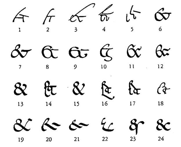
Part 1 of 2: Evolution of the Ampersand from Jan Tschichold’s The Ampersand: its origin and development (via shadycharacters.co.uk)
In a twist on the traditional story, the logogram ‘&’ came way before the word it now represents, ‘ampersand’. It was once the 27th letter of the alphabet, derived from the Roman word for and: ‘et’. When ancient Roman scribes were scribbling away in Roman Cursive around the 1st century AD, they had a tendency to connect to two letters into a ligature.
That symbol evolved over time, and by the Renaissance had developed into the calligraphic symbol that we’re so familiar with now.
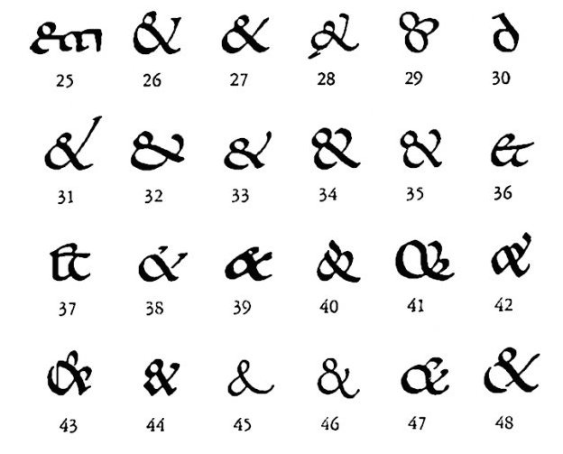
Part 2 of 2: Evolution of the Ampersand from Jan Tschichold’s The Ampersand: its origin and development (via shadycharacters.co.uk)
The word ampersand evolved by a process called mondegreen — when a new word comes from the common mistaken pronunciation of something else. British schoolchildren in the 1800s would recite the alphabet, concluding with “X, Y, Z, and per say &.” They inserted the “per say” so to indicate ‘&’ was by itself rather than ending the string of letters with a hanging conjunction.
Clearly it wasn’t a perfect solution, as over time the children slurred the words together to create the word ampersand. Over time, it was dropped from the alphabet, like many fascinating characters before it. But it was added to dictionaries starting in 1837.
The Tironian et
To make it just a little bit more confusing, the ampersand isn’t the only symbol used in the middle ages to represent the concept of ‘and’. Tironian is the name of a different system of writing, a sort of shorthand for Latin taught in monasteries. Their ligature for the word et looked a bit more like the current number 7, and still survives to this day in Ireland and Scotland. Here’s the et: ⁊
Usage

The pre-split logo from Hoefler & Frere-Jones (Now Hoefler & Co.)
Though it was derived so long ago, the ampersand has most definitely found its place in contemporary culture. The way we’re probably all most familiar with is its use in formal or business titles, like law firms or these days hipster restaurants and upscale goods stores (i.e. Craftsmen & Wolves or Hoefler & Co.)
Another fun little fact that we discovered in researching this article: the phrase et cetera, most often expressed as etc. can also be expressed as &c.
It also has its uses in computer programming languages as well as math. There’s a mathematical symbol called a turned ampersand which is an actual upside down version of the symbol: ⅋.
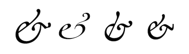
Styles
There are several distinct styles of ampersand. The main variation is between the Carolingian/Roman style and the Italic style, though pretty much every distinct style of typeface (i.e. Gothic) has their own take on the symbol. As you will notice from the examples below, there are typefaces that use both Roman and Italic based on the specific font that has been selected — Adobe Caslon Pro and it’s Italic version are a perfect example.
Roman
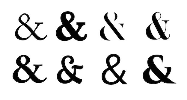
Probably the most widely recognized version of the ampersand. Clockwise from the top — Adobe Caslon Pro, Baskerville (bold), Delicate, Didot (bold), Trajan Pro, Proxima Nova, Nautilus Pompilius, and Menlo.
Italic
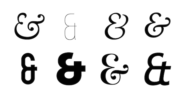
The Italic versions tend to be a little more whimsical and romantic: Clockwise from the top — Adobe Caslon Pro (italic), Bebas Neue (thin), Grafolita, Iowan Old Style (italic), Trebuchet (italic), Prata, Museo Slab, Mohave (bold)
Lowercase
Technically these are also Italic, but in shape appear to be based off of a lowercase e: Cochin, Adobe Garamond Pro (italic), Hoefler (italic), Minion Pro
Eclectic

The ampersand is a great shape for designers to infuse with character in a display typeface. From the left it’s Copal STD, Glamour, Prisma, and Zapfino.
Tips for using Ampersands in your designs
- It’s for display: Remember, the ampersand is for display typography — a logo, maybe a heading. It’s not meant to be used to replace the word “and” in the body text of a design.
- Embrace the right style: We mentioned this above, but there are lots of styles of this particular symbol. Make sure you choose one that fits the style of the business you’re working for. A Roman style is a bit more formal, and might be a better option for a straightforward professional business, while an Italic style is a bit softer and can be used in a more light-hearted context.
- Explore your options: Your ampersand doesn’t have to be the same size, color, or typeface as the rest of your text. Find ways to make the character stand out!
- Browse, browse, browse: Look through all of the ampersands you have in your font library — there are a ton of them, we promise. But if you can’t find what you’re looking for, take a look through this resource: opensourceampersands.org
What are your favorite versions of the ampersand? Show us below!
Republished with permission from the 99designs Designer Blog
Cover image: opensourceampersands.org
Frequently Asked Questions (FAQs) about the Origin of the Ampersand
What is the historical significance of the ampersand symbol?
The ampersand symbol has a rich history that dates back to the 1st century AD. It was initially a ligature of the letters ‘E’ and ‘T’, forming ‘et’, the Latin word for ‘and’. Over time, the symbol evolved into the recognizable ampersand we use today. It was even considered the 27th letter of the alphabet in the 19th century. The name ‘ampersand’ is believed to have originated from the phrase “and per se and”, which was used to denote the symbol during the recitation of the alphabet.
How is the ampersand used in modern language and writing?
Today, the ampersand is used as a shorthand for the word ‘and’. It is commonly used in business names, logos, and titles due to its compact and visually appealing design. It is also used in literature, programming languages, and social media to save space and add stylistic flair.
What is the correct way to use an ampersand in a sentence?
The ampersand should be used sparingly in formal writing. It is generally accepted in business names, titles, and headers. However, in the body of a text, it is recommended to use the word ‘and’ unless the ampersand is part of a recognized brand or title.
How has the design of the ampersand evolved over time?
The design of the ampersand has evolved significantly since its inception. The original design was a combination of the letters ‘E’ and ‘T’. Over time, the design was stylized and simplified, leading to the modern ampersand symbol we recognize today.
Why was the ampersand considered a letter in the 19th-century alphabet?
The ampersand was considered the 27th letter of the alphabet because it was commonly used in writing and was included at the end of the alphabet when children were taught to recite it. The name ‘ampersand’ comes from the phrase “and per se and”, which was used to denote the symbol during the recitation of the alphabet.
Is the ampersand used differently in different languages?
Yes, the use of the ampersand varies across languages. While it represents the conjunction ‘and’ in English, it may have different meanings or uses in other languages. For example, in Spanish, the ampersand is rarely used in regular text but is common in business names and logos.
How is the ampersand used in programming languages?
In programming languages, the ampersand is often used as an operator or to denote specific functions. Its use varies depending on the programming language. For example, in C++ and PHP, it is used as a reference operator.
What is the cultural significance of the ampersand?
The ampersand has cultural significance in various fields. In design and typography, it is appreciated for its unique and versatile form. In literature and media, it is used for stylistic purposes. It has also been adopted in popular culture as a symbol of unity and collaboration.
Can the ampersand be used in academic writing?
The use of the ampersand in academic writing depends on the citation style being used. For example, in APA style, the ampersand is used when citing sources within parentheses, but ‘and’ is used when the authors are mentioned in the text.
How is the ampersand used in legal documents?
In legal documents, the ampersand is often used in the names of partnerships or firms where it represents the word ‘and’. However, it is generally not used in the body of legal texts, where the full word ‘and’ is preferred for clarity.
 Kaitlyn Ellison
Kaitlyn is part of the Community Team at 99designs. She grew up in Boulder, CO and went to school at Northwestern University in Chicago. When she's not blogging, she spends her time having adventures and being generally creative. She's all about having new experiences as often as possible!