- Remove Default Styling
- :focus
- :checked
- :indeterminate
- :required
- :optional
- :valid
- :invalid
- :in-range (number and range inputs)
- :out-of-range (number and range inputs)
- :disabled
- :enabled
- :read-only
- :read-write
- :default (submit buttons or inputs only)
- Placeholder Text Style
- CSS Specificity
- Validation Bubble
- Browser Support
- Creating Usable Forms
- Frequently Asked Questions (FAQs) about HTML5 Forms and CSS
In the second article of this three-part series about HTML5 forms, we’re going to look at styling or — more specifically — the pseudo-class selectors you can use to target input fields in various states. If you haven’t read it already, please refer to part one to ensure you understand the basic markup concepts.
Remove Default Styling
You’ve probably noticed browsers applying default formatting. For example, most browsers apply rounded corners tosearch boxes and add subtle background gradients that can look misplaced on your flat design.
To remove default styling, you can use the appearance: none; property, which requires prefixes. However, use with caution since it can remove essential styles — checkboxes and radio buttons disappear in Chrome! To be on the safe side, only apply the property when it’s required and test in as many browsers as possible, e.g.
input[type="text"],
input[type="email"],
input[type="tel"],
input[type="number"],
textarea {
  -webkit-appearance: none;
  -moz-appearance: none;
  -ms-appearance: none;
  appearance: none;
  outline: 0;
  box-shadow: none;
}outline and box-shadow to remove the default ugly blue box-shadow focus and error styling in all browsers.
The appearance property is documented on CSS-Tricks but it’s in a state of flux.
:focus
:focus has been supported since CSS2.1 and sets styles for the field currently being used, e.g.
input:focus,
textarea:focus,
select:focus {
  background-color: #eef;
}
:checked
:checked styles are applied to checked checkboxes or radio buttons, e.g.
<input type="checkbox" name="test" />
<label for="test">check me</label>input:checked ~ label {
font-weight: bold;
}:checked is activated. Alternatively, you can use :not(:checked).
:indeterminate
:indeterminate is technically not yet in the spec, though it is mentioned. According to the spec, it represents a checkbox or radio button that is “neither checked nor unchecked.”
It is unusual in that it only applies styles when you set a checkbox’s .indeterminate property via JavaScript, i.e.
document.getElementById("mycheckbox").indeterminate = true;.checked property, which can only be true or false.
There are few a situations when :indeterminate could be useful. If you had a list checkboxes, you could provide a ‘check all’ checkbox that checked or unchecked every item when clicked. However, if you check some of the items, the ‘check all’ checkbox could go into an indeterminate state.
:required
:required applies styles to any input that has a required attribute and must be entered prior to submit.
:optional
:optional applies styles to any input that does not have a required attribute. I’m not sure why it’s been added since :not(:required) would do the same?!
:valid
:valid applies styles to any input that currently holds valid data.
:invalid
Similarly,:invalid (or :not(:valid)) applies styles to any input that currently holds invalid data, e.g.
input:invalid {
    border-color: #900;
}
:in-range (number and range inputs)
Numbers and ranges holding a valid value between themin and max attributes that adhere to the step value can be selected using :in-range. Obviously, it’s a little difficult for a slider to be out of range, but…
:out-of-range (number and range inputs)
:out-of-range targets invalid number values for range inputs.
:disabled
Inputs with adisabled attribute can be targeted with the :disabled pseudo-class, e.g.
input:disabled {
    color: #ccc;
    background-color: #eee;
}:required and :invalid will still be applied.
:enabled
Similarly, non-disabled fields can be selected with:enabled (or :not(:disabled)). In practice, you’re unlikely to require this selector since it’s the default input style.
:read-only
Inputs with areadonly attribute can be targeted with the :read-only pseudo-class. Remember that read-only inputs will still be validated and posted to the server but the user cannot change the values.
:read-write
Standard read-write fields can be selected with:read-write (or :not(:read-only)). Again, it’s not a selector you’ll need often.
:default (submit buttons or inputs only)
Finally, we have the:default selector, which applies styles to the default submit button.
Placeholder Text Style
Theplaceholder attribute text can be styled using the ::placeholder pseudo-element with vendor-prefixes (in separate rules), e.g.
input::-webkit-input-placeholder { color: #ccc; }
input::-moz-placeholder { color: #ccc; }
input:-ms-input-placeholder { color: #ccc; }
input::placeholder { color: #ccc; }
CSS Specificity
The selectors above have the same specificity so some care is necessary when defining two or more styles that apply to the same input. Consider:input:invalid { color: red; }
input:enabled { color: black; }:required field will be :invalid so it’s rarely necessary to style the former.
Validation Bubble
On submit, the first invalid value is highlighted with an error bubble: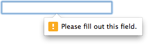 The bubble design will vary across devices and browser. Only the Webkit/Blink browsers permit a level of non-standard CSS customization:
::-webkit-validation-bubble { ... }
::-webkit-validation-bubble-arrow { ... }
::-webkit-validation-bubble-message { ... }
::-webkit-validation-bubble-arrow-clipper { ... }Browser Support
In general, the important styles and selectors work in all modern browsers from IE10+. Some of the less useful ones, such asin-range are Webkit/Blink only for now. Older browsers will support :focus but, for anything more sophisticated, you’ll need to provide JavaScript fall-backs.
Creating Usable Forms
The styles above are applied immediately. For example:input:invalid {
border-color: #900;
}- halt validation until a form is used
- use custom error messages
- polyfill unsupported input types
- provide fall-back styling and validation for older browsers, and
- create more usable forms
Frequently Asked Questions (FAQs) about HTML5 Forms and CSS
How can I style my HTML5 form using CSS?
Styling your HTML5 form using CSS is a straightforward process. First, you need to define your CSS styles. You can do this in a separate CSS file or within a style tag in your HTML document. For instance, if you want to change the background color of your form, you can use the following code:form {
background-color: #f2f2f2;}
In this code, ‘form’ is the selector that targets all form elements, and ‘background-color’ is the property that sets the background color. The value ‘#f2f2f2’ is the color code for light grey.
What are the different input types in HTML5 forms?
HTML5 introduced several new input types for forms. These include ‘color’, ‘date’, ‘datetime-local’, ’email’, ‘month’, ‘number’, ‘range’, ‘search’, ‘tel’, ‘time’, ‘url’, and ‘week’. Each of these input types has a specific purpose and can help to improve the user experience by providing more appropriate and useful input fields.
How can I make my HTML5 form responsive using CSS?
To make your HTML5 form responsive, you can use CSS media queries. Media queries allow you to apply different styles depending on the size of the user’s screen. For example, you might want to change the layout of your form when the screen size is less than 600 pixels:@media (max-width: 600px) {
form {
flex-direction: column;
}}
In this code, ‘form’ is the selector that targets all form elements, and ‘flex-direction’ is the property that changes the layout direction. The value ‘column’ makes the form elements stack vertically.
How can I validate user input in HTML5 forms?
HTML5 provides several attributes for form validation, including ‘required’, ‘pattern’, and ‘min’/’max’ for numerical input fields. The ‘required’ attribute makes a field mandatory, the ‘pattern’ attribute allows you to define a regular expression for the input, and the ‘min’/’max’ attributes set the minimum and maximum values for numerical inputs.
How can I style individual form controls using CSS?
You can style individual form controls by using their respective CSS selectors. For example, to style all text input fields, you can use the ‘input[type=”text”]’ selector. To style a specific input field, you can assign it an id and use the id as the selector.
How can I use CSS to improve the accessibility of my HTML5 form?
CSS can be used to improve the accessibility of your HTML5 form in several ways. For instance, you can use CSS to increase the contrast between the text and the background, make the form controls larger and easier to click or tap, and provide visual feedback when a form control is focused or when a form validation error occurs.
How can I use CSS to create a multi-step form in HTML5?
Creating a multi-step form in HTML5 using CSS involves hiding and showing different sections of the form based on the user’s progress. This can be achieved by using CSS to set the ‘display’ property of the form sections. JavaScript can then be used to change the ‘display’ property when the user clicks the ‘Next’ or ‘Previous’ buttons.
How can I use CSS to style the error messages in my HTML5 form?
You can style the error messages in your HTML5 form by using the ‘:invalid’ CSS pseudo-class. This pseudo-class targets all form controls that have an invalid value. For example, you can change the background color and border color of invalid input fields:input:invalid {
background-color: #ffdddd;
border-color: #ff0000;}
How can I use CSS to style the placeholders in my HTML5 form?
You can style the placeholders in your HTML5 form by using the ‘::placeholder’ CSS pseudo-element. This pseudo-element targets the placeholder text within form controls. For example, you can change the color and font style of the placeholders:input::placeholder {
color: #888;
font-style: italic;}
How can I use CSS to create a custom look for the checkboxes and radio buttons in my HTML5 form?
Creating a custom look for the checkboxes and radio buttons in your HTML5 form involves hiding the default checkboxes and radio buttons and using CSS to create new ones. This can be achieved by using the ‘appearance’ property to remove the default appearance, and then using CSS to add a new background image or shape.
 Craig Buckler
Craig is a freelance UK web consultant who built his first page for IE2.0 in 1995. Since that time he's been advocating standards, accessibility, and best-practice HTML5 techniques. He's created enterprise specifications, websites and online applications for companies and organisations including the UK Parliament, the European Parliament, the Department of Energy & Climate Change, Microsoft, and more. He's written more than 1,000 articles for SitePoint and you can find him @craigbuckler.