It’s the 2020s, so we shouldn’t any longer have to make the case for accessibility. An accessible site means you reach more people, the people you reach (even abled ones) all have an easier time using your site, and you won’t get sued. And with the tools and resources available to developers and designers, it’s now easier than ever to make sure you have an accessible site.
At Polypane, accessibility is one of the three core areas we focus on, the other two being performance and responsive design. If you’re not familiar with Polypane, it’s a web browser specifically for web developers. It has all sorts of tools you won’t find in regular browsers — tools that make you more effective and efficient. To learn more about Polypane, check out the introduction article.
In this article, we’ll focus on a few common accessibility issues and find ways to audit and fix them in your site to make sure it’s as accessible as possible. Here’s what we’ll look at:
- Does my text have enough contrast, and where it doesn’t, how do I fix that?
- How does my site look for people with visual impairments like color blindness or farsightedness? What about situational impairments like bright sunlight or a device with night mode?
- Does my page structure make sense for people that depend on it?
- How do I make sure I don’t have any code quality issues in my site, and are the things I did to improve accessibility actually helping?
- Does my site work well on smaller screens?
- How do I make sure my site works well for users that prefer dark colors or don’t deal well with motion?
Contrast
Does my text have enough contrast, and where it doesn’t, how do I fix that?
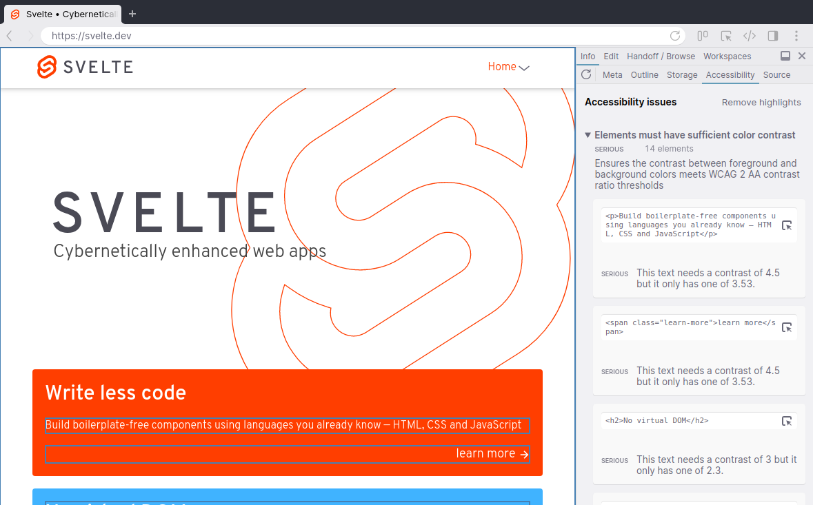
Ideally, text contrast is dealt with during the design, with tools like Stark making it easy to test individual text and background pairs. But unfortunately, this isn’t always the case. While there are plenty of places online to check a given text color and a given background (we even built our own online color contrast tester), your web pages likely have many different colors and backgrounds, and for any reasonably complex site, you might not know all combinations beforehand.
And that makes it really easy to overlook that one grey text that’s normally shown on a white background, but has this one place where it’s on light gray, or a dark text color with opacity that only works for certain backgrounds.
In Polypane, nearly all interactions with an element will do a quick contrast check for that specific element. Our algorithm determines the real text and background colors, taking into account the color, opacity and all background colors. We then merge that into the actual perceived text and background color and compare that.
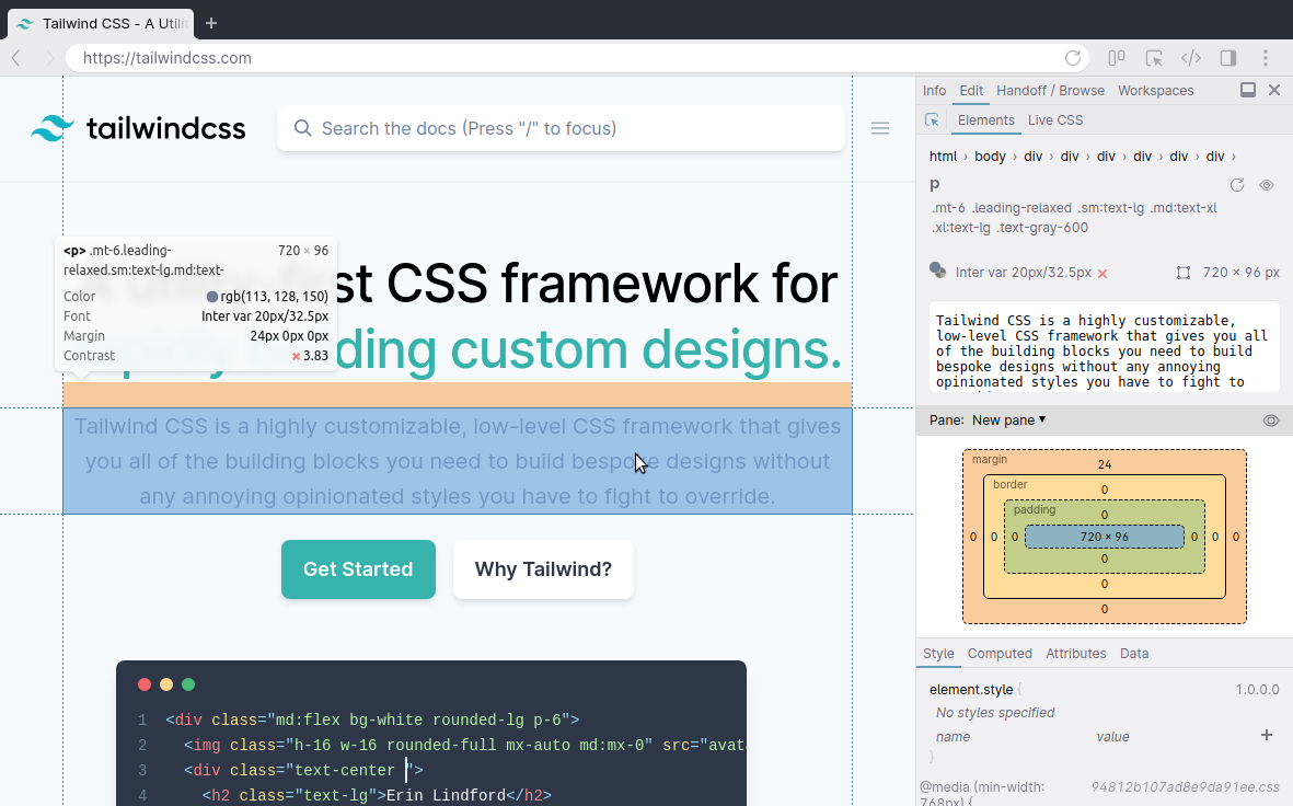
We’ll show the result in an element tooltip and in the elements panel alongside other information like font family and font size. That way, your text contrast is always glanceable.
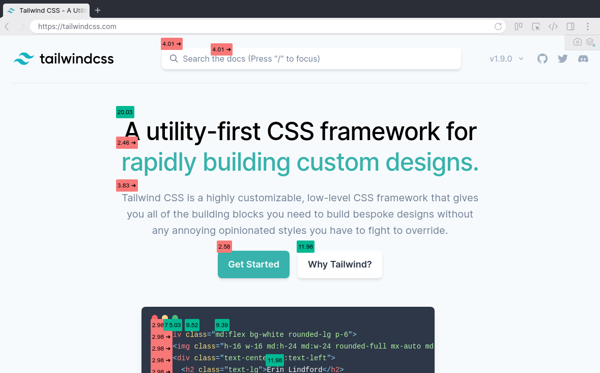
That still relies on chance, though, so Polypane also has a color contrast overlay. This will go through your entire page and find all unique text and background combinations, check all of them and add labels to each element. All passing contrast pairs get a single label with the contrast, and any failing contrast gets a warning label for each instance, so you don’t overlook any.
We made it really easy to find contrast issues. But how do you fix them?
If you’re lucky, you can use another color from your design system, but if you don’t have one, or if this is a one-off color pair, you have to go back to your designer or use an online contrast tester and find another color yourself — a tedious and time-consuming process, and something I wanted to do something about.
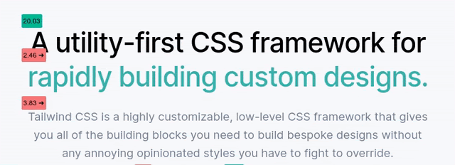
For every failing contrast pair, Polypane calculates a text color that has enough contrast with the background, and suggests that to you for easy copying. You can even preview it just by hovering over it. (The online contrast checker we mentioned also suggests improved colors for you.)
Visual and Situational Impairments
How does my site look for people with visual impairments like color blindness or farsightedness? What about situational impairments like bright sunlight or a device with night mode?
Not everyone that visits your site is going to have perfect vision. In fact, a large number of your visitors will definitely have some form of visual impairment. And while you can make sure to follow guidelines around minimum text size and not communicate anything just through use of colors, it can be easy to overlook an issue. The best way to get empathy is to try to simulate how other people experience your site.
Color blindness
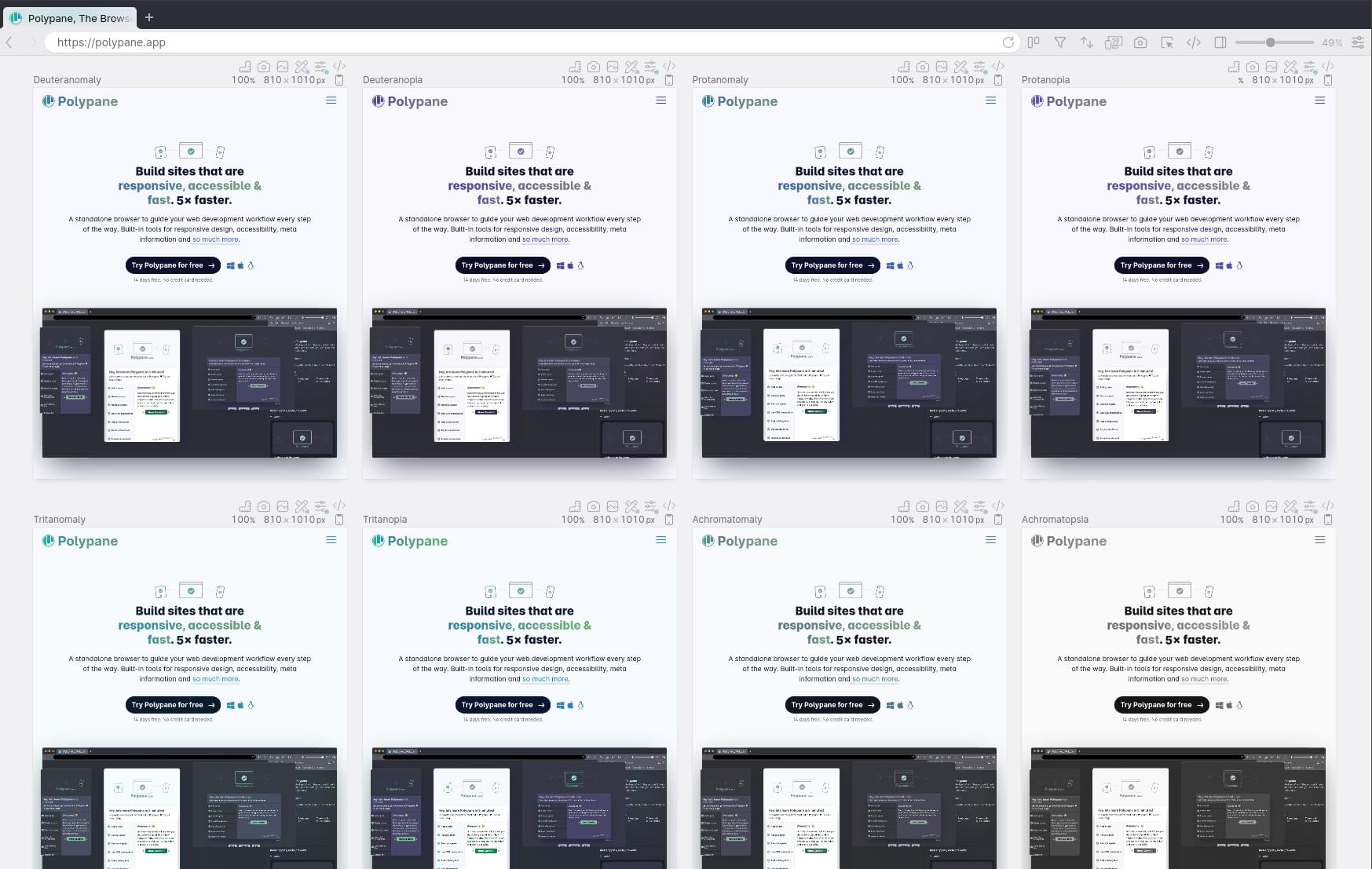
Between 8 and 10% of men worldwide are color blind (women much less so, at 0.5%), and they fall in three different groups: red-green color blindness, blue-yellow color blindness, and full color blindness. Polypane lets you simulate all of these with our accessibility overlays.
You should test with these simulators to make sure that you don’t rely on just color to bring across messages. For example, if you just make the border of an input field red when you make an error, you’ll find that’s barely noticeable, or unnoticeable with any of these simulators turned on. Rather, you should provide a second, non-color indicator like an error message to communicate the issue to your user.
Red-green color blindness is the most common and the vast majority of people with color blindness have this. In Polypane, we offer four different simulators: Deuteranopia, Deuteranomaly, Protanopia and Protanomaly. The -anomaly variants here are the less severe version, while the -opia variants would be classified as “full” red-green color blindness.
As the name implies, people with this type of color blindness have difficulty seeing the difference between red and green, but also brown and orange and certain shades of blue and purple. You can see how, for example, the common “green is good, red is bad” coloring of elements can become an issue.
Blue-yellow color blindness is much more rare, at just 0.0002% of men worldwide. The technical name for it is “tritanopia”, and tritanomaly is the less severe version. This type of color blindness makes people less sensitive to blue light, making the blue part of anything grey.
Lastly, full colorblindness is the most rare at 0.00003% of men worldwide. Its proper name is “Achromatopsia”, with “achromatomaly” being the less severe version where people see some color, but it’s severely dulled.
It’s worth noting that the simulators in Polypane (and any simulator really) are approximations. Especially the less severe variants come in a range from nearly unnoticeable to close to the full thing, and so the simulator chooses a middle ground there.

Blurred vision
So that’s color blindness, but far more people worldwide have some form of farsightedness (roughly 10% world wide), which can cause screens to look blurry. This can be “regular” farsightedness, or other visual impairments that blur vision like cataracts and glaucoma.
Cataracts is the leading cause of blindness. It progressively clouds the lens of your eye. Glaucoma is the second most common cause of blindness and decreases your peripheral vision, followed by your central vision. It’s sometimes called tunnel vision, though that’s an umbrella term for a number of different impairments.
Using these simulators, you’ll notice how difficult it is to read regular text. People with blurred vision can usually compensate for it with glasses or magnification, but it still helps to make sure that your page remains scannable. Make sure that your headers are large enough to be readable with these simulators. That will make sure your page is scannable without too much strain.
Situational impairments
Not all visual impairments are physical. Some are situational as well: they only occur when you’re in a certain situation. Polypane lets you simulate two of these: Bright sunlight, and night mode.
Screens are hard to read in bright sunlight. They get washed out, there’s glare, and only the largest contrast remains readable. Maybe not all sites are meant to be used in bright sunlight, but if you have a mobile or responsive site, it’s going to end up being shown on a screen in bright sunlight at some point. This is a good simulator to check if your nice subtle contrasts aren’t too subtle.
Night mode, on the other hand, is something that has slowly appeared in most operating systems over the past few years, on computers and mobile devices. Night mode will decrease the amount of blue in a screen at night, making screens more relaxing to your eyes and decreasing the suppression of melatonin. Melatonin is what makes you sleepy and you make more of it at the end of the day as the natural light around you dims. If you’ve ever kept working on your computer until 2am not feeling tired at all, suppressed melatonin is why.
Night modes in most operating systems are designed to prevent any issues with what’s being shown on screen, but if you rely on yellows to convey meaning then those might get lost when everything is slightly yellow.
Dyslexia
Around 5% to 10% of people worldwide have some form of dyslexia, which is a reading impairment. While this is not a situational impairment, it does affect how people experience your site visually.
Some experts suggest it might even be upward of 15%, because a lot of people with reading impairments do not realize they have it. Since there’s no way to compare our experience of reading with anyone else’s, it’s hard to know when your experience is significantly different.
Some people with dyslexia describe it as seeing the letters on screen dance around, and that is what our dyslexia simulator shows. The letters in each word are jumbled and re-ordered as you look at them. They’re still mostly readable, but they take more effort than usual.
Not everyone with dyslexia experiences reading like this, and the use of the simulator is more for gaining empathy than anything else. Still, if you get stuck on a jumbled word, because it’s very long or the letters can form multiple words, you might consider changing it to a simpler, clearer word.
Page Structure
Does my page structure make sense for people that depend on it?
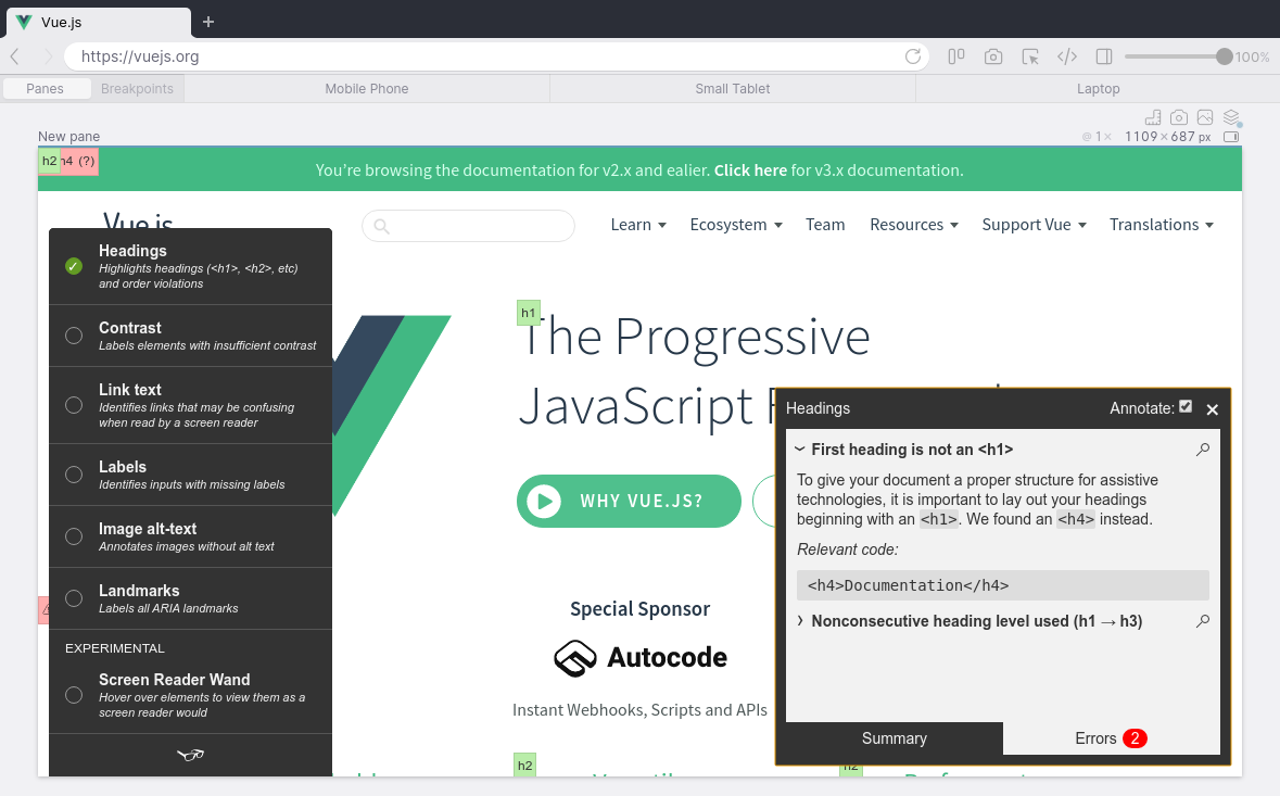
Your page structure, like your headings and landmarks (elements like body, nav, main, aside and section) is more important than you think. Many assistive technologies, such as screen readers, let users pull up a list of all your headings, landmarks or links for them to quickly go through and see if they find the section they’re looking for.
It’s important to have a logical order to your page, with headings that don’t skip a level and the proper landmarks (like navigation, headers and footers). When your site is constructed out of many components and templates, you might not be able to get a good overview of all the headings and their order until they’re rendered on a page, and not all your landmarks may end up with a matching header.
The Polypane Outline panel implements the HTML5 outline algorithm to visualize the page and heading structure. That makes it easy to see where you skip a heading level, and if there’s landmarks with a missing title.
Code Quality
How do I make sure I don’t have any code quality issues in my site, and are the things I did to improve accessibility actually helping?
There’s no denying that accessibility is a large field. This article has already mentioned contrast issues, different visual and situational impairments and document structure, but that’s only scratching the surface. There’ are many things that can negatively affect someone’s experience on your site, like missing alt attributes for images, links without text, and an undefined page language — to name just a few. It would be nice if you didn’t need to go through a huge checklist for every page, but could just surface the issues. In Polypane, there are multiple ways to do that: through our built-in accessibility panel, and two overlays — A11y.css and Tota11y.
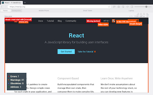
A11y.css is a CSS file that highlights possible risks and mistakes in your page — mostly for accessibility, but also for mistakes that can cause accessibility issues like a missing charset. It can be a little in-your-face, because it draws thick borders around anything it thinks you should check, even for things that are on purpose (like empty alt attributes).
Tota11y by Khan Academy, on the other hand, is a collection of a couple of different tools. There’s a tool to list headings and landmarks (and highlight any order violations), find contrast issues (though not as thorough as the color contrast checker built into Polypane) and highlight any links, images or labels that can cause issues (due to missing content, and missing or empty alt or for attributes).
Lastly, Polypane comes with its own Accessibility panel that can run an accessibility check based on the popular Axe ruleset. When you run a test, Polypane analyses your entire page and lists all issues in four separate categories: critical, serious, moderate and minor.
The critical and serious issues are the really important ones to fix. Critical issues are things like missing alt texts for images and wrong use of ARIA.
You can expand each found issue to get more information on which elements are affected by it and the specific problem with each element.
It’s important for us that these errors are actionable: that they don’t just tell you what’s wrong, but also give you suggestions and advice on how to deal with them. For images with missing alt attributes, for example, we explain the difference between content and presentational images, and for color contrast issues we’ll suggest a color that does have enough contrast.
From the accessibility panel you can click on any element and show it in the element inspector, where you can usually fix the issue by updating the attributes or styling. Once you’ve done that, copy it over to your source and the issue is resolved!
Interestingly, when building the accessibility panel and checking many different websites with it, it was more common to see ARIA being misused as a problem rather than lack of ARIA being the issue. Accessibility is a complicated topic, and it’s easy to think you’re doing the right thing while actually making it a little harder. Personal knowledge and manual testing are invaluable, but automated tests provide an excellent spot check.
Smaller Screens
Does my site work well on smaller screens?
There’s already plenty written about responsive design, but it’s also an important accessibility concern. For one, causing a horizontal scrollbar on screens of 320 pixels wide is not allowed according to WCAG rule 1.4.10. And on wider screens, while not a violation, it can look pretty jarring and confusing.
Finding the cause of horizontal overflows can be a real pain, since most of the time it’s not immediately clear which element is causing it. You end up randomly deleting elements in the dev tools in the hope of finding the element. That’s a lot of tedious work.
With the “layout debugging” overlay turned on, Polypane detects if there is a horizontal scrollbar and finds the elements causing them. It then colors them red so you can find and fix them, for example by making sure the parent element has an overflow:hidden, or by making sure your content fits the available space.
Even though a mobile screen is smaller than your desktop, with screen sizes increasing it becomes harder to reach all parts of the screen easily when holding your phone in one hand. With the reachability overlay we show which parts of the screen are easier or harder to reach when holding the phone in your hand (right hand or left hand).
Holding your phone in one hand, the bottom part of the screen tends to be easier to reach than the top so depending on your site. Placing important items at the bottom of the screen could actually be more user-friendly. Placing items at the bottom of the screen is very common in apps, and we’re seeing more websites and web apps migrating to this pattern too.
Dark Mode and Motion
How do I make sure my site works well for users that prefer dark colors or don’t deal well with motion?
Dark mode, while trendy, is also a potential accessibility help for people that find bright computer screens painful or straining to look at. A good dark mode can be a good look alternative to something like inverted colors (a feature on Mac) or force colors (a feature in Edge and on Windows, that forces all your colors to a specified palette, commonly with light text on a black background).
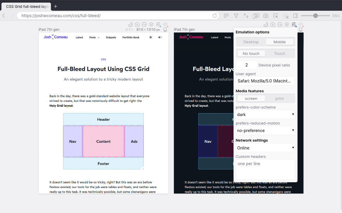
To test and implement your dark mode, with “prefers-color-scheme: dark”, you can switch your entire operating system to dark mode, dive deep into the browser dev tools (settings menu > more tools > rendering > scroll down > pick “dark” in the emulation dropdown) or in Polypane, you can pop open the options dropdown and click “dark” to switch to dark mode for a single pane, so it’s easy to see it side by side with your light design.
Similarly, people with vestibular disorders can experience discomfort with movement on websites, like large animations and transitions. For them, the “prefers-reduced-motion: reduce” media query can be a solution. When that is set, it’s important to tone down animations and transitions. You don’t need to disable all animation (though that works, too) but try to make it less swoosh and more subtle fade. Similarly, if you have smooth scrolling turned on, that’s a huge movement, so make sure “scroll-behaviour” is set to “auto”, not to “smooth”.
Testing this in Polypane is similarly easy: open the options menu and switch the prefers-reduced-motion option to “reduce”. Now you can test it on its own, or side by side with your regular website.
I hope this gives you a taste of the type of accessibility issues you can encounter, how to deal with them, and the ways Polypane tries to make them easier to resolve. Polypane has a free trial that gets you running your first accessibility audit within five minutes of signing up.
FAQs About Common Website Accessibility Issues
Website accessibility refers to the design and development practices that ensure websites are usable and navigable by people with diverse abilities, including those with disabilities. It is crucial for providing an inclusive online experience and ensuring equal access to information and services.
Common accessibility issues include lack of alternative text for images, insufficient color contrast, non-descriptive link text, inaccessible forms, and keyboard navigation barriers. These issues can hinder users with disabilities from accessing and navigating the content effectively.
Alternative text (alt text) is essential for users with visual impairments who rely on screen readers. Without alt text, these users may miss out on important information conveyed through images. Including descriptive alt text ensures a more inclusive experience for all users.
Insufficient color contrast can make content difficult to read for users with visual impairments or color blindness. Ensuring an appropriate color contrast ratio between text and background enhances readability and accessibility for all users.
Inaccessible forms can pose challenges for users with mobility or cognitive disabilities. Common issues include lack of proper labels, insufficient form field instructions, and inadequate focus management. Designing forms with accessibility in mind improves usability for a broader audience.
Some users rely on keyboards instead of mice for navigation. If a website lacks proper keyboard navigation support, these users may struggle to interact with the content. Ensuring all interactive elements are accessible via keyboard input enhances the overall accessibility of the website.
Developers can incorporate accessibility best practices from the beginning of the design and development process. This includes using semantic HTML, providing descriptive labels, ensuring proper focus management, testing with screen readers, and conducting regular accessibility audits.
Web Content Accessibility Guidelines (WCAG) set the international standard for web accessibility. Adhering to these guidelines ensures that websites are designed and developed in a way that accommodates users with disabilities. Following web standards promotes a more inclusive and user-friendly online environment.
 Kilian Valkhof
Kilian is a web developer from The Netherlands that builds software that helps designers and developers be better at what they do. He is interested in the modern web, app development and new tech, and regularly writes about topics like responsive websites, design systems and Electron on his site.