Landing pages serve a unique and specific purpose. Simply put, landing pages are best used to take an individual from a specific advertisement to an equally specific landing page built to answer any roadblocks that individual might have so that they convert. Whether you are running campaigns on Adwords or Facebook, landing pages are a must.
Multiple softwares exist that will allow those less blessed in the computer sciences to be dangerous:
Feel free to build your own page while reading this or analyze a current page for opportunities.
Market > Ad > Landing Page Fit
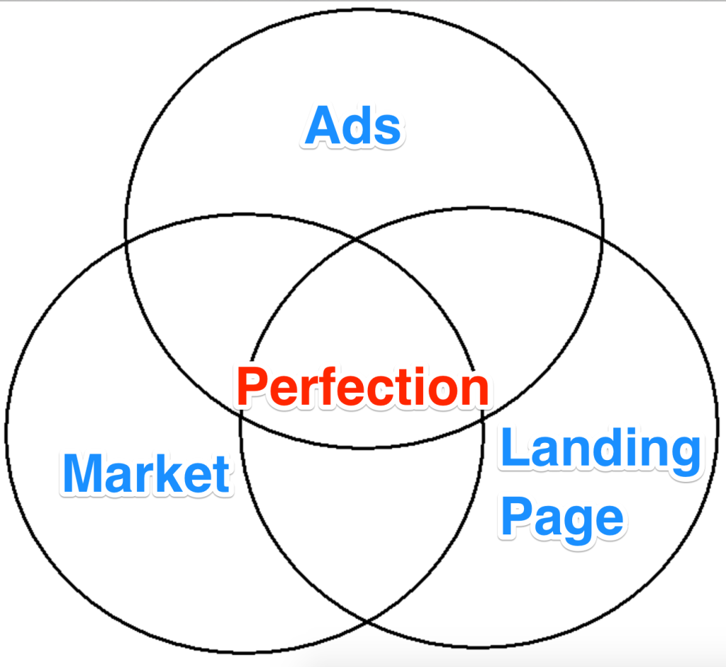
Every truly great ad campaign relies on three pieces working in perfect unison: The Market, The Ad, and The Landing Page. When all three of these forces collide correctly, you are destined to double digit conversion rates and landing page greatness.
Now, before you can properly build a landing page or even an ad, it is critical that you understand your own unique selling point. Or, as I like to call it, your WHY. The reason why someone needs what you are selling.
If you can clearly tell the story of why someone needs what you are offering, it becomes a lot easier for you to gain traction.
Next, you will need to do your competitive research. It will be crucial that you have an idea of what exactly your competitors are doing. Luckily, terrific software exists for you to spy with!
With these tools you will want to be answering the following questions:
- What keywords are they bidding on?
- How much does the average CPC cost?
- What copy are they using to convey their own WHY?
- What do their landing pages look like?
With this data in hand, you can now begin to determine the singular goal of your campaign. The purpose of a singular goal for a campaign is that your user can be going through their normal day whether that is scrolling through their social news feed or searching on Google. Then…out of nowhere… you are able to interrupt them with such creativity and singular purpose that they can understand your ad, click on it, and are clearly compelled to convert, because you have given them something they truly need.
Building The Landing Page
Building a landing page is mix of art, science, and dumb luck. When all three play nicely you have reached landing page nirvana.
Header
A perfect header can take many forms and shapes, but most often, it is divided into three main parts:
- Logo
- Copy
- Call to Action Button
Using the same color scheme and font style/size from your website, you will want to add your logo in the top left corner and then add a call to action. Before that call to action, you will want to emphasize your WHY so that users are compelled to click.
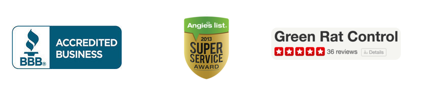
Below is a variety of header examples from pages we’ve done to get the juices flowing:
Green Rat Control, converting at 14%:

The First State Bank, converting at 8.41%:
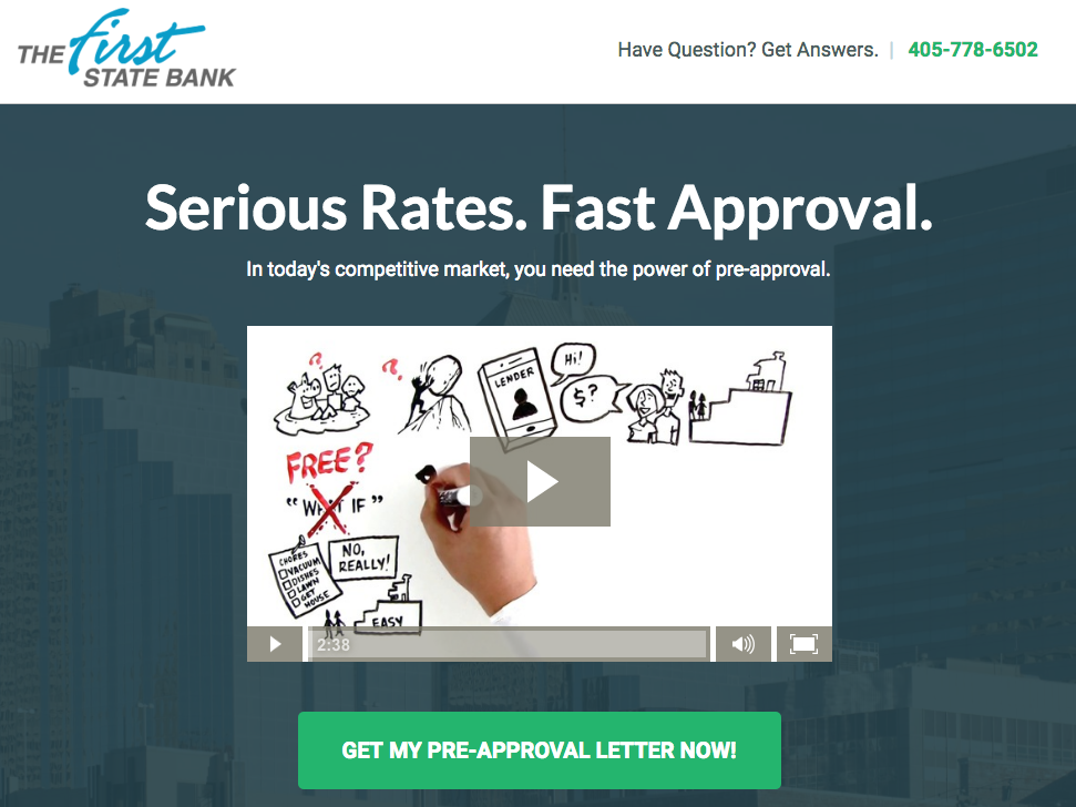
Notice that the size of the copy and the purpose of the copy varies according to the market and its inherent needs.
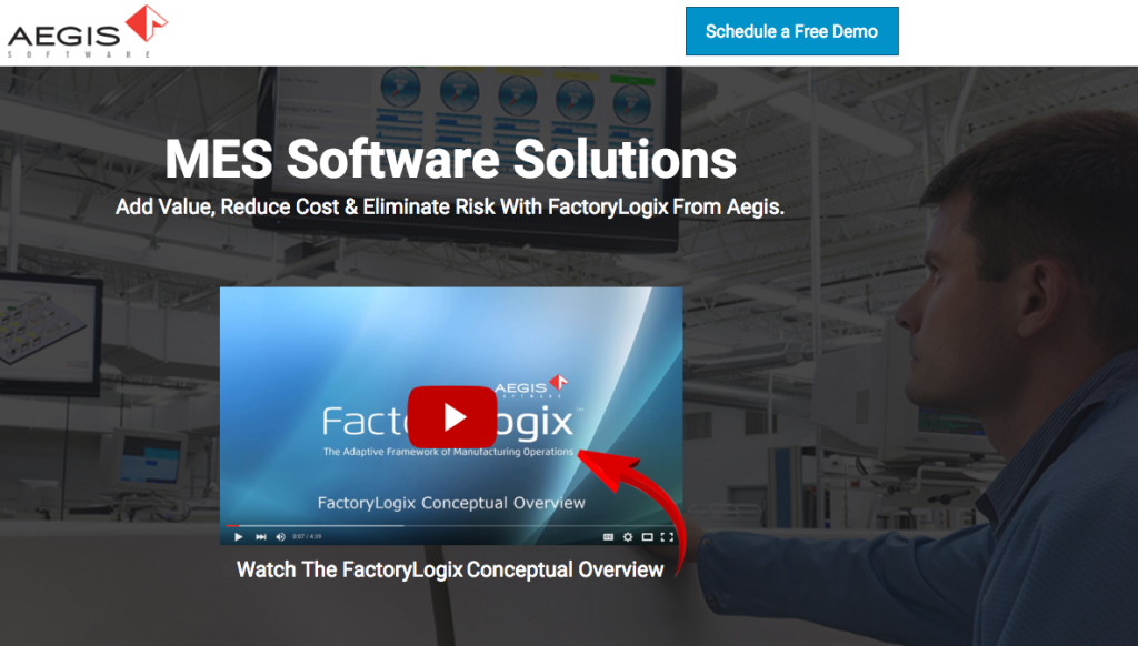
Hero Shot
With everything from videos to illustrations being featured in hero shots, it’s hard to know what to choose and why.
The prevailing logic and best practice from thought leaders around the industry is this: don’t let your hero shot take away from your copy or call to action.
For 99% of industries, your hero shot does not sell you… unless you are a photographer, and I would argue that even then, compelling copy above the fold is more likely to improve your conversion rates.
Here is a sample of how we often use directional design in our hero shots to best guide the user’s attention to our desired action and make the shot and copy work in unison:
For more info on directional design check out this post by Unbounce
Call to Action Buttons
The elixir of a great landing page is the call to action button. The button should be prominent and the copy compelling.
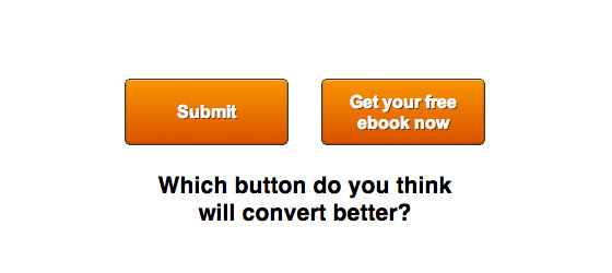
The perfect landing page does not hinge on one element, but instead a summation of all the parts. The call to action button should be representative of exactly what your target user will receive and the experience they can expect. Here are some examples for you to test:
- Let’s Talk
- Start My Project
- Get My Quote
- Start the Process
- Get My Proposal
- Schedule My Consultation
- Contact the CEO
As always, apply these to your exact needs and test, test, test.
Crafting Copy
The copy is often the most important ingredient in the landing page marketing mix. How we tell our story is important as we make our case for conversion.
If you are looking to convert, it’s best to highlight your brand in someone else’s words. A great way to do that is with testimonials. If someone else is saying you’re the best it means more than you saying it. Here’s a self-promotional example:
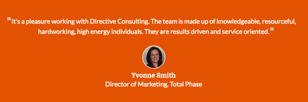
While these are hard to earn, they are worth it as you develop your brand.
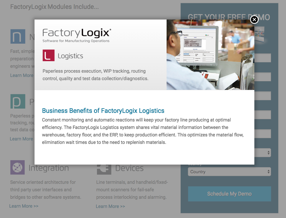
Another tactic you can implement is to utilize lightboxes. Lightboxes are pop-ups that keep you on the same page, but allow you to add more copy but also leave the page with only one action, filling out the form, while still providing a ton of actionable info on that page in a readable way.
The Ideal Footer
There is no perfect footer, but we like to get as close as possible. When you are building your page, you want the footer to serve two purposes: call to action button and social proof.
With your landing page only having one purpose, converting, and not having any external links, the footer is great for sending people back up to your form with a nice button. Also, you will want to give them that last final reason to convert.
That reason can be social proof. Whether that is clients, press, or reviews. You want to make sure that they know exactly WHY they need you.
Here are a couple examples:
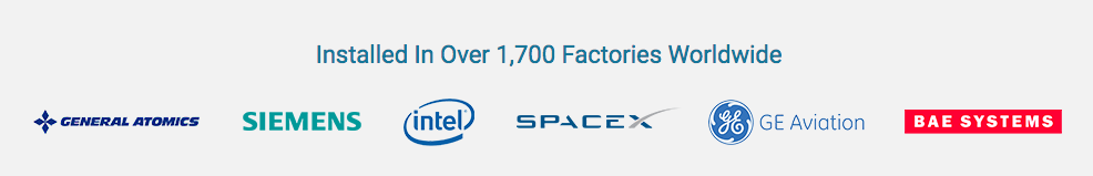

The goal in all of these is to add some icing on the cake. To make a final reason as to WHY you are the best solution to their need.
Bonus: Our Favorite Scripts for Unbounce!
Setting Up the Tracking
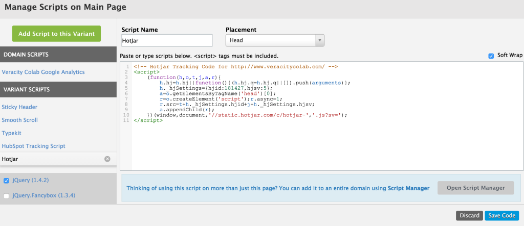
Now that you have built the landing page, it’s time to start learning based off of user data. There are a lot of great analytical tools out there, like Google Analytics, but when it comes to gathering actionable user data, our software of choice is Hotjar.
With Hotjar, you can record users, setup heatmaps, view form dropoffs, analyze funnels, and directly interact with customers. Once setup, you can begin to analyze your landing pages and make insightful changes. But what do you need to look for?
We find the following principles crucial in our testing process, try to have 100+ users to do any testing:
- Test headline copy (A/B test in Unbounce)
- Pick a winner headline and test hero images? (A/B test in Unbounce)
- Do more fields help convert better? (form analysis in Hotjar)
- Is there information that users aren’t getting enough of? (heatmaps in Hotjar)
- What info is above or below the fold on both desktop or mobile? (page analysis in Hotjar)
Establishing the tracking code is as simple as pasting in the JavaScript. Here are instructions if you are using Unbounce.
Conclusion
With time and effort, every one of your advertising campaigns has an opportunity to improve by testing the tactics discussed above. No campaign is perfect and no size fits all with landing pages, but if you are consistent and test, test, test some of the largest opportunities for increasing ROI are already at your fingertips.
Proper ads + landing pages do two things better than anything else: decrease cost per acquisition and increase conversion rates. Start crafting or improving your campaigns for 15 minutes a day and you will be amazed at how quickly you can accelerate user acquisition.
Frequently Asked Questions about Building the Perfect Landing Page
What are the key elements of a successful landing page?
A successful landing page should have a clear and concise headline, a compelling subheadline, a brief description of the offer, at least one supporting image or video, social proof, and a single conversion goal – your Call-To-Action (CTA).
How important is the design of my landing page?
The design of your landing page is crucial. It should be visually appealing, clean, and uncluttered. The design should guide the visitor’s eye towards your CTA. It’s also important to keep your branding consistent across all pages.
How can I make my landing page mobile-friendly?
To make your landing page mobile-friendly, ensure it’s responsive so it adjusts to fit any screen size. Also, keep your design simple, use large buttons that are easy to tap, and make sure your text is readable on a small screen.
What is the role of social proof on my landing page?
Social proof, such as testimonials or reviews, can significantly increase conversions. They build trust and credibility by showing that others have benefited from your offer.
How can I optimize my landing page for SEO?
To optimize your landing page for SEO, use relevant keywords in your content, meta title, and meta description. Also, ensure your page loads quickly, is mobile-friendly, and provides a great user experience.
How can I test the effectiveness of my landing page?
You can test the effectiveness of your landing page by running A/B tests. This involves creating two versions of your page with one varying element, then seeing which version performs better.
What should my landing page’s call-to-action include?
Your call-to-action should be clear, concise, and compelling. It should tell visitors exactly what they’ll get when they click, and it should stand out visually on the page.
How can I reduce the bounce rate on my landing page?
To reduce the bounce rate, ensure your page loads quickly, is easy to navigate, and delivers on the promises made in your ad or link. Also, make sure your content is relevant and valuable to your target audience.
How important is the headline on my landing page?
The headline is one of the most important elements of your landing page. It’s the first thing visitors see, and it can determine whether they stay on your page or leave. Your headline should be clear, compelling, and aligned with your offer.
How can I use images effectively on my landing page?
Images can help to grab attention, convey your message, and evoke emotion. Use high-quality images that are relevant to your offer, and ensure they’re optimized for fast loading. If possible, use images of people using your product or service to help visitors visualize themselves doing the same.
 Garrett Mehrguth
Garrett Mehrguth is the CEO of Directive Consulting, an Unbounce Partner and MozLocal Recommended Agency serving small-enterprise level firms. He has been published in Moz, Kissmetrics, Ahref, Marin, Acquiso, Convince and Convert, Wordstream, Raven, Local Search Ranking Factors, and more. He has also spoken at MozCon Ignite, General Assembly, PeopleSpace Innovation Labs, SoCal Code Camp and others.