Bootstrap comes packed with tons of ready-to-use jQuery-powered plugins. The beauty of Bootstrap plugins is that you can slot them into your project, write the appropriate markup using data- attributes, and the JavaScript kicks in automatically. No need to write any JavaScript code.
There may be times when you’d like to add your own customizations to Bootstrap’s plugins to fit your project’s requirements.
If this is you, read on. I’m going to show you one way in which you can do just that.
How to Customize the Appearance of Bootstrap Plugins
You can customize Bootstrap plugins’ look and feel by working with CSS. On the other hand, if you’d like to modify the plugin’s functionality, you’ll need to write some JavaScript code.
Customizing Bootstrap CSS should be done in your own custom file, whether you’re working with the Sass source code or with the compiled version.
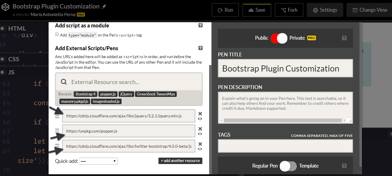
To keep things simple and CodePen-friendly, pull the precompiled Bootstrap package from the CDN.
This includes both the stylesheet …
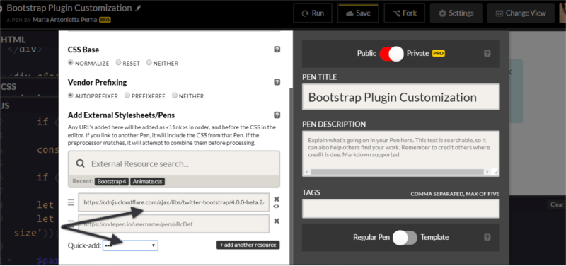
… and the JavaScript file. Also, don’t forget to include jQuery and, if you plan to use dropdowns, Popper.js too:
To make it even easier to modify CSS code, the developers behind Bootstrap have included a list of CSS variables for colors and breakpoints inside the :root element at the top of the stylesheet.
For example, the variable for the green success color is --success: #28a745;
To change this into a different shade of green, replace the variable’s color value in your own stylesheet and add this code to your chosen selector:
selector {
  background-color: var(--success);
}
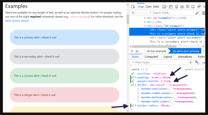
To change the look and feel of a specific plugin, the easiest way is to find the Bootstrap styles using your browser’s devtools and overriding them with your own styles.
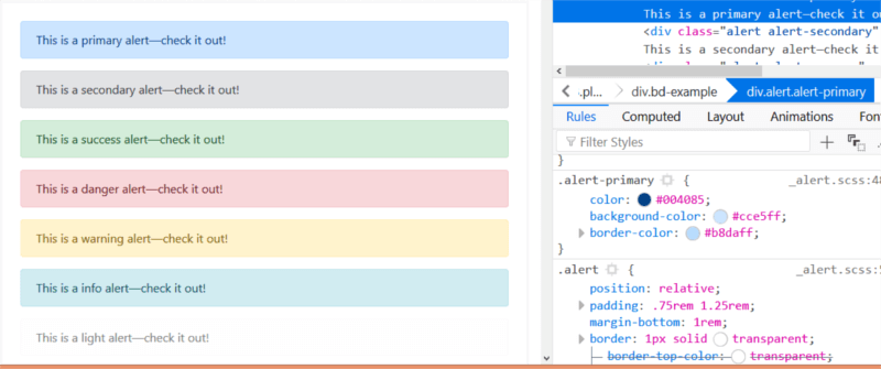
Let’s focus on the simple alert component in this article.
For instance, try changing the alert’s original values for the padding, margin-bottom, and border-radius in your custom CSS document:
.alert {
  padding: 2rem 1.50rem;
  margin-bottom: 1.5rem;
  border-radius: 50rem;
}
Now, all elements with the .alert class will look like this:
Next, let’s move on to extending the Bootstrap alert’s functionality.
Customizing a Bootstrap Plugin’s Functionality
Modifying Bootstrap plugins’ functionality often involves working both with the CSS and JavaScript document.
Most dynamic effects are produced by adding and removing CSS classes, and overall the functionality is quite simple.
In this article, I’m going to add some extra functionality to the Alert component.
Alerts display a piece of information and users can remove them from the page at the click of a button.
I’m going to add zoom in and zoom out buttons to the alert, which enable users to make the alert bigger or smaller respectively. I’m also going to include a high contrast button to allow users to view the alert contents in high contrast mode, i.e., inverting the background color and the text color.
Let’s get to work!
The Alert’s Structure
To follow along, start by adding the markup for the alert:
<div class="alert alert-info alert-zoom-in-out">
  <a href="#" class="close" data-dismiss="alert" aria-label="close">×</a>
  <a href="alert" class="close zoomIn" data-zoomIn="alert" aria-label="zoom in">+</a>
  <a href="alert" class="close zoomOut" data-zoomOut="alert" aria-label="zoom out">-</a>
  <a href="alert" class="close high-contrast" data-highContrast="alert" aria-label="high contrast mode"><i class="fa fa-adjust"></i></a>
  <p><strong>New Bootstrap Alert</strong></p>
  <p>Zoom in and out, or enable contrast mode.</p>
</div>
Above is a simple alert box with three links: the first one is a native Bootstrap dismiss alert link. This serves as template for the custom three links you’re going to create. The – link lets users shrink the size and contents of the alert box, while the + link does the exact opposite — that is, enlarge the alert box and the text inside it.
The contrast link enables high contrast mode on the alert.
Notice the data-zoomIn, data-zoomOut, and data-highContrast on each custom link’s markup. These are our hooks for the click event: a button with those custom data types will be responsible for triggering the actions on the alert box.
Modifying the CSS
The next step is to create your own custom CSS file for the alert plugin and add the following code:
.alert-zoom-in-out {
  font-size: 16px;
  height: auto;
  top: 20px;
  color: rgb(12, 84, 96);
  background-color: rgb(209, 236, 241);
}

.high-contrast-on,
.high-contrast-on a,
.high-contrast-on i {
  background-color: rgb(12, 84, 96);
  color: rgb(209, 236, 241);
}
alert-zoom-in-out is the class I’ve chosen for the alert box. Because the functionality you’re building includes modifying the size and color combination of the alert box, you need to set those for the alert-zoom-in-out class.
The high-contrast-on class on the alert box will be added and removed dynamically using JavaScript. When added, color and background-color values are inverted. When removed, the alert box will get back to its default appearance.
Adding Zoom-in Functionality
There’s usually more than one way of achieving the same result in programming. My approach owes a lot to Benjamin Jakobus and Jason Marah. For this simple customization, I’ve chosen to take the public close() method on the Bootstrap alert.js file as my reference point.
Start by wrapping the code inside an immediately invoked function expression (IIFE), which avoids polluting the global scope with the plugin’s code. Also, add the function to the jQuery object:
(function ($) {
  'use strict';
})(jQuery);
The Bootstrap JavaScript docs state that each plugin exposes its raw constructor on a Constructor property, which you can access in your code to add custom functionality:
(function ($) {
  'use strict';

  const Alert = $.fn.alert.Constructor;

})(jQuery);
At this point, the constant Alert contains a reference to the alert plugin’s constructor. This lets you access the plugin’s prototype so you can now add a custom method to it:
Alert.prototype.zoomIn = function(e) {
  // zoom-in code here
};
Now you’re all set to add your custom method. Here’s Bootstrap close() method, which will work as template for zoomIn():
close(element) {
  element = element || this._element

  const rootElement = this._getRootElement(element)
  const customEvent = this._triggerCloseEvent(rootElement)

  if (customEvent.isDefaultPrevented()) {
    return
  }

  this._removeElement(rootElement)
}
Below is the code for the zoomIn() method:
// prevent default action on the link
if (e) e.preventDefault();

// cache the element which has been clicked
const $this = $(this);

// find the parent of the element that has
// been clicked, which is the Alert
const $parent = $this.closest('.alert');

// trigger the custom event on the element
$this.trigger(e = $.Event('zoomIn.bs.alert'));

// grab the alert's current width and font-size
let $parentWidth = parseInt($parent.css('width'));
let $parentFontSize = parseInt($parent.css('font-size'));

// allow devs to run their own custom functionality
if (e.isDefaultPrevented()) return;

// increment alert's width by 20px on each click
// and the font-size by 2px
$parent.css({
  width: $parentWidth += 20,
  fontSize: $parentFontSize += 2
});
The code above is self-explanatory. The bit that could be somewhat confusing is e.isDefaultPrevented(). I found a great explanation oo this Stack Overflow thread.
The way the code is supposed to work is that each time you click on the + link, the alert box and its text content get bigger.
The code for the zoom out functionality is the same as the code above, but instead of increasing the pixel values of width and font-size, it makes it smaller:
$parent.css({
  width: $parentWidth -= 20,
  fontSize: $parentFontSize -= 2
});
Adding High Contrast Functionality
The highContrast() function follows the same pattern as zoomIn() and zoomOut(), but instead of using inline CSS styles to dynamically modify the alert’s appearance, it adds and removes the high-contrast-on class:
Alert.prototype.highContrast = function(e) {
  if (e) e.preventDefault();

  const $this = $(this);

  const $parent = $this.closest('.alert');

  $this.trigger(e =
  $.Event('highContrast.bs.alert'));

  if (e.isDefaultPrevented()) return;

  $parent.toggleClass('high-contrast-on');
};
Setting Up the Event Listeners
The last piece of the puzzle consists of hooking up the actions to the DOM element with a specified data attribute. The Bootstrap alert.js file gives some indications as to how you could do this.
In the Data API implementation section, you’ll find:
$(document).on(
  Event.CLICK_DATA_API,
  Selector.DISMISS,
  Alert._handleDismiss(new Alert())
)
The document listens to a click event on any element with a data-dismiss attribute and its value. In fact, Selector.DISMISS is defined at the top of the file, as well as the EVENT_KEY and DATA_API_KEY:
const Selector = {
  DISMISS : '[data-dismiss="alert"]'
}

const DATA_KEY       = 'bs.alert'
const EVENT_KEY      = `.${DATA_KEY}`
const DATA_API_KEY   = '.data-api'
Therefore, you can hook up the zoomIn(), zoomOut(), and highContrast() methods to the DOM elements with data-zoomIn, data-zoomOut, and data-highContrast attributes as follows:
// hook up zoomIn()
$(document).on('click.bs.alert.data-api', '[data-zoomIn="alert"]', Alert.prototype.zoomIn);

// hook up zoomOut()
$(document).on('click.bs.alert.data-api', '[data-zoomOut="alert"]', Alert.prototype.zoomOut);

// hook up highContrast()
$(document).on('click.bs.alert.data-api', '[data-highContrast="alert"]', Alert.prototype.highContrast);
And that’s it!
See the Pen Customizing Bootstrap Alert by SitePoint (@SitePoint) on CodePen.
Conclusion
As you can see, Bootstrap has made it convenient to add customizations to all its modules, including its JavaScript-powered components.
What’s your customization technique for Bootstrap jQuery plugins? Let me know in the comments!
Frequently Asked Questions on Customizing Bootstrap jQuery Plugins
How can I customize Bootstrap jQuery plugins?
Customizing Bootstrap jQuery plugins involves modifying the default settings to suit your specific needs. This can be done by overriding the default settings in your custom JavaScript file. For instance, if you want to change the default transition duration of the Bootstrap carousel, you can do so by modifying the ‘interval’ option in your JavaScript file. Remember to always include your custom JavaScript file after the Bootstrap JavaScript file in your HTML document to ensure your custom settings take effect.
What are the different types of Bootstrap jQuery plugins available?
Bootstrap offers a variety of jQuery plugins that you can use to enhance the functionality of your website. These include the Carousel for creating slideshows, the Dropdown for adding dropdown menus, the Modal for creating modal windows, the Tooltip for adding tooltips to elements, and the Popover for creating popovers, among others. Each of these plugins can be customized to suit your specific needs.
How can I use Bootstrap jQuery plugins without jQuery?
Starting from Bootstrap 5, jQuery is no longer a dependency, meaning you can use Bootstrap jQuery plugins without jQuery. Instead, Bootstrap 5 uses vanilla JavaScript for its plugins. However, if you’re using Bootstrap 4 or earlier, you’ll need jQuery to use the plugins.
How can I add borders to elements using Bootstrap?
Bootstrap provides utility classes that you can use to add borders to elements. For instance, you can use the ‘.border’ class to add a border to an element, the ‘.border-top’ class to add a top border, the ‘.border-right’ class to add a right border, and so on. You can also use the ‘.border-0’ class to remove all borders from an element.
How can I change the color of borders using Bootstrap?
Bootstrap provides border color classes that you can use to change the color of borders. These classes are in the format ‘.border-color’, where ‘color’ is the name of the color. For instance, you can use the ‘.border-primary’ class to change the border color to the primary color, the ‘.border-secondary’ class to change it to the secondary color, and so on.
How can I use Bootstrap jQuery plugins with Angular?
To use Bootstrap jQuery plugins with Angular, you’ll need to install the ‘ngx-bootstrap’ package, which provides Bootstrap components powered by Angular. After installing the package, you can import the specific modules for the plugins you want to use in your Angular application.
How can I use Bootstrap jQuery plugins with React?
To use Bootstrap jQuery plugins with React, you’ll need to install the ‘react-bootstrap’ package, which provides Bootstrap components built with React. After installing the package, you can import the specific components for the plugins you want to use in your React application.
How can I use Bootstrap jQuery plugins with Vue?
To use Bootstrap jQuery plugins with Vue, you’ll need to install the ‘bootstrap-vue’ package, which provides Bootstrap components built with Vue. After installing the package, you can import the specific components for the plugins you want to use in your Vue application.
How can I troubleshoot issues with Bootstrap jQuery plugins?
If you’re experiencing issues with Bootstrap jQuery plugins, there are several steps you can take to troubleshoot. First, ensure that you’ve included the correct Bootstrap JavaScript and CSS files in your HTML document. Second, check that you’ve included jQuery (if you’re using Bootstrap 4 or earlier) and that it’s loaded before the Bootstrap JavaScript file. Third, check your browser’s console for any error messages that might indicate what’s going wrong.
How can I contribute to the development of Bootstrap jQuery plugins?
Bootstrap is an open-source project, meaning anyone can contribute to its development. If you’re interested in contributing, you can start by checking out the project on GitHub, where you’ll find information on how to get started, including the project’s code of conduct, contribution guidelines, and the process for submitting pull requests.
 Maria Antonietta Perna
Maria Antonietta Perna is a teacher and technical writer. She enjoys tinkering with cool CSS standards and is curious about teaching approaches to front-end code. When not coding or writing for the web, she enjoys reading philosophy books, taking long walks, and appreciating good food.