HTML5 Development Center

Developed for you in part by
 
742-css3-starwars

Star Wars 3D Scrolling Text in CSS3

By | | CSS | CSS3 | HTML | HTML5

I always try to offer practical tips on SitePoint. Really. This isn’t one, but I couldn’t resist it. Without further ado…

Star Wars 3D scrolling title text
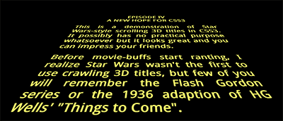
View Star Wars 3D Scrolling Text in CSS3
(Chrome, Safari or Firefox)

How cool is that? No JavaScript, no graphics — just pure HTML5 text and CSS3. It works in Chrome, Safari and Firefox. Opera won’t show the 3D transform in the current release, but it’ll work. Internet Explorer. Hmmm. Sorry, but you’ll need to wait for IE10 since previous versions don’t support transformations and animations.

The effect is remarkably easy to implement. The HTML requires an outer element (#titles) and a section which will be scrolled (#titlecontent):


<div id="titles"><div id="titlecontent">
	<p>content</p>
</div></div>

The outer DIV is positioned at the bottom center of the browser window then rotated using 3D perspective using a transform (note that vendor prefixes have been omitted here, but they’re in the actual code):


#titles
{
	position: absolute;
	width: 18em;
	height: 50em;
	bottom: 0;
	left: 50%;
	margin-left: -9em;
	font-size: 350%;
	font-weight: bold;
	text-align: justify;
	overflow: hidden;
	transform-origin: 50% 100%;
	transform: perspective(300px) rotateX(25deg);
}

A pseudo-element is applied to overlay a fade-out gradient at the top of the outer DIV:


#titles:after
{
	position: absolute;
	content: ' ';
	left: 0;
	right: 0;
	top: 0;
	bottom: 60%;
	background-image: linear-gradient(top, rgba(0,0,0,1) 0%, transparent 100%);
	pointer-events: none;
}

Then all we need do is scroll the content using CSS animation:


#titlecontent
{
	position: absolute;
	top: 100%;
	animation: scroll 100s linear 4s infinite;
}
@keyframes scroll {
	0% { top: 100%; }
	100% { top: -170%; }
}

(Note you could also use margin-top instead of absolutely-positioning the content, but it didn’t seem as smooth.)

View the demonstration again…

That’s all there is to it. If you want to delve further: view the source, Luke.

Please use the code as you wish, but I hope this article doesn’t lead to the re-introduction of pointless Star Wars-inspired splash pages!

If you enjoyed reading this post, you’ll love Learnable; the place to learn fresh skills and techniques from the masters. Members get instant access to all of SitePoint’s ebooks and interactive online courses, like Learn CSS3.

Learn Responsive Web Design

Join Learnable $29 Includes all SitePoint books

Craig Buckler

Craig is a Director of OptimalWorks, a UK consultancy dedicated to building award-winning websites implementing standards, accessibility, SEO, and best-practice techniques.

More Posts - Website

{ 45 comments }

Jules Webb October 26, 2012 at 1:51 pm

Love it!

I’ve been playing around with it and it’s so CCS (cool, creative, and simple).
The one thing I’m struggling with is adjusting the movement amount and timing depending on the quantity of text shown. Is that controlled by animation or keyframes?

Thanks!
Jules

Jules Webb October 29, 2012 at 7:57 pm

Well, I finally figured it out…

Since my scrolling text was so much shorter, and the effect is within a blog post, I needed to reduce the height of #titles as well as reduce the @keyframes scroll top from -170% to -100%.

I also modified it to be responsive. Looks pretty good on an iphone.

I showed my husband this effect and it inspired him to write a short story so I could implement it on a live site. If you want to check it out go to: http://eddwebb.com/blog/the-a-hole-clause-episode-1

Cheers!
Jules

John October 26, 2012 at 11:11 am

I don’t see how this could work in in all browsers as it’s missing this in the #titles:

-webkit-transform-origin: 50% 100%;
-moz-transform-origin: 50% 100%;
-ms-transform-origin: 50% 100%;
-o-transform-origin: 50% 100%;
transform-origin: 50% 100%;
-webkit-transform: perspective(300px) rotateX(25deg);
-moz-transform: perspective(300px) rotateX(25deg);
-ms-transform: perspective(300px) rotateX(25deg);
-o-transform: perspective(300px) rotateX(25deg);
transform: perspective(300px) rotateX(25deg);

and missing #titles:after

background-image: -webkit-linear-gradient(top, rgba(0,0,0,1) 0%, transparent 100%);
background-image: -moz-linear-gradient(top, rgba(0,0,0,1) 0%, transparent 100%);
background-image: -ms-linear-gradient(top, rgba(0,0,0,1) 0%, transparent 100%);
background-image: -o-linear-gradient(top, rgba(0,0,0,1) 0%, transparent 100%);
background-image: linear-gradient(top, rgba(0,0,0,1) 0%, transparent 100%);
pointer-events: none;

He did point out at the end of his article to view the source code, but that could have been probably explained a little better.

Davit October 26, 2012 at 2:13 am

Awesome but barely useable, as the rest of css3+html5 crap.

Jeremy L October 26, 2012 at 1:00 am

Fantastic! Works well in Chrome and brought a real smile to my face. All it needs now is for the scene to pan left to reveal the Galactic Empire’s mighty Star Destroyer blasting at Leia’s ship… Any takers…?

Brad W October 25, 2012 at 11:50 pm

Oh wow – this is so cool. I’ve always wanted to reproduce the Star Wars scrolling text effect. Looks good in win 7, chrome.

Solo did shoot first… I was there for the original man!

Glow October 25, 2012 at 2:58 pm

It’s working on IE10 preview

Joel October 25, 2012 at 2:48 pm

Works in Firefox for me, but not Chrome 22.0.1229.79.

I’m wondering what could be done about the flickering of the distant text. Googling to try to find the name of the effect – it might be called a Moiré interference pattern. When rendering the distant text, a single sample of the area is taken, which is either all white or all black, and as the text moves slightly, it can cause the opposite sample to be taken, which makes it flicker. To fix that, it should taking an average of the colours in that area. I guess this is a job for browser vendors?

kyle October 25, 2012 at 11:16 am

Hey! This is awesome. Ages ago, I made a JS-based site that did this. Your solution is much better now that more browsers support this stuff and the 3d transforms are compatible.

Here’s an example… it pulls the text from a political blog (but you can use any website):

http://www.shoffle.com/Cillies/root/en/StaRSS/Main/make?anyway=1&url=http%3A%2F%2Ffivethirtyeight.blogs.nytimes.com&mood=DUELLING&colour=3f0

Do you mind if I freshen my “galactifier” up with your CSS/HTML? (with credit of course)

Cheers

Kyle

Craig Buckler October 25, 2012 at 11:36 am

That’s very clever. Help yourself to the code, though — that’s what it’s there for!

Michael October 25, 2012 at 11:04 am

Thanks Craig. Didn’t seen this one before. I’m going to play around a bit ;)

donaven October 25, 2012 at 10:57 am

Epic! Will use this in a presentation within Keynote soon. :)

Christian October 25, 2012 at 10:46 am

Works great for me. I do use Chrome sometimes but to me it’s not the panacea so many people make it out to be.

Jenn October 25, 2012 at 10:19 am

Its works great in Firefox on my OS X install, but all other browsers (safari, Opera, Chrome) (latest stable/auto-updated versions) are not working.similar to above It does no show the long scrolling text properly but the star wars title shows up.

Craig Buckler October 25, 2012 at 11:39 am

That’s odd. I’d have thought Safari would have worked at least. I think it’s a lesson for us all though — don’t rely on modern CSS3 effects without a fallback!

viki53 October 25, 2012 at 8:22 am

Nice job, but what’s new in copying something that has already been done in 2009?
http://ajaxian.com/archives/star-wars-html-and-css-a-new-hope

Craig Buckler October 25, 2012 at 8:43 am

Nothing is original, is it!

That is a very good facsimile of the title sequence. It even uses hard spaces to ensure the scrolling text looks similar. Interestingly, it takes a different approach and transforms the titles through 3D space rather than sliding them on a 3D background like mine does.

Luis Acevedo October 24, 2012 at 5:17 pm

That was really, really good.

Craig Buckler October 25, 2012 at 4:59 am

Cheers Luis!

Mikko Ohtamaa October 24, 2012 at 4:24 pm

You get nice extra tearing effect on iPad 2 + iOS 5 :(

Michal October 24, 2012 at 1:32 pm

Aliasing in Firefox is so terrible (on Windows)
Nice and smooth in Chrome.
http://i.imgur.com/7rB2N.jpg

Craig Buckler October 24, 2012 at 2:09 pm

Ughh. My installation doesn’t look that bad – I suspect it depends on your graphics card. Some are reporting that Chrome doesn’t work too.

Michal October 25, 2012 at 5:58 am

I did forget one important thing: Thanks! for the demo. It was reading your process. Cheers!

Anonymous October 24, 2012 at 10:39 am

At the very end, as the text moves off to the horizon, please add “If you can read this you don’t need glasses” that would make my day lol Nice work!

müzso October 24, 2012 at 9:00 am

Works in Firefox 16.0.1, but not in Chrome 22 (or 24 if I switch to the dev channel). In Chrome I get the “Star Wars titles in CSS3″ text, but not the scrolling text after that. I used a quite old setup running Windows XP (SP3) with an ATI X1250 (integrated) GPU. I guess the latter could be responsible for the failure. Maybe Chrome’s 3D transformations depend on some GPU features? :-o

Craig Buckler October 24, 2012 at 9:09 am

I’m beginning to wonder if Google have restricted certain effects on some graphics cards. I think they do for WebGL, but this is CSS3 transforms — it should work regardless?

Despite its popularity, I do find Chrome a little quirky at times.

Peter Westendorp October 24, 2012 at 10:00 am

3D Transforms are hardware accelerated, and Chrome has some GPU/OS/Browser combinations blacklisted because caused issues. (https://code.google.com/p/chromium/issues/detail?id=146250&thanks=146250&ts=1346676221)

You can go to chrome://gpu to check if your setup has 3D transforms enabled…

Craig Buckler October 24, 2012 at 10:19 am

That explains it — thanks, Peter.

It seems people are not be experiencing all browser effects as we expect them too. Haven’t web developers got enough hassle to contend with!

Interestingly, I have 3D CSS as “Hardware accelerated”, but CSS Animation as just “Accelerated”. Not sure what the difference is?

Peter Westendorp October 25, 2012 at 3:20 pm

‘Normal’ CSS animations aren’t hardware accelerated, but you can trick the browser into hardware acceleration by setting an ‘empty’ 3D transform e.g. translateZ(0). (http://www.youtube.com/watch?v=IKl78ZgJzm4)

No idea why they specifically show CSS animations as ‘Accelerated’ though.

Florian October 24, 2012 at 8:41 am

The Aliasing, it gives me eye cancer.

Craig Buckler October 24, 2012 at 9:01 am

Most effects are far better if you shut your eyes…

greg October 24, 2012 at 7:13 am

It works in both Chrome(v22) and FF on my Windows 7 system. It doesn’t work on IE 9

Andrew Sylvester October 24, 2012 at 6:21 am

I’m using Chrome version 22.0.1229.94 m (which is apparently “up to date,” according to the about menu) on Windows 7, and I’m not seeing the scrolling text, either.

Craig Buckler October 24, 2012 at 6:52 am

That’s the version I’m using. I suppose an extension could cause the problem? Or perhaps it’s a graphics card issue? Do CSS3 animations fail elsewhere?

You could try re-installing. Alternatively, try it in Firefox?

Andrew Sylvester October 24, 2012 at 7:04 am

Hi Craig,

Opened the demo up in Firefox and it worked fine! Tried again in Chrome with all my extensions disabled, but no luck. Very odd…

Jeroen October 24, 2012 at 6:07 am

@Darth Craig. Nice!
It does work for me in Chrome and in FF. In FF with a bit of a stutter btw. Also an amazing CPU load for something with no actual use.
Always good to know that the people at sitepoint are pushing the boundries (to a galaxy far, far away)

Craig Buckler October 24, 2012 at 6:19 am

Thanks Jeroen!

Try clearing the browser history and cache in Firefox. It seems fine on a 3 year-old Windows 7 laptop but I did notice stuttering if it was left going for a few minutes.

David Corbacho October 24, 2012 at 4:51 am

haha! I love it!

amin October 24, 2012 at 4:37 am

this code doesn’t work on ie even 9 and chrome

Aurelio De Rosa October 24, 2012 at 5:22 am

I’m using Chrome and it works like a charm.

Craig Buckler October 24, 2012 at 6:17 am

I mentioned that it won’t work in IE9. It should be fine in recent versions of Chrome, though.

Andy October 24, 2012 at 8:18 am

Of course it doesn’t work in IE9. Microsoft creates inferior browsers and despite the commercial’s claims of it being awesome and up-to-date, it’s not. Still behind Chrome & Firefox.

Tom B October 24, 2012 at 4:11 am

Great effect but it seems to be broken in chrome. The text goes totally along the wrong vector.

Craig Buckler October 24, 2012 at 6:16 am

Which version of Chrome are you using? It certainly works in v22 on Windows.

Tom B October 24, 2012 at 7:07 am

Ah, I forgot that I’m on the beta channel, perhaps that has something to do with it. I’m on 23.0.1271.40 beta-m.

Comments on this entry are closed.