The capabilities of HTML5 and CSS3 completely outshine what we could do on the web just five years ago. The CSS Shapes Module Level 1 specification has the potential to break us out of the rectangular limitations of the web and transform web design to new heights. It allows elements to be styled in various shapes (think circle or pentagon-shaped divs) and for text to wrap around elements in much more natural ways (wrap your text around the edges of your curvy design rather than having to stick to square boundaries). This article will go over the possibilities of CSS Shapes with a bunch of little demos to show what’s possible and help you start exploring!
About the Shapes Spec
The specification is a candidate recommendation which is “an explicit call to those outside of the related Working Groups or the W3C itself for implementation and technical feedback”.
Basically, this means it’s ready for web developers in the community to get in there, give it a shot, and share their thoughts and ideas to help get this specification as solid as possible. It’s not ready for mainstream usage yet but it’s at the stage when it’s so crucial for the web development community to get on board and help explore how this will be used in the wild.
If you’re a dev who doesn’t usually tinker with things that aren’t widely available and aren’t cross-browser compatible, this article may not be for you — however I’d encourage you to try out a demo or two if you have the time and really see where you might take these new features in your future designs.
What You’ll Need to Experiment with CSS Shapes
In order to develop and experiment with the spec, you’ll need to ensure you’re using a supported browser. It currently works in the following:
- Chrome 34 and above, with a special flag (see below)
- Chrome Canary
- WebKit Nightly
If using Chrome (not Canary), paste this into your address bar:
chrome://flags/#enable-experimental-web-platform-featuresThen click “Enable” under “Enable experimental Web Platform features” and choose “Relaunch Now” to restart your browser and give it brand new CSS superpowers.
With those introductions out of the way, let’s get right into what the Shapes spec has to offer.
The shape-outside Property
The first area we’ll explore is the new shape-outside property. This works to define a different float area around an element. Rather than text flowing around the floated element solely as a rectangle, the element can wrap text around it as a circle, polygon, or ellipse. It cuts out a new area within the float box boundaries of the element, into which text is allowed to wrap.
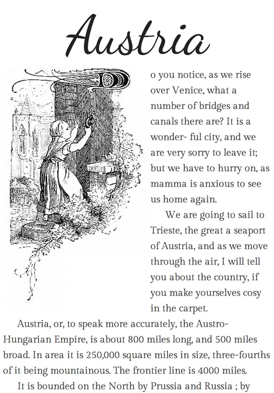
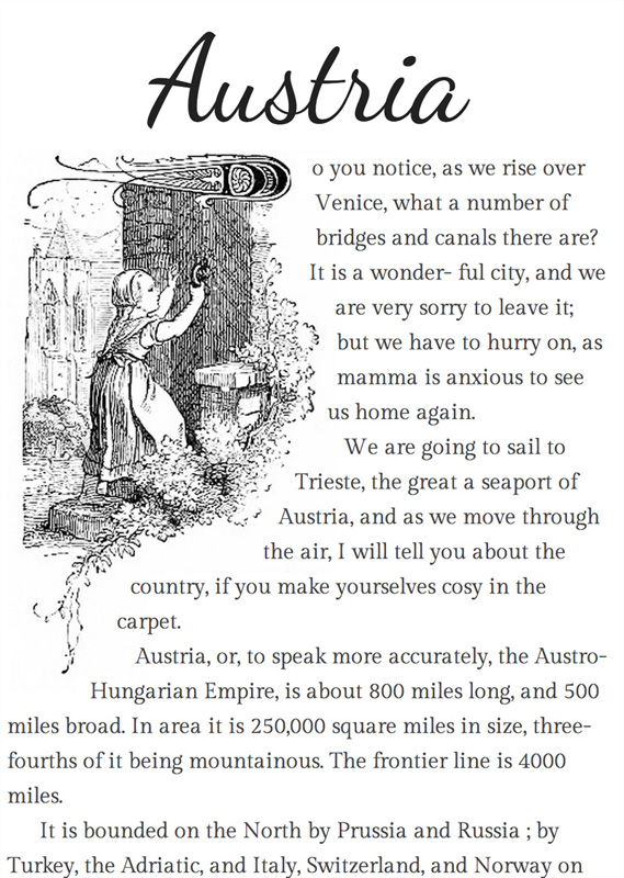
Throughout my demos, I’ll be bringing a few snippets to life from the book The Children’s fairy geography, or a merry trip round Europe by F. Winslow. The British Museum were kind enough to release a bunch of works into the public domain and this children’s book happens to be one of them (and also happens to have a bunch of differently sized images!).
Our first and super simple example looks like this:
The HTML looks like this:
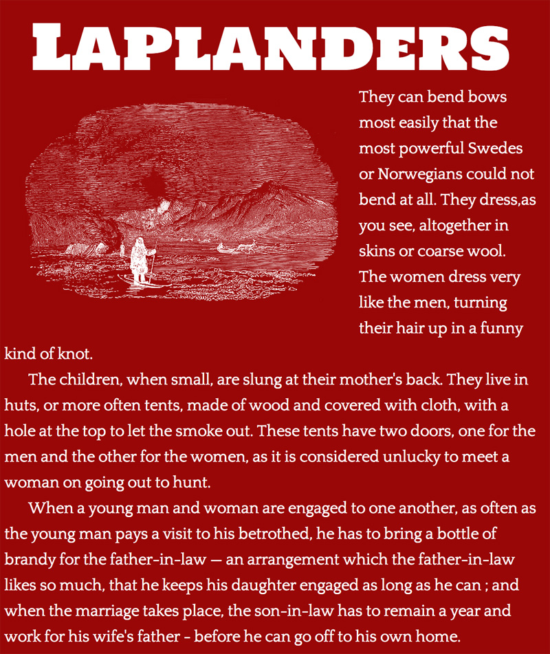
<h1>Laplanders</h1>
<img src="http://www.patrickcatanzariti.com/experiments/css3/cssshapes/lapland.png"
     class="lapland" />
<p>They can bend bows most easily that the most powerful Swedes or Norwegians
could not bend at all. They dress,as you see, altogether in skins or coarse wool.
The women dress very like the men, turning their hair up in a funny kind of knot.</p>
We’ll add the shape-outside property to the image (.lapland) element’s CSS:
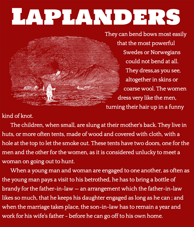
.lapland {
  float: left;
  shape-outside: inset(1% round 45%);
}
As a result, the image’s corners become nicely rounded to match the illustration’s natural border radius:
And for those viewing on a supporting browser, here’s a CodePen demo:
See the Pen CSS Shapes Demo #2 by SitePoint (@SitePoint) on CodePen.
We’ll take a closer look at this example and the inset function options further in the next section.
What Kinds of Shapes are Possible?
The shape-outside property allows us to use a few different functions to define the shape:
inset()
The inset() function allows you to define an inner rectangle within the float area. This would be useful if you have a design where you’d like the text to overlap part of a rectangular image. Maybe you’ve got a bit of a subtle bleed of colour around the image that you don’t mind the text moving into, or there’s a lot of white space around the image that you’d like to preserve in some cases but want to style out in others. The inset function would make this all possible!
You define your top, right, bottom, and left positions of the rectangle similar to how you define margins or padding:
shape-outside: inset(10px, 5px, 10px, 5px);You can shorten the value just like in margin/padding values, so the following gives an inset rectangle that is 1% from all edges of the element:
shape-outside: inset(1%);You can also give this rectangle various border-radius styles, providing various opportunities for rounded containers. This is actually where I see the inset function being especially valuable in designs.
If you add “round” and then specify the size using the regular border-radius syntax, the aforementioned possibilities of rounded containers will appear. This is what we did in our Laplander example above.
I’ll give a few variations to explain our earlier example a bit more. The code below gives the element a 10px border-radius that is inset from the edge of our image by 1%:
shape-outside: inset(1% round 10px);Our example above follows this pattern, but the radius is much more rounded to match our image:
shape-outside: inset(1% round 45%);You can go further with these settings by giving it a different border-radius on each corner. The following, for example, would give the top left 5px, top right 10px, bottom right 5px, and bottom left 5px:
shape-outside: inset(1% round 5px 10px 5px 5px);circle()
If you’ve got a genuine circle shape in your image, you can set the float area to match the circle like so:
shape-outside: circle();To demonstrate how this works, let’s say we had the following:
By adding the code above to the image in the top-right of the above screen shot, we get this:
CodePen example:
See the Pen BDqLe by SitePoint (@SitePoint) on CodePen.
Setting the Radius of the Circle
You can set the radius of the circle in the first argument of the circle() function.
By default, the circle’s radius is half of the element’s width:
shape-outside: circle(50%);You could set the radius to 25% to set the circular float area to be a quarter of the width of the element:
shape-outside: circle(25%);Note: Percentages in circle() are computed by a formula using both width and height in cases where the element is not a perfect square. (Thanks to Razvan Caliman in the comments for pointing this out)
There are two other ways to set the radius of the circle, which are newer concepts but quite neat: closest-side and farthest-side define how the browser should work out the radius of our circle using the boundaries of the element itself. They will make no difference if our element is a square though, only in cases where you’ve got a rectangular element.
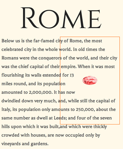
closest-side calculates the radius of the circle from the edges of the element closest to the center. This is th default, so using circle() on its own, is equivalent to circle(closest-side). If we have a rectangular element and we use the following:
shape-outside: circle(closest-side);closest-side will ensure that the circle fits snugly inside the container as shown in the image below (I’ve added an orange border around the edge of the image so you can see where the boundaries are):
See it on CodePen:
See the Pen CSS Shapes Demo #3 by SitePoint (@SitePoint) on CodePen.
farthest-side, on the other hand, calculates the radius of the circle from the edges farthest from the center. This will clip the circle on one pair of edges. If we have a new rectangular element like the one above but with a clipped circle image, we can use farthest-side:
shape-outside: circle(farthest-side);That’ll allow us to wrap text on elements like so:
See it on CodePen:
See the Pen CSS Shapes Demo #4 by SitePoint (@SitePoint) on CodePen.
Moving the Center of the Circle
You can use the keyword at to move the center of the circle. You might do this in cases when the circle isn’t precisely in the center of the image, or in cases when you’re looking to achieve a semi-circle from one edge. For example, if we use this CSS on a tall image:
shape-outside: circle(farthest-side at left);We can achieve a circle whose center is to the left of the image and whose height matches the height of the element:
On CodePen:
See the Pen CSS Shapes Demo #5 by SitePoint (@SitePoint) on CodePen.
You can use a bunch of different positioning values for the center of the circle. Theoretically, everything that the CSS position syntax allows:
shape-outside: circle(closest-side at center);
shape-outside: circle(closest-side at 10% 10%);
shape-outside: circle(closest-side at center);
You can even get quite specific, specifying the radius of the circle and the position. For example, the CSS below would create a circle that is half the width of the element, whose center is at the very left of the element (0) and 25% from the top:
shape-outside: circle(25% at 0 25%);ellipse()
If you’ve instead got an oval shape, rather than a circle, you can use the ellipse function. With this, the height and width of the ellipse will be the height and width of your image, unless you define the radius similar to how you’d define it for the circle — just with two values, one for the radius of x and one for the radius of y.
The following code:
shape-outside: ellipse();Results in this:
On CodePen:
See the Pen CSS Shapes Demo #6 by SitePoint (@SitePoint) on CodePen.
Setting the Size of the Ellipse
We can make an oval of a different size in the same way as defining a circle radius, just with two values: One for the width and a second for the height:
shape-outside: ellipse(25% 10%);There’s probably a better real-world example, but this gives an idea of what it would look like. I’ve got an image with a smaller oval inside it at the size defined above (I’ve added an orange border again to show where the image lies):
See it on CodePen:
See the Pen CSS Shapes Demo #7 by SitePoint (@SitePoint) on CodePen.
You can also define width and height via the closest-side and farthest-side values as we did with the circle, only with the ellipse we again use two values: One for the width and one for the height:
shape-outside: ellipse(closest-side closest-side);Moving the Center of the Ellipse
You can move the center of the ellipse using the same method as the circle element:
shape-outside: ellipse(25% 10% at 0 25%);polygon()
The polygon() function lets you define any number of points for your shape, allowing you to get your text flowing around even the most awkwardly shaped image!
You define polygons by setting coordinates for each point. The coordinates can be in pixels or in percentages. The first point must be able to link up to the last one:
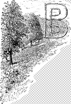
shape-outside: polygon(x1 y1, x2 y2, x3 y3, x4 y4, x5 y5);Take this example with a very fancy illustration making up the “D” at the start of our page:
We can then define a polygon float area like so:
shape-outside: polygon(88% 0, 90% 15%, 83% 22%,
                       93% 31%, 100% 36%, 72% 73%,
                       35% 75%, 19% 100%, 0 100%,
                       0 0);
That’ll adjust the float area so that our text wraps around the specific polygon we’ve defined:
On CodePen:
See the Pen CSS Shapes Demo #8 by SitePoint (@SitePoint) on CodePen.
But… Working out Polygon Coordinates is Hard!
I agree. It’s a pain to work out when it comes to complicated images, especially when using percentages! There is a Brackets extension that’ll help you out here.
If you’d rather not use Brackets, there’s a simple online tool for working out the polygon shape you’d like to use.
Definitely give that a try if you’re looking to have a faster way to come up with the polygon coordinates. Or you can set up polygon shapes using images themselves, which I’ll discuss next!
Shapes from Images
One of the very handy features of CSS Shapes is that if you’ve got a transparent PNG or GIF image, you can use the alpha channel to define your float area. It’s as simple as these two lines:
shape-outside: url(b.png);
shape-image-threshold: 0.0;
The URL format is just like the format used to refer to a background-image and it can be either the same image as the element or a totally different one. You could create new images whose sole purpose is to define the alpha channel for the shape if you so desire. This is slightly easier than polygons, but would add an extra HTTP request.
The shape-image-threshold defines the level of opacity you’re wanting to pick up. 0.0 is fully transparent while 1.0 is fully opaque.
In my example, I’ve gone with 0.0 as my image has completely transparent areas that define the float area:
The example code from above will result in this:
And here’s the CodePen demo:
See the Pen CSS Shapes Demo #9 by SitePoint (@SitePoint) on CodePen.
Editor’s Update: As we discussed in the comments, the CodePen demo above, when tested in Chrome Canary with the proper flag enabled doesn’t seem to work properly due to a cross-origin bug in either Chrome or CodePen. It will work if you refresh the page a few times, but for now you can refer to Patrick’s demo for a working version.
One important point — if you load the HTML from your filesystem (e.g. file:///Users/philkensebben/Web/yourfile.html) rather than from a web server, you’ll run into a Cross-Origin Resource Sharing error like this:
Image from origin 'file://' has been blocked from loading by Cross-Origin Resource Sharing policy: Received an invalid response. Origin 'null' is therefore not allowed access.So make sure to test this on a remote web server to avoid any confusion over why it’s not working!
Shapes from the Box Model
Another choice for defining your float area is to use the element’s built in box model. For simple rounded corners, you can also get the rounded corner effect by using box models for your float area too.
You can use the various box model areas as your float area. I’ve added an image below to remind you of the various parts of the box model in CSS:
- The blue area is the
margin-box. This is made up of the margin of the element and is outside the element’s boundary. - The black area is the
border-box. In the case of the example above, we’ve got a border of 2px. - The orange area is the
padding-box. This is the area that surrounds your content (e.g. our image). - The image itself is in the
content-box. This is the box area that holds our image.
You can use these boundary areas as the float area like so:
shape-outside: margin-box;
shape-outside: border-box;
shape-outside: padding-box;
shape-outside: content-box;
Basically, whichever you define will be where the text will wrap to. If you define the shape-outside as margin-box, then the text will wrap up to the edge of your margin (e.g. the blue area in the example above). If you define it as border-box, it will wrap to the edge of your border, and so on.
One of the simple uses of this is to give your image float area rounded corners (just like we did with inset but a bit simpler to implement and maintain). This CSS will add a 5px gap between our image and the text, while also wrapping the text around the image with a 150px border-radius value:
border-radius: 150px;
margin: 5px;
shape-outside: margin-box;
Which looks like this:
And on CodePen:
See the Pen CSS Shapes Demo #10 by SitePoint (@SitePoint) on CodePen.
The same effect with the border-radius can be done with border-box, padding-box, and content-box — it just changes how close the text gets to the image.
The shape-margin Property
You also have the option to add space around your defined CSS Shape’s float area to ensure that the text doesn’t run into the edge of your images. This is handy in cases where you’re not using the box model values for your shape.
The spec says you can use either a length (e.g. px, em. rem, etc.), percentages, or a calc() function value. Only Chrome Canary currently supports percentages, but Chrome stable supports lengths and calc() functions (as long as those calc() functions do not include a percentage). A few examples include:
shape-margin: 10px;
shape-margin: 1em;
shape-margin: 5%;
shape-margin: calc(2em - 1px);
Combine a Few Ideas and Explore!
Don’t be fooled by the ye olde illustrations in my examples — the spec can be used for more modern looking designs with photos and such too:
See it on CodePen (this demo is too awkward for an embed).
Soon enough the web will be buzzing with all sorts of shapes! Designers shall rejoice and developers shall breathe a sigh of relief that finally they can do things their print friends have been doing for years.
Please do get involved, experiment, and share your findings to help develop the spec into something we can use confidently and happily in the future. You can provide feedback to the W3C here, or get in touch with the Adobe Web Platform team.
Further Info
If you’re super keen and want to read more on the CSS Shapes spec, check out the following links:
- CSS Shapes 101 on A List Apart (which is highly recommended and which was released while our article was still in production)
- The W3C CSS Shapes Module Level 1 spec
- The Web Platform page on CSS Shapes with various demos
- Article by the Adobe Web Platform team with links to further resources
- Impressive demo of Alice in Wonderland using the CSS Shapes module (this uses some features from CSS Shapes Module Level 2 which I haven’t covered here)
Frequently Asked Questions on CSS Shapes
How can I create non-rectangular shapes using CSS?
Creating non-rectangular shapes in CSS can be achieved using various properties and functions. The most common method is using the ‘clip-path’ property along with the ‘polygon()’ function. This allows you to define points to create a custom shape. For example, to create a triangle, you could use the following code:.element {
clip-path: polygon(50% 0%, 0% 100%, 100% 100%);}
This code creates a triangle by defining three points: the top center, bottom left, and bottom right of the element.
What are the different types of shapes I can create with CSS?
CSS allows you to create a wide variety of shapes. Some of the most common include rectangles, circles, ellipses, polygons, and even complex shapes using the ‘clip-path’ property. You can also create shapes using borders and gradients. The possibilities are virtually endless, and it all depends on your creativity and understanding of CSS properties.
How can I use CSS shapes to improve the design of my website?
CSS shapes can greatly enhance the visual appeal of your website. They can be used to break the monotony of rectangular layouts, create interesting visual effects, and guide the user’s eye through the page. For example, you can use shapes to wrap text around images, create unique navigation menus, or highlight specific content on your page.
Can I animate CSS shapes?
Yes, CSS shapes can be animated using CSS animations or transitions. You can change the shape, size, position, color, and other properties over time to create interesting visual effects. However, keep in mind that animating complex shapes can be resource-intensive and may impact the performance of your website.
Are CSS shapes supported in all browsers?
Most modern browsers support CSS shapes, but there may be some differences in how they are rendered. It’s always a good idea to test your designs in multiple browsers to ensure they look and function as expected. You can also use tools like Can I Use to check the compatibility of specific CSS properties and functions.
How can I create complex shapes with CSS?
Creating complex shapes with CSS can be achieved using the ‘clip-path’ property along with the ‘polygon()’ function. This allows you to define multiple points to create a custom shape. You can also use SVGs for more complex shapes, as they provide more control and precision.
Can I use CSS shapes to create responsive designs?
Yes, CSS shapes can be used to create responsive designs. You can use media queries to change the shape of elements based on the viewport size. This allows you to create designs that adapt to different screen sizes and orientations.
How can I use CSS shapes to wrap text around images?
You can use the ‘shape-outside’ property to wrap text around images. This property defines a shape around which text will flow. For example, you can use a circle shape to make the text flow around a circular image.
Can I use gradients with CSS shapes?
Yes, you can use gradients with CSS shapes. You can apply a gradient to the background of a shape using the ‘background-image’ property and the ‘linear-gradient()’ or ‘radial-gradient()’ functions.
How can I create 3D shapes with CSS?
Creating 3D shapes with CSS can be achieved using the ‘transform’ property. This property allows you to rotate, scale, skew, and translate elements in three dimensions. However, creating 3D shapes requires a good understanding of CSS transforms and perspective.
 Patrick Catanzariti
PatCat is the founder of Dev Diner, a site that explores developing for emerging tech such as virtual and augmented reality, the Internet of Things, artificial intelligence and wearables. He is a SitePoint contributing editor for emerging tech, an instructor at SitePoint Premium and O'Reilly, a Meta Pioneer and freelance developer who loves every opportunity to tinker with something new in a tech demo.