
Shakespeare and Hemingway may have crafted words in a way that asks us to reflect on the human condition, but could they increase your conversion rate? The answer may surprise you.
In this piece, we’re going to discuss the best practices for writing the user interface copy for your product, which covers some methods that work for all interfaces, and some that are unique to digital copy.
Clarity is Your #1 Priority
Ambiguity is the enemy of good design. This is especially true for interface copy, because the confusion will only be amplified since words are such a direct interaction.
In this section we’ll provide essential tips for saying what you mean, based on those originally listed by John Zeratsky, design partner at Google Ventures, in his post on interface copywriting.
We have found in particular to be most applicable to interaction design, so let’s take a deeper look:
1. Be Specific
State precisely what you mean, with little room for vagueness.
A lot of this simply goes back to choosing the right words. For example, the Save function is not the same as Submit. Similarly, a Filter function is sometimes misrepresented as a Search.
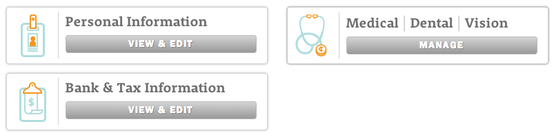
In the above example from Zenefits, you can see how the benefits button is labelled Manage, while the personal and financial information are labelled View & Edit.
It’s a very subtle difference, but it makes sense based on the required user effort. The Manage button is more accurate because the menu provides actions like adding dependents, changing plans, and printing confidential information. Meanwhile, the personal and financial menus are just simple data input.
Another tip for specificity is proper titling. Let’s say your product creates an activity stream of the companies you follow. While this may be self-explanatory to you, to a new user it may be confusing or even negligible. A specific title, something as simple as “Company Updates,” could save the user from confusion.
In the case of multipage wizards ” a series of pages where users enter information on each page, as in an account sign-up ” being specific can help set you apart.
While most products label next step buttons as Next or Continue, explaining exactly the next step can create a more helpful interaction. This can be done with smaller sized copy, i.e., “[Save & continue] Next, we’ll ask for payment info.”
2. Avoid Jargon
An easy mistake in interaction design is using the same language with your users as you do around the office.
Unless you’re designing for other designers and developers, your jargon will either fly over your users’ heads, or slow them down as they struggle to comprehend. Refer to a ‘site’ as a “website”, call an ‘invite’ an invitation, and a ‘repo’ should be known as a repository.
While we use the terms UX, IxD, and UI frequently in our own ebooks targeted to a specialized audience, the average person probably won’t have a clue what we’re talking about.
As discussed in The Guide to Usability Testing, you should always test for a clear understanding of terminology. You can set your demographics and receive test results within an hour with UserTesting, or go with a cheaper route like Mechanical Turk (the process for testing interface language is described here).
3. Important Words First
Important words should always appear front and center.
For example, in a form field, the label “First name” is far better than “Name (first).” If you want to draw attention to additional details at the bottom of a page, “Below you’ll find additional details”, is not as effective as “Additional details below”.
The Apple Store demonstrates good word placement by using inline form validation (a pattern described in Web UI Patterns 2014). Because the description sits in the form fields, you don’t need to clutter the interface with descriptions of each entry. The descriptions also disappear as the fields are completed, creating cleaner interactions as the user progresses.
4. Omit Needless Words
The eternal advice of William Strunk, Jr. in the timeless Elements of Style, omitting needless words is fundamental to all writing. This advice holds extra weight with digital design given the size, character, and attention span limitations.
You can’t ignore this advice, considering that a study on 205,873 web pages shows it only takes users about 10-20 seconds to decide if a site is worthwhile.
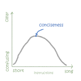
As a general rule of thumb, try to say everything in as few words as possible (while still retaining the meaning). For example, ‘Click to Continue‘ can usually be shortened to simply ‘Continue‘, and ‘All changes have been saved‘ can be shortened to ‘Changes saved‘.
Don’t Force Personality
Cheeky and aggressively personable wording may have been an effective strategy years ago, when a casual tone stood out against other products using corporate-speak. But these days, most products use a casual tone, so this strategy isn’t as unique as it once was.
Don’t get me wrong – we’re not saying your product should be stripped of a distinct personality. Just don’t force it. Far too often, brands prioritize being clever or standing out over clearly stating their meaning. When personality gets in the way of clarity, it’s time to cut it out.
As Randy Hunt, Creative Director at Etsy, advises, the cleverness of first impressions doesn’t survive the first few minutes – but the frustration of obscurity certainly will.
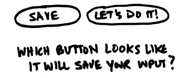
Headlines and buttons make up the backbone of your product, so don’t risk weakening them with wording that can be misinterpreted. Clarity is prioritized over personality for key interactions, so ‘Save and Continue‘ will work better than Awesome, let’s go!. If you’re intent on flexing your creative muscles, save it for the subheadings and supporting text.

In our UXPin button, inviting others to collaborate, we balanced personality with functionality by still explicitly describing the action. It’s a subtle touch, since the action would be muddled if the second sentence was something like “Start the fun with a coworker!”
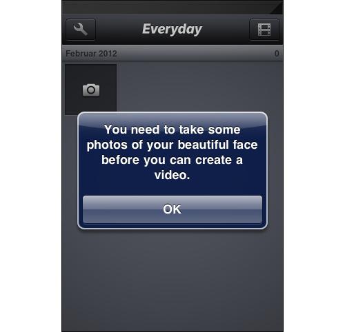
The Everyday photo app strikes a similar balance with its onboarding messages, turning an otherwise annoying reminder into a delightful interaction that has probably cracked a few smiles. Again, the key here is that the user action remains crystal clear.
Your design’s personality will come out one way or another, regardless of your word choice. Besides, a company personality is not something you want to force or self-consciously build – it should emerge organically and truthfully. People are more sensitive to being manipulated than you might think, and friendly words won’t necessarily make you appear friendlier.
To learn more about how to infuse your design with the right amount of personality, I recommend this excellent A List Apart piece by Mailchimp UX Director Aarron Walter.
Emphasize Emotional Connections Over Length
What does a legendary Renaissance-era battle have to do with a modern-day coffee company? Read the Our Story section of the Blue Bottle Coffee website and you’ll see.
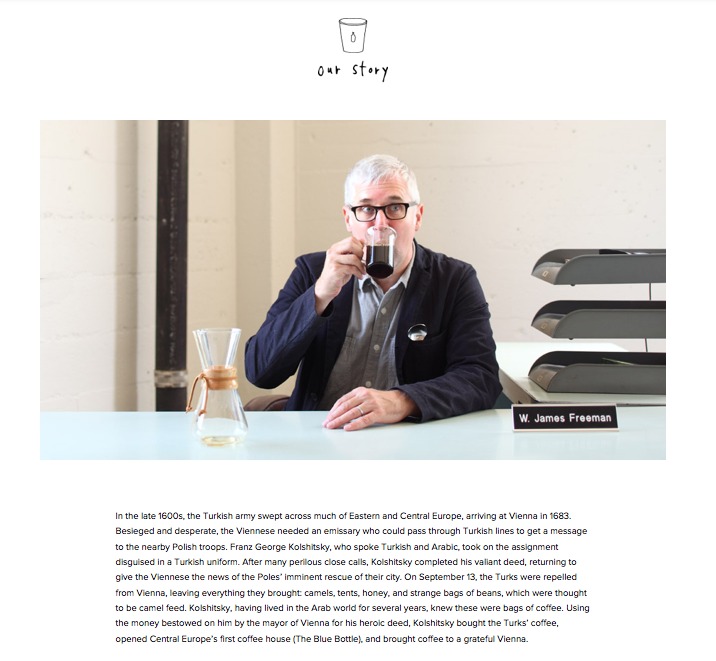
Blue Bottle’s page on their company is perfect example of how readability trumps length. A common misconception about copywriting is that shorter is always better – but don’t confuse the art of omitting needless words with omitting as much as you can.
Most companies would shy away from such a roundabout company description. But if you scroll down the page, this story serves a smarter purpose. It describes how the founder was inspired to produce fresh, no-BS, responsibly-sourced coffee, separating the brand from other “hundred flavors and one” coffee shops.
Longer content is fine, as long as it is highly engaging and serves a purpose. In this case, the copy creates an interaction that leads to deeper trust and credibility, which is one of the pillars of infusing your personality in design.
Take Advantage of Human Reading Patterns
You also need to know how to lay out the content so that it’s readable. As discussed in Interaction Design Best Practices Vol.1, longform content has mostly received a bad rap because of the way it’s been presented, without hierarchy or structure. That’s why your layout and typography matter.
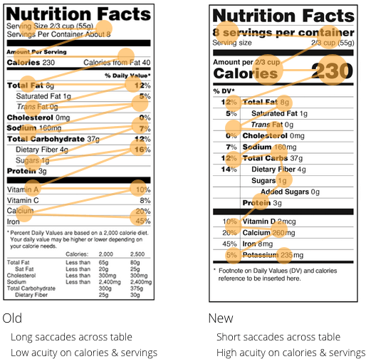
In terms of interaction design, designing according to reading patterns improves the familiarity of your interface (which, as we described previously, improves learnability). We can also examine the importance of scanning patterns by looking at how the FDA redesigned their nutrition labels.
Let’s look at this from interaction design’s goal-oriented framework.
Reading nutrition labels helps achieve the goal of staying healthy. The excessive white space in the old version created lag time when reading.
As you can see from the above example, the new, condensed version is more streamlined, allowing the reader to process the information quicker and more effectively. This interaction is now simplified, reducing the obstacles between the user and their goal.
The other improvement to the nutrition label, the varying text sizes, also demonstrates the power of font size in prioritizing important information.
Typography
If your typography is lacking, your user may be distracted from the content, or unable to read it at all. Conversely, a well-planned typography can complement your content and direct your user’s eyes where you’d like. The iOS Human Interface Guidelines lists some helpful typography tips applicable to any design.
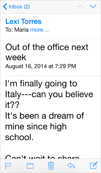
- Text must always be legible – “If users can’t read the words in your app, it doesn’t matter how beautiful the typography is.”
- Prioritize content by text size – To draw your reader’s eye to more important text, make it bigger. Notice how, in the example below, the parts of the email that concern the user (title, body) are large, while the optional details (date & time, recipient) are small. The email sender is also in blue, helping to differentiate important information.
- Test custom fonts at all sizes –If you’re using a custom font, be careful. You’ll want to test it at different sizes to make sure it’s legible at each.
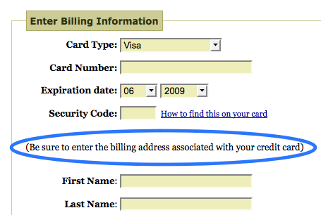
Remember the Importance of Microcopy
It’s not just the main content that matters – the secondary copy (microcopy) can’t be neglected either. As a testament to its value, Jared M. Spool, Founder of User Interface Engineering, tells the story of how a microcopy adjustment increased profits for an ecommerce site by $300 million a year.
In a nutshell, the addition of a well-placed, well-worded, and brief explanation patched a problem on the checkout page. The page had been designed in a way that confused a lot of users, and so they replaced a button and added the following simple piece of microcopy:
‘You do not need to create an account to make purchases on our site’.
Simply click Continue to proceed to checkout. To make your future purchases even faster, you can create an account during checkout.
The result? A 45% increase in purchases, raking in $300 million new profits at the end of the year.
Despite its small-sounding name, microcopy can wield an enormous influence on the way people interact with your site or app. The skill of microcopy lies in knowing what to say and where to say it.
Usability tests can help you pinpoint where some explanatory text or instructions are needed – as was the case for Spool’s example – but you don’t need a $300 million mistake in order to use microcopy to your advantage. Joshua Porter, former Director of UX at Hubspot,lists on his blog Bokardo a handful of common microcopy additions and corrections:
- “Low-volume newsletter” – Users often are scared of having their email boxes flooded with spam-like newsletters, dissuading them from signing up. Reassure them that your newsletters come in a reasonable amount.
- Anti-spam reminder – Related to the above tip, adding a small, empathetic phrase like, “We hate spam as much as you do,” during an email signup reassures your user that you won’t bombard them with unnecessary emails.
- “Unsubscribe at any time” Put your users’ fears at ease by explaining your cancellation policy before they sign up.
- Free trials – If you offer a free trial, make it known. Your free trial will better do its duty of creating conversions if it’s well-advertised, plus paying customers might resent you later if they bought the product without knowing there was a free trial.
The benefits of microcopy typically fall under the categories of giving instructions or alleviating your users’ fears and concerns (which improves their interactions for key steps like registration, signing up, etc.). Before you start deconstructing your entire design to solve a specific problem, try adding or changing a few key words to see if that helps.
The Takeaway
There’s an inner Shakespeare and Hemingway inside all of us, so it’s time to get to work. All you need to do is follow the guidelines we’ve listed above and focus on what you want to communicate. Speak like a person who must help the user accomplish a goal, and optimize the content for readability.
We’ll close this article fittingly, with the words of a poet. As George Herbert once said, “Good words are worth much, and cost little.”
If you’re interested in delving deeper into good interface copy writing techinques, grab a copy of my e-book Interaction Design Best Practices: Words, Visuals, Space. Visual case studies are included from 30+ companies including Google, AirBnB, Facebook, Yahoo.
Frequently Asked Questions (FAQs) about Creating Unforgettable Interface Copy
What is the importance of interface copy in decision-making?
Interface copy plays a crucial role in decision-making. It guides users through a website or app, helping them understand how to use it and what actions they can take. Good interface copy can make the user experience smooth and enjoyable, leading to higher user engagement and conversion rates. It can also help reduce user errors and confusion, making the interface more user-friendly.
What are the different types of copy in web and mobile UI?
There are several types of copy in web and mobile UI, including instructional copy, navigational copy, error messages, and success messages. Instructional copy guides users on how to use the interface, while navigational copy helps users move around the interface. Error messages inform users when something goes wrong, and success messages confirm when an action has been successfully completed.
What does “business optional” mean in the context of interface copy?
“Business optional” is not a standard term in interface copy. However, it could potentially refer to optional features or elements in a business application or website that users can choose to use or ignore based on their needs.
How can I create effective UI copy for websites and apps?
Creating effective UI copy involves understanding your users, being clear and concise, using a consistent tone and language, and testing your copy. Understand your users’ needs and expectations, and write copy that speaks directly to them. Be clear and concise to avoid confusion, and use a consistent tone and language to create a cohesive user experience. Finally, test your copy with real users to ensure it works as intended.
What is a “company option” in the context of interface copy?
A “company option” could refer to a feature or element in a business application or website that is specifically designed for company use. This could include options for managing company profiles, setting up business accounts, or accessing company-specific features.
How can I make my interface copy unforgettable?
Making your interface copy unforgettable involves creating copy that is clear, concise, and engaging. Use simple and straightforward language, avoid jargon, and make sure your copy is easy to read and understand. Also, make your copy engaging by using a conversational tone, adding a touch of humor where appropriate, and speaking directly to the user.
How can interface copy improve user experience?
Interface copy can significantly improve user experience by guiding users through the interface, reducing confusion, and making the interface more enjoyable to use. Good interface copy can help users understand how to use the interface, what actions they can take, and what each feature does. It can also help reduce user errors and frustration, leading to a more positive user experience.
What are some common mistakes to avoid when writing interface copy?
Some common mistakes to avoid when writing interface copy include using jargon or complex language, being inconsistent in tone or language, and not testing your copy. Avoid using jargon or complex language that your users may not understand. Be consistent in your tone and language to create a cohesive user experience. And always test your copy with real users to ensure it works as intended.
How can I test the effectiveness of my interface copy?
You can test the effectiveness of your interface copy by conducting user testing. This involves observing real users as they interact with your interface and noting any areas where they seem confused or make errors. You can also gather feedback from users about their experience using your interface. This can help you identify any issues with your copy and make necessary improvements.
How can I improve my interface copy based on user feedback?
Improving your interface copy based on user feedback involves identifying the issues users have with your copy and making necessary changes. This could involve simplifying your language, clarifying instructions, or changing the tone of your copy. Always be open to feedback and willing to make changes to improve your interface copy and the overall user experience.
 Jerry Cao
Jerry Cao is a UX content strategist at UXPin – the wireframing and prototyping app . His Interaction Design Best Practices: Volume 1 ebook contains visual case studies of IxD from top companies like Google, Yahoo, AirBnB, and 30 others.


