When learning about a new framework we often see trivial demos depicting the framework’s basic features, for example the well-known TodoMVC Application. And that’s great — I mean who doesn’t like Todo apps, right? Well today, we’re going to take a slightly different tack. We’re going to shun the generic and instead focus on one of the unique core features of the Aurelia framework: visual composition.
Aurelia, the new kid on the block, has already been introduced in a previous article, along with it’s capabilities of extending HTML. By the end of this article we should get a better understanding of how composition helps to assemble complex screens out of small resuable components. To do so we’re going to create a report builder app. You can find a demo of the app here and find the full source code here.
What Is Visual Composition?
The basic idea of composition in computer science is to take small entities, in the case of object composition, simple objects/data types, and combine them into bigger and more complex ones. The same thing applies to function composition, where the result of one function is passed as the attribute to the next and so on. Visual composition shares this fundamental concept by allowing one to aggregate multiple distinct sub-views into a more complex view.
An important thing to consider when talking about visual composition is the difference between heterogeneous and homogeneous sub-items. In order to understand this, lets look at the following figure.
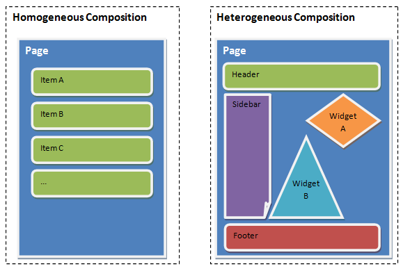
Comparison of visual composition types
On the left side we see an example of homogeneous composition. As the name suggests, this is all about rendering items which have the same type and only varying content. This type of composition is used in most frameworks when creating repeated lists. As the example depicts, imagine a simple list of items being rendered sequentially one after another. On the right side we can see an example of heterogeneous composition. The major difference is the assembly of items which have different types and views. The example demonstrates a page consisting of several building blocks with different content and purpose.
A lot of frameworks offer that functionality via router-views, where specific view-regions are placed on the screen and different route endpoints are loaded up. The obvious drawback of this method is that the application requires a router. Besides that, creating complex view compositions can still become quite a tedious task, especially if you take nested compositions into account.
Aurelia on the other hand offers, in addition to the router-view, an alternative approach by exposing visual composition as a first-class feature via a custom element. That way it enforces the separation of concerns even on a visual level and thus leads the developer towards the creation of small and reusable components. The result is increased modularity and the chance to create new views out of already existing ones.
Using Aurelia’s Compose Element
In order to make use of visual composition within Aurelia, we can utilize the predefined compose custom element. It operates on one of Aurelia’s key conventions, the view and view-model (VM) pairs (which this article will also be referring to as a page). In short, compose allows us to include a page at any particular position inside another view.
The following snippet demonstrates how to use it. At the position we’d like to include the Hello World page, we simply define the custom element and set the value of its view-model attribute to the name of the file containing the VM definition.
<template>
  <h1>Hello World</h1>
  <compose view-model="hello-world"
           model.bind="{ demo: 'test' }"></compose>
</template>
If we need to pass some additional data to the referenced module, we may use the model attribute and bind a value to it. In this case we pass on a simple object, but could also reference a property from the calling VM.
Now the HelloWorld VM can define an activate method, which will get the bound model data passed as an argument. This method may even return a Promise, e.g. in order to get data from the backend, which will make the composition process wait until it’s resolved.
export class HelloWorld {
  constructor() { }

  activate(modelData) {
    console.log(modelData); // --> { demo: 'test' }
  }
}
Besides loading the VM, the corresponding HelloWorld view will also be loaded and its contents placed into the compose element.
But let’s say that we don’t want to follow that default convention of VM and view pairs. In this case we can use the additional attribute view and point it to the HTML file we’d like to use as a view.
<compose view-model="hello-world"
         model.bind="{ demo: 'test' }"
         view="alternative-hello-world.html"></compose>
In this case the VM will still be loaded, but instead of loading hello-world.html the composition engine will insert the contents of alternative-hello-world.html into the compose element. Now what if we need to decide dynamically which view should be used? One way we can accomplish this is to bind the view attribute to a property of the calling VM, whose value will be determined by some logic.
// calling VM
export class App {
  pathToHelloWorld = "alternative-hello-world.html";
}

// calling view
<compose view-model="hello-world"
         model.bind="{ demo: 'test' }"
         view.bind="pathToHelloWorld"></compose>
This is fine but might not fit each use case. What if the HelloWorld VM needs to decide itself which view it wants to show? In that case we simply let it implement a function called getViewStrategy which has to return the name of the view file as a string. An important thing to note is, that this will be called after the activate function, which allows us to use the passed on model data, to determine which view should be displayed.
export class HelloWorld {
  constructor() { }

  activate(modelData) {
    this.model = modelData;
  }

  getViewStrategy() {
    if( this.model.demo === 'test' )
      return 'alternative-hello-world.html';
    else
      return 'hello-world.html';
  }
}
Preparing the Project Setup
Now that we’ve seen how the compose element does its magic, lets get a look at the report builder application. In order to kick start the development, we’ve built it upon the Skeleton Navigation App. Some parts, such as the router, have been stripped off since this application is using just a single complex view composed of other sub-views. To get started, either visit our GitHub repo, download the master branch and extract it to a folder, or clone it locally by opening a terminal and executing following command:
git clone https://github.com/sitepoint-editors/aurelia-reporter.gitTo complete the installation, please follow the steps listed under “Running The App” in the project’s README.
Creating the Report View
Our app’s entry point is the page app.html (located in the src folder). The VM (app.js) is just an empty class, pre-loading Twitter Bootstrap. The view, as depicted in the snippet below, acts as the main app’s container. You’ll notice that it composes the screen out of two separate pages called toolbox and report. The first acts as our container for various draggable tools whereas the second is the sheet you place those widgets on.
<template>
  <div class="page-host">
    <h1 class="non-printable">Report Builder</h1>

    <div class="row">
      <compose class="col-md-2 non-printable" view-model="toolbox"></compose>
      <compose class="col-md-10 printable" view-model="report"></compose>
    </div>
  </div>
</template>
Looking at toolbox.html we see that the view is outputting a list of available widgets alongside the buttons to print or clear the report.
<template>
  <h3>Toolbox</h3>
  <ul class="list-unstyled toolbox au-stagger" ref="toolboxList">
    <li repeat.for="widget of widgets"
        class="au-animate"
        title="${widget.type}">
          <i class="fa ${widget.icon}"/> ${widget.name}
    </li>
  </ul>
  <button click.delegate="printReport()"
          type="button"
          class="btn btn-primary fa fa-print"> Print</button>
  <button click.delegate="clearReport()"
          type="button"
          class="btn btn-warning fa fa-remove"> Clear Report</button>
</template>
The toolbox VM exposes those widgets by declaring an identically named property and instantiating it inside its constructor. This is done by importing the widgets from their respective locations and passing their instances — created by Aurelia’s dependency injection — to the widgets array. In addition an EventAggregator is declared and assigned to a property. We’ll get to this a bit later.
import {inject} from 'aurelia-framework';
import {EventAggregator} from 'aurelia-event-aggregator';

import {Textblock} from './widgets/textblock';
import {Header} from './widgets/header';
import {Articles} from './widgets/articles';
import {Logo} from './widgets/logo';

@inject(EventAggregator, Textblock, Header, Articles, Logo);
export class Toolbox {

  widgets;

  constructor(evtAgg, textBlock, header, articles, logo) {
    this.widgets = [
      textBlock,
      header,
      articles,
      logo
    ];
    this.ea = evtAgg;
  }

  ...
}
So what do those widgets contain? Looking at the project structure, we can find all of them inside the sub-folder src/widgets. Lets start with a simple one: the logo widget. This widget simply shows an image inside its view. The VM follows a default pattern by implementing the properties type, name and icon. We’ve seen those being used in the toolbox repeater block.
// logo.html
<template>
  <img src="images/main-logo.png" />
</template>

// logo.js
export class Logo {
  type = 'logo';
  name = 'Logo';
  icon = 'fa-building-o';
}
Looking at the textblock widget we see an additional activate method, accepting initial model data from the composition engine
// textblock.js
export class Textblock {
  type = 'textblock';
  name = 'Textblock';
  icon = 'fa-font';
  text = 'Lorem ipsum';

  activate(model) {
    this.text = model;
  }
}
In order to see how that model is made available to the view, lets take a look at the report page. What we see in its view is a mix of both homogeneous and heterogeneous composition. The report, essentially an unordered list, will output any widgets added to it — this is the homogeneous part. Now each widget itself has a different display and behavior which constitutes the heterogeneous part. The compose tag passes on the initial model, as well as the name of the sub-views’ view-model. Additionally, a remove icon is drawn which can be used to remove a widget from the report sheet.
<template>
  <ul class="list-unstyled report" ref="reportSheet">
    <li repeat.for="widget of widgets" class="au-animate">
      <compose
        model.bind="widget.model"
        view-model="widgets/${widget.type}" class="col-md-11"></compose>
      <i class="remove-widget fa fa-trash-o col-md-1 non-printable"
         click.trigger="$parent.removeWidget(widget)"></i>
    </li>
  </ul>
</template>
The removal is carried out by looking for the respective widget’s id and splicing it from the report.widget array. Aurelia’s repeater will take care of updating the view to actually remove the DOM-Elements.
removeWidget(widget) {
  let idx = this.widgets.map( (obj, index) => {
    if( obj.id === widget.id )
      return index;
  }).reduce( (prev, current) => {
    return current || prev;
  });

  this.widgets.splice(idx, 1);
}
Inter-Component-Communication via Events
We’ve mentioned that the toolbox has a “Clear Report” button, but how does that trigger the clearance of all the widgets added to the report page? One possibility would be to include a reference to the report VM inside the toolbox and call the method this would provide. This mechanism would however, introduce a tight coupling between these two elements, as the toolbox wouldn’t be usable without the report page. As the system grows, and more and more parts become dependent on each other, which will ultimately result in an overly-complex situation.
An alternative is to use application-wide events. As shown in the figure below, the toolbox’s button would trigger a custom event, which the report would subscribe to. Upon receiving this event, it would perform the internal task of emptying the widgets list. With this approach both parts become loosely coupled, as the event might be triggered by another implementation or even another component.
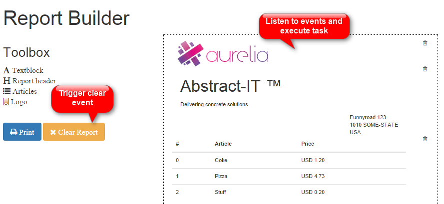
Events used to create the clear all feature
To implement this we can use Aurelia’s EventAggregator. If you look at the toolbox.js code snippet above, you can see that the EventAggregator has already been injected into the toolbox VM. We can see it in action in the clearReport method, which simply publishes a new event with the name clearReport.
clearReport() {
  this.ea.publish('clearReport');
}
Note that we could also pass an additional payload with the data, as well as have events identified via custom types instead of strings.
The report VM then subscribes to this event inside its constructor and, as requested, clears the widgets array.
import {inject} from 'aurelia-framework';
import {EventAggregator} from 'aurelia-event-aggregator';
import sortable from 'sortable';

@inject(EventAggregator)
export class Report {

  constructor(evtAgg) {
    this.ea = evtAgg;
    this.ea.subscribe('clearReport', () => {
      this.widgets = [];
    });
  }

...
Use External Code via Plugins
So far we haven’t looked at the actual drag & drop feature, which we’re going to use to drag widgets from the toolbox onto the report sheet. Of course one could create the functionality via native HTML5 Drag and Drop, but why go reinventing the wheel when there are already a bunch of nice libraries such as Sortable out there to do the work for us.
A common pattern when developing applications is thus to rely on external code bases which provide out-of-the-box features. But not only 3rd party code might be shared that way. We can do the same with our own reusable features by leveraging Aurelia’s plugin system. The idea is the same. Instead of rewriting code for each application, we create a custom Aurelia plugin, hosting the desired functionality and exporting it with simple helpers. This is not limited to pure UI components but might be used as well for shared business logic or complex features like authentication/authorization scenarios.
Leverage Subtle Animations
In that vein, let’s take a look at Aurelia Animator CSS, a simple animation library for Aurelia.
Aurelia’s animation library is built around a simple interface which is part of the templating repository. It acts as a kind of generic interface for actual implementations. This interface is called internally by Aurelia in certain situations where built-in features work with DOM-Elements. For example, the repeater uses this to trigger animations on newly inserted/removed elements in a list.
Following an opt-in approach, in order to make use of animations, it is necessary to install a concrete implementation (such as the CSS-Animator) which does its magic by declaring CSS3 animations inside your stylesheet. In order to install it we can use the following command:
jspm install aurelia-animator-cssAfter that, the final step is to register the plugin with the application, which is done during the manual bootstrapping phase in the main.js file of our report builder example.
export function configure(aurelia) {
  aurelia.use
    .standardConfiguration()
    .developmentLogging()
    .plugin('aurelia-animator-css');  // <-- REGISTER THE PLUGIN

  aurelia.start().then(a => a.setRoot());
}
Note: The plugin itself is just another Aurelia project following the convention of having an index.js file exposing a configure function, which receives an instance of Aurelia as a parameter. The configure method does the initialization work for the plugin. For example, it might register components such as custom elements, attributes or value converters, so that they can be used out-of-the-box (as with the compose custom element). Some plugins accept a callback as a second parameter which can be used to configure the plugin after initialization. An example of this is the i18n plugin.
The report builder makes use of subtle animations during the composition phase and to indicate the removal of a widget from the report. The former is done within the toolbox view. We add the class au-stagger to the unordered list to indicate that each item should be animated sequentially. Now each list-item needs the class au-animate, which tells the Animator that we’d like to have this DOM-Element animated.
<ul class="list-unstyled toolbox au-stagger" ref="toolboxList">
  <li repeat.for="widget of widgets"
      class="au-animate"
      title="${widget.type}">
        <i class="fa ${widget.icon}"/> ${widget.name}
  </li>
</ul>
We do the same for the reports view widget-repeater:
<li repeat.for="widget of widgets" class="au-animate">As mentioned, the CSS-Animator will add specific classes to elements during the animation-phase. All we need to do is to declare those in our stylesheet.
Adding Drag & Drop
As for including 3rd party libraries, we can take advantage of Aurelia’s default package manager JSPM. To install the previously mentioned library, Sortable.js, we need to execute following command, which will install the package under the name sortable.
jspm install sortable=github:rubaxa/sortable@1.2.0After installation, JSPM will automatically update the file config.js and add its package mappings:
System.config({
  "map": {
    ...
    "sortable": "github:rubaxa/sortable@1.2.0",
    ...
  }
});
Now that the package is installed we can use it inside our toolbox VM by fist importing it and then registering the drag & drop feature for our widgets list inside the attached hook. It’s important to do it at this time, since this is when the view is fully generated and attached to the DOM.
import sortable from 'sortable';
...

export class Toolbox {
  ...
  attached() {
    new sortable(this.toolboxList, {
      sort: false,
      group: {
        name: "report",
        pull: 'clone',
        put: false
      }
    });
  }
}
You might wonder where
this.toolboxListis coming from. Take a look at therefattribute of thetoolboxview in the animation section above. This simply creates a mapping for an element between the view and the VM.
The final part is to accept the dropped elements inside the report VM. To do this, we can leverage the onAdd handler of Sortable.js. Since the dragged list element itself is not going to be placed inside the report but rather the referenced widget composed by the view, we first have to remove it. After this, we check the type of the widget and in case of a textblock, we initialize a prompt for the text, which will be used as the widget’s model data. Finally, we create a wrapper object including the widget’s id, type and model, which will be used by the report view to compose the widget.
attached() {
  new sortable(this.reportSheet, {
    group: 'report',
    onAdd: (evt) => {
      let type = evt.item.title,
          model = Math.random(),
          newPos = evt.newIndex;

      evt.item.parentElement.removeChild(evt.item);

      if(type === 'textblock') {
        model = prompt('Enter textblock content');
        if(model === undefined || model === null)
          return;
      }

      this.widgets.splice(newPos, 0, {
        id: Math.random(),
        type: type,
        model: model
      });
    }
  });
}
Conclusion
And that’s it. We’ve seen how Aurelia’s compose element can help us to create a complex visual composition and nicely separate all of our components into small reusable parts. On top of that, I’ve demonstrated the concept of Aurelia Plugins, to share code between multiple projects as well as how to use 3rd party libraries. We, the Aurelia Team, hope you’ve enjoyed reading this article and would be happy to answer any questions, either here in the comments or on our Gitter channel.
Frequently Asked Questions about Aurelia Report Builder
What is Aurelia Report Builder and how does it work?
Aurelia Report Builder is a powerful tool that allows developers to create, design, and manage reports in a web application. It leverages the capabilities of Aurelia, a modern JavaScript framework, to provide a seamless and efficient report building experience. The report builder works by allowing users to drag and drop elements onto a canvas, define data sources, and customize the layout and style of the report. It also supports exporting reports in various formats such as PDF, Excel, and HTML.
How does Aurelia Report Builder compare to other JavaScript report builders?
Compared to other JavaScript report builders, Aurelia Report Builder stands out due to its simplicity, flexibility, and robustness. It is built on the Aurelia framework, which is known for its clean and modular architecture. This makes the report builder easy to use and highly customizable. Moreover, it supports a wide range of data sources and export formats, providing a comprehensive solution for report building needs.
Can I use Aurelia Report Builder with other JavaScript frameworks?
Aurelia Report Builder is designed to work with the Aurelia framework. However, it can be integrated with other JavaScript frameworks with some additional configuration. The process may require a good understanding of both Aurelia and the other framework, and it is recommended to consult the documentation or seek help from the community if you encounter any issues.
What types of data sources does Aurelia Report Builder support?
Aurelia Report Builder supports a wide range of data sources. You can connect it to SQL databases, NoSQL databases, REST APIs, and even local JSON files. This flexibility allows you to use the report builder in various scenarios and with different types of data.
How can I customize the layout and style of my reports?
Aurelia Report Builder provides a drag-and-drop interface for designing reports. You can add elements such as tables, charts, and text boxes to your report, and arrange them as you like on the canvas. You can also customize the style of each element, including its color, font, and size. Moreover, you can define conditional formatting rules to highlight certain data in your report.
Can I export my reports to different formats?
Yes, Aurelia Report Builder supports exporting reports to various formats. You can export your reports as PDF, Excel, or HTML files. This allows you to share your reports with others in a format that suits their needs.
Is there any community or support available for Aurelia Report Builder?
Yes, there is a vibrant community of developers and users around Aurelia and its tools, including the report builder. You can find help and support on the Aurelia forums, GitHub, and other online platforms. There are also numerous tutorials, guides, and articles available to help you get started with Aurelia Report Builder.
How can I get started with Aurelia Report Builder?
To get started with Aurelia Report Builder, you first need to install Aurelia and set up a new project. Then, you can install the report builder and start designing your reports. The documentation provides detailed instructions on how to do this, and there are also many tutorials and guides available online.
What are the system requirements for Aurelia Report Builder?
Aurelia Report Builder is a web-based tool, so it can be used on any system that supports a modern web browser. However, to develop with Aurelia and the report builder, you need a development environment with Node.js and npm installed.
Can I use Aurelia Report Builder for commercial projects?
Yes, you can use Aurelia Report Builder for commercial projects. However, it is recommended to check the licensing terms and conditions to ensure that it fits your project’s requirements.
 Vildan Softic
Vildan Softic is a consultant and software developer from Graz/Austria. He is passionate about developing Single Page Applications, grinding LOB Apps with .NET and is pushing more and more towards Node.JS development. Moreover, he is hopelessly in love with the Durandal Framework and, while still using other libraries in his day job, he's working hard contributing as a core team member as much as possible to Aurelia.