Responsive cover and video

How would this be set up being that both the cover/jacket are a different size from the video itself?
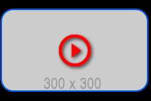
300 x 300 cover

640 video

If this piece of code was made specifically for the video

.video-wrapper {
  min-width: 40%;
  max-width: 640px;
  margin: auto;
}

Wouldn’t a wrapper need to be made specifically for the cover?
Because they are both two different sizes.

html,
body {
  height: 100%;
  margin: 0;
  padding: 0;
}

body {
  background: #000000;
}

.outer {
  display: table;
  height: 100%;
  margin: 0 auto;
  width: 100%;
}

.tcell {
  display: table-cell;
  vertical-align: middle;
  padding: 8px 8px;
}

.video-wrapper {
  min-width: 40%;
  max-width: 640px;
  margin: auto;
}

.ratio-keeper {
  position: relative;
  padding-top: 56.25%;
}

.video-frame {
  position: absolute;
  top: 0;
  left: 0;
  width: 100%;
  height: 100%;
}

.jacket {
  position: absolute;
  left: 0;
  top: 0;
  right: 0;
  bottom: 0;
  margin: 0;
  width: 100%;
  height: auto;
  cursor: pointer;
  background: url("https://via.placeholder.com/300x300") no-repeat center center;
  border-radius: 25px;
  border: 3px solid #0059dd;
  box-sizing: border-box;
}

.play {
  position: absolute;
  left: 0;
  top: 0;
  right: 0;
  bottom: 0;
  margin: auto;
  width: 64px;
  height: 64px;
  fill: red;
  filter: drop-shadow(3px 3px 3px rgba(0, 0, 0, 0.7));
}

.wrap iframe {
  position: absolute;
  top: -3px;
  left: -3px;
  width: calc(100% + 6px);
  height: calc(100% + 6px);
}

.wrap {
  position: absolute;
  left: 0;
  top: 0;
  right: 0;
  bottom: 0;
  margin: 0;
  width: 100%;
  height: 100%;
  overflow: hidden;
  border-radius: 25px;
  border: 3px solid red;
  box-sizing: border-box;
}

.wrap,
.jacket {
  position: absolute;
  top: -3px;
  left: -3px;
  width: calc(100% + 6px);
  height: calc(100% + 6px);
}

.hide {
  display: none;
}

<div class="outer">
  <div class="tcell">
    <div class="video-wrapper">
      <div class="ratio-keeper">
        <div class="jacket" title="Play">
          <svg class="play" viewBox="0 0 64 64">
            <path d="M25.6,46.4L44.8,32L25.6,17.6V46.4z M32,0C14.3,0,0,14.3,0,32s14.3,32,32,32s32-14.3,32-32S49.7,0,32,0z
              M32,57.6C17.9,57.6,6.4,46.1,6.4,32S17.9,6.4,32,6.4S57.6,17.9,57.6,32S46.1,57.6,32,57.6z" />
          </svg>
        </div>
        <div class="wrap hide">
          <div class="video video-frame" data-id="M7lc1UVf-VE"></div>
        </div>
      </div>
    </div>
  </div>
</div>

My Attempt

The size isn’t right, it should be 300 x 300, and the responsive part isn’t working correctly.

html,
body {
  height: 100%;
  margin: 0;
  padding: 0;
}

body {
  background: #000000;
}

.outer {
  display: table;
  height: 100%;
  margin: 0 auto;
  width: 100%;
}

.tcell {
  display: table-cell;
  vertical-align: middle;
  padding: 8px 8px;
}

.video-wrapper {
  min-width: 40%;
  max-width: 640px;
  margin: auto;
}

.cover-wrapper {
  min-width: 40%;
  max-width: 300px;
  margin: auto;
}

.ratio-keeper {
  position: relative;
  padding-top: 56.25%;
}

.video-frame {
  position: absolute;
  top: 0;
  left: 0;
  width: 100%;
  height: 100%;
}

.jacket {
  position: absolute;
  top: 0;
  left: 0;
  bottom: 0;
  right: 0;
  margin: auto;
  /* margin: 0; */
  width: 100%;
  height: auto;
  cursor: pointer;
  background: url("https://via.placeholder.com/300x300") no-repeat
    /*center center*/
    0 0;
  background-size: cover;
  border-radius: 25px;
  border: 3px solid #0059dd;
  box-sizing: border-box;
}

.play {
  position: absolute;
  top: 0;
  left: 0;
  bottom: 0;
  right: 0;
  margin: auto;
  width: 64px;
  height: 64px;
  fill: red;
  filter: drop-shadow(3px 3px 3px rgba(0, 0, 0, 0.7));
}

.wrap iframe {
  position: absolute;
  top: -3px;
  left: -3px;
  width: calc(100% + 6px);
  height: calc(100% + 6px);
}

.wrap {
  position: absolute;
  top: -3px;
  left: -3px;
  width: calc(100% + 6px);
  height: calc(100% + 6px);
  /*left: 0;
  top: 0;
  right: 0;
  bottom: 0;
  margin: 0;
  width: 100%;
  height: 100%;*/
  overflow: hidden;
  border-radius: 25px;
  border: 3px solid red;
  box-sizing: border-box;
}

/* .wrap,
.jacket {
  position: absolute;
  top: -3px;
  left: -3px;
  width: calc(100% + 6px);
  height: calc(100% + 6px);
} */

.hide {
  display: none;
}

<div class="outer">
  <div class="tcell">
    <div class="video-wrapper">
      <div class="ratio-keeper">
        <div class="jacket cover-wrapper" title="Play">
          <svg class="play" viewBox="0 0 64 64">
            <path d="M25.6,46.4L44.8,32L25.6,17.6V46.4z M32,0C14.3,0,0,14.3,0,32s14.3,32,32,32s32-14.3,32-32S49.7,0,32,0z
              M32,57.6C17.9,57.6,6.4,46.1,6.4,32S17.9,6.4,32,6.4S57.6,17.9,57.6,32S46.1,57.6,32,57.6z" />
          </svg>
        </div>
        <div class="wrap hide">
          <div class="video video-frame" data-id="M7lc1UVf-VE"></div>
        </div>
      </div>
    </div>
  </div>
</div>

I made some adjustments here, but something doesn’t seem right.

It goes into a rectangle and doesn’t stay a square.
It’s supposed to remain a square as the image gets smaller.

.cover-wrapper {
  min-width: 40%;
  max-width: 300px;
  min-height: 40%;
  max-height: 300px;
  margin: auto;
}

.jacket {
  max-width: 300px;
  max-height: auto;
}

I’m not sure if I follow exactly what you want to do but in the above fiddle if you adjust the width and height of the cover as follows it should do what you want (I think).

.wrap,
.jacket {
  position: absolute;
  top: -3px;
  left: -3px;
  width: calc(100% + 6px);
  height: calc(100% + 6px);
}
.jacket{
  width:auto;
  height:auto;
  max-width:300px;
  max-height:300px;
  margin:auto;
}

Obviously as the screen gets smaller than the 300px in width and height then the jacket will match the video size.

How would I be able to use contain and keep the red behind the image, and the border wrapped around the image?

Using contain the image always stays a square and doesn’t change to a rectangle.

Is this possible to do, to keep the image a square as it gets bigger and smaller?

Cover instead of contain might work too, I’m not sure.

I don’t want the cover / jacket the same size as the video.

Right now, here it is 640 in width when it should be 300px.

cover 300 x 300

video
640


.jacket {
  position: absolute;
  left: 0;
  top: 0;
  right: 0;
  bottom: 0;
  margin: 0;
  width: 100%;
  height: auto;
  cursor: pointer;
  background: url("https://via.placeholder.com/300x300") red no-repeat center center;
  background-size:contain;
  border-radius: 25px;
  border: 3px solid #0059dd;
  box-sizing: border-box;
}

I’m still not sure what you want with the red background because obviously it cannot go outside of the blue border unless we start adding extra elements. It sounds like you wanted the red background as shown in your drawing but the blue border around the gray bit in the middle. However that makes no sense :slight_smile:

If you just wanted to keep the gray bit square with the border around and ignoring the red bit for now we could do that with a bit of math.

If you change the first fiddle to this:

.wrap,
.jacket {
  position: absolute;
  top: -3px;
  left: -3px;
  width: calc(100% + 6px);
  height: calc(100% + 6px);
}
.jacket{
  max-width:300px;
  height:0;
  max-width:47.25%;
  padding-top:46.8%;
  margin:auto;
}

I haven’t worked out the exact mathematics but you should be able to tweak (assuming I haven’t missed something in the rush).

Back tomorrow afternoon now so won’t reply until then.

1 Like

You have max-width; specified twice in your example.

Does one of them get deleted

This one?
max-width: 300px;

or does it stay and get changed to something else?

or is there nothing wrong with having 2 max-width’s?

.jacket{
  max-width:300px; 1.
  height:0;
  max-width:47.25%; 2.
  padding-top:46.8%;
  margin:auto;
}

Sorry that’s a typo. Just delete the first one. :slight_smile:

1 Like

Got it, perfect.

Final code.

max-width: 46.875%;
padding-top: 45.94%;

equals
300 x 300

html,
body {
  height: 100%;
  margin: 0;
  padding: 0;
}

body {
  background: #000000;
}

.outer {
  display: table;
  height: 100%;
  margin: 0 auto;
  width: 100%;
}

.tcell {
  display: table-cell;
  vertical-align: middle;
  padding: 8px 8px;
}

.video-wrapper {
  min-width: 40%;
  max-width: 640px;
  margin: auto;
}

.ratio-keeper {
  position: relative;
  padding-top: 56.25%;
}

.video-frame {
  position: absolute;
  top: 0;
  left: 0;
  width: 100%;
  height: 100%;
}

.jacket {
  position: absolute;
  top: 0;
  left: 0;
  bottom: 0;
  right: 0;
  margin: auto;
  width: 100%;
  height: auto;
  cursor: pointer;
  background: url("https://i.scdn.co/image/fe6076b92ee8d20545c47124d3cc29ff049cd738") no-repeat 0 0;
  background-size: cover;
  border-radius: 25px;
  border: 3px solid red;
  box-sizing: border-box;
}

.play {
  position: absolute;
  top: 0;
  left: 0;
  bottom: 0;
  right: 0;
  margin: auto;
  width: 64px;
  height: 64px;
  fill: green;
  filter: drop-shadow(3px 3px 3px rgba(0, 0, 0, 0.7));
}

.wrap iframe {
  position: absolute;
  top: -3px;
  left: -3px;
  width: calc(100% + 6px);
  height: calc(100% + 6px);
}

.wrap {
  position: absolute;
  top: 0;
  left: 0;
  bottom: 0;
  right: 0;
  margin: auto;
  width: 100%;
  height: 100%;
  overflow: hidden;
  border-radius: 25px;
  border: 3px solid red;
  box-sizing: border-box;
}

.wrap,
.jacket {
  position: absolute;
  top: -3px;
  left: -3px;
  width: calc(100% + 6px);
  height: calc(100% + 6px);
}

.jacket {
  height: 0;
  max-width: 46.875%;
  padding-top: 45.94%;
  margin: auto;
}

.hide {
  display: none;
}

<div class="outer">
  <div class="tcell">
    <div class="video-wrapper">
      <div class="ratio-keeper">
        <div class="jacket" title="Play">
          <svg class="play" viewBox="0 0 64 64">
            <path d="M25.6,46.4L44.8,32L25.6,17.6V46.4z M32,0C14.3,0,0,14.3,0,32s14.3,32,32,32s32-14.3,32-32S49.7,0,32,0z
              M32,57.6C17.9,57.6,6.4,46.1,6.4,32S17.9,6.4,32,6.4S57.6,17.9,57.6,32S46.1,57.6,32,57.6z" />
          </svg>
        </div>
        <div class="wrap hide">
          <div class="video video-frame" data-id="M7lc1UVf-VE"></div>
        </div>
      </div>
    </div>
  </div>
</div>

This code is no longer needed on the jacket right?

How it was originally set up.

.wrap,
.jacket {
  position: absolute;
  top: -3px;
  left: -3px;
  width: calc(100% + 6px);
  height: calc(100% + 6px);
}

And so, I can set it up like this then?

Did I mess anything up, and is there anything you would change in how I did this?

Is there anything I removed that I should have kept in the code?

.wrap,
.wrap iframe {
  position: absolute;
  top: -3px;
  left: -3px;
  width: calc(100% + 6px);
  height: calc(100% + 6px);
}

.wrap {
  /* position: absolute;
  left: 0;
  top: 0;
  right: 0;
  bottom: 0;
  margin: auto;
  width: 100%;
  height: 100%; */
  overflow: hidden;
  border-radius: 25px;
  border: 3px solid red;
  box-sizing: border-box;
}

And the jacket part would go inside here, like this.

.jacket {
  position: absolute;
  top: 0;
  left: 0;
  bottom: 0;
  right: 0;
  margin: auto;
  /* width: 100%;
  height: auto; */
  height: 0;
  max-width: 46.875%;
  padding-top: 45.94%;
  cursor: pointer;
  background: url("https://i.scdn.co/image/fe6076b92ee8d20545c47124d3cc29ff049cd738") no-repeat 0 0;
  background-size: cover;
  border-radius: 25px;
  border: 3px solid red;
  box-sizing: border-box;
}

I think I have settled on this way in putting it together.

If you see anything that needs to be fixed let me know.

I removed all of this from .wrap because I don’t think it needs to be there anymore.

/*
  position: absolute;
  left: 0;
  top: 0;
  right: 0;
  bottom: 0;
  margin: auto;
  width: 100%;
  height: 100%; */

https://jsfiddle.net/Lj5ovr9a/6/

.jacket {
  position: absolute;
  top: 0;
  left: 0;
  bottom: 0;
  right: 0;
  height: 0;
  max-width: 46.875%;
  padding-top: 45.94%;
  margin: auto;
  cursor: pointer;
  background: url("https://i.scdn.co/image/fe6076b92ee8d20545c47124d3cc29ff049cd738") no-repeat 0 0;
  background-size: cover;
  border-radius: 25px;
  border: 3px solid red;
  box-sizing: border-box;
}

.play {
  position: absolute;
  top: 0;
  left: 0;
  bottom: 0;
  right: 0;
  margin: auto;
  width: 64px;
  height: 64px;
  fill: red;
  filter: drop-shadow(3px 3px 3px rgba(0, 0, 0, 0.7));
}

.wrap,
.wrap iframe {
  position: absolute;
  top: -3px;
  left: -3px;
  width: calc(100% + 6px);
  height: calc(100% + 6px);
}

.wrap {
/*
  position: absolute;
  left: 0;
  top: 0;
  right: 0;
  bottom: 0;
  margin: auto;
  width: 100%;
  height: 100%; */
  overflow: hidden;
  border-radius: 25px;
  border: 3px solid red;
  box-sizing: border-box;
}

If I understand this correctly, top/left -3px is only meant for the iframe, not also the wrap.

.wrap iframe {
  position: absolute;
  top: -3px;
  left: -3px;
  width: calc(100% + 6px);
  height: calc(100% + 6px);
}

It could be written like this instead.


.wrap iframe {
  position: absolute;
  top: -3px;
  left: -3px;
  width: calc(100% + 6px);
  height: calc(100% + 6px);
}

.wrap {
  position: absolute;
  top: 0;
  left: 0;
  bottom: 0;
  right: 0;
  width: calc(100% + 6px);
  height: calc(100% + 6px);
  margin: auto;
  overflow: hidden;
  border-radius: 25px;
  border: 3px solid red;
  box-sizing: border-box;
}

Another adjustment I made was, I added a min-width and height to the jacket.

.jacket {
  min-width: 148.167px;
  min-height: 148.167px;
  max-width: 56.72%;
  padding-top: 55.782%;
}

And did the same with the play svg.

.play {
  min-width: 70px;
  min-height: 70px;
  max-width: 30%;
  max-height: 30%;
}

I have a question.

Both the cover/jacket and video are 363px in height.
https://jsfiddle.net/7uvdtr9s/9/show

Why aren’t they equal 76/76 for the cover and how would that be fixed?

There’s no issue with the video, that one is even.
The space between the object and the top and bottom border.

Cover/jacket
79px top

76px bottom

The video gives me.
76px top
76px bottom

Additional information from post #12

I tested this in both firefox and chrome.

How would this be fixed?

What kind of issue is this, and how would this code be adjusted so that it is even?

or is this a bug in firefox?

It seems to be consistently off by 3px in firefox.

Firefox
Top - 104
Bottom - 101

Chrome
Top - 123
Bottom - 123

 <!DOCTYPE html>
<html>
<head>
<title>Page Title</title>
<style>
html,
body {
  height: 100%;
  margin: 0;
  padding: 0;
}

body {
  background: #000000;
}

.outer {
  display: table;
  height: 100%;
  margin: 0 auto;
  width: 100%;
}

.tcell {
  display: table-cell;
  vertical-align: middle;
  padding: 8px 8px;
}

.video-wrapper {
  min-width: 40%;
  max-width: 640px;
  margin: auto;
}

.ratio-keeper {
  position: relative;
  padding-top: 56.25%;
}

.video-frame {
  position: absolute;
  top: 0;
  left: 0;
  width: 100%;
  height: 100%;
}

.jacket {
  position: absolute;
  top: 0;
  left: 0;
  bottom: 0;
  right: 0;
  height: 0;
  width: 100%;
  min-width: 148.167px;
  min-height: 148.167px;
  max-width: 56.72%;
  padding-top: 55.782%;
  margin: auto;
  cursor: pointer;
  background: url("https://i.scdn.co/image/fe6076b92ee8d20545c47124d3cc29ff049cd738") no-repeat 0 0;
  background-size: cover;
  border-radius: 25px;
  border: 3px solid red;
  box-sizing: border-box;
}

.play {
  position: absolute;
  top: 0;
  left: 0;
  bottom: 0;
  right: 0;
  margin: auto;
  min-width: 70px;
  min-height: 70px;
  max-width: 30%;
  max-height: 30%;
  fill: red;
  filter: drop-shadow(3px 3px 3px rgba(0, 0, 0, 0.7));
}

.wrap iframe {
  position: absolute;
  top: -3px;
  left: -3px;
  width: calc(100% + 6px);
  height: calc(100% + 6px);
}

.wrap {
  position: absolute;
  top: 0;
  left: 0;
  bottom: 0;
  right: 0;
  width: calc(100% + 6px);
  height: calc(100% + 6px);
  margin: auto;
  overflow: hidden;
  border-radius: 25px;
  border: 3px solid red;
  box-sizing: border-box;
}

.hide {
  display: none;
}

</style>
</head>
<body>

<div class="outer">
  <div class="tcell">
    <div class="video-wrapper">
      <div class="ratio-keeper">
        <div class="jacket" title="Play">
          <svg class="play" width="100%" height="100%" viewBox="0 0 64 64">
            <path d="M25.6,46.4L44.8,32L25.6,17.6V46.4z M32,0C14.3,0,0,14.3,0,32s14.3,32,32,32s32-14.3,32-32S49.7,0,32,0z
              M32,57.6C17.9,57.6,6.4,46.1,6.4,32S17.9,6.4,32,6.4S57.6,17.9,57.6,32S46.1,57.6,32,57.6z" />
          </svg>
        </div>
        <div class="wrap hide">
          <div class="video video-frame" data-id="M7lc1UVf-VE"></div>
        </div>
      </div>
    </div>
  </div>
</div>

</body>
</html>

I think your percentage padding is wrong because you are making the element 363 x 363 and Firefox is deciding it can’t be centred in a container that is only 360px tall.

Try fiddling with the the percentages on the jacket until you make the cover 360 x 360 and then it should be the same in both browsers.

Unfortunately I am rushing around all day so may not get back to this until much later.

Would I be able to make a separate container to hold just the cover?

I don’t know how the html part here would be re-written to do this if it can be done.

ratio-keeper would stay at the top.

.video-wrapper would be wrapped around the video somehow.

And the cover-wrapper would be wrapped around the jacket class.

Giving them two separate containers.

Can this be done, or no?

.video-wrapper {
  min-width: 40%;
  max-width: 640px;
  margin: auto;
}

.cover-wrapper {
  min-width: 40%;
  max-width: 363px;
  margin: auto;
}
<div class="outer">
  <div class="tcell">
    <div class="video-wrapper">
      <div class="ratio-keeper">
        <div class="jacket" title="Play">
          <svg class="play" width="100%" height="100%" viewBox="0 0 64 64">
            <path d="M25.6,46.4L44.8,32L25.6,17.6V46.4z M32,0C14.3,0,0,14.3,0,32s14.3,32,32,32s32-14.3,32-32S49.7,0,32,0z
              M32,57.6C17.9,57.6,6.4,46.1,6.4,32S17.9,6.4,32,6.4S57.6,17.9,57.6,32S46.1,57.6,32,57.6z" />
          </svg>
        </div>
        <div class="wrap hide">
          <div class="video video-frame" data-id="M7lc1UVf-VE"></div>
        </div>
      </div>
    </div>
  </div>
</div>

Another fix rather than messing with the padding is to make the top and bottom negative numbers and then the available space will be greater than the cover and will be centred.

e.g.

.jacket {
  position: absolute;
  top: -3px;
  left: 0;
  bottom: -3px;
  right: 0;
  height: 0;
  width: 100%;
  min-width: 148.167px;
  max-width: 56.72%;
  padding-top: 55.782%;
  margin: auto;
  cursor: pointer;
  background: url("https://i.scdn.co/image/fe6076b92ee8d20545c47124d3cc29ff049cd738") no-repeat 0 0;
  background-size: cover;
  border-radius: 25px;
  border: 3px solid red;
  box-sizing: border-box;
}

You don’t want the min-height as there is no height. The height is controlled by the padding.

Does that make sense when you want the central point to be the same for both even though they will be different sizes? That’s why you were placing one on top of the other.

You could change the html but then you would need to change all the js. The easiest solution is the ones I have just given :slight_smile:

It won’t get smaller than this size.
min-height: 148.167px;

When removed.

The image gets squished.
/* min-height: 148.167px; */

If I were to change the html, what would the setup look like?

Like this, or would it be different?

<div class="outer">
  <div class="tcell">
    <div class="ratio-keeper">
      <div class="cover-wrapper">
        <div class="jacket" title="Play">
          <svg class="play" width="100%" height="100%" viewBox="0 0 64 64">
            <path d="M25.6,46.4L44.8,32L25.6,17.6V46.4z M32,0C14.3,0,0,14.3,0,32s14.3,32,32,32s32-14.3,32-32S49.7,0,32,0z
              M32,57.6C17.9,57.6,6.4,46.1,6.4,32S17.9,6.4,32,6.4S57.6,17.9,57.6,32S46.1,57.6,32,57.6z" />
          </svg>
        </div>
      </div>
      <div class="video-wrapper">
        <div class="wrap hide">
          <div class="video video-frame" data-id="M7lc1UVf-VE"></div>
        </div>
      </div>
    </div>
  </div>
</div>

or maybe like this?

<div class="outer">
  <div class="tcell">
    <div class="ratio-keeper">
      <div class="jacket cover-wrapper" title="Play">
        <svg class="play" width="100%" height="100%" viewBox="0 0 64 64">
          <path d="M25.6,46.4L44.8,32L25.6,17.6V46.4z M32,0C14.3,0,0,14.3,0,32s14.3,32,32,32s32-14.3,32-32S49.7,0,32,0z
            M32,57.6C17.9,57.6,6.4,46.1,6.4,32S17.9,6.4,32,6.4S57.6,17.9,57.6,32S46.1,57.6,32,57.6z" />
        </svg>
      </div>
      <div class="wrap video-wrapper hide">
        <div class="video video-frame" data-id="M7lc1UVf-VE"></div>
      </div>
    </div>
  </div>
</div>

or like this:

Where ratio-keeper is above the video stuff because it has nothing to do with the cover.

I couldn’t get this css part working in the code, it is most likely set up wrong.

I just mimicked the video one, but maybe they aren’t supposed to look the same.

.cover-wrapper {
  min-width: 40%;
  max-width: 363px;
  margin: auto;
}

.video-wrapper {
  min-width: 40%;
  max-width: 640px;
  margin: auto;
}
<div class="outer">
  <div class="tcell">
    <div class="cover-wrapper">
      <div class="jacket" title="Play">
        <svg class="play" width="100%" height="100%" viewBox="0 0 64 64">
          <path d="M25.6,46.4L44.8,32L25.6,17.6V46.4z M32,0C14.3,0,0,14.3,0,32s14.3,32,32,32s32-14.3,32-32S49.7,0,32,0z
            M32,57.6C17.9,57.6,6.4,46.1,6.4,32S17.9,6.4,32,6.4S57.6,17.9,57.6,32S46.1,57.6,32,57.6z" />
        </svg>
      </div>
    </div>
    <div class="ratio-keeper hide ">
      <div class="video-wrapper">
        <div class="wrap ">
          <div class="video video-frame" data-id="M7lc1UVf-VE"></div>
        </div>
      </div>
    </div>
  </div>
</div>

or is a cover-wrapper not needed around the jacket, only the video gets it.

Shown here.

<div class="outer">
  <div class="tcell">
    <div class="jacket" title="Play">
      <svg class="play" width="100%" height="100%" viewBox="0 0 64 64">
        <path d="M25.6,46.4L44.8,32L25.6,17.6V46.4z M32,0C14.3,0,0,14.3,0,32s14.3,32,32,32s32-14.3,32-32S49.7,0,32,0z
          M32,57.6C17.9,57.6,6.4,46.1,6.4,32S17.9,6.4,32,6.4S57.6,17.9,57.6,32S46.1,57.6,32,57.6z" />
      </svg>
    </div>
    <div class="ratio-keeper hide ">
      <div class="video-wrapper">
        <div class="wrap ">
          <div class="video video-frame" data-id="M7lc1UVf-VE"></div>
        </div>
      </div>
    </div>
  </div>
</div>

And when it comes to the javascript, there’s only one className being utilized that could be changed to anything if need be.

Yes I forgot you would need to remove the min-width also and allow the image to get smaller. Once you add the min-width you break the aspect ratio so that’s why you why also need the min-height.

I was assuming that no one would have a screen as small as 148.167px but I guess you may have a few in a row. In which case you can leave your min width and height in place.

I think we’d need to redefine what you want to happen and then manage it from there. If I remember correctly you were previously placing the cover on top of the video but now it seems you hide and show as required so you can have two separate containers and then just hide and show each one.

If all you doing is centering something in the viewport then you can lose the cover wrapper and the absolute positioning. Of course the js needs changing also.

Something like this (roughly):

<!DOCTYPE HTML>
<html>
<head>
<meta charset="utf-8">
<title>Untitled Document</title>
<style>
html, body {
	height: 100%;
	margin: 0;
	padding: 0;
}
body {
	background: #000000;
}
.outer {
	display: table;
	height: 100%;
	margin: 0 auto;
	width: 100%;
}
.tcell {
	display: table-cell;
	vertical-align: middle;
	padding: 8px 8px;
}
.video-wrapper {
	min-width: 40%;
	max-width: 640px;
	margin: auto;
}
.ratio-keeper {
	position: relative;
	padding-top: 56.25%;
}
.video-frame {
	position: absolute;
	top: 0;
	left: 0;
	width: 100%;
	height: 100%;
}
.jacket {
	position:relative;
	min-width: 148px;
	min-height: 148px;
	max-width: 363px;
	max-height:363px;
	margin: auto;
	cursor: pointer;
	background: url("https://i.scdn.co/image/fe6076b92ee8d20545c47124d3cc29ff049cd738") no-repeat 0 0;
	background-size: cover;
	border-radius: 25px;
	border: 3px solid red;
	box-sizing: border-box;
}
.jacket::before {
	content: "";
	width: 1px;
	margin-left: -1px;
	float: left;
	height: 0;
	padding-top:100%;
}
.jacket::after { /* to clear float */
	content: "";
	display: table;
	clear: both;
}
.play {
	position: absolute;
	top: 0;
	left: 0;
	bottom: 0;
	right: 0;
	margin: auto;
	min-width: 40px;
	min-height: 40px;
	max-width: 120px;
	max-height: 120px;
	fill: red;
	filter: drop-shadow(3px 3px 3px rgba(0, 0, 0, 0.7));
}
.wrap iframe {
	position: absolute;
	top: -3px;
	left: -3px;
	width: calc(100% + 6px);
	height: calc(100% + 6px);
}
.wrap {
	position: absolute;
	top: 0;
	left: 0;
	bottom: 0;
	right: 0;
	width: calc(100% + 6px);
	height: calc(100% + 6px);
	margin: auto;
	overflow: hidden;
	border-radius: 25px;
	border: 3px solid red;
	box-sizing: border-box;
}
.hide {
	display: none;
}
</style>
</head>
<body>
<div class="outer">
  <div class="tcell">
    <div class="jacket" title="Play"> <svg class="play" width="100%" height="100%" viewBox="0 0 64 64">
      <path d="M25.6,46.4L44.8,32L25.6,17.6V46.4z M32,0C14.3,0,0,14.3,0,32s14.3,32,32,32s32-14.3,32-32S49.7,0,32,0z
            M32,57.6C17.9,57.6,6.4,46.1,6.4,32S17.9,6.4,32,6.4S57.6,17.9,57.6,32S46.1,57.6,32,57.6z" />
      </svg> </div>
    <div class="video-wrapper hide">
      <div class="ratio-keeper">
        <div class="wrap ">
          <div class="video video-frame" data-id="M7lc1UVf-VE"></div>
        </div>
      </div>
    </div>
  </div>
</div>
<script>
const load = (function() {
  "use strict";

  function _load(tag) {
    return function(url) {
      return new Promise(function(resolve) {
        const element = document.createElement(tag);
        const parent = "body";
        const attr = "src";
        element.onload = function() {
          resolve(url);
        };
        element[attr] = url;
        document[parent].appendChild(element);
      });
    };
  }
  return {
    js: _load("script")
  };
}());
(function manageCover() {
  "use strict";

  function hide(el) {
    el.classList.add("hide");
  }

  function coverClickHandler(evt) {
    const cover = evt.currentTarget;
    hide(cover);
  }
  const cover = document.querySelector(".jacket");
  cover.addEventListener("click", coverClickHandler);
}());
const videoPlayer = (function makeVideoPlayer() {
  "use strict";

  function onPlayerReady(event) {
    const player = event.target;
    player.setVolume(100); // percent
  }

  function onPlayerStateChange(event) {
    const player = event.target;
    const playerVars = player.b.b.playerVars;
    if (playerVars.loop && event.data === YT.PlayerState.ENDED) {
      player.seekTo(playerVars.start);
    }
  }

  function addVideo(video) {
    new YT.Player(video, {
      width: 640,
      height: 360,
      videoId: video.dataset.id,
      host: "https://www.youtube-nocookie.com",
      playerVars: {
        autoplay: 1,
        controls: 0,
        rel: 0,
        iv_load_policy: 3,
        cc_load_policy: 0,
        fs: 0,
        disablekb: 1
      },
      events: {
        "onReady": onPlayerReady,
        "onStateChange": onPlayerStateChange
      }
    });
  }

  function init(opts) {
    load.js("https://www.youtube.com/player_api").then(function() {
      YT.ready(function() {
        addVideo(opts.video);
      });
    });
  }
  return {
    init
  };
}());

(function iife() {
  "use strict";

  function show(el) {
    el.classList.remove("hide");
  }

  function initPlayer(wrapper) {
    videoPlayer.init({
      video: wrapper.querySelector(".video")
    });
  }

  function coverClickHandler(evt) {
    const wrapper =  evt.currentTarget.nextElementSibling;
    show(wrapper);
    initPlayer(wrapper);
  }

  const cover = document.querySelector(".jacket");
  cover.addEventListener("click", coverClickHandler);
}());

</script>
</body>
</html>