Websites need to look great and have optimal functionality, regardless of whether they are viewed on a laptop, tablet all mobile phone. Developers are adapting to a mobile-centric design philosophy with a focus on creating legible sized fonts, making images responsive, adapting content to fit etc. However, menus themselves are often neglected or overlooked. In this tutorial I will explain how to create mobile friendly menus.
Mobile menus and their importance
Mobile menus have specific considerations:
Smaller device sizes
There is less physical space, meaning a way is needed to organize the menu and its links in an easy to use way. Mobile menus achieve this by either customizing the main menu or showing another menu exclusively for mobile devices (such as on phones or tablets)
These mobile menus should be free from clutter and appropriately sized, allowing users to navigate through them with ease.
Touch screens and interactivity
Developers have long relied on pseduo states such as :hover and :active to create interactive drop-down menus. On touch screens these either don’t work reliably or don’t work at all (you can’t hover over a link and expect its child sub-menu to appear below it for example).

Speed and responsiveness
Navigation is more important on a mobile device and since menus have become the default location where users clicks to navigation, it’s crucial that menus are as quick as possible. Nothing is worse than opening a menu and watching it slowly animate, chopping and sliding its way open or closed!
A mobile menu should be as swift as possible (with embellishments where appropriate)
Powering menu animations – CSS or jQuery
When it comes to animations for your mobile menus, there are two main methods:

- CSS animations: Use either CSS transitions or transformations to manipulate your menus and animate them.
- jQuery: Use jQuery’s animate functions to animate your menu.
While both methods will work, there are considerations to evaluate before you choose which way to proceed.
Cross browser compatibility
Unlike desktop environments where the limitations of Internet Explorer are still an issue, the mobile landscape is dominated by Chrome, Safari and Firefox and thankfully most of these browsers are capable of animations.

CSS transitions / transformations
If you want to animate with CSS you can use either transitions or transformations to apply your styling.
Transitions
All mobile browsers support transitions and most modern versions support CSS3 standard version using transition. Older browsers will need the -moz, -webkit- or -ms prefixes. In most cases you can set a property value such as height or left and then let the transition animate the item.
Transformations
Transformations come in both 2D and 3D variants. These versions determine if the item can be transformed along a 2D or 3D plane. All mobile devices support transformations, in both their 2D and 3D forms. For example transform: translate(50px,0px) or transform: translate3d(50px,50px,1px)
Both transitions and transformations have amazing support on mobiles. This means that designs that rely on 3D transformations and transitions can be built with the knowledge that everything will work correctly (as long as the correct prefixes are included).
jQuery animate
Since we are talking about mobile browsers, jQuery is supported in virtually every browser and version (with jQuery sorting out compatibility issues)
Ease of use / implementation
Both methods are similar and easy to set up. However the complexity often expands when building intricate movements or optimizing animations for speed.
CSS transitions / transformations
CSS powered animations are easy to use. Specify a starting and ending value and the browser will animate itself.
For example, moving a box:
/*Move an item when hovering over it*/
.my-container .my-box{
    left: 0px;
    transition: all 350ms linear;
    position: relative;
}
.my-container:hover .my-box{
    left: 100px;
}
This moves from one value to another and the browser fills in the gaps with the transition.
For more complex animation or to animate to an unknown value (like the position of another element on the page), JavaScript is needed for the calculation (which can then be turned into a transition or transformation)
jQuery animate
One of the strongest arguments for using jQuery’s animate function is that is easy to implement and gives access to additional information.
//On hover, move the box inside left or right
$('.my-container').hover(
  function() {
    $('.my-box').animate({left: "100px"},500);
  }, function() {
    $('.my-box').animate({left: "0px"},500);
  });
Since the animations are powered by jQuery, browser support is not an issue. Different versions of the animations are not needed for different browsers.
Since these animations are via jQuery, a developer can find complex values and perform calculations before animation (for example, setting the animation end value to be the value of another element on the page).
Speed and responsiveness
Responsiveness and speed are a critical part of mobile interfaces and influence the choice of animation creators.
CSS transitions / transformations
Animations with CSS are almost always faster than jQuery’s animate function. Although jQuery has been optimized in recent versions, CSS powered animations are generally smoother and quicker, leaving the animation directly up to the browser to handle. Even in CSS the speed of your animations will be determined by the form of animation. Without hardware acceleration the browser will calculate everything. If hardware acceleration is triggered the browser will offset some of the work to the GPU, speeding up processing.
CSS transitions
/*transition an item with its top value when its active*/
.transition-item{
    position: relative;
    top: 0px;
    transition: top 300ms ease;
}
.transition-item.active{
    top: 300px;
}
In this example the item would move from the top by 300px when it’s set to it’s activate state. This transition will be fast, but it won’t be triggering hardware acceleration.
CSS transformations
/*Apply an animation when the item is in its active state*/
.animation-item{
    position: relative;
    transition: top 300ms ease;
    transform: translate3d(0px,-300px,1px);
}
.animation-item.active{
    transform: translate3d(0px,0px,1px);
}
This would trigger hardware acceleration due to the use of a 3D based transformation for movement. Because a transition is set it will animate its top position smoothly.
Slide-out menu with translate3d
This menu will initially be outside of the viewable portion of the website, to the left of the screen.
When you toggle the menu on or off it will slide the menu in or out. This type of menu takes advantage of 3D transformations to power its movement (using both translate3d and rotate)
The animate function works by using JavaScript to move an element X number of times per second.
While this method works fine, the issue is that it’s still slow and can produce a noticeable ‘lag’ or ‘jitter’ of movement as the item updates its position.
It’s this jerkiness during animation that can make a website feel slow and unresponsive.
While it’s hard to place an exact measure on speed, jQuery animate generally doesn’t run as fast or smoothly as CSS transitions or transformations translate3d and rotate.
Here is a live example:
This menu uses transformations in combination with transitions to apply a rotation / slide animation to the menu.
The menu itself is absolutely positioned and has its width set to 65% of the width of the window.
On load jQuery will find out the height of the body and then set the height of the nav-menu to match. This ensures they are both the same size (as a tiny menu would need the full height extended down the page).
Using a transformation with translate3d, the nav-menu-wrap container is effectively hidden to the left from the user. The menu has been rotated –90 degrees using a secondary transformation of rotate. Normally this rotation would make the menu spin from the middle, however the menu has its transform-origin set to be the top left (effectively pushing the menu up and to the left).
When the nav-menu-toggle is activated, jQuery sets the nav-menu-wrap to be active. This sets the translate3d animation back to 0% along with the rotation of 0 degrees, causing the menu to swing in from the top left.
While the nav-menu-wrap is animating, a secondary element called nav-menu-background is transitioning its opacity and z-index. This element is the black background that sits over the page content, but under the menu.
If the user presses either the nav-menu-background item or the close item (first element of the menu). It will trigger the state to change again (and will toggle the inactive state).
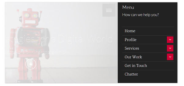
Popup menu with sliding sub-menus
This menu is a little different. When we toggle the menu it will pop-out the navigation menu which will both fade in and scale up (appearing to pop out from the center of the screen). Another interesting addition is that sub-menu items can be accessed by clicking on an sub-toggle. This click will slide the sub-menu over the menu giving you access to these new links.
Here is a live example:
This menu can display sub-menus inside a mobile menu (without the need to scroll up and down through a complex list).
The nav-menu element has an overflow:hidden applied and initially has its opacity set to 0 along with a scale3d to 0.5.
When activated, the nav-menu-toggle will toggle the state of the nav-menu. If the menu is opened, it will apply another transformation with scale3d to set its scale to 1, along with its opacity to 1 (which will make the menu appear from the center and pop out).
Each of the menu items inside may have sub-menu elements. Any menu elements that have children will have a toggle floated to the right of the element (These give access to the next menu).
The sub-menu elements are positioned absolutely and placed on position left 100% and top 0%. This forces any sub-menu to be offset to the right of its parent.
When a sub-menu-toggle is activated it will toggle the state of its sibling sub-menu. This menu (now active) will apply a translated transformation to slide the item over the menu, covering the old menu.
Inside each sub-menu there is a close item that will toggle the state of the sub-menu (sliding the element to the right, away from the menu).
The menu and all its sub-children can be navigated in one easy to use list. The menu supports overflowing so that if viewed on a tiny device the menu will scroll up and down.
The background element called nav-menu-background toggles on when the menu is opened. This gives the user a way to close the menu quickly (it removes the active state of the menu)
In Conclusion
The overall idea is that you can combine both CSS and jQuery to create great interactive interfaces for a mobile audience that not only look good, but are lightning fast! After going through the examples you should have a good understanding of how to use transformations or transitions to create fast, responsive menus. You can copy one of the examples and expand upon it or even experiment with your own ideas.
What would you make first? Let us know if you have any questions or comments.
 Simon Codrington
Full stack developer and overall web enthusiast. I love everything to do with web / design and my passion revolves around creating awesome websites. Focusing primarily on WordPress, I create themes, plugins and bespoke solutions.