Create Type Within A Shape In Photoshop
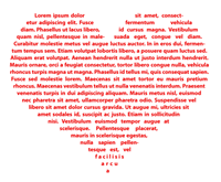 Adobe Illustrator and InDesign are both well known for their excellent capabilities when working with type. Photoshop is not at the same level when dealing with large amounts of text but you can create some nice and unsusual type designs by using shapes as text boxes.
You can create shapes in a number of ways.
Use the Pen Tool
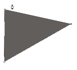
1. Select the Pen Tool (P) from the toolbar and set the options to “Create Shape Layer.” It’s the first icon on the left. You could also choose the second icon “Create Work Path.”
![]()
2. Draw out any kind of shape with the pen. It doesn’t matter what color the foreground is set to as we’ll be hiding it in a moment.
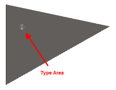
3. Select the Type Tool (T) and bring the cursor over the shape you’ve just drawn. The cursor changes to the Type Area cursor.
4. Click once and start to type. As you type, the text will fill the shape you’ve drawn.
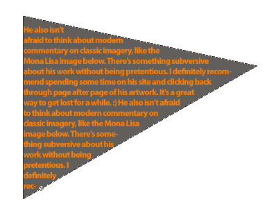
5. To remove the background color of the shape you’ve drawn, simply hide the shape layer in the Layers palette.
Use The Shape Tool
For more elaborate shapes, or shapes that are a bit harder to draw with the pen, you can use the Custom Shape Tool (U). Photoshop comes with lots of shapes installed and you can download tons more.
- Select the Custom Shape Tool (U) and in the tool options bar, click on the Shapes drop down menu.
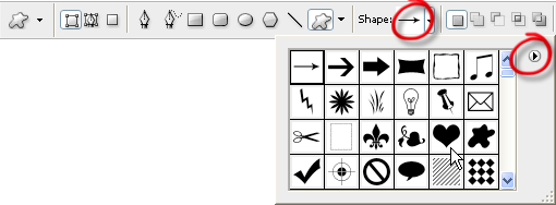
For this example I’m going to choose the heart shape. You can find more shapes by clicking on the flyout menu at the top right corner and choosing Load Shapes. - Drag out the shape. Hold down Shift to constrain the proportions.

- Select the Type Tool (T), click once and start typing. Your text will stay inside the shape you’ve drawn.
- When you add enough text to fill the shape, you can get better results by making some changes to the paragraph justification. Open the Paragraph palette and choose Center Justify.
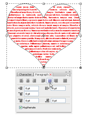
- To finish up, click on any other layer to hide the edge of the shape. Your final image should look something like this:
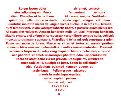
This is a very useful technique in graphic and print work but I think it could be used equally as well on a web site. Is this a technique you’ve used before in Photoshop?
If you enjoyed reading this post, you’ll love Learnable; the place to learn fresh skills and techniques from the masters. Members get instant access to all of SitePoint’s ebooks and interactive online courses, like Foundations of Photoshop.
Comments on this article are closed. Have a question about Photoshop? Why not ask it on our forums?
Frequently Asked Questions on Creating Type within a Shape in Photoshop
How can I add text to a shape in Photoshop without distorting the text?
To add text to a shape in Photoshop without distorting it, you need to use the ‘Type’ tool. First, create your shape using the ‘Shape’ tool. Then, select the ‘Type’ tool and click inside the shape. You can now start typing your text. The text will automatically wrap within the shape, maintaining its original form without any distortion.
Can I change the shape of my text after typing it in Photoshop?
Yes, you can change the shape of your text after typing it in Photoshop. To do this, you need to convert your text layer into a shape layer. Once you’ve done this, you can use the ‘Direct Selection’ tool to manipulate the anchor points of the shape, effectively changing the shape of your text.
How can I fill a shape with text in Photoshop?
To fill a shape with text in Photoshop, you need to create a shape using the ‘Shape’ tool and then add your text using the ‘Type’ tool. Once you’ve added your text, you can adjust its size and position to fill the shape. If your text is too small to fill the shape, you can duplicate the text layer until the shape is filled.
Can I put text on a path or around a shape in Photoshop?
Yes, you can put text on a path or around a shape in Photoshop. To do this, you need to create a path using the ‘Pen’ tool and then select the ‘Type’ tool. When you hover over the path, the cursor will change to indicate that you can type along the path. You can then start typing your text, which will follow the path you’ve created.
How can I edit the text inside a shape in Photoshop?
To edit the text inside a shape in Photoshop, you need to select the ‘Type’ tool and then click inside the shape. This will make the text editable, allowing you to change the font, size, color, and other attributes of the text.
Can I add multiple lines of text to a shape in Photoshop?
Yes, you can add multiple lines of text to a shape in Photoshop. To do this, you need to use the ‘Type’ tool to add your text. Once you’ve added your text, you can press ‘Enter’ to create a new line of text within the shape.
How can I adjust the position of text within a shape in Photoshop?
To adjust the position of text within a shape in Photoshop, you need to use the ‘Move’ tool. With the ‘Move’ tool selected, you can click and drag the text to reposition it within the shape.
Can I add text to a custom shape in Photoshop?
Yes, you can add text to a custom shape in Photoshop. To do this, you need to create your custom shape using the ‘Pen’ tool or the ‘Custom Shape’ tool. Once you’ve created your shape, you can use the ‘Type’ tool to add your text.
How can I change the color of the text inside a shape in Photoshop?
To change the color of the text inside a shape in Photoshop, you need to select the ‘Type’ tool and then click inside the shape. This will make the text editable, allowing you to change its color using the ‘Color Picker’ tool.
Can I add a gradient to the text inside a shape in Photoshop?
Yes, you can add a gradient to the text inside a shape in Photoshop. To do this, you need to create a gradient using the ‘Gradient’ tool and then apply it to your text using the ‘Blending Options’ in the ‘Layer Style’ dialog box.
Jennifer Farley is a designer, illustrator and design instructor based in Ireland. She writes about design and illustration on her blog at Laughing Lion Design.
