 Subpixel rendering is a method used to increase the apparent resolution of LCD displays. Each pixel on an LCD screen is made up of individual red, green and blue subpixels. Subpixel rendering allows for improved character shapes and spacing and almost completely eliminates the “jaggies” seen in bitmapped images. Why do I mention this?
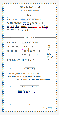
Well, over on Typophile, there’s an interesting blog post by Miha showcasing a new miniscule font he has created. It’s called The Bee’s Knees, has an x-height of 3 pixels and was designed with favicons in mind. Below you can see the font at actual size, it’s not scaled down.

If you look very closely at these tiny fonts you can see color variations. Below you can see the font enlarged by 1600% and can see the colours of each pixel.

The amazing thing about this font is that it is actually legible at 3 pixels high.
Another Tiny Font
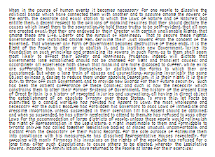
In the midst of the discussion on the Typophile blog post (and there are some very long and convoluted discussions going on there), it emerged that there was another subpixel font already on the scene. It was designed by Ken Perlin and you can see it at actual size below. That’s the first five hundred words of the American Declaration of Independence in that little box.

Why did he make this font?
“My goal was to have something that is clearly readable, yet can fit an entire page of text onto a QVGA (320×240) screen (eg: an Apple IPod or T-Mobile SideKick). In contrast, I’ve noticed that Microsoft’s smallest screen fonts are unreadable, whereas their smallest readable screen fonts are way bigger than necessary. “
At the time of writing, neither font is available for download but I think they’re interesting to look at and I imagine that Miha will eventually make his tiny three pixel high font available when he’s finished experimenting.
What do you think of these fonts? When they become available for download should they come with a free pair of jam-jar glasses? Is there a serious application for these fonts or are they simply a curiosity?
Frequently Asked Questions (FAQs) about Teeny Tiny Fonts
What are the benefits of using teeny tiny fonts?
Teeny tiny fonts, also known as small text or tiny text, offer several benefits. They can be used to create unique and eye-catching designs, especially in digital media where space is often limited. They can also be used to add footnotes, disclaimers, or additional information without distracting from the main content. Additionally, they can be used to create a sense of hierarchy in your text, drawing attention to the most important elements.
How can I convert my text into teeny tiny fonts?
There are several online tools available that can convert your text into teeny tiny fonts. These tools work by replacing each character in your text with a corresponding character from a set of small text characters. Simply input your text into the tool, and it will output the converted text which you can then copy and paste wherever you need it.
Are teeny tiny fonts compatible with all platforms?
While teeny tiny fonts can be used on most platforms, there may be some compatibility issues. Some platforms or devices may not support the special characters used in small text, causing the text to display incorrectly. It’s always a good idea to test your text on multiple platforms and devices to ensure it displays correctly.
Can I use teeny tiny fonts in my website’s SEO?
While you can use teeny tiny fonts in your website’s content, it’s important to note that search engines may not be able to read or index this text. This means that any keywords or important information contained in the small text may not contribute to your website’s SEO. It’s generally recommended to use standard-sized text for any content that you want to be indexed by search engines.
Are there any limitations to using teeny tiny fonts?
While teeny tiny fonts can be a fun and unique way to add flair to your text, there are some limitations to keep in mind. The small size of the text can make it difficult to read, especially for users with visual impairments. Additionally, as mentioned earlier, some platforms or devices may not support the special characters used in small text.
Can I use teeny tiny fonts in my social media posts?
Yes, you can use teeny tiny fonts in your social media posts. However, keep in mind that the small size of the text may make it difficult for some users to read. Additionally, some social media platforms may not support the special characters used in small text.
How can I make my teeny tiny fonts stand out?
There are several ways to make your teeny tiny fonts stand out. You can use them in contrast with larger text to create a sense of hierarchy, or use them to add additional information or footnotes without distracting from the main content. You can also experiment with different colors and backgrounds to make the small text more visible.
Can I use teeny tiny fonts in my email marketing campaigns?
While you can use teeny tiny fonts in your email marketing campaigns, it’s important to keep readability in mind. The small size of the text may make it difficult for some users to read, especially on mobile devices. It’s generally recommended to use larger, more legible fonts for your main content, and reserve small text for footnotes or additional information.
Are there any best practices for using teeny tiny fonts?
When using teeny tiny fonts, it’s important to prioritize readability. Avoid using small text for your main content, and reserve it for footnotes or additional information. Also, be aware that not all platforms or devices may support the special characters used in small text. Always test your text on multiple platforms and devices to ensure it displays correctly.
Can I create my own teeny tiny fonts?
While it’s possible to create your own teeny tiny fonts, it requires a good understanding of typography and character encoding. You would need to create a set of small text characters, and then create a tool or script to replace each character in your text with the corresponding small text character. If you’re not comfortable with this level of technical work, there are plenty of online tools available that can do the job for you.
Jennifer Farley is a designer, illustrator and design instructor based in Ireland. She writes about design and illustration on her blog at Laughing Lion Design.
