While it’s important for web site visitors to be able to navigate freely and unconfused through a site, sometimes it’s nice to land on a site and use a navigation system that’s a little out of the norm. It might be unusual because of the way it looks or the way it functions. Menus don’t always have to sit at the top of the page in list form and sidebars don’t always have to exist to hold links or “about me” text.
The target audience is a major factor in how wild you can go with your navigation or layout. One of the quickest ways to lose visitors is to alienate them by making it difficult to find their way around. If you’re creating a corporate site, you may want to avoid anything but standard layout and navigation. However if you’re going mega-creative and know your audience will come along for the ride, then why not experiment?
Many of the sites I’ve chosen are Flash-based but I believe it would be possible to recreate a lot of the ideas using HTML and CSS, maybe just without the smooth animation. It’s good to look and learn from something a little atypical and get new ideas.
So, for the purpose of inspiration and new design perspectives, here are ten websites that break the “traditional” navigation mold. They are creative, different and (oh no!) might make the visitor think a little bit.
This site has a hand-drawn, collage feel about it and it’s good fun to use. There are buttons to press and icons to drag as you find your way through the content.

This layout looks just like a typical woman’s glossy magazine and the headlines are links. This is a flash site but I think something very similar could be achieved using CSS.

A beautiful, tactile site. The old-style Polaroid images are links to different sections on the sites.

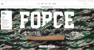
Another flash site. I’m not too sure what to say about this – it’s a bit insane really, and could be considered challenging. It’s probably best to just visit this one and see what you think.

Nice hand-drawn graphics are used to show the sections of the site literally on the back of the napkin. It’s a mixture of HTML/CSS and a few small pieces of flash on parts of the napkin.

This is very simple and easy to use. A numbered grid of rollovers provides navigation through the site. The grid stays put and the text on the right hand side changes.

Aksident uses card holding “actors” to identify the different parts of the site. When you click on a card, you’re taken to that part of the site where the information is displayed in a novel way by the actor. Good fun.

Gleis3 uses what look like an underground transport map to layout the contents of their site.

The Dollar Dreadful is designed to look like an old time newspaper. Rollovers on the center of the page link to free booklets. Links in the newspaper columns on the left and right provide information about the site as well as links to the various sections. This is very nicely put together.

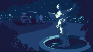
This is a beautiful site, relying heavily on flash for the smooth animation. It requires the visitor to mouse over the images to reveal the navigation.

How do you feel about sites where the navigation is a little different than “normal”? Have you seen any sites like this that have really impressed you?
 Jennifer Farley
Jennifer Farley is a designer, illustrator and design instructor based in Ireland. She writes about design and illustration on her blog at Laughing Lion Design.