
Keep up to date on current trends and technologies
Blog

How AI and APIs Are Changing Everyday Development Work
Saifullah Adenwalla
Building Reusable Component Libraries That Actually Survive Enterprise Scale
SitePoint Team

Best AI Prototyping Tools for Product Teams
SitePoint Sponsors

Removing Image Backgrounds in Web Projects: A Practical Guide
SitePoint Sponsors

How to scale e-commerce revenue with deep learning programmatic retargeting?
SitePoint Sponsors
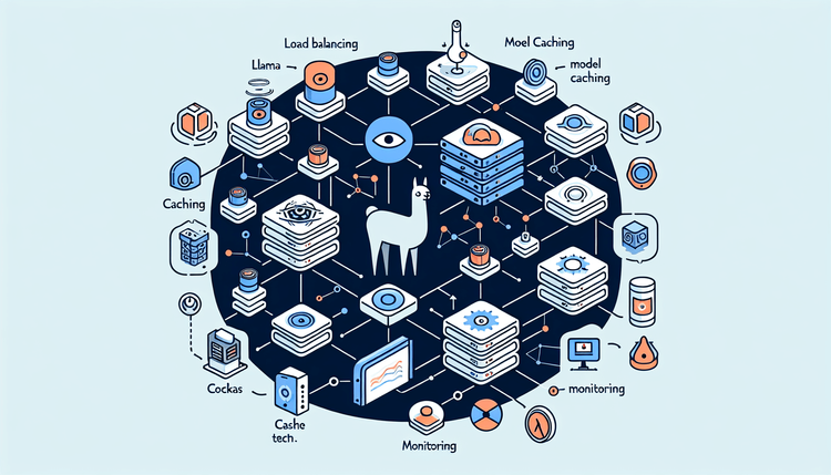
From Demo to Production: Self-Hosting LLMs with Ollama and Docker
SitePoint Team
Building a Responsible AI Review Process for Agile Development
Saifullah Adenwalla
Why AI Detection Should Not Replace Code and Content Review
Saifullah Adenwalla
How AI Can Improve Agile Development Without Replacing Human Judgments
Saifullah Adenwalla
GIF, MP4, WebM, or Animated WebP: Choosing the Right Format for Web Animation
Saifullah Adenwalla
Building Dynamic Interfaces: Integrating Generative Video APIs into Web Applications
Saifullah Adenwalla
Beyond the Model: Building Real World Machine Learning
Craig Hardy

Optimizing Arm-based Build Servers
Dave Neary
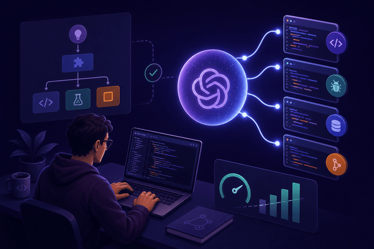
GPT-5.6 Sol: What OpenAI's New Flagship Model Means for Developer Workflows
SitePoint Team

Why business transaction monitoring matters for web app performance
SitePoint Sponsors

Configuring secure, sovereign AIOps for IT teams in regulated sectors with OpManager and Ollama
SitePoint Sponsors

Designing Human-in-the-Loop AI Systems for Commerce Operations
Anwesha Roy
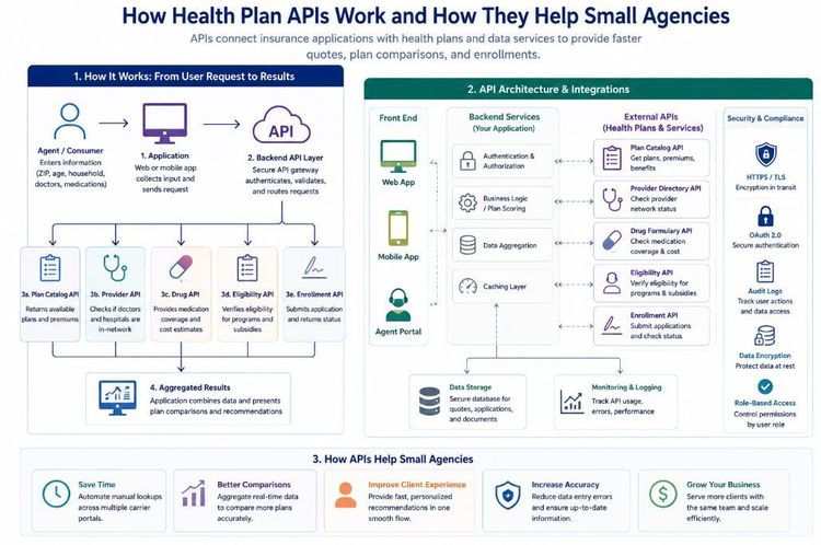
Building Smarter Insurance Applications: How Health Plan APIs Can Empower Small Agencies
Shilei Zhang
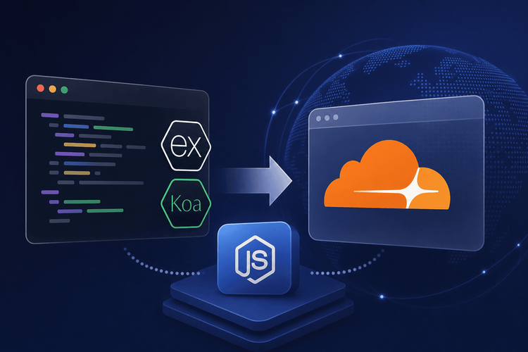
Migrating Express and Koa Apps to Cloudflare Workers: Node.js Compatibility Production Guide
SitePoint Team
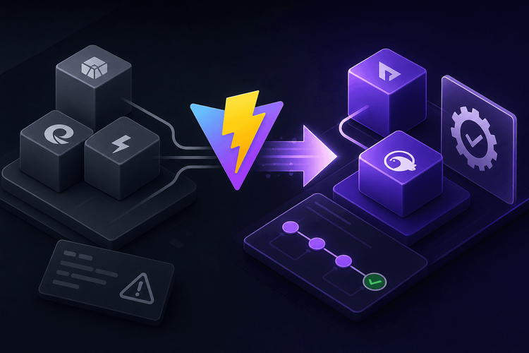
Vite 7 Production Migration: From esbuild to Rolldown and Oxc
SitePoint Team

Testing React Server Components: Vitest Patterns for Async Boundaries and Mock Strategies
SitePoint Team

CSS Container Queries and Subgrid: Building Context-Aware Component Layouts
SitePoint Team
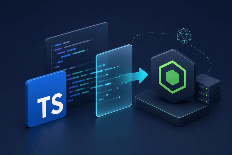
TypeScript 5.8 Production Migration: Adopting Erasable Syntax for Node.js 23+
SitePoint Team
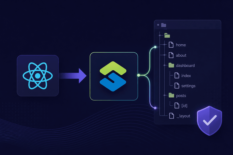
TanStack Router v1: Migrating from React Router to Type-Safe File-Based Routing
SitePoint Team
Vite 8 Migration: Moving from esbuild to Oxc in Production React Apps
SitePoint Team

Optimizing Cost per Insight in AI Data Analytics Systems
SitePoint Team

Local AI Coding vs Cloud: Performance Analysis 2026
SitePoint Team

AI Agent Testing Automation: Developer Workflows for 2026
SitePoint Team

Best Ethereum Payment Gateways 2026
NOWPayments

How AI Assistants Improve Remote Team Communication for Developers
SitePoint Team
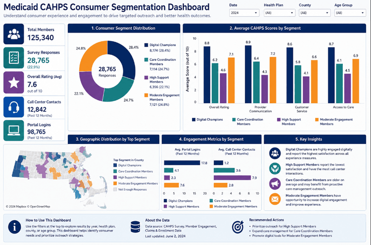
From Survey Responses to Consumer Insights: Building a Medicaid Consumer Segmentation Pipeline with Python, K-Means, and Tableau
Shilei Zhang

Claude Sonnet 5 Pricing: What the Cost Parity Misses
SitePoint Team
Showing 32 of 8478