 Natural beauty in engineering and design is often a result of refined simplicity. For those who don’t know, minimalist Web design refers to site design that has been stripped of all superfluous glitter, hammered down to its most fundamental features and the basic elements to support them.
In the words of one designer; “a balance between the way a site works and looks” is fundamental to the minimalist philosophy. Evaluating aesthetics and function in this way can be equated to building a leaf of a tree, the perfect combination of form, color and function. So then, minimalist sites mimic nature to a great degree. Let’s take a look at some superb examples from around the Web.
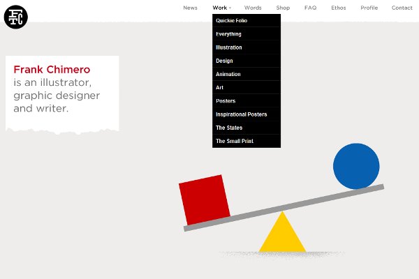
Frank Chimero is an illustrator, writer and graphic designer who teaches design and typography at Missouri State University. With clients from The New York Times to Starbucks, Frank is making a name for himself in several communities including animation graphics. His website is one of the best of its type I have seen. Utilizing a balanced white space approach, with a tiny bit of motion graphics over simple navigation, Frank has created a poster child for the type.
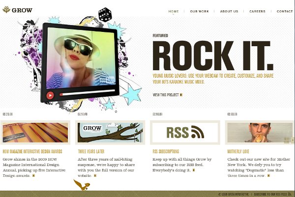
Grow is the website of Grow Interactive, a company that specializes in technology that engages everything from online ads to social networking and viral marketing. Their site is not only simple and uncluttered, but the initial flash presentation translates the Grow logo motif by literally growing out of the viewer’s screen. It is not what many would consider truly minimalist, as it is rather like a superbly simple design that mutated slightly past minimal into ornate. The image below pretty well illustrates this. The reader can just see a little animated squirrel at the bottom of the site (a cute touch), which further conveys a sense of nature and interaction without over doing it.
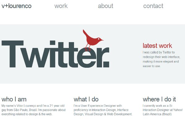
Web and interactive designer Vitor Lourenco’s site operates on the level of a single thought it is so simple. A closer look at the site, and especially Vitor’s other work, reveals a method to his minimalist madness however. Vitor is the Sr. User Experience Designer at Yahoo! Brazil, and has recently worked as the visual and interface designer for Twitter. He specializes in designs that are both interactive and aesthetically beautiful, as illustrated by his home site.
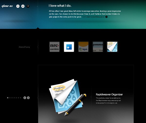
glear is the website of interactive designer Kevin Kalle. This design is engagingly beautiful, it also reflects a balance which is inherent to all great websites of any persuasion. A quote from Kalle himself expresses this idea best:
Without a proper balance of the way it works and the way it looks, you are left with a platter of gravy.
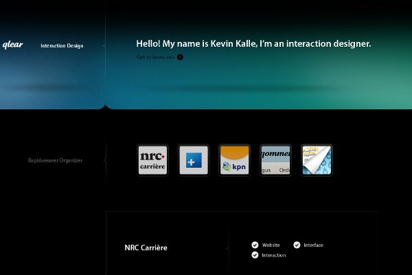
Of all the sites I visited, Kalle’s is perhaps the most striking. This is a perfect example of how function can be accentuated by form and color. The designer created a site to exactly match the philosophy of “balance”, and from text to every minute function, the site offers a unique clarity to the visitor experience. A superb design – period.
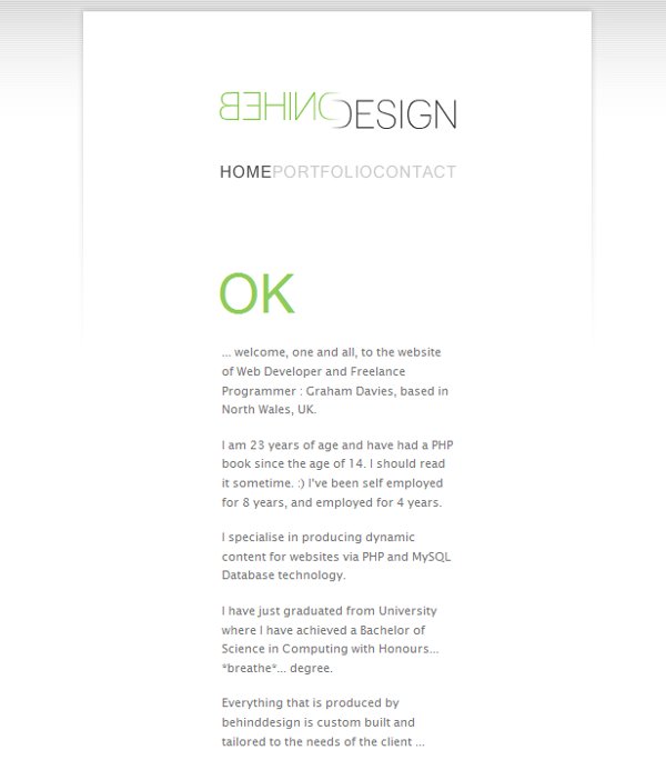
The Behind Design website is the ultimate expression of simplicity and the use of white space cleanness. Graham Davies is a freelance programmer and Web developer based in the U.K., who was something of a child prodigy, starting at age 14 reading PHP and working at age 15. The dramatic effect of washed out white space and highlighted black text is a little out of balance for my taste, but it is exemplary as another example of a type of design art.
I am no graphic design or coding wizard, but seeing the beauty of form and function in a web design can be crystal clear to anyone who frequents so many. Whether or not you are a fan of this style (most notably illustrated by Google’s ugliness), it is clear the people who adhere to the “balance” principle have a lot going for them. On an Internet full of over-engineered innovation, I think there is a lot to be learned from the best designers of this philosophy. Perhaps the lesson is; “Set goals for what you want to achieve, and do only that better than anyone else”. I hope you enjoy these sites, and that you will share some other great examples with the community.
 Phil Butler