Keep up to date on current trends and technologies
Blog

**PyTorch Stochastic Gradient Optimization Technique**
aritrabesu
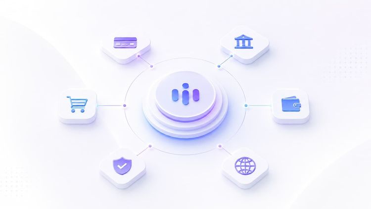
Payment orchestration Platforms for Enterprises to watch in 2026
SitePoint Sponsors

How to Authenticate AWS Workloads to Google Cloud Without Service Account Keys
Saurabh Ahuja
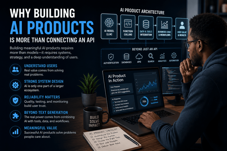
Why Building AI Products Is More Than Connecting an API
Christian chimeremeze ezenwa

Why Function Calling Is More Important Than Prompt Engineering
Christian chimeremeze ezenwa
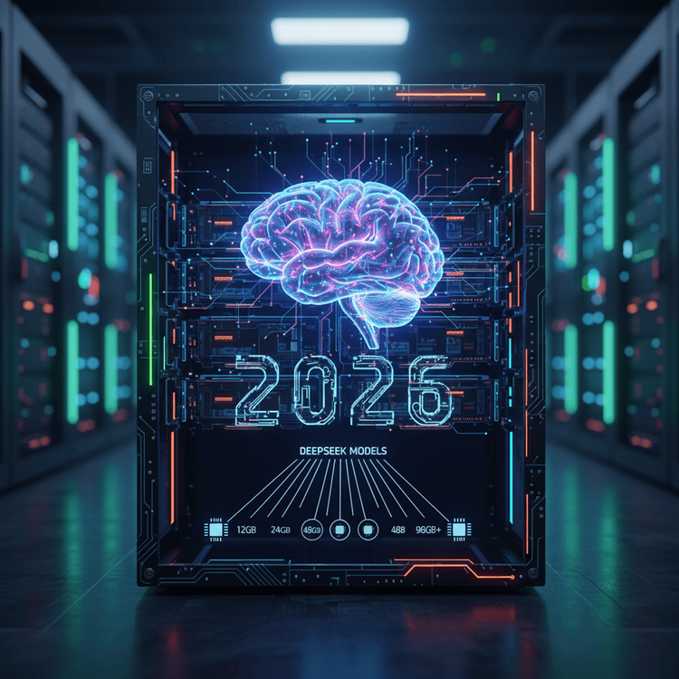
Which DeepSeek Model Fits Your Hardware? VRAM Sizing Guide for 2026
SitePoint Team
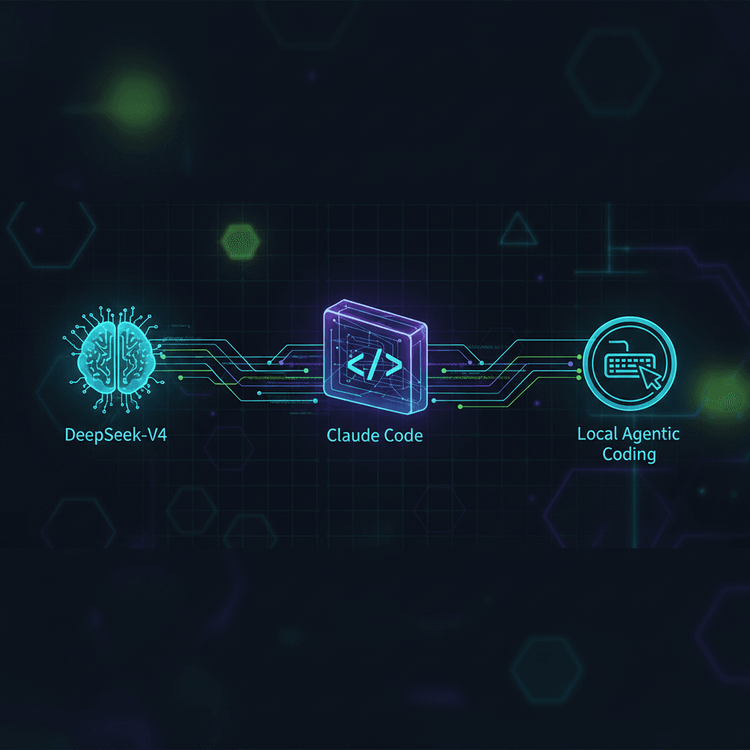
How to Route DeepSeek-V4 Through Claude Code for Local Agentic Coding
SitePoint Team
Claude Code Plan Mode: The Read-First Workflow for Complex Refactors
SitePoint Team

AI Is Not Your Accessibility Expert: What LLMs Still Miss About WCAG
ashokyadav1231
How I Architected an Automated Programmatic SEO Auditor Using Node.js and LLM Function Calling
Christian chimeremeze ezenwa
DeepSeek R2: What Developers Need to Know Before August
SitePoint Team
Automating Code Review with DeepSeek in GitHub Actions
SitePoint Team
DeepSeek API + OpenAI SDK: A Developer's Quick-Start Guide
SitePoint Team

Local LLMs Are Getting Easier: The Complete Guide (2026)
SitePoint Team
Local LLM Deployment: Ollama vs vLLM vs LM Studio Compared
SitePoint Team

Stop Building Dumb AI Wrappers: Getting Real with LLM Function Calling
SitePoint Team

Stop Guessing: Why Transparent Pricing Calculators Are the Future of Web Agencies
sharjeel

Vibe Coding 2026: The Structured Guide to AI-First Development
SitePoint Team
Build a Human-AI Collaborative Workflow with ArvoWorks and Kanban
SitePoint Team
Vitest 4 Browser Mode: Component Testing Without Playwright
SitePoint Team
OpenAI Codex CLI: Terminal-First Coding Agent Tutorial (2026)
SitePoint Team

LM Studio 0.4 Headless Deployment: Local LLM APIs Without the GUI
SitePoint Team
Everything Claude Code: Turn Your AI Coding Agent Into a Production Engineering Platform
SitePoint Team

The New Reality of Agent Memory: The Complete Guide (2026)
Matt Mickiewicz
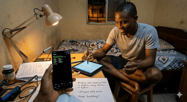
From a Shattered Screen to the Cloud: Building an AI Future with Termux in Nigeria
SitePoint Team

How to Name Your App (and Get the Best Trademark)
SitePoint Sponsors
5 Best JavaScript Beautifier Tools for Clean and Readable Code
Bansidhar Kadiya

Write for SitePoint
Zain Zaidi
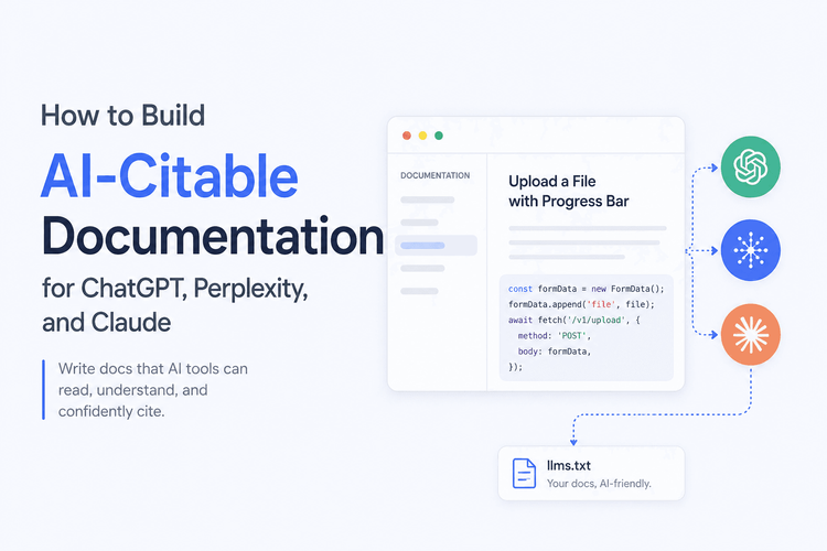
How to Build AI-Citable Documentation for ChatGPT, Perplexity, and Claude
SitePoint Sponsors
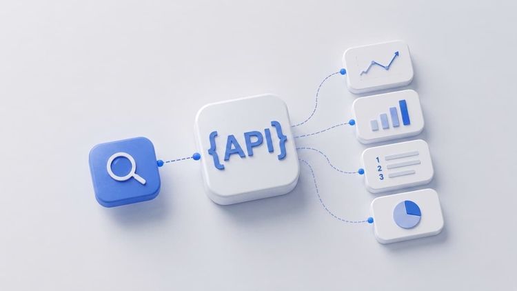
Top 10 SEO Data APIs for 2026: The Digital Expert’s Technical Guide to Programmatic Search
SitePoint Sponsors
How to track user behavior with JavaScript (without bloating your site)
andrei saioc
5 Best DataForSEO Alternatives in 2026: A Senior Expert's Breakdown
SitePoint Sponsors
Showing 32 of 8383