

The majority of articles about web development include code examples, and across the web we see great variation in how they’re formatted and presented.
But a lot of them are not very good — because the code is badly formatted, hard to read, or can’t be copied-and-pasted without unwanted junk. So in this article I’d like to take a hard look at code examples, to investigate the common problems they have, and try to establish some best practice for how they should be done.
As we go along, you’ll inevitably notice how the code examples here at SitePoint don’t come up to scratch! This is one of the things we’ll be improving in the very near future.
Key Takeaways
- Ensure code examples use good semantic markup, like combining `
` and `
` tags, to maintain readability and accessibility. - Maintain original tabulation in code examples to preserve the intended formatting, using CSS properties like `tab-size` for consistent display across browsers.
- Implement basic syntax highlighting in code examples to enhance readability, especially for beginners, using simple HTML tags like ``, ``, and ``.
- Avoid vertical scrolling in code examples; use horizontal scrolling if necessary, and ensure long lines do not wrap by setting appropriate CSS properties.
- Include line numbers in code examples but ensure they are not copied with the code by using CSS-generated content and positioning techniques.
- Make code examples editable to enhance interaction, using the `contenteditable` attribute to allow users to modify examples directly within the text area.
What Are Code Examples For?
The purpose of code examples in technical articles and documentation can be reduced to two key premises:
- to illustrate a concept or idea, or document the syntax of something
- to provide copy-and-paste code for the reader
The first premise is all about how code examples are presented — they should be easy to read, and it should be obvious that they’re code. Yet if that was all that mattered, why not just have a picture? Indeed, it sometimes seems to me like that’s exactly how many sites regard their code examples, focusing on visual appearance to the detriment of their practical use.
But code is not a picture, it’s important textual content, and that’s why the second premise is all about how code examples are implemented — it should be easy to copy-and-paste from them without loss of formatting, and without getting unwanted junk in the text. Code examples should also have good semantics, to give assistive technologies and robots the best chance of understanding them.
The Principles of Good Code Examples
Based on those premises, here’s a list of what I consider the core principles of good code examples. We’ll start with this list, then look at each item in turn, to see how it might be achieved:
- Code examples should use good semantic markup.
- Tabs in code should not be converted to spaces.
- Code should have basic syntax highlighting.
- Code examples can have horizontal scrolling, but shouldn’t have vertical scrolling.
- Code examples should have line numbers, which are not included in text selection.
I’m also going to throw in another idea, which you might not have considered before, but which actually makes a huge difference to the usability of code examples (as we’ll see):
- Code examples should be editable.
Now some of these principles might seem tricky to adhere to. It’s very common, for example, to see tabs being converted to groups of spaces, because most browsers render tabs at 8-characters wide. Equally common is wrapping each line in an <li> for the line numbers, but this of course means that the clipboard text will still include the numbers.
What many sites do to compensate for these issues is to add a separate icon in the corner of the code block, which opens a popup-window with the original code, to copy-and-paste from. But I don’t consider that an acceptable solution — frankly, it’s irritating — and opening popups is never good for accessibility or usability.
And it isn’t necessary anyway: as we’ll see, there are ways to implement all these requirements in a clean, accessible and usable way.
1. Examples should use good semantic markup
Almost every code example I’ve seen uses the same basic elements — a combination of <pre> and <code> — which is a perfect choice.
The inner <code> provides semantic meaning and is never the wrong choice for code, although there is also a <samp> element which can be used to show the output of a process (such as displaying a sample of HTTP headers returned by a request). The outer <pre> is a block-level element with native white-space-preserved formatting, so we get that formatting even when CSS is not available:
<pre><code>while(sheep != "zzz")

{

  sleep ++;

}</code></pre>
Since the <pre> preserves all white-space in its content, this will include anything between the <pre> and <code> tags, or between the <code> tags and the text, which is why they’re all run together.
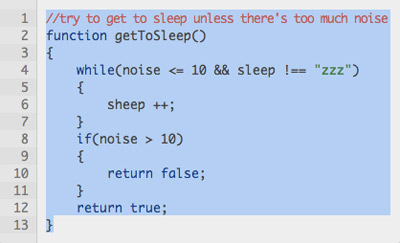
And finally, in HTML5 we can wrap a <figure> around the whole thing. The <figure> element was designed for marking-up things like diagrams, pictures and code examples, and can optionally have a caption using the <figcaption> element. We can also improve accessibility by adding some ARIA attributes — aria-labelledby on the <pre> which points to the <figcaption> (if there is one), and aria-describedby which points to the preceding text (if it describes the example).
So let’s add those too, and then we’ll have a solid and accessible structure, with excellent all-round semantics:
<p id="example1-description">

  This is the descriptive text before the code example:

</p>

<figure>

  <figcaption id="example1-caption">

    This is the caption

  </figcaption>

<pre

  aria-labelledby="example1-caption"

  aria-describedby="example1-description"><code>function getToSleep()

{

  while(noise <= 10 && sleep !== "zzz")

  {

    sheep ++;

  }

  if(noise > 10)

  {

    return false;

  }

  return true;

}</code></pre>

</figure>
Let’s see what our code example looks like so far. The demo includes a content column which is centered in the page, while the code block itself has no defined width, so it takes up the whole column. I’ve also defined some basic design and font properties, and it’s worth noting how the same core font is applied to both the <pre> and <code> elements, which is necessary to avoid browser differences (since browsers have different defaults), and then allows the overall font-size to be controlled from the <pre>:
2. Tabs in code should not be converted to spaces
When a reader copies-and-pastes from a code example, the text should have the same formatting as you would use in an ordinary editor. Nobody sensible writes code with spaces instead of tabs, so code examples shouldn’t do this either.
However a problem we find, as noted before, is that browsers render tabs which are 8-characters wide, and this is far more space than most people want. It also exacerbates the problem of having limited horizontal space (which we’ll look at later on).
But there is a neat solution with the CSS tab-size property. It’s supported in Chrome, Firefox and Opera, with the latter two using a vendor-prefix, so to get it to work we’ll need three variants:
pre

{

  -moz-tab-size:4;

  -o-tab-size:4;

  tab-size:4;

}
Some sites prefer 2-character tabs, though I think 4 is more readable, but it doesn’t make a huge difference either way. The point is that tabs should be tabs — how big they are is up to you.
Of course browsers that don’t support this property will still render the tabs at their default size; this is unfortunate, but it’s better than replacing them with spaces.
While we’re talking about white-space, I’d also say that empty lines should not be removed. We add empty lines to code for a reason — to create logical sections and to make it more readable — and the same is true for code examples.
Now let’s take a look at our demo with the addition of tab-size:
3. Code should have basic syntax highlighting
The point of syntax highlighting is to make the code easier to understand. The improvement can be significant, especially for beginners.
To implement it, we have no choice but to wrap extra elements around bits of code, and this can be done with PHP or JavaScript, or hard-coded into the examples. Personally, I think hard-coding is best (since there’s no additional processing overhead), but such questions are outside the scope of this article, so I’ll leave that decision up to you. As far as the end-result is concerned, it doesn’t make any difference
What I would like to talk about is which elements to use — and my recommendation is as follows:
- use
<i>or<em>for comments - use
<b>or<strong>for programming keywords and constants, CSS property names, and HTML tags and attribute names - use
<u>for programming strings, CSS strings, and HTML attribute values
This is ratified in CSS with several descendent combinations, so that strings override keywords, and comments overrides everything:
pre b

{

  font-weight:normal;

  color:#039;

}

pre u, pre u b

{

  text-decoration:none;

  color:#083;

}

pre i, pre i *, pre i * *

{

  letter-spacing:-0.1em;

  text-decoration:none;

  font-style:normal;

  color:#c55;

}
This choice of elements might be contentious, and it certainly is quite restrictive — using <span> with different classes has far more scope, and if that’s the solution you prefer, I can’t tell you it’s wrong. But syntax highlighting doesn’t need to be all that extensive, it only needs to be enough to improve comprehension, and the advantage of using the elements I’m suggesting is that we still get basic highlighting even without CSS.
Well actually, there’s another reason too — but I’m saving that for later!
You’ll notice from the CSS that I’ve chosen to use <b> and <i> instead of <strong> and <em>, and this choice is also debatable. You could argue, for example, that it’s right to use <em> because it’s a kind of emphasis, but equally, you could argue that it’s right to use <i> because the difference is primarily visual. Personally, I tend towards the latter point of view.
So let’s see how our demo is improved with the addition of syntax highlighting:
4. Examples can have horizontal scrolling, but shouldn’t have vertical scrolling
This is the opposite of how we treat pages as a whole, where horizontal scrolling is sorely avoided, but vertical scrolling is inevitable. And it’s precisely because we make pages this way, that code examples should do the opposite — because horizontal space is limited, but vertical space is not.
Inner scrolling regions are generally not great for usability, because they’re harder to interact with, and can’t be controlled with the keyboard unless the element itself takes the focus. So we should treat horizontal scrolling as a fallback in case of long lines.
In other words, it’s best to write example code in such a way as to avoid long lines, but if we then add overflow-x:auto we’ll be ready for cases where that’s not possible, or for when it’s viewed on a very small screen.
The only time that will fail is when printing the page, but for this case we can override scrolling and compensate with white-space:pre-wrap:
pre

{

  overflow-x:auto;

}

@media print

{

  pre

  {

    overflow-x:visible;

    white-space:pre-wrap;

  }

}
I wouldn’t recommend the use of pre-wrap generally — because wrapping lines of code can make it much more difficult to understand — but if we don’t do that for print then the longest lines will be lost entirely.
Back to our updated demo, and if you resize your window to a much smaller width, you’ll see when the horizontal scrolling kicks-in:
5. Examples should have line numbers, which are not included in clipboard data.
Almost all the code examples I’ve seen which have line numbers at all, implement them by wrapping extra markup around the individual lines — either using an <ol> element with an <li> for each line, or using <table> markup like this:
<table>

  <tbody>

    <tr>

      <td><code>1</code></td>

      <td><code>while(sleep != "zzz")</code></td>

    </tr>

    <tr>

      <td><code>2</code></td>

      <td><code>{</code></td>

    </tr>

    <tr>

      <td><code>3</code></td>

      <td><code>  sheep ++;</code></td>

    </tr>

    <tr>

      <td><code>4</code></td>

      <td><code>}</code></td>

    </tr>

  </tbody>

</table>
I think one would have great difficulty in justifying that semantically, but quite apart from that, the real problem there is that when the reader copies-and-pastes the code, its numbers are still included. Even if the numbers are implemented using CSS generated-content, some browsers will still include them in the clipboard data.
I mentioned earlier how there’s a common solution to this problem, which is to add an icon in the corner of the code block, which opens a popup-window with the original code. And I’ve already dismissed that as a tedious and unacceptable solution!
There must be a better way — and there is, in fact it’s quite straightforward. All we need to do is implement the numbers with elements outside the code. Basically this:
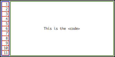
The boxes we need to create line numbers, showing how the number elements are entirely outside the code.
The tricky bit is to keep the numbers in vertical sync with the lines of code. The first thing this implies is that we definitely can’t use pre-wrap formatting, because then we wouldn’t have a fixed link between the lines of code and the numbers. But the second and most important thing is that we must make sure all the elements use an identical font and line-height.
So this implies a number of changes in how the code examples are styled. Firstly, we must use the inner code element as the primary layout block, applying the padding, overflow and tab-size that was previously on the <pre>. We must also define explicit white-space for the benefit of IE7 (which other browsers just inherit):
pre, pre code, pre samp

{

  display:block;

  margin:0;

}

pre code, pre samp

{

  white-space:pre;
  padding:10px;
  overflow-x:auto;

}
We must also extend the font reset so it applies to everything inside the <pre>, while the overall font-size is still controlled the same way:
pre, pre *

{

  font:normal normal normal 1em/1.4 monaco, courier, monospace;

}

pre

{

  font-size:0.8em;

}
These changes free-up the <pre> to act as a positioning context for the numbers container; the container is hidden by default until an extra class is applied (and I’ll explain the reason for that in just a moment):
pre.line-numbers

{

  position:relative;

}

pre.line-numbers code,

pre.line-numbers samp

{

  margin-left:3em;

}

pre div

{

  display:none;

}

pre.line-numbers > div

{

  display:block;
  position:absolute;

  top:0;

  left:0;

}
Inside that container, we’ll create a bunch of empty <span>, each of which have block display so they form a vertical stack, with width and padding which combine to create the 3em space we allowed for in the <pre> margin-left:
pre.line-numbers > div > span

{

  display:block;

  width:2.5em;

  padding:0 0.5em 0 0;
  text-align:right;

}
The numbers themselves are implemented using CSS generated content, which is preferable to normal text because they won’t be visible without CSS (whereas normal text would appear as a row of digits above the <pre>):
pre.line-numbers > div

{

  counter-reset:line;

}

pre.line-numbers > div > span

{

  counter-increment:line;

}

pre.line-numbers > div > span::before

{

  content:counter(line);

}
But it also ties in with my general belief that generated content is not really content — because line numbers are not really content either, they’re presentation. The container <div> should also have aria-hidden, so that screenreaders won’t read the numbers; some screenreaders don’t read generated content anyway, but those that do would read them all at once and out of context, like it was one big number before the code.
To generate all of this I’m going to use JavaScript — partly for ease of maintenance, but mostly because it will give us the chance to filter-out IE8 and earlier (which don’t support generated content). This is also why the extra styles are defined with a class selector — so they won’t apply unless the scripting is supported:
(function()

{

  if(typeof(window.getComputedStyle) == 'undefined')

  {

    return;

  }

  var pre = document.getElementsByTagName('pre');

  for(var len = pre.length, i = 0; i < len; i ++)

  {

    var code = pre[i].getElementsByTagName('code').item(0);

    if(!code)

    {

      code = pre[i].getElementsByTagName('samp').item(0);

      if(!code)

      {

        continue;

      }

    }

    var column = document.createElement('div');

    column.setAttribute('aria-hidden', 'true');

    for(var n = 0; n < code.innerHTML.split(/[nr]/g).length; n ++)

    {

      column.appendChild(document.createElement('span'));

    }

    pre[i].insertBefore(column, code);

    pre[i].className = 'line-numbers';

  }

})();
The end result is perfectly-aligned numbers which don’t appear in the copied text — when you select the code, that’s all you get:
Code can be selected and copied without including the line numbers.
And if any lines are long enough to trigger horizontal scrolling, the numbers won’t scroll with it — they’ll stay in the same position, keeping them visible all the time!
However you may remember from earlier how we use white-space:pre-wrap for print, and we can’t combine that with this technique because we can’t compensate for wrapping lines. There’s no simple way of detecting when a line is wrapping, so the only thing we can really do is get rid of the numbers for print:
@media print

{

  pre code

  {

    overflow-x:visible;

    white-space:pre-wrap;

  }

  pre.line-numbers div

  {

    display:none;

  }

  pre.line-numbers > code,

  pre.line-numbers > samp

  {

    margin-left:0;

  }

}
Have a look at the updated demo and see how it all works in practice:
6. Code examples should be editable
There’s no particular reason why readers would want to edit code examples (unless you were making a code editor, but that’s something else entirely).
No, the reason why editable code examples are useful is that editable regions have extra navigation and selection controls, for example:
- You can click inside the code and use Ctrl+A to select it all.
- You can use Shift+Arrow to make partial text-selections with the keyboard.
- You can navigate internally using keys like Home and End.
- It’s now possible to scroll with the keyboard (as a consequence of navigation).
Happily, this is easy to achieve, simply by adding contenteditable to the inner <code> or <samp> element. It has to be on the inner element because that’s the one with scrolling, not to mention that putting it on the <pre> would allow the user to accidentally delete everything inside it! We’ll also add tabindex to make it keyboard accessible, and disable spellcheck since it’s basically useless for code (although that won’t stop it in Firefox):
<code contenteditable="true" tabindex="0" spellcheck="false">
This won’t affect our syntax highlighting since editable regions can still contain markup. In fact … you remember how I mentioned an extra compelling reason for using <b>, <i> and <u>? Well here’s the reason — because using these elements means the reader can edit the syntax highlighting themselves with native editor keystrokes — Ctrl+B, Ctrl+I and Ctrl+U.
However browsers vary in which elements they use to implement these actions — for example, some browsers implement Ctrl+B by wrapping <strong> around the text, while others use <b>. So to get it to work cross-browser we’ll need to double-up the syntax rules (which also means the question of whether <strong> or <b> is the right semantic choice is now somewhat moot!):
pre b, pre strong

{

  font-weight:normal;

  color:#039;

}

pre u, pre u b, pre u strong

{

  text-decoration:none;

  color:#083;

}

pre i, pre em, pre i *, pre em *, pre i * *, pre em * *

{

  letter-spacing:-0.1em;

  text-decoration:none;

  font-style:normal;

  color:#c55;

}
Of course, I’ve already said that we’re not building an editor here, so there’s no real reason why it’s important to have this control. It’s not important at all, it’s just a nice touch! So if you’d rather use <span> for syntax highlighting and not have these highlighting keystrokes, don’t let me persuade you otherwise.
But the reason for using contenteditable is to provide additional selection and navigation controls — editable code examples have significantly improved usability and accessibility. Having a way to Select-All
is reason enough by itself.
So now let’s take a final look at the demo with that addition. I’ve also defined some :focus styles to provide a visual cue, adding a white background and a strong inset shadow:
Conclusion
And there we have it — six guiding principles for good code examples, which ensure they’re accessible, usable, semantically valid, easy to read, and easy to copy-and-paste from.
You can download a zipfile with all this article’s demos:
Frequently Asked Questions (FAQs) about Best Practices for Code Examples
What are the best practices for writing code examples?
Writing code examples that are easy to understand and implement is crucial. The best practices include keeping the code simple and concise, using meaningful variable names, and including comments to explain complex parts of the code. It’s also important to follow the coding standards and conventions of the programming language you’re using. Lastly, always test your code to ensure it works as expected.
How can I make my code examples more readable?
To make your code examples more readable, use proper indentation and spacing. Break down complex code into smaller, manageable functions or methods. Use comments to explain what each part of the code does. Also, use meaningful variable and function names that describe what they do.
How can I ensure my code examples are accurate?
To ensure your code examples are accurate, always test them before sharing. This will help you catch any errors or bugs. Also, have your code reviewed by a peer or a mentor to get a second opinion.
How can I make my code examples more engaging?
To make your code examples more engaging, try to relate them to real-world scenarios. This will help the reader understand the practical application of the code. Also, use a conversational tone when explaining the code to make it more relatable.
How can I make my code examples more beginner-friendly?
To make your code examples more beginner-friendly, avoid using complex programming jargon. Explain each part of the code in simple terms. Also, provide step-by-step instructions on how to implement the code.
How can I make my code examples more interactive?
To make your code examples more interactive, consider using online code editors that allow the reader to edit and run the code. Also, provide exercises or challenges that the reader can try to solve using your code examples.
How can I make my code examples more relevant?
To make your code examples more relevant, try to use examples that solve common problems or tasks in your field. Also, keep up-to-date with the latest trends and technologies in your field and incorporate them into your examples.
How can I make my code examples more comprehensive?
To make your code examples more comprehensive, provide examples for different levels of complexity. Start with simple examples and gradually move to more complex ones. Also, cover different aspects of the programming language or technology you’re teaching.
How can I make my code examples more consistent?
To make your code examples more consistent, follow a consistent coding style and convention. This includes consistent use of indentation, spacing, and naming conventions. Also, be consistent in the way you explain your code.
How can I make my code examples more accessible?
To make your code examples more accessible, provide alternative text descriptions for any images or diagrams used in your examples. Also, use a font size and color scheme that is easy to read. If you’re using videos to explain your code, provide captions or transcripts.

