Image replacement is arguably one of the most important CSS-based techniques available to a web designer. While some people view image replacement as merely a way to use fonts absent from the client computer, I believe that’s simply untrue. Image replacement has a place on nearly every web site – it can be useful in displaying a variety of page elements: company logos, attractive navigation bars, and fancy paragraph headings. Most importantly though, is its use for the “call to action” buttons; these must stand out in order to attract a visitor’s attention for performing important tasks (like signing up, downloading, or making a purchase).
Why Image Replacement is So Important
If you already understand the fundamentals of image replacement, you can safely skip this section. Otherwise, let’s talk about it for a moment.
Styling text with CSS alone is basically limited to the selection of a few typefaces and flat-shaded coloring. Displaying effects like reflections, shadows, and perspective transformations to all users is a task that’s simply impossible given the level of support by web browsers in current use. The only reliable alternative for web designers is to display an image that contains these effects (created in a graphics program like Photoshop). And the most basic technique for displaying this image – a technique that was common even before CSS gained widespread use – is to embed that image in a page using an <img/> tag.
However, using the img element to display what’s essentially textual information introduces a lot of complications. For one, when images are turned off, the page sometimes degrades insufficiently, especially in Internet Explorer. Secondly, because the actual text is separate to the markup, screen readers and search engines may be unable to read that text properly. Finally, depending on how the image was created, updating the text in the image can be inconvenient.
One solution is to use image replacement, the practice of placing text inside an HTML element, then using CSS to replace that text with an upgraded version – the image. Unfortunately, because there are many different approaches (see Dave Shea’s excellent summary for a comprehensive list), each method to accomplish this can produce new complications of their own.
Web designers need an image replacement method that works without compromise – one that supports printing, degrades gracefully when images have been turned off in the client browser, imposes only necessary markup, and is simple enough to be used by anyone.
The Problem with Other Methods
Most other image replacement techniques (Fahrner, Phark, Gilder/Levin, Leahy/Langridge) use the same CSS when images are on and off. I’ve come to the conclusion that it’s important to make use of different CSS when images are on and off, otherwise the result suffers from one or more of the following side effects:
- The technique breaks easily – for example, when images are disabled or if the replaced image has transparent regions.
- It’s too complex to be implemented rapidly and reliably.
- The technique uses JavaScript to traverse the DOM tree, which causes an undesirable flicker while the page loads (and is brittle for a variety of other reasons).
- The technique may be incompatible with some browsers.
The @media block lets us scope CSS to different media types, but we’re without a useable construct to show different CSS when images are on or off. I’m unsure how the W3C missed this, but they did, even in the latest CSS3 media queries module. The ability to use declarations like the following would be ideal:
h1 { ... } /* This rule would theoretically only be displayed when images are on */

@media images-on {

    h1 { .. }

   }
I believe that this shortcoming is the reason why all of the techniques proposed to date have been weak at best. The good news: it’s possible to fake this syntax with a little ingenuity.
A New Image Replacement Method
I’m proposing a new way to do image replacement. I’ve named my technique State Scope image replacement, because the technique uses JavaScript to set an “images are on” state across the entire page.
State Scope image replacement requires JavaScript, but implementing it is easy. Include a small script (available for download here) into the <head> element of your document.
Once this script is in place, appending .images-on before any CSS rule on your web site will cause that rule to be applied only when images are enabled in the client browser. Here’s an example where State Scope image replacement is used on an h1 element:
h1 {

  width: 100px;

  height: 50px;

}


@media screen {

  .images-on h1 {

    text-indent: -10000px;

    background-image: url(image.png);

    overflow: hidden;

  }

}
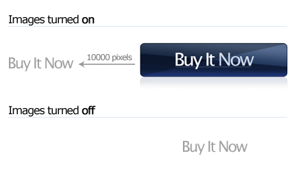
There are two rules being used in the styles above. The first one is always applied, and the second is applied only when images are enabled. When images are on, the text inside the h1 is pushed far off the left edge of the screen, thanks to the text-indent rule, and a background image is applied (see the diagram above). The overflow: hidden property is a fix to prevent the focus rectangle from extending far off the left edge of the screen in Firefox, if an anchor is used instead of a heading.
You’ll notice that the second rule is wrapped in an @media screen block. This is to ensure that image replacement happens only on the screen, rather than in print. Because browsers’ background images are excluded by default when printed, this is important. If it’s left out and the page is printed, most people will receive a big blank gap instead of meaningful information.
As you can see, this technique is very quick to implement, and markup changes are unnecessary to the body of your document. And because the text is pushed clearly off the left edge of the page, your images can consist of transparent regions without the chance of the text peeking through from behind the image. The script that makes this happen is very short, executes instantaneously (from the user’s perspective), and makes use of browser features that have been around before the turn of the century.
That’s all you really need to know to start running with rock-solid image replacement. However, if you’re the type that likes to peek under the hood, read on.
First, a Little Background …
Before we go much further, I need to discuss a slightly off-topic issue here: object oriented design patterns. Design patterns are a fundamental concept in software development. For those who are unfamiliar with them: they’re solutions to common software architecture problems that have been used for decades. You may have heard of some of the more famous patterns, such as Model-view-controller, Singleton, and the Factory method pattern. In general, software architects who understand and use design patterns can write code more efficiently, because they’re able to apply pre-solved solutions to the problems they face.
There are similar design patterns that exist in the field of web technology. One such pattern we’ve found is known as a state scope. A state scope, in the context of a web document, is a mechanism used to quickly enable a set of CSS rules based on a given state; it does this while still keeping all the CSS for the site logically grouped together, while avoiding the dreadful process of scanning and manipulating the DOM tree. There are two reasons to use a state scope:
- to reformat parts of the page in response to a user action, and
- to apply additional formatting based on the client’s browser, device, or some other condition.
State Scope image replacement works by using the following script to append a CSS class name to the html element of a document:
    document.enableStateScope = function(scope, on)

    {

      var de = document.documentElement;

      if (on)

      de.className += " " + scope;

      else

      de.className = de.className.replace(

        new RegExp("\b" + scope + "\b"), "");

    };
With that function defined, scopes can be toggled on and off with a single call:
if (condition == true) document.enableStateScope("myScope", true);Finally, in the style sheet, that scope name can be prepended to the selector of any rule that should only be applied if the state scope is on. The following style rule would cause all anchors on the page to turn from red to blue when the above condition evaluates to true:
a { color: red; } .myScope a { color: blue; }As you might suspect, State Scope image replacement works by checking whether images are enabled, and if so, activating an “images on” state scope. This is a fairly straightforward process so let’s take a look at how this is done.
Checking Whether Images Are Enabled
In our script, we’re going to test for the presence of an image. I wanted to avoid testing this on an image on the server, which would incur an additional HTTP request. However, it seems that avoiding this overhead required a little creativity.
In most browsers, an Image object can be instantiated and sourced to an invalid URL (http://0). Then, we can easily determine if images are enabled, because if they are, the onerror event will trigger. At the beginning of our script, we set up a new Image object:
var img = new Image();
However, there are two oddball browsers that complicate this approach; in Gecko-based browsers, the onerror event is always triggered regardless of whether images are enabled, so it fails to work. Fortunately, there’s a workaround. By attaching an invalid background image to the document’s HTML element, and then reading back its style with the getComputedStyle method, the background-image CSS property will read none or url(invalid-url:) if images are disabled:
  if (img.style.MozBinding != null)

  {

    img.style.backgroundImage = "url(" + document.location.protocol + "//0)";

    var bg = window.getComputedStyle(img, '').backgroundImage;


    if (bg != "none" && bg != "url(invalid-url:)" || document.URL.substr(0, 2) == "fi")

    {

      document.enableStateScope("images-on", true);

    }

  }
The other challenging browser is Safari. If a request is made to an invalid URL, Safari reports an error in the status bar. The layout will be unaffected, but if the user has the status bar turned on, the error screams unprofessional. Again, I’ve created another workaround. If an image is sourced to a 1×1 pixel GIF encoded as a data URI, the width of that image will be zero if images are disabled. Here’s how we test for it in Safari:
  else

  {

    img.style.cssText = "-webkit-opacity:0";

    if (img.style.webkitOpacity == 0)

    {

      img.onload = function()

      {

        document.enableStateScope("images-on", img.width > 0);

      }

      img.src =

        "data:image/gif;base64," +

        "R0lGODlhAQABAIAAAP///wAAACH5BAE" +

        "AAAAALAAAAAABAAEAAAICRAEAOw==";

    }

 }
Finally, for all other browsers, we can simply test for an onerror event triggered by the Image object we instantiated at the beginning:
    else

    {

      img.onerror = function(e)

      {

        document.enableStateScope("images-on", true);

      }

      img.src = "about:blank";

    }
This all works even when the user is disconnected from the Internet. A small caveat, though – in Firefox 3, images with a file:/// URL will always be loaded even if you have images turned off. In this case, it’s better to test from a web server you can access using HTTP.
State Scopes Are Switchable
As an added bonus, because state scopes can be switched on and off, it’s easy to create a system that lets you switch between text and image replacements with one click (you’ll see this working in the example file). Depending on what software you’re using to write your CSS, this can be helpful during development.
The main reason the class name is added to the html element, instead of the body element or a child of it, is that the body element needs to be fully loaded before it can be manipulated. If the images-on class name is added to any element other than the html element, an undesirable flicker occurs when enabling the state scope. Also, it’s a popular practice to place CSS class names on the body element to restrict certain CSS rules to certain pages. This practice could be hampered if the images-on CSS class was also set on the body element.
What This Means for Web Developers
For any web designer that has been wanting to use image replacement, but has decided against it because of the associated complications, this technique can make a monumental difference in the way you build web sites. For everyone else, it’s a great way to improve the robustness of your site.
When you consider your reasons for using text inside an image, image replacement should be used as often as you can – whether that’s a company logo, a fancy title, or an “Add to Cart” button. There really only is one appropriate place for the image tag: when you are truly describing an image! Semantically, images are photographs and drawings, rather than pictures of text generated in Photoshop. And when you consider techniques like CSS sprites, search engine optimization, and ease of maintenance, working with CSS background images is much more desirable than working with image elements.
In my opinion, image replacement is the most critical part of CSS construction – which is why I’ve spent so much time trying to find a better way to implement it. I hope this information can help you build a better web site.
(Photo credit: JR3)
Frequently Asked Questions about CSS Image Replacement
What is the purpose of CSS Image Replacement?
CSS Image Replacement (CSS IR) is a technique used in web design to replace text elements with images without affecting the way the website is indexed by search engines. This technique is often used to maintain the aesthetic appeal of a website while ensuring that it remains accessible and SEO-friendly. For instance, a designer might want to use a stylized logo as a heading instead of plain text. Using CSS IR, they can display the logo while keeping the text for screen readers and search engines.
How does CSS Image Replacement work?
CSS Image Replacement works by using CSS to hide the text and display an image in its place. The text is moved out of the visible area of the browser window, but it remains in the HTML code. This means that it can still be read by search engines and screen readers, ensuring that the website remains accessible and SEO-friendly.
What are some common techniques for CSS Image Replacement?
There are several techniques for CSS Image Replacement, each with its own advantages and disadvantages. Some of the most common techniques include the Phark method, the Leahy/Langridge method, and the Scott Kellum method. These techniques use different CSS properties to hide the text and display the image, such as text-indent, overflow, and background.
Are there any drawbacks to using CSS Image Replacement?
While CSS Image Replacement is a powerful tool for web designers, it does have some potential drawbacks. One of the main concerns is accessibility. If not implemented correctly, it can make the website less accessible to users with visual impairments who rely on screen readers. It’s also important to note that some search engines may penalize websites that use this technique, as it can be seen as an attempt to manipulate search rankings.
How can I ensure that my use of CSS Image Replacement is accessible and SEO-friendly?
To ensure that your use of CSS Image Replacement is accessible and SEO-friendly, it’s important to use it sparingly and only when necessary. Always provide alternative text for images, and make sure that the text you’re replacing is still accessible to screen readers and search engines. It’s also a good idea to test your website with different devices and browsers to ensure that it remains accessible and functional.
Can CSS Image Replacement be used with responsive design?
Yes, CSS Image Replacement can be used with responsive design. However, it’s important to ensure that the images you’re using scale properly on different devices. You may need to use different techniques or additional CSS rules for different screen sizes.
Is CSS Image Replacement still relevant with the advent of web fonts and SVG?
While web fonts and SVG have provided more options for web designers, CSS Image Replacement still has its place. It can be particularly useful when you need to use a specific image as a logo or heading, or when you want to ensure that your website remains accessible and SEO-friendly.
Can CSS Image Replacement affect website performance?
If used correctly, CSS Image Replacement should not have a significant impact on website performance. However, it’s important to optimize your images to ensure that they load quickly and don’t slow down your website.
What are some alternatives to CSS Image Replacement?
Some alternatives to CSS Image Replacement include using web fonts, SVG, or CSS3 properties such as text-shadow and border-image. These techniques can provide similar effects without the need to hide text and display an image.
Where can I learn more about CSS Image Replacement?
There are many resources available online to learn more about CSS Image Replacement. Websites like SitePoint, CSS-Tricks, and A List Apart offer in-depth articles and tutorials on the subject. You can also find many examples and demos on code sharing platforms like CodePen and GitHub.
 Paul Young
Paul Young has been working with technology since the IBM 8088. He is the co-founder of Skybound Software, the company behind Stylizer, a ground-breaking, productivity-focused visual CSS editor.