By now, you should be fairly comfortable with the object-oriented approach used by the .NET Framework to create ASPX pages. If not, see Sample Chapter 1, “Getting Started with ASP.NET”. You gained some experience (in Chapter 3) of using ASP.NET server controls (also known as web controls). This chapter will continue the discussion of ASP.NET server controls and provide numerous details and samples illustrating their usage. HTML server controls and User controls are not covered in this chapter. Throughout this chapter, the phrase “ASP.NET server controls” will refer to that specific group of controls derived from the System.Web.UI.WebControls base class, which includes, for example, <asp:button>, <asp:textbox>, <asp:listbox>, and <asp:datagrid>.
ASP.NET server controls are reusable components that can perform the same work as traditional HTML controls, but have the additional benefit of being “programmable objects”. In other words, they can be programmatically accessed, just like any other .NET object or class, respond to events, get/set properties, and do all the other things objects do. ASP.NET server controls use a tag-like syntax for declaring the various controls used on a web page — for example:
<asp:button id="SampleButton" runat="server" text="I'm A Sample Button!"/>One of the unique qualities of ASP.NET server controls is that, even though their tag syntax is different from HTML’s, every ASP.NET server control is rendered to standard HTML after being processed on the server, thus abstracting the functionality of the entire HTML control set. Additional ASP.NET server controls, provide the ability to render rich web content — for example, a Calendar control for displaying dates, a DataGrid control for displaying data, as well as other controls, which we will explore throughout this chapter.
Here’s a summary of the topics we will cover in this chapter:
- A review of the syntax and benefits of ASP.NET server controls
- A brief recap of the System.Web.UI.Page lifecycle
- Using a variety of ASP.NET server controls on a web form.
- Using validation controls — you’ll learn some techniques for validating user input in a web form
- Introducing data rendering controls — a brief introduction to this very powerful group of controls for displaying data
- Presenting a complete application that allows you to incorporate your own schedule of events within the context of an ASP.NET calendar control
In the past, the way we would create a web page might vary, but it would almost always involve the embedding of various HTML tags in our pages — perhaps some client-side scripting to handle event processing, or validate form input, and some text to make up the overall content of the page. Additionally, the advanced developer would often be required to write pages in a manner that supported a variety of browser types and capabilities, thus mixing in special-case code, and even client-side validation, which added an additional layer of development complexity that was often difficult to maintain.
In this chapter, we’re going explore ASP.NET server controls in detail — specifically, what they are, how to create them, and how to programmatically manipulate them within ASP.NET web forms (ASPX files). We will explore the various types of ASP.NET server controls, which can be broken down into four broad categories:
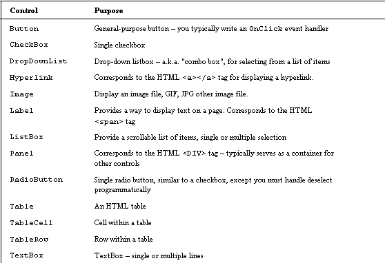
- Intrinsic controls — these controls correspond to their HTML counterparts, or simulate one if none exists. Examples include the Button, ListBox, and TextBox controls.
- Data-centric controls — controls used for binding and displaying data from a data source, such as the DataGrid control.
- Rich controls — these controls have no direct HTML counterparts. Rich controls, like the Calendar control, are made up of multiple components, and the HTML generated will typically consist of numerous HTML tags (as well as client-side script), to render the control in the browser.
- Validation controls — like, for example, the RequiredFieldValidator, which can be used to ensure proper data input within a web form.
By the end of this chapter, you will be able to create your own web forms that utilize a variety of the ASP.NET server controls available. You will be exposed to the variety of ASP.NET control properties available to you as a web developer, which can be used to tailor the look or functionality of the various controls. You will also learn to write event handlers for the various events raised by ASP.NET server controls.
Other Types Of Controls
The thrust of this chapter is primarily to describe and demonstrate the various aspects of ASP.NET server controls. There are, however, two additional types of controls that you should be aware of:
- HTML Server Controls
- User Controls
HTML Server Controls
HTML server controls correspond directly to various HTML tags, and are defined within the System.Web.UI.HtmlControls namespace. These controls derive their functionality from the System.Web.UI.HtmlControls.HtmlControl base class. Microsoft provides this suite of HTML server controls for a couple of reasons:
- Some web developers may prefer to work with the HTML-style of control that they’re used to
- Developers can convert existing HTML tags to HTML server controls fairly easily, and thus gain some server-side programmatic access to the control
The following HTML tag declaration is, believe it or not, a fully qualified HTML server control that can be accessed programmatically on the server within your web form’s code:
<INPUT id="MyHTMLTextBox" type="text" name="MyHTMLTextBox"

runat="server">
What makes this a programmable HTML server control? Simply the reference to runat="server. In this example, using runat=”server” ensures that the .NET Framework will convert the HTML tag into a corresponding HtmlInputText object (there is an HTML server control object for every corresponding HTML tag). We also add id="MyHTMLTextBox", to provide a unique name of the object so that we can reference it in our server-side code. Like ASP.NET server controls, HTML server controls offer a variety of features, which include:
- Programmatic Object Model — you can access HTML server controls programmatically on the server using all the familiar object oriented techniques. Each HTML server control is an object and, as such, you can access its various properties and get/set them programmatically.
- Event Processing — HTML server controls provide a mechanism to write event handlers in much the same way you would for a client-based form. The only difference is that the event is handled in the server code.
- Automatic Value Caching — when form data is posted to the server, the values that the user entered into the HTML server controls are automatically maintained when the page is sent back to the browser.
- Data Binding — it’s possible to bind data to one or more properties of an HTML server control.
- Custom Attributes — You can add any attributes you need to an HTML server control. The .NET Framework will render them to the client browser without any changes. This enables you to add browser-specific attributes to your controls.
- Validation — you can actually assign an ASP.NET validation control to do the work of validating an HTML server control. Validation controls are covered in detail later in this chapter.
One reason you might consider using HTML server controls in your own web form pages, is to leverage an existing HTML page’s HTML tag or code base. For example, let’s say you have an existing HMTL page that you would rather not re-write from scratch, but still would like to write some server-side code to access various properties of the various controls on the page. Converting an existing HTML page’s controls to HTML server controls is simple: you just add the runat="server" attribute within the tag declaration of the HTML control. You might also need to add an id="MyControl" reference, where “MyControl” is your unique naming identifier for this object so that you can reference the object in your server-side code.
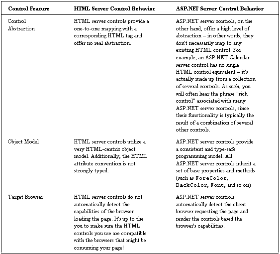
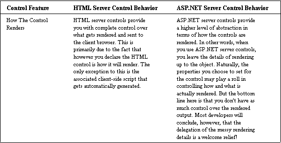
HTML Server Controls vs. ASP.NET Server Controls
Given that Microsoft has provided two distinct categories of server controls (HTML and ASP.NET server controls), with both sets of controls sharing some degree of overlapping functionality, you may be a bit confused as to which set of controls you should use within your web forms. The short answer is simply this: you can use both! It’s perfectly okay to mix the usage of HTML server controls and ASP.NET server controls within your web forms — using one set of controls does not restrict you to that control type. Depending on your preferences and web page requirements, there may, however, be reasons to choose one set over the other. Despite the overlap in functionality, there are some clear distinctions between these controls that you should be aware of when developing your ASP.NET web form pages (we’ll be covering the ASP.NET behaviors listed below throughout this chapter):
User Controls
User controls, as you might guess, are controls that you write yourself. You create these controls with any text editor, or with the assistance of an IDE like Visual Studio.NET. A user control can consist of text, HTML tags, HTML server controls, and ASP.NET server controls, along with any additional server-side code to handle events and perform server-side processing. The purpose of a user control is to provide the ability to reuse common user interface functionality across your ASP.NET web applications. For example, consider a typical logon page. You might have one textbox control for the logon name, another for the password, and a button control to submit the form logon data to the server. You might additionally have some validation controls to validate the user’s input, and various server- side code to perform the actual logon authentication. If this was a common set of functionality that was going to be used by several pages in your web application, you might consider creating a user control to facilitate this functionality so that you only need write it once. You can think of a user control as being very similar to an ASP.NET web form. However, unlike a web form, a user control must always be included into an existing web form in order to work. A user control cannot load independently from a web form. User controls are covered in more detail in Chapter 13.
Now let’s get into the substance of this chapter — ASP.NET Server Controls.
ASP.NET Server Controls
ASP.NET server controls serve as the building blocks for creating ASP.NET web forms. Like their HTML counterparts, ASP.NET server controls provide all the basic controls necessary for building web forms (Button, ListBox, CheckBox, TextBox, et al.), as well as a collection of rich controls (controls with several functions — we’ll look at them later on), like the Calendar and DataGrid controls. The various control families are categorized and discussed later in this section, along with many mini- examples to demonstrate syntax and other features. At this point though, you might be wondering what benefits there are, if any, to using ASP.NET server controls instead of standard HTML controls. Here’s a listing of some of the benefits ASP.NET server controls offer us:
- Rich Object Model
- Automatic Browser Detection
- Properties
- Events
Rich Object Model
ASP.NET server controls draw from the rich features of the .NET Framework. As such, each of the ASP.NET controls inherits base methods, properties and events from the System.Web.UI.WebControls base class. As you may recall from previous chapters, inheritance is a key feature of object oriented design and programming. When instantiating an ASP.NET server control, you’re really creating an instance of an object that gives you access to the properties, methods, and events of its base class.
Automatic Browser Detection
ASP.NET server controls detect client browser capabilities, and create the appropriate HTML and client-side script for the client browser. In other words, ASP.NET pages, and the controls within them, are compiled and “served up,” meaning they’re not merely static text files. For example, consider the following ASP.NET button control declaration:
<asp:Button id="SampleButton" runat="server" Text="My Button"/> When this control is processed on the server, the resultant HTML generated for both Netscape and Internet Explorer will be pretty much the same:
<input type="submit" name="SampleButton" value="My Button"

id="SampleButton" />
Depending on the type of browser and its limitations and capabilities, as well as the type of ASP.NET control being rendered, however, there may in fact be a difference in the HTML generated. In the case of a simple button control, the significance is not immediately apparent — just about any browser today will be able to render a standard button. The benefits for the developer are substantial once events, properties and validation come into play, however, as these are all factors which affect how the ASP.NET control is generated for the client browser. The bottom line here is that the HTML/script rendered for the different browsers (IE, Netscape, Opera) is all handled by the ASP.NET server control and, by and large, the developer is freed from having to worry too much about client browser capabilities and/or limitations.
Properties
All ASP.NET controls share a common set of base properties, as well as their own class-specific properties. These properties allow you to change the look and even the behavior of the control. Throughout this chapter, you will be exposed to a variety of properties for the various ASP.NET server controls. Some of the more common base class properties shared by all ASP.NET server controls include:
BackColor— the background color of the control. The possible values for all color properties can be ascertained by referencing the .NET Framework’s Color structure properties in the SDK Documentation (or by using ILDasm or the class browser sample). For example, AliceBlue, AntiqueWhite, or even a hexadecimal value like #C8C8C8.ForeColor— the foreground color of the control.BorderWidth -– the width of the border of the control, in pixels.Visible— if set to True (the default for all controls) the control will be displayed. If set to False, the control will be hidden. This property is useful for when you want to hide a particular control on the web form. For example, if you were obtaining details from a user, and in one box, they had declared their nationality as English, then you might want to hide another box that asks them for their Social Security Number.Enabled— whether on not the control is enabled. If set to False, the control will appear grayed out, and will not process or respond to events until its Enabled property is set to True.Height— the height of the control in pixels.Width— the width of the control in pixels.ToolTip— hover text displayed dynamically on mouse roll-over. Typically, used to supply additional help without taking up space on the form.Font-Size— the size of the control’s font.
The above properties are merely an abbreviated listing; many more common properties are available. To see these, have a look at the SDK Documentation. An important thing to note is that not all browsers support all the possible property settings. You needn’t worry too much about this however, because, when ASP.NET server controls are rendered, the output generated for the target browser will generally be suitable for that browser, whatever its capabilities or limitations are.
The following is an example of an ASP.NET Button server control with several of the common base class properties assigned, to give the it a rather distinctive look:
<asp:Button id="MyButton" runat="server" Text="I'm an ASP.NET

server control Button!"

  BackColor="purple"

  ForeColor="white"

  BorderWidth="4"

  BorderStyle="Ridge"

  ToolTip="Common Properties Example!"

  Font-Name="Tahoma"

  Font-Size="16"

  Font-Bold="True"

/>
When rendered and displayed in the client browser, this ASP.NET Button server control will look something like this:
The HTML generated for this control (for Internet Explorer 6.0) looks like this:
<input type="submit" name="MyButton" value="I'm an ASP.NET

server control Button!"

id="MyButton" title="Common Properties Example!"

style="color:White;background-

color:Purple;border-width:4px;border-

style:Ridge;font-family:Tahoma;font-

size:16pt;font-weight:bold;" />
Have a go yourself — to look at the HTML, just select View > Source.
Events
ASP.NET server controls support the ability to assign event handlers in order to execute programmatic logic in response to whatever events a given ASP.NET server control may raise. As we saw in Chapter 3, an event handler is essentially the code you write to respond to a particular event. For example, a Button control raises an OnClick event after being clicked; a ListBox control raises an OnSelectedIndexChanged event when its list selection changes; a TextBox control raises an OnTextChanged event whenever its text changes, and so on.
Events and event handlers are extremely useful to us as web developers, because they provide a mechanism for responding dynamically to events in our forms, in that we can write our own event handlers to perform any special logic or processing that the form or control calls for. For example, let’s say we were asked to write a page that contained a button that listed the current date and time to the latest second. For demonstration purposes, when the user clicks on the button, we would like the date and time to be displayed as the button’s new text.
Try It Out — Creating an event handler
1. The first step would be to declare the ASP.NET button control. To do this, type the following text into our code editor:
<form id=SampleEvent method=post runat="server">

  <asp:Button id="CurrentTimeButton" runat="server"

    Text="Click for current time..." OnClick="UpdateTime" />

</form>
2. Save this file as eventhandler.aspx. If you run this code in your browser right now, you’ll see the following error message:
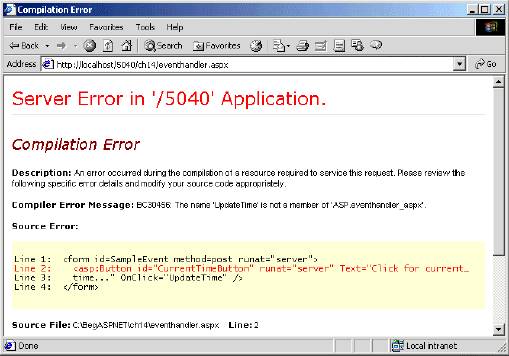
We get this error, because we have not yet defined our UpdateTime event handler. Let’s do this now.
3. Open up eventhandler.aspx, and amend the code by adding the following opening section:
<script language="VB" runat="server">

 Public Sub UpdateTime (ByVal sender As Object, ByVal e As

  system.EventArgs)

 ' Perform custom logic here -- update the button text with

 current time

 CurrentTimeButton.Text = DateTime.Now.ToShortTimeString()

 End Sub

</script>

<form id=SampleEvent method=post runat="server">

 <asp:Button id="CurrentTimeButton" runat="server"

 Text="Click for current time..." OnClick="UpdateTime" />

</form>
To find out all the properties, methods and events pertaining to the controls such as the ASP.NET Button control, take a look at the class browser.
4. Now if you run the code in your browser, you’ll see the button we created, and when you click on it, you’ll see the current time:
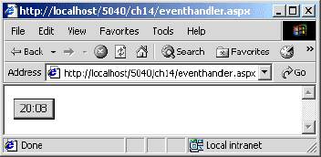
How It Works
In this example, a CurrentTimeButton server control is declared, and its corresponding Text property is set to “Click for current time…”:
<asp:Button id="CurrentTimeButton" runat="server"

 Text="Click for current time..." OnClick="UpdateTime" />
Additionally, we’ve assigned the name of our custom event handler, UpdateTime, to the OnClick event method for this button control.
The OnClick event method for the Button control is essentially a placeholder, which can be assigned the name of a method (which we write, and in this case is UpdateTime) to perform the processing when that particular event is raised. The method name we assign to the OnClick handler must conform to the required “method syntax” (same number or arguments, same types, same return value) defined by the event method.
We then defined our custom UpdateTime event handler to update the button text with the current time as follows:
Public Sub UpdateTime (ByVal sender As Object, _

     ByVal e As system.EventArgs)

  ' Perform custom logic here -- update the button text with

    current time

  CurrentTimeButton.Text = DateTime.Now.ToShortTimeString()

 End Sub
All we are doing here is firstly establishing the UpdateTime subroutine, and then assigning to the Text property of our CurrentTimeButton, the values DateTime.Now.ToShortTimeString(). This is basically saying, “when the UpdateTime sub routine is triggered, display the current time in the text property of CurrentTimeButton, which is a string data type”.
Page Lifecycle
Although this topic is covered elsewhere in this book, it’s worthwhile to review the System.Web.UI.Page object’s lifecycle, in the context of ASP.NET server controls. Specifically, we will briefly review how the ASP.NET Page class loads, processes events, and closes down. When designing a web form, you are really referencing the base functionality of the ASP.NET Page class. As such, the Page class offers its own methods, properties, and events to the form. When loading a web form for the first time, you might, for example, want to preload the Page object’s server controls with values from a database, or set property values to various server controls on the page dynamically. The following listings provide an overview of the various methods that are commonly overridden in your ASPX Page object implementation, that allow you to perform processing during the various stages of the Page object’s lifetime.
Page_Load
The Page_Load method is a virtual method (recall that a virtual method of an object is one which you can override) of the Page class, which means it can be (and often is) overridden in the Page class implementation. The Page_Load method is invoked when the ASPX page is loaded for the first time, or refreshed. The following is an example implementation of the Page_Load method:
Sub Page_Load(ByVal Sender As System.Object, ByVal e As System.EventArgs)

 If Not Page.IsPostback Then

  ' First time page loads --

  ' perform initialization here!

 End If

End Sub
The most interesting part of the above listing is the reference to the Page class’s IsPostback property. The IsPostback property is significant because this property can be used to distinguish whether or not a page is being loaded for the very first time, or if it’s being loaded as the result of what is commonly referred to as a “Postback” — in other words, if a Button server control was clicked, an OnClick event would be raised and the form data would be posted back to the server — hence the term Postback. We have seen this method several times in the past few chapters.
The most common uses for implementing the Page_Load method in your ASPX pages are to:
- check whether this is the first time the page is being processed, or to perform processing after being refreshed.
- perform data binding the first time the page is processed, or re-evaluate data binding expressions on subsequent round trips, to display the data sorted differently, for example.
- Read and update control properties.
Event Handling
The second part of a page’s lifecycle, is the event handling stage. After an ASPX page is loaded and displayed, additional event handlers will be invoked when control events are raised. For example, after a user clicks an ASP.NET Button control, the OnClick event will be raised, thus posting the event to the server. If an event handler is written and assigned to process the OnClick event for that particular control, it will be invoked whenever the Button control is clicked.
Not all controls perform this type of automatic “posting back” to the server when an event is raised. For example, the TextBox control does not, by default, post back notification to the server when its text changes. Similarly, the ListBox and CheckBox server controls do not, by default, post back event notifications to the server every time their selection state changes. For these particular controls, their AutoPostBack property (which can be set to either True or False) would need to explicitly be set to True in the control’s declaration (or set programmatically within the code) to enable automatic post back of event/state changes to the server for processing.
If you create an ASP.NET server control that performs server-side processing whenever the control’s state changes (like when a CheckBox is checked), and you don’t seem to be getting the results you expect, check if the control has an AutoPostBack property, and if so, set it to True. This property typically defaults to False if not explicitly declared when the control was defined. We’ll take a closer look at the AutoPostBack property in action in the Try It Out section that follows.
Page_Unload
Page_Unloadserves the opposite purpose of thePage_Loadmethod. ThePage_Unloadmethod is used to perform any cleanup just prior to the page being unloaded. It is a virtual method of the Page class, which can be implemented. You would want to implement thePage_Unloadmethod in cases where any of the following actions needed to be performed:
- Closing files
- Closing database connections
- Any other cleanup or discarding of server-side objects and/or resources
The following is an example implementation of the Page_Unload method:
Sub Page_Unload(ByVal Sender As System.Object, ByVal e As

System.EventArgs)

 ' Perform any cleanup here!

End Sub
One thing to note is that the unloading of a page doesn’t happen when you close the browser or move to another page. The Page_Unload event happens when the page has finished being processed by ASP.NET, and before it’s sent to the browser.
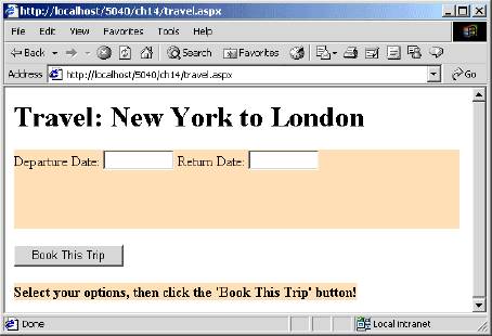
Try It Out — “Oh To Travel, Travel, Travel”
Okay, let’s get right into this, and do something neat with ASP.NET server controls. In this section, we’ll put together a single web form, travel.aspx, that allows us to book a flight from New York to London with only a couple clicks of the mouse! Okay, so it will only be a demo — we won’t actually “book” anything (sigh). We will, however, get some experience building a web form that uses a variety of ASP.NET server controls.
1. Open your code editor and add the following starter lines to layout the Framework for this ASPX page, and save it as travel.aspx:
<%@ Page Language="VB" %>

<%@ Import Namespace="System.Drawing" %>

ASP.NET Server Controls 481

   <script language="VB" runat="server">

   </script>

 <html>

 <head></head>

   <body>

     <h1>Travel: New York to London</h1>

        <form id="TravelForm"

method="post" runat="server">

        <!-- Flight Info -->

        <!-- BOOK IT BUTTON SECTION &

FEEDBACK -->

        </form>

   </body>

 </html>
We’ll be referencing the .NET Framework’s Color structure in our code, therefore we needed to add an Import directive referencing the System.Drawing namespace at the top of this page. The remainder of the code consists of the <script></script> tag sections (where we will insert our code for this page), and the two HTML tags to setup our page.
2. In this step, we’re going to add some flight date boxes to the page. We’re using the ASP.NET panel control to serve as our container for the various controls on our simulated tab. The panel control is a visual tool to display a box, within which other controls can be rendered. Add the following lines:
<!-- Flight Info -->
<asp:panel id="Panel" runat="server" Width="504px" Height="89px"
BackColor="Wheat">
Departure Date:
<asp:TextBox id="flightDepartureDateTextBox" runat="server"
Width="80px" Height="22px"/>
Return Date:
<asp:TextBox id="flightReturnDateTextBox" runat="server"
Width="80px" Height="22px"/></br>
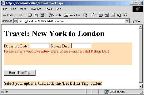
<asp:RequiredFieldValidator id="validateFlightDepartureDate"
runat="server"
ErrorMessage="Please enter a valid Departure Date. "
ControlToValidate="flightDepartureDateTextBox" />
<asp:RequiredFieldValidator id="validateFlightReturnDate"
runat="server"
ErrorMessage="Please enter a valid Return Date."
ControlToValidate="flightReturnDateTextBox" />
<asp:CustomValidator id="validateFlightDates"
runat="server"
ControlToValidate="flightDepartureDateTextBox"
OnServerValidate="ValidateTravelData" />
</asp:panel>Note here that we added three validation controls: two RequiredFieldValidator controls, and a CustomValidator control. These controls will serve to force the user to enter a value into the Departure Date and Return Date TextBox controls. The CustomValidator control will raise an OnServerValidate event, and call our ValidateTravelData method, which will perform the work of validating that the date entries make sense logically (for example, the departure date can’t be later than the return date). The RequiredFieldValidator control ensures that something is entered into the field, so the user can’t skip an entry.
3. The next control we’ll add to this form is the bookTheTripButton, which will serve to post the form data to the server, and the feedbackLabel label control will serve to provide instructions, and offer feedback in the event of an invalid data entry. Add the following lines:
<!-- BOOK IT BUTTON SECTION & FEEDBACK -->
<p>
<asp:Button id="bookTheTripButton" runat="server"
Text="Book This Trip"
OnClick="bookTheTripButton_Click" />
</p>
<p> <asp:Label id="feedbackLabel" runat="server"
BackColor="Wheat"
Font-Bold="True"
Text="Select your options, then click the 'Book This Trip' button!" />
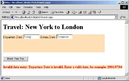
</p> 4. Recall from step 2 that we added two RequiredFieldValidator controls and the CustomValidator control. In this section, we’ll write the event handler for the OnServerValidate event, the ValidateTravelData method, to validate our dates and their logic. Add the following lines between the script tags:
<script language="VB" runat="server">

Protected Sub ValidateTravelData (source As Object, _

  args As System.Web.UI.WebControls.ServerValidateEventArgs)

 ' Since we have a bit to validate

 ' assume that the entry is invalid...

 args.IsValid = False


Dim departDate, returnDate As Date

feedbackLabel.ForeColor = Color.Red


Try

  departDate = Date.Parse (flightDepartureDateTextBox.Text)

Catch ex As Exception

  feedbackLabel.Text = "Invalid data entry: Departure Date

  is invalid. " _

    + "Enter a valid date, for example: 2001/07/04"

  Return

End Try


Try

  returnDate = Date.Parse(flightReturnDateTextBox.Text)

Catch ex As Exception

  feedbackLabel.Text = "Invalid data entry: Return Date

is invalid. " _

    + "Enter a valid date, for example: 2001/07/04"

Return

End Try


' Verify that the departure date is less than the

' return date - no same day trips in this system!

If (departDate >= returnDate) Then

  feedbackLabel.Text = "Invalid data entry: The Departure Date

must be " _

  + "earlier than the Return Date and no same-day " _

  + "returns for this travel package!"

  Return

End If


' Verify that the departure date is not in the past or today!

If (departDate < Date.Now) Then

  feedbackLabel.Text = "Invalid data

entry:  The Departure

Date cannot " _

  + "be in the past or today!"

  Return

End If


  ' Everthing is valid - set the IsValid flag...

  args.IsValid = True


End Sub

</script>
5. The final step in this travel.aspx example, is to write an event handler for the bookTheTripButton's OnClick event. Add the following lines to your <script> block, after the lines we just added:
<script language="VB" runat="server">
...
Private Sub bookTheTripButton_Click(ByVal sender As System.Object, _
ByVal e As System.EventArgs)
' Has the page been validated for all data entry?
If (Not Page.IsValid) Then
Return
End if
' We're all set - book the flight!
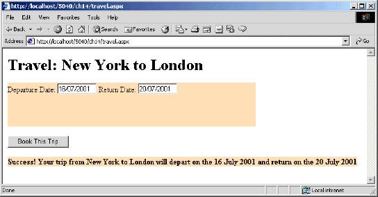
Dim departDate, returnDate As Date
departDate = Date.Parse(flightDepartureDateTextBox.Text)
returnDate = Date.Parse(flightReturnDateTextBox.Text)
feedbackLabel.ForeColor = Color.Black
feedbackLabel.Text = "Success! Your trip from New York to London " _
+ "will depart on the " _
+ departDate.ToLongDateString() _
+ " and return on the " _
+ returnDate.ToLongDateString()
End Sub
</script> If you load travel.aspx in your browser, you should see something like the following page:
In the <!-- Flight Info --> section of travel.aspx, we begin by creating the panel, in which we will contain our text boxes, and set its colour, width and height (in pixels). We then create our Departure Date, and Return Date text boxes, again specifying their size.
<asp:panel id="Panel" runat="server" Width="504px" Height="89px"

BackColor="Wheat">

Departure Date:

<asp:TextBox id="flightDepartureDateTextBox" runat="server"

  Width="80px" Height="22px"/>

Return Date:

<asp:TextBox id="flightReturnDateTextBox" runat="server"

  Width="80px" Height="22px"/></br>
Then we go on to validate the Departure Date and Return Date TextBox entries. After we established our RequiredFieldValidator controls, we added a CustomValidator control to our page — the event handler we assigned to the OnServerValidate event property was ValidateTravelData:
<asp:CustomValidator id="validateFlightDates" runat="server"

  ControlToValidate="flightDepartureDateTextBox"

  OnServerValidate="ValidateTravelData" />
This method is invoked when the form is posted back to the server. In this example, we’re concerned about the data entries in the Departure Date and Return Date TextBox controls. We already know that the user entered something — the RequiredFieldValidator controls handled that task. We still don’t know if the dates the user entered were valid however, — this will be the work of our CustomValidator method handler, ValidateTravelData. Let’s review the pertinent sections from step 4:
Protected Sub ValidateTravelData (source As Object, _

    args As System.Web.UI.WebControls.ServerValidateEventArgs)

  ' Since we have a bit to validate

  ' assume that the entry is invalid....

  args.IsValid = False

  Dim departDate, returnDate As Date

  feedbackLabel.ForeColor = Color.Red


  Try

    departDate = Date.Parse(flightDepartureDateTextBox.Text)

  Catch ex As Exception

    feedbackLabel.Text = "Invalid data entry: Departure Date is

    invalid. " _

      + "Enter a valid date, for example: 2001/07/04"

    Return

  End Try

  Try
The first thing we do, is to set the IsValid property of the args argument (a ServerValidateEventArgs object) to False:
args.IsValid = False We’re being pessimistic here, but until we validate everything, we want to be sure that nothing passes our validation test until the very end of the method. Next, we declare two variables of type Date:
Dim departDate, returnDate As Date We perform the work of getting the user’s date input within a Try ... Catch block, so we can catch exceptions:
  Try

    departDate = Date.Parse(flightDepartureDateTextBox.Text)

  Catch ex As Exception

    feedbackLabel.Text = "Invalid data entry: Departure Date is

    invalid. " _

      + "Enter a valid date, for example: 2001/07/04"

    Return

  End Try
The Date object’s static Parse method is called to pass the user’s Departure Date entry. An exception will be thrown under two conditions: a null date (no date entered), or a malformed, or incorrect date entered; one that doesn’t meet the criteria of the Date datatype. The flightReturnDateTextBox is similarly validated:
Try

  returnDate = Date.Parse(flightReturnDateTextBox.Text)

Catch ex As Exception

  feedbackLabel.Text = "Invalid data entry: Return Date is invalid. " _

      + "Enter a valid date, for example: 2001/07/04"

  Return

End Try
If an exception is thrown, we provide the user with some feedback text, via the feedbackLabel that we created in the <!-- BOOK IT BUTTON SECTION & FEEDBACK --> part of our code file. We then promptly return the execution to the program that called this subroutine, so it is ready for the user to have another go. Try entering Today as your departure date, and Tomorrow as your return date, for example, and you’ll see this:
Even after it’s confirmed that the user entered two valid dates however, there’s still some more work to do. The next validation ensures that the departure date entered is earlier than the return date:
' Verify that the departure date is less than the

' return date - no same day trips in this system!

If (departDate >= returnDate) Then

  feedbackLabel.Text = "Invalid data entry: The Departure Date must

  be " _

      + "earlier than the Return Date and no same-day " _

      + "returns for this travel package!"

  Return

End If
The code for this section is pretty straightforward, using just an if statement, which sends a feedback message if the departure date is greater then the return date. The code then returns to the state it was in before the validation control was called. Just to make things even more robust, we validate that the departure date is not in the past, using the same technique:
' Verify that the departure date is not in the past or today!

If (departDate < Date.Now) Then

  feedbackLabel.Text = "Invalid data entry: The Departure Date

  cannot " _

      + "be in the past or today!"

  Return

End If
If we were to attempt to book our trip from New York to London without entering anything into the Departure Date and Return Date boxes, the assigned RequiredFieldValidator controls would kick into action and display a message to the user:
As you may have noticed, date validation can be a bit tedious — but it’s worth the effort! The nice thing about this implementation is that we didn’t need to restrict the user to a particular date format for their data entry. Yes, we suggested a format like YYYY/mm/dd, but the user could have entered “10/31/2001” or even “October 31, 2001” — this is because we called the Date.Parse method, which did the work of parsing the user’s date entry.
Let’s have a quick look at the button function of the web form. The button itself is very simple — we just give it some text and define its OnClick event as bookTheTripButton_Click:
<p>

<asp:Button id="bookTheTripButton" runat="server" Text="Book This Trip"

    OnClick="bookTheTripButton_Click" />

</p>
When the button is clicked, it sends the form information back to the server, which then processes all the server controls we have used. If our page validates correctly (if args.IsValid = True ) our bookTheTripButton OnClick event is triggered:
Private Sub bookTheTripButton_Click(ByVal sender As System.Object, _

    ByVal e As System.EventArgs)


' Has the page been validated for all data entry?

If (Not Page.IsValid) Then

  Return

End if


' We're all set - book the flight!

Dim departDate, returnDate As Date

departDate = Date.Parse(flightDepartureDateTextBox.Text)

returnDate = Date.Parse(flightReturnDateTextBox.Text)


feedbackLabel.ForeColor = Color.Black

feedbackLabel.Text = "Success! Your trip from New York to London " _

      + "will depart on the " _

      + departDate.ToLongDateString() _

      + " and return on the " _

      + returnDate.ToLongDateString()


End Sub
In the end, when all the dates and logic are validated, our trip from New York to London will be booked with a simple click of the mouse:
Control Families
ASP.NET server controls can be grouped into four basic family types: Intrinsic, Validation, Rich, and Data Rendering controls. These control families are fairly broad and are based primarily on the function or purpose of the control.
When designing a web form, you’ll often need to ask yourself two questions: “What do I need to display?” and “How am I going to display it?”. Once you’re familiar with the various controls and what they do, it’s relatively easy to know which ASP.NET server controls you’ll need to get the job done. When you create ASP.NET pages, you are free to mix and match all kinds of different controls within your pages, including standard HTML controls.
Intrinsic Controls
These are controls that correspond directly to HTML commands, such as Button, Checkbox, DropDownList and TextBox. We are familiar with these controls now, as we’ve been using them throughout the book, so we won’t spend any more time explaining how they all work, but here is a list to remind you of which controls fall into this group:
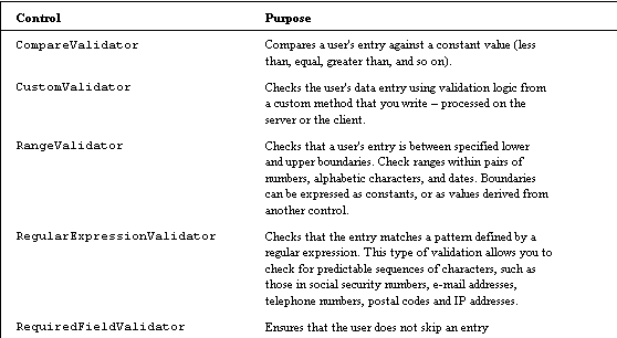
Validation Controls
The worth of any given web form could be measured by the accuracy of the data it was designed to collect. If the data is bogus, with values that are missing, out of range, or simply meaningless, your clients will probably complain pretty quick!
To help alleviate the problem of invalid data entry, and to ease some of the development burden, Microsoft has provided a family of ASP.NET server controls that specialize in validating input and, if necessary, provide feedback to the user.
Validation controls are good examples of how ASP.NET server controls, in general, serve to abstract common tasks that would typically involve manual client-side validation scripting. By using ASP.NET validation controls within ASP.NET web forms, developers are relieved of the work of writing custom client-side validation for their web pages. Validating a user’s data entry is important in a variety of scenarios. For example, if we wrote a logon form that collects a user’s name and password, we would want to validate that these fields were entered before passing the data on to the server.
We’ve already seen some validation controls in action in travel.aspx, so we won’t spend long looking at them here. Just take a look through the list of controls below, to get an idea of what is possible:
Rich Controls
Rich controls are controls are compound in nature, and provide extended functionality. In other words, these controls are typically combinations of two or more intrinsic controls that provide similar, but distinct functionality in one single control. Another distinguishing trait of these controls is that they don’t have any direct correlation to any HTML controls, although they do in fact render to HTML when displayed in the client browser.
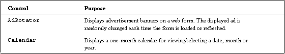

The nice thing about this family of “Rich Controls” is that they are just as easy to use as the other ASP.NET server controls. They may boast more features and properties, but the basic way to define them and interact with them programmatically is exactly the same as all ASP.NET server controls. We haven’t seen much of these yet, so let’s look at a couple to see how they’re used (to find out what properties any other controls have, consult the documentation).
Calendar
One of the simplest and most practical uses for this control is to allow a user to select a particular date. It’s even possible, via the SelectionMode property, to configure the control to allow the user to select a range of dates. The Calendar control has many properties, and we’ll list a few here, that are of particular interest:
<asp:Calendar id="Calendar1" runat="server"

  FirstDayOfWeek="Default|Monday|Tuesday|Wednesday|

  Thursday|Friday|Saturday|Sunday"
Notable here is the FirstDayOfWeek property — this enables you to choose which day of the week your calendar starts from, and we will use this property in the example at the end of this chapter. Some calendars default to Sunday as the first day of the week — for business purposes, however, it’s typically more practical to view the week starting from Monday. A nice feature!
SelectionMode="None|Day|DayWeek|DayWeekMonth" By default, the Calendar control’s SelectionMode defaults to Day. This is useful when you want your user to select a single day. You can select multiple days by setting the SelectionMode property to either DayWeek, however, which will allow you to select a single day or an entire week, or DayWeekMonth, which will allow you to select a single day, an entire week, or the entire month:
  SelectMonthText="HTML text"

  SelectWeekText="HTML text"
The Calendar control’s SelectMonthText and SelectWeekText allow you to customize the HTML — use these properties if you’re really going for a customized look.
You need not define all of the properties of the ASP.NET Calendar control to display the control. In fact, the following declaration will create an ASP.NET Calendar server control that looks and displays, depending on your tastes and needs, very nicely:
<asp:Calendar id="MyCalendarControl" runat="server" />When delivered to the client browser, the result is an HTML calendar display that provides links which, when defined, enable you to navigate through the various days, months and years. Try it for yourself:
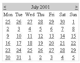
Have a look at the HTML that your ASP.NET produced to create this page — over 100 lines of code, consisting of HTML and JavaScript, were generated to produce this and you wrote only a single line!
The ASP.NET Calendar control is extremely feature-rich. Refer to the ASP.NET documentation for complete details on this control.
LinkButton
The LinkButton control is functionally very much the Button control. What distinguishes this control, though, is that when rendered in the client browser, it looks like a traditional hyperlink. The LinkButton object’s functionality is dependent upon how the OnClick event handler is implemented. The following is an example of a LinkButton declaration:
<html>

  <body>

    <form runat="server">

      <asp:LinkButton id="WroxLinkButton" runat="server"

        Text="Visit the Wrox Press Home Page" />

    </form>

  </body>

</html>
In this example, the Text property is set, and the OnClick event is assigned the name of the method handler, OnWroxLinkButtonClick. When displayed in the browser, this particular LinkButton will look like this:
If we added the following event handler an OnClick event to our link button:
<script language="VB" runat="server">

  Public Sub OnWroxLinkButtonClick(sender As Object , e

  As System.EventArgs)

    Response.Redirect("http://www.wrox.com")

  End Sub

</script>
An OnClick event to our link button:
<html>

  <body>

    <form runat="server">

      <asp:LinkButton id="WroxLinkButton" runat="server"

        Text="Visit the Wrox Press Home Page"

        OnClick="OnWroxLinkButtonClick" />

    </form>

  </body>

</html>
We end up at the Wrox website! Try it for yourself.
This is a button rather than a straightforward hyperlink, therefore we can use it to perform server-side processing, such as logging entries to a database in order to track our web site’s URL usage.
Data Rendering Controls
These controls are extremely feature-rich (they have numerous properties to choose from) and greatly simplify the work of displaying a variety of data, particularly database-related data. The definition of “data” in the context of these controls is very broad. It could include database records, an ArrayList, an XML data source and so on.
Before we look at the controls themselves, we need to get hold of two important concepts:
- Data Binding. This is the term used to describe the process of associating information in a data store (which could be anything from a database table, to an
ArrayListobject) with a server control. Data binding is established by setting the server control’sDataSourceproperty to reference a particular set of data (with a line similar toDataSource = set of data). All data referenced will come from this data source. Once this link has been established, the set of data is then referenced by the DataSet object. - Templates. This is a way to define the various layout elements of a particular control; to describe how the data is displayed in the browser. The
DataGridandDataListhave default templates, so you only need to create templates if you want to change the default look. Now let’s look at those controls:

There is a great deal to these controls. Each is very powerful, and, unfortunately, it is beyond the scope of this book to examine them thoroughly (each one deserves an entire chapter at least). Let’s take a bit of a closer look however, at how each one functions.
DataGrid
As well as allowing you to create a grid, the DataGrid control also lets you format its columns and rows to control the layout of your grid, using templates (see the DataList control for a list of some of the templates). For example, you could alternate the colors for the rows of data being displayed. As well as templates, this control supports several interesting properties, which include:
- AllowSorting: enables you dynamically sort and re-display the data based on a selected column. For example, if you had a table containing your employees surnames and salaries, enabling sorting would allow you to sort your table according to either column.
- AllowPaging: the ability to view subsets of the data called by the
DataGridcontrol on different pages. The number of items displayed on the page is determined by thePageSizeproperty. - AlternatingItemStyle: the style (such as background colour) of every other item listed.
- FooterStyle: the style of the footer at the end of the list (if any).
- HeaderStyle: the style of the header at the beginning of the list (if any) .
- ItemStyle: the style of individual items.
To use the DataGrid control, you have to specify it within tags, set the relevant properties, define the columns in your table, and then apply the relevant template for those columns. Within the template tags, you include the information the template must be applied to:
<asp:DataGrid id="EventData"

  AllowSorting="true"

    <Columns>

      <asp:TemplateColumn HeaderText="Column1">

        <ItemTemplate>

          <%# Container.DataItem("ShortDesc") %>

        </ItemTemplate>

      </asp:TemplateColumn>

      <asp:TemplateColumn HeaderText="Column2">

        <ItemTemplate>

          <%# Container.DataItem("DetailDesc") %>

        </ItemTemplate>

      </asp:TemplateColumn>

    </Columns>

</asp:DataGrid>
We’ll see the DataGrid control in action in the last Try It Out of this chapter.
DataList
The DataList control is useful for displaying rows of database information (which can become columns in DataGrid tables) in a format that you can control very precisely using templates and styles. Manipulating various template controls changes the way your data is presented. The DataList control enables you to select and edit the data that is presented. The following is a listing of some supported templates:
ItemTemplate:required template that provides the content and layout for items referenced byDataList.AlternatingItemTemplate:if defined, this template provides the content and layout for alternating items in theDataList. If not defined,ItemTemplateis used.EditItemTemplate: if defined, this template provides editing controls, such as text boxes, for items set to ‘edit’ in theDataList. If not defined,ItemTemplateis used.FooterTemplate: if defined, theFooterTemplateprovides the content and layout for the footer section of theDataList. If not defined, a footer section will not be displayed.HeaderTemplate: if defined, this provides the content and layout for the header section of theDataList. If not defined, a header section will not be displayed.SelectedItemTemplate: if defined, this template provides the content and layout for the currently selected item in theDataList. If not defined,ItemTemplateis used.SeparatorTemplate: if defined, this provides the content and layout for the separator between items in theDataList. If not defined, a separator will not be displayed.
To use the DataList control and its templates, you have to specify it in tags, and then specify your templates within tags as well. Unlike the DataGrid, items to be affected by the template occur within the template tags. Each template has its own set of properties, which you can find in the .NET documentation (and remember to be sure to have defined your DataSource):
<asp:DataList id="DataList1" runat="server">

  <FooterTemplate>

   'Items to be affected by this template

  </FooterTemplate>

  <SeparatorTemplate>

    'Items to be affected by this template

  </SeparatorTemplate>

</asp:DataList>
If you use the DataList control to set up a column in a grid, you can set additional templates within that column by using the DataGrid control. Refer to the ASP.NET documentation for more information.
Repeater
The Repeater control is very similar to the DataList control with one very important distinction: the data displayed is always read only — you cannot edit the data being presented. It is particularly useful for displaying repeating rows of data. Like the DataGrid and DataList controls, it utilizes templates to render its various sections. The templates it uses are generally the same as the ones used with the DataList control, and the syntax is also the same. We’ll see an example of the Repeater control in action in the next Try It Out.
We’ve now looked at almost everything we’re going to in this chapter. All that is left to do is to bring everything together in two exercises, the first of which creates a dynamic calendar, and the second one uses the EditItemTemplate to create an editable able of information.
Try It Out — MyCalendar
In the previous sections of this chapter, you were exposed to many of the most common ASP.NET server controls, including the Calendar control. Many web sites, particularly personal home pages, share information regarding upcoming events. For example, a local soccer team might have a web site that displays the team’s game schedule for the players, parents, coaches, and so on; or a band might display an on-line calendar that shows all upcoming gigs for their fans. In either case, the ability to render intuitive and familiar calendar-related events or appointments on a web page is crucial.
Due to the centrality of the calendar to many situations, we’ve decided to base this Try It Out around the Calendar control. We’re not going to try to replicate the advanced features of a desktop calendaring tool, such as Microsoft Outlook though. The object of our application will be to share some key dates and appointments on the Web, in the context of a familiar calendar.
To flesh this out a little, here’s a mini-specification of some of the features we’ll be implementing for the MyCalendar application:
- The
Calendarcontrol should read our calendar data from an XML file (we’ll be using the XML file as a data source). This will make it easy to update and change the calendar data, without ever having to change the ASPX file. Due to this, none of our appointments or events will be hard-coded within the ASPX page itself. - We’d like to be able to see several events within a day.
- While we obviously want to see the title of an event or appointment on the calendar, we also want to see some additional information (for example, a detailed description of the event and the start/end time). To enable this, when we click on the event link, a listing of all details should appear.
- Although the
Calendarcontrol defaults to Sunday as the first day of the month, we want the first day of the month to be Monday. - Weekends should display in a slightly different shade (so we know they’re coming!), as should days that are part of the previous or next month.
Since we’re taking all our information from an XML file, let’s begin by looking at the XML that we’re going to use.
The XML Source — MyCalendar.xml
The source XML file we shall use will just contain the basic information we want display in the Calendar control. The MyCalendar.xml file, as with all the listings throughout this book, is available for download on www.wrox.com. The following excerpt of the MyCalendar.xml file is provided, just to show you the XML syntax used, as well as some of the sample data:
<MyCalendar>

  <Event>

    <ShortDesc>Concert at the Riverfront</ShortDesc>

    <DetailDesc>4th of July celebration. Bring stand and a jacket.

    </DetailDesc>

    <EventDate>2001/07/04</EventDate>

    <StartTime>9:30PM</StartTime>

    <EndTime>11:00PM</EndTime>

  </Event>

  <Event>

    <ShortDesc>CCT Rehearsal - Brigadoon</ShortDesc>

    <DetailDesc>Community Theatre orchestra rehearsal - bring mutes.

    </DetailDesc>

    <EventDate>2001/07/14</EventDate>

    <StartTime>3:30PM</StartTime>

    <EndTime>6:30PM</EndTime>

  </Event>

</MyCalendar>
The elements of this XML file are fairly straightforward:
MyCalendar— the root element. XML requires a single root element to contain the child elements.Event— basically serves as the main parent for each group of elements.ShortDesc— a short description of the event.DetailDesc— a detailed description of the event — could be random notes, comments, or thoughts.EventDate— the date on which the event occurs. In the sample data, the format used is yyyy/mm/dd, which should serve to eliminate any ambiguity between various local date discrepancies. In fact, because we will use theDateTimeobject to reference this information, any valid format that theDateTimeobject can parse will be acceptable. Having said that, you might prefer to use your local date format — it’s certainly easier to read because that’s what you are used to.StartTime— the time the event starts.EndTime— the time the event ends.
The rest of the XML file is very similar to this excerpt — it merely contains information that we are going to reference in our MyCalendar.aspx file. Let’s take a look at this now.
The Web Form — MyCalendar.aspx
The following is the complete listing of the MyCalendar.aspx web form implementation. You’ll declare the various ASP.NET server controls used in this web form, as well as the corresponding code and event handlers, in a series of incremental steps. The example is quite a long one, therefore we’ll discuss much of what is going on as we go through it. At the end, further analysis and discussion will be provided in the subsequent “How It Works” section.
1. Download MyCalendar.xml from www.wrox.com, and save it in the Chapter 14 folder of your BegASPNET virtual directory.
2. Create a new file, called MyCalendar.aspx, save it in the same folder as MyCalendar.xml, and add the following lines, which will serve as a starting point for creating the page’s ASP.NET server control objects, as well as the corresponding code and event handlers:
<%@ Page Language="VB" %>

<%@ Import Namespace="System.Data"%>

<%@ Import Namespace="System.IO" %>


<html>

<head>

<script language="VB" runat="server">


</script>


</head>

<body>


</body>

</html>
3. Add the following code between the <body> tags:
<body>

  <h1>My Calendar</h1>


    <form id="MyCalendarForm" method="post" runat="server">

      <p align="center">

      <asp:Calendar id="MyCalendar" runat="server"

        SelectedDate="2001/07/17"

        VisibleDate="2001/07/01"

        FirstDayOfWeek="Monday"

        DayNameFormat="Full"

        ShowDayHeader="True"

        ShowGridLines="True"

        ShowNextPrevMonth="True"

        ShowTitle="True"

        nextprevstyle-backcolor="DodgerBlue"

        nextprevstyle-forecolor="White"

        nextprevstyle-font-bold="True"

        nextprevstyle-font-size="Large"

        TitleFormat="MonthYear"

        TitleStyle-BackColor="DodgerBlue"

        TitleStyle-ForeColor="White"

        TitleStyle-Font-Size="Large"

        TitleStyle-Font-Bold="True"

        dayheaderstyle-backcolor="DodgerBlue"

        dayheaderstyle-forecolor="White"

        daystyle-horizontalalign="Left"

        daystyle-verticalalign="Top"

        daystyle-font-size="Small"

        SelectedDayStyle-Font-Bold="True"

        selecteddaystyle-horizontalalign="Left"

        selecteddaystyle-verticalalign="Top"

        selecteddaystyle-font-size="Small"

        selecteddaystyle-forecolor="Red"

        TodayDayStyle-HorizontalAlign="Left"

        TodayDayStyle-VerticalAlign="Top"

        todaydaystyle-backcolor="White"

      </asp:Calendar>

      </p>

    </form>

</body>
In this step, we’re adding the main visual component of the page — the ASP.NET Calendar control. The Calendar control will be responding to events, it’s declared within the context of a <form> tag. The numerous properties defined here will serve, not only to give the Calendar control a unique look, but will also affect its behavior. The FirstDayOfWeek property is set to “Monday”, for example. If you have a look through the other properties we’re defining here, you’ll find they’re pretty self-explanatory.
A couple things to note so far: the SelectedDate and VisibleDate properties are hard coded for demonstration purposes only — this is discussed in more detail in the How It Works section to follow.
To conclude the definition of this Calendar control, assign event handlers for the OnDayRender and OnSelectionChanged events just before the closing </asp:Calendar> tag. These will be explained in detail later in this section:
<body>

...

      OnDayRender="MyCalendar_DayRender"

      OnSelectionChanged="MyCalendar_SelectionChanged">

    </asp:Calendar>

    </p>

  </form>

</body>
4. You’ll now add a Label control to the page, which will later serve to provide some date selection feedback to the user, regarding the currently selected date. Add these lines after the declaration of the Calendar control, and just before the </form> end tag:
<body>

...

    <p align="center">

    <asp:label id="SelectedDate" runat="server" font-size="Large" />

    </p>

  </form>

</body>
5. The final visual components used in this example consist of two controls: the Panel and Repeater controls. When a user selects a date from the calendar, the OnSelectionChanged event (for which we assigned the handler in step 2) will be raised by the Calendar control. This will enable us to gather an ArrayList of all daily events and bind them to the Repeater control. The ASP.NET Panel control serves as a container for the Repeater control, and will be used to control the visibility state of the displayed Repeater elements (when the Panel control’s Visible property is set to false, all corresponding child controls, like the Repeater control, are also hidden).
The code we’re adding here, just sets up the Repeater control (within the panel control) and establishes the properties of the templates, which will be used to display our information. Insert the following ASP.NET Panel and Repeater control declarations before the final </form> end tag:
<body>

...

  <asp:panel id="DailyDetailsPanel" runat="server">

  <asp:Repeater id="DailyEventDetailRepeater" runat="server">

    <HeaderTemplate> <p align="center">

    <table border="1" width="100%">

    <table style="color:Black;border collapse:collapse;">

      <tr style="color:White;background-color:DodgerBlue;font

      -weight:bold;">

      <td><b>Event</b></td>

      <td><b>Description</b></td>

      <td><b>Start Time</b></td>

      <td><b>End Time</b></td>

    </tr>

  </HeaderTemplate>

  <ItemTemplate>

    <tr style="background-color:White;">

      <td> <%# DataBinder.Eval(Container.DataItem, "ShortDesc") %>

      </td>

      <td> <%# DataBinder.Eval(Container.DataItem, "DetailDesc")%>

      </td>

      <td> <%# DataBinder.Eval(Container.DataItem, "StartTime") %>

      </td>

      <td> <%# DataBinder.Eval(Container.DataItem, "EndTime") %>

      </td>

    </tr>

  </ItemTemplate >

  <AlternatingItemTemplate>

    <tr style="background-color:Gainsboro;">

      <td> <%# DataBinder.Eval(Container.DataItem, "ShortDesc") %>

      </td>

      <td> <%# DataBinder.Eval(Container.DataItem, "DetailDesc")%>

      </td>

      <td> <%# DataBinder.Eval(Container.DataItem, "StartTime") %>

      </td>

      <td> <%# DataBinder.Eval(Container.DataItem, "EndTime") %>

      </td>

    </tr>

  </AlternatingItemTemplate>

  <FooterTemplate>

  </table>

  </p>

  </FooterTemplate>


  </asp:Repeater>

  </asp:panel>

 </form>

</body>
6. At this point, all the visual components used in MyCalendar.aspx have been declared and set up. Over the next few steps, we will add the method and event handler code implementations between the <script> </script> tags of the page. Add the following code for the Page_Load method implementation:
<script language="VB" runat="server">


Protected Sub Page_Load(ByVal Sender As System.Object, _

ByVal e As System.EventArgs)

    If Not IsPostback Then

      ShowDailyEvents()

    End If

  End Sub

</script>
In this listing, the IsPostback property is checked to see if this is the first time the page has been loaded — if so, a method, ShowDailyEvents, is called, which will perform the work of binding and displaying the daily event data in the Repeater control. We’ll define ShowDailyEvents shortly.
7. The Calendar control in this page declares an event handler for the OnSelectionChanged event that we added in step 2. Remember that in step 2 the name of the event handler we assigned was MyCalendar_SelectionChanged. The implementation for this event handler should be added within the <script> </script> tags, and below the Page_Load method we just added, as follows:
<script language="VB" runat="server">

...

Public Sub MyCalendar_SelectionChanged(ByVal sender As Object, _

ByVal e As System.EventArgs)

    ShowDailyEvents()

  End Sub

</script>
When the user clicks a new date on the calendar control (thus triggering the OnSelectionChanged event), the MyCalendar_SelectionChanged event handler will call the ShowDailyEvents method. So this is almost functionally identical to our Page_Load implementation, above.
8. In order to display our custom calendar events within the Calendar control, we must write a method that loads the data from MyCalendar.xml into a DataSet object. This is implemented as follows (again, add this code in your <script> </script> tags, below the event handler we just added):
<script language="VB" runat="server">

...

Protected Function LoadMyCalendarData() As DataSet


    Dim sourceXML as String = Server.MapPath("MyCalendar.xml")

      If ( Not File.Exists ( sourceXML ) ) Then

        Return Nothing

      End if


    Dim cachedDataSet as DataSet = Session("MyCalendarData")

        if ( Not cachedDataSet Is Nothing ) Then

          Return cachedDataSet

        End if

    Dim dataSet As DataSet = New DataSet()


  Try

    dataSet.ReadXml(sourceXML)


    Session("MyCalendarData") = dataSet


  Catch e As Exception

    SelectedDate.Text = e.Message

    dataSet = Nothing

  End Try


  Return dataSet

 End Function

</script>
The key points to observe from this listing are that we first check to see if the file, MyCalendar.xml (that we defined, along with the location of the file, in the first line, as sourceXML) exists. If it doesn’t exist on the server file system, we won’t be able to display any of our custom calendar data in the Calendar or Repeater controls. Note also that we use the Session object to determine if we’ve already loaded (or cached) this DataSet object — if so, we can use it and optimize our code slightly. We’ll discuss this more in the How It Works section. The part of the code in the Try block loads the XML data into a DataSet object via the ReadXml method (which enables the XML in the file to be read). The Catch block checks that LoadMyCalendarData does return something when it is called, as it is possible that nothing could be returned, particularly if MyCalendar.xml contains any malformed data:
9. We are able to display our own data within the calendar by implementing an event handler for the Calendar control’s OnDayRender event, which is raised each time a visible day in the calendar is being rendered. The MyCalendar_DayRender method (remember we introduced this in step 2) renders the Calendar control’s Cell display by iterating through each record in the DataSet to determine if there is an event to display for the particular day being rendered. This method will also perform the work of setting various Cell.BackColor properties based on if the day being rendered is a weekend, weekday, or a day from a next or previous month. It is implemented as follows, and is to be placed, once again, within the <script> </script> tags:
<script language="VB" runat="server">

...

    Protected Sub MyCalendar_DayRender(ByVal Sender As System.Object, _

          ByVal e As DayRenderEventArgs )

    if ( e.Day.IsOtherMonth )

      e.Cell.BackColor=System.Drawing.Color.FromName("Gainsboro")

    Else If ( e.Day.IsWeekend )

      e.Cell.BackColor=System.Drawing.Color.FromName("PaleGoldenrod")

    Else

      e.Cell.BackColor=System.Drawing.Color.FromName

      ("LightGoldenrodYellow")

  End if


Dim dataSet as DataSet = LoadMyCalendarData()

  if dataSet is Nothing

    Exit Sub

  End if


Dim zRow as DataRow


  For Each zRow in dataSet.Tables(0).Rows

    Dim compareDate as DateTime

    compareDate = GetSafeDate ( zRow.Item("EventDate") )


    If ( compareDate = e.Day.Date ) Then


      ' Event matches date criteria -- display it...

      Dim myEventData as New MyCalendarEventData

      myEventData.ShortDesc = zRow.Item("ShortDesc")

      myEventData.DetailDesc = zRow.Item("DetailDesc")

      myEventData.StartTime = zRow.Item("StartTime")

      myEventData.EndTime = zRow.Item("EndTime")


      Dim dailyEventLabel as New Label

      dailyEventLabel.Text = "<br />" + myEventData.ShortDesc

      e.Cell.Controls.Add ( dailyEventLabel )

    End if

  Next


End Sub

</script> 10.The next section implements the method, ShowDailyEvents, that we referenced in steps 5 and 6. This method’s task is to display the detailed information for all events (the detailed event description, the start time, the end time, and so on), based on the currently selected day in the calendar. This detailed display of calendar data will actually be rendered via a Repeater control, and will be displayed below the Calendar. In this way, we’ll have a bit more real estate to display the detailed information about the selected day’s events, which would normally be too verbose to display in within the Calendar control itself. Add the following lines in the <script> </script> tags:
<script language="VB" runat="server">

...

    Protected Sub ShowDailyEvents()


    Dim d As Date = MyCalendar.SelectedDate()

    Dim dataSet as DataSet = LoadMyCalendarData()

    if dataSet is Nothing

      Exit Sub

    End if


    Dim zRow as DataRow

    Dim aEvents as new ArrayList()


    For Each zRow in dataSet.Tables(0).Rows

      Dim compareDate as DateTime

      compareDate = GetSafeDate ( zRow.Item("EventDate") )


    If ( compareDate = d ) Then


      ' Event matches date criteria -- display it...

      Dim myEventData as New MyCalendarEventData

      myEventData.EventDate = d

      myEventData.ShortDesc = zRow.Item("ShortDesc")

      myEventData.DetailDesc = zRow.Item("DetailDesc")

      myEventData.StartTime = zRow.Item("StartTime")

      myEventData.EndTime = zRow.Item("EndTime")


      aEvents.Add ( myEventData )

    End If

  Next


  ' Bind to the Repeater control...

  DailyEventDetailRepeater.DataSource = aEvents

  DailyEventDetailRepeater.DataBind()


  If ( aEvents.Count > 0 ) Then

    DailyDetailsPanel.Visible = True

    SelectedDate.Text = "Events For " + d.ToLongDateString()

  Else

    DailyDetailsPanel.Visible = False

    SelectedDate.Text = "No Events Scheduled For " +

    d.ToLongDateString()

  End if


End Sub

</script>11.The MyCalendar.xml data source file could conceivably contain an invalid date entry in its EventDate XML element tag therefore, we’ll add the following helper method to our page to guarantee that a non-null DateTime object is always returned, regardless of the date value obtained from the source XML:
<script language="VB" runat="server">

...


  Private Function GetSafeDate ( ByVal proposedDate as String )

  As DateTime returns a non-null DateTime even if proposed

  date can't be parsed

  Dim safeDate as DateTime = DateTime.MinValue

  Try

    safeDate = DateTime.Parse ( proposedDate )

  Catch e As Exception

    Response.Write ( "<!-- Failed to parse date: " +

    e.Message + " -->" )

  End Try


  GetSafeDate = safeDate

 End Function

</script>
12.In this step, we add a MyCalendarEventData class implementation. This class serves as a container for the various data elements that make up our own custom calendar event data:
<script language="VB" runat="server">

...

Public Class MyCalendarEventData


  Private m_ShortDesc As String

  Private m_DetailDesc As String

  Private m_EventDate As DateTime

  Private m_StartTime As String

  Private m_EndTime As String

  Public Property ShortDesc() As String

    Get

      Return m_ShortDesc

    End Get

    Set

    m_ShortDesc = value

    End Set

  End Property


  Public Property DetailDesc() As String

    Get

      Return m_DetailDesc

    End Get

    Set

      m_DetailDesc = value

    End Set

  End Property


  Public Property EventDate As DateTime

    Get

      Return m_EventDate

    End Get

    Set

      m_EventDate = Value

    End Set

End Property

  Public Property StartTime() As String

    Get

      Return m_StartTime

    End Get

    Set

      m_StartTime = value

    End Set

  End Property


  Public Property EndTime() As String

    Get

      Return m_EndTime

    End Get

    Set

      m_EndTime = value

    End Set

  End Property

 End Class

</script>
Once you’ve completed all the steps for entering the controls and code, you should be able to load the MyCalendar.aspx file into your browser. You should see the following display served up after the page loads:
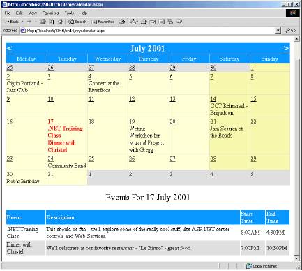
How It Works
The first step in creating the MyCalendar.aspx web form was to define what we wanted it to do, which was this: given a custom XML file with various calendar event data (MyCalendar.xml), load each of the event items in an ASP.NET Calendar control. In steps 1 through 4, above, we basically created an ASPX page that defined three different ASP.NET server controls: Calendar, Repeater and Panel.
Calendar Implementation Details
The Calendar control serves as the primary visual interface for the user. We set a host of properties to customize the look of the control — see step 2 for details. The first question you might be wondering is, why does the Calendar control default to July 2001, and why is the date July 17, 2001 selected by default? It comes down to the following code:
<asp:Calendar id="MyCalendar" runat="server"

  SelectedDate="2001/07/17"

  VisibleDate="2001/07/01"
The SelectedDate property is used to set the date that the calendar will default to when first opened. The VisibleDate property sets the month of the calendar that is visible, for example, defining the date “2001/08/01” will make the month August of 2001 visible.
As previously mentioned, the SelectedDate and VisibleDate properties were set this way for demonstration purposes only, since the entries in the MyCalendar.xml file only have calendar data for this particular time span.
When we declared the Calendar control, we assigned event handlers for two of the Calendar controls events:
<asp:Calendar id="MyCalendar" runat="server"

...

  OnDayRender="MyCalendar_DayRender"

  OnSelectionChanged="MyCalendar_SelectionChanged">

...
The MyCalendar_DayRender event is invoked whenever the Calendar control begins to display a day that will be visible, and the MyCalendar_SelectionChanged event is invoked when a new date is selected. Our Calendar control displays six weeks worth of data — the days representing the month being displayed, as well as a share of days from the previous and next months. In order to give our Calendar control a unique look, we implemented a bit of logic to determine if the day being rendered was part of another month (IsOtherMonth), a weekend day (IsWeekEnd), or if the day was part of the month being displayed. The logic for displaying the various Calendar Cell color formatting is demonstrated in this code fragment (from step 8):
Protected Sub MyCalendar_DayRender(ByVal Sender As System.Object, _

         ByVal e As DayRenderEventArgs )


  if ( e.Day.IsOtherMonth )

      e.Cell.BackColor=System.Drawing.Color.FromName("Gainsboro")

  Else If ( e.Day.IsWeekend )

    e.Cell.BackColor=System.Drawing.Color.FromName("PaleGoldenrod")

  Else

    e.Cell.BackColor=System.Drawing.Color.FromName(

    "LightGoldenrodYellow")

  End if

...

End Sub
The way this code works is that we use an if statement to determine whether the day being called is a month, for example, if ( e.Day.IsOtherMonth ). If this statement is true, we define the backcolour of that Cell by importing the System.Drawing namespace, and requesting the color we want. The variable e is automatically passed into this event procedure by ASP.NET. It contains additional information about the control that might be useful to a programmer. In our case we use it to set the color of the Cell (which represents a day).
The next step in rendering the MyCalendar.xml data to a given Calendar Cell involved loading the XML data source into a DataSet. What might not be obvious is the use of the Session object to store a cached instance of the loaded DataSet. The reason for caching the DataSet object, is so that we can reduce the number of times the calendar data (stored in the MyCalendar.xml file) is loaded from scratch. The DataSet object will be cached for the lifetime of the session.
In step 7, before we attempted to load the file, we first checked the Session object for an instance of a MyCalendarData object, which is a DataSet object. If there’s already one declared, there’s no need to perform the work of loading in the XML file again — the cachedData object is returned. If Session("MyCalendarData") returns Nothing, then we perform the work of loading the XML source, but once we’re done loading it, we assign the dataset to the Session("MyCalendarData") object:
Protected Function LoadMyCalendarData() As DataSet

...

Dim cachedDataSet as DataSet = Session("MyCalendarData")

if ( Not cachedDataSet Is Nothing ) Then

  Return cachedDataSet

End if

...

Try

  fileStream = New FileStream(sourceXML, FileMode.Open)

  dataSet.ReadXml(fileStream)

  fileStream.Close()


  Session("MyCalendarData") = dataSet

...

End Function
In using the DataSet from the Session object, we don’t need to load the MyCalendar.xml file from scratch each time the Calendar control renders a day item. Keep in mind that the Calendar control renders 6 weeks worth of days, which amounts to 42 calls (6 weeks times 7 days in a week) to the LoadMyCalendarData method on a single page load — so even though the LoadMyCalendar method is being invoked numerous times, it’s optimized to use the cached DataSet stored in Session ("MyCalendarData").
The code to render the MyCalendar.xml data to a specific Cell within the Calendar control is fairly straightforward. We loop through all the rows in our DataSet object’s default Table and compare with the date the Calendar control is currently rendering — if the dates are the same, we have some work to do. Remember that each row represents a single event, and each time a day is rendered we have to see if that day matches one of the events. Otherwise, we loop through to the next item. When we encounter a match, we actually add the content to the Calendar object’s Cell property, by creating a new Label object, setting its display properties, and adding it to the Cell object’s Controls container:
Protected Sub MyCalendar_DayRender(ByVal Sender As System.Object, _

         ByVal e As DayRenderEventArgs )

...

Dim zRow as DataRow


For Each zRow in dataSet.Tables(0).Rows

  Dim compareDate as DateTime

  compareDate = GetSafeDate ( zRow.Item("EventDate") )

  If ( compareDate e.Day.Date ) Then


    ' Event matches date criteria -- display it...

    ...

    Dim dailyEventLabel as New Label

    dailyEventLabel.Text = "<br />" + myEventData.ShortDesc

    e.Cell.Controls.Add ( dailyEventLabel )

  End If

Next


End Sub
Repeater Control Implementation Details
The sole reason for implementing a Repeater control is to display the specific MyCalendar.xml event details that correspond to the currently selected day in the calendar. The details of an event or an appointment could contain quite a bit of information, therefore trying to put it all into a single Cell object of the Calendar control probably wouldn’t look all that great. Displaying a short description (ShortDesc) in the Calendar control’s Cell, however, and relegating the detailed description (DetailDesc), and any additional information to the Repeater is prudent.
The mapping of the MyCalendar.xml data to the Repeater control is handled by the ShowDailyEvents method, which is invoked when the page first loads, and also as a result of an OnSelectionChanged event posted by the Calendar control. This event is automatically reaised when the day (or month) selected is changed by the user. Recall from step 10 that we declared a class, MyCalendarEventData. This contained various Private members and corresponding Public properties, which served as a container for the data extracted from the MyCalendar.xml file:
Public Class MyCalendarEventData


    Private m_ShortDesc As String

    Private m_DetailDesc As String

    Private m_EventDate As DateTime

    Private m_StartTime As String

    Private m_EndTime As String

    Public Property ShortDesc() As String

      Get

        Return m_ShortDesc

      End Get

      Set

        m_ShortDesc = value

      End Set

   End Property

   ...
There are at least two reasons for going through the effort of creating this class. The first is purely related to object oriented design. In the event that the MyCalendar.xml file changes, or if new elements are added, it’s good practice to have an object, like MyCalendarEventData, to map the new values to. This way, we would only have to make the changes under the relevant sections of our XML file – the method that calls these sections would still work.
The second reason is interrelated with the first, but is actually more practical: we can bind MyCalendarEventData objects to any data rendering control, like a Repeater control (which we did in steps 8 and 9).
This brings us back to the ShowDailyEvents method. When invoked, this method performs a similar set of tasks to the MyCalendar_DayRender method, with a key difference: it renders all the matching events for a given day to the Repeater control, not the Calendar control. The ShowDailyEvents method proceeds to loop through all the DataRow objects in the DataSet object’s default table in order to build an ArrayList of MyCalendarEventData objects. We need to do this because the DataSet contains all events, and not just those for the selected day. So, we build an ArrayList containing just those events for the selected day. As you can see in the code we added in step 9:
Protected Sub ShowDailyEvents()

  ...

  Dim aEvents as new ArrayList()


  For Each zRow in dataSet.Tables(0).Rows

    Dim compareDate as DateTime

    compareDate = GetSafeDate ( zRow.Item("EventDate") )


    If ( compareDate = d ) Then


      ' Event matches date criteria – display it...

      Dim myEventData as New MyCalendarEventData

    ...

      aEvents.Add ( myEventData )

    End If

  Next


  ' Bind to the Repeater control...

  DailyEventDetailRepeater.DataSource = aEvents

  DailyEventDetailRepeater.DataBind()

...

  End Sub
The significance of storing the matching MyCalendarEventData objects in the aEvents variable (an ArrayList containing just those events for the selected day) is that we can bind this sub-set of records to the DailyEventDetailRepeater object to generate a detailed listing of the events for the selected day.
The final details concerning the Repeater control implementation deal with display issues. For some days, there may be no specific events. As such, when the user clicks on a particular day Cell link of the Calendar control that has no related events, we implement the following code to toggle the visibility of the Panel control (which contains the DailyEventDetailRepeater object):
Protected Sub ShowDailyEvents()

  ...

  if ( aEvents.Count > 0 ) then

    DailyDetailsPanel.Visible = True

    SelectedDate.Text = "Events For " + d.ToLongDateString()

  else

    DailyDetailsPanel.Visible = False

    SelectedDate.Text = "No Events Scheduled For " + d.ToLongDateString()

  End if

  End Sub
The SelectedDate object is a Label control that is not declared within the DailyDetailsPanel declaration, and therefore will not be affected when the DailyDetailsPanel.Visible property is changed. The DailyEventDetailRepeater control’s visibility status, however, this will correspond to whatever the DailyDetailsPanel.Visible property is. This is a nice feature to use, especially when you want to control the visibility state of a group of controls with one single property change.
Editing the Data Using Templates
In Chapter 13, we looked at updating data in DataSets, and in this chapter we’ve looked at using the grids and templates. One of the most powerful features behind ASP.NET is the templating architecture, which allows us to define a different set of controls depending upon the actions of the user. For the DataGrid and DataList we can use the EditItem template we saw earlier to automatically display different controls when the user wishes to edit some data.
Let’s look at a simple example to see how this works.
Try It Out – Using the EditItem Template
1. Create a new file called EditTemplate.aspx, and add the following HTML elements and ASP.NET server controls. Don’t worry about it looking long and complex – we’ll explain it after we’ve seen what it does:
<html>

  <body>

    <form runat="server">

      <asp:Label id="ErrorMessage" runat="server" /><br/>


      <asp:LinkButton OnClick="DEDR_Add" Text="Add new event"

          runat="server"/><br/>


      <asp:DataGrid id="EventData"

          AutoGenerateColumns="false" width="100%"

          runat="server"

          OnEditCommand="DEDR_Edit"

          OnUpdateCommand="DEDR_Update"

          OnCancelCommand="DEDR_Cancel"

          OnDeleteCommand="DEDR_Delete">


        <HeaderStyle ForeColor="White"

         BackColor="DodgerBlue" Font-Bold="true"/>

        <ItemStyle BackColor="White"/>

        <AlternatingItemStyle BackColor="Gainsboro"/>

        <Columns>

          <asp:TemplateColumn HeaderText="Event">

            <ItemTemplate>

             <%# Container.DataItem("ShortDesc") %>

            </ItemTemplate>


            <EditItemTemplate>

              <asp:TextBox id="txtShortDesc" Size="25"

                Text='<%# Container.DataItem("ShortDesc") %>'

                runat="server"/>

            </EditItemTemplate>

         </asp:TemplateColumn>


         <asp:TemplateColumn HeaderText="Description">

            <ItemTemplate>

              <%# Container.DataItem("DetailDesc") %>

            </ItemTemplate>


            <EditItemTemplate>

              <asp:TextBox id="txtDetailDesc" Size="50"

                    Text='<%# container.DataItem("DetailDesc") %>'

                    runat="server"/>

          </EditItemTemplate>

        </asp:TemplateColumn>


        <asp:TemplateColumn HeaderText="Start Time">

          <ItemTemplate>

            <%# Container.DataItem("StartTime") %>

          </ItemTemplate>


          <EditItemTemplate>

           <asp:TextBox id="txtStartTime" Size="7"

            Text='<%# Container.DataItem("StartTime") %>'

            runat="server"/>

          </EditItemTemplate>

         </asp:TemplateColumn>


         <asp:TemplateColumn HeaderText="EndTime">

          <ItemTemplate>

            <%# Container.DataItem("EndTime") %>

          </ItemTemplate>

          <EditItemTemplate>

            <asp:TextBox id="txtEndTime" Size="7"

                   Text='<%# Container.DataItem("EndTime") %>'

                   runat="server"/>

          </EditItemTemplate>

        </asp:TemplateColumn>


        <asp:TemplateColumn>

          <ItemTemplate>

           <asp:LinkButton CommandName="Edit"

            Text="Edit" runat="server"/>

           <asp:LinkButton CommandName="Delete"

            Text="Delete" runat="server"/>

          </ItemTemplate>

          <EditItemTemplate>

           <asp:LinkButton CommandName="Cancel"

            Text="Cancel" runat="server"/>

           <asp:LinkButton CommandName="Update"

            Text="Update" runat="server"/>

          </EditItemTemplate>

        </asp:TemplateColumn>


     </Columns>

   </asp:DataGrid>

 </form>

</body>

</html>
2. Now add the following to the top of this page:
<%@ Import Namespace="System.Data" %>

<%@ Import Namespace="System.IO" %>


<script language="VB" runat="server">


  Sub Page_Load(Sender As Object, E As EventArgs)


    If Not Page.IsPostBack Then

      EventData.DataSource = LoadMyCalendarData

      EventData.DataBind()

    End If


  End Sub


  Protected Function LoadMyCalendarData() As DataSet

    Dim sourceXML as String = Server.MapPath("MyCalendar.xml")

      If ( Not File.Exists ( sourceXML ) )

Then

        Return Nothing

      End if

    Dim cachedDataSet as DataSet = Session("MyCalendarData")

      If ( Not cachedDataSet Is Nothing )

Then

        Return cachedDataSet

      End if

    Dim dataSet As DataSet = New DataSet()


    Try

      dataSet.ReadXml(sourceXML)


      Session("MyCalendarData") = dataSet


    Catch e As Exception

      ErrorMessage.Text = e.Message

      dataSet = Nothing

    End Try


    Return dataSet


  End Function


  Sub DEDR_Edit(Sender As Object, E As DataGridCommandEventArgs)


    EventData.EditItemIndex = CInt

(e.Item.ItemIndex)

    EventData.DataSource = LoadMyCalendarData

    EventData.DataBind()


  End Sub


  Sub DEDR_Update(Sender As Object, E As DataGridCommandEventArgs)

    Dim dataSet  As DataSet = LoadMyCalendarData

    Dim row      As Integer = CInt(e.Item.ItemIndex)

    Dim EditText As TextBox


    EditText = E.Item.FindControl("txtShortDesc")

    dataSet.Tables(0).Rows(row).Item("ShortDesc") = EditText.Text

    EditText = E.Item.FindControl("txtDetailDesc")

    dataSet.Tables(0).Rows(row).Item("DetaiLDesc") = EditText.Text

    EditText = E.Item.FindControl("txtStartTime")

    dataSet.Tables(0).Rows(row).Item("StartTime") = EditText.Text

    EditText = E.Item.FindControl("txtEndTime")

    dataSet.Tables(0).Rows(row).Item("EndTime") = EditText.Text


    dataSet.WriteXml(Server.MapPath("MyCalendar.xml"))


    Session("MyCalendarData") = Nothing


    EventData.EditItemIndex = -1


    EventData.DataSource = LoadMyCalendarData

    EventData.DataBind()


  End Sub


  Sub DEDR_Cancel(Sender As Object, E As DataGridCommandEventArgs)


    EventData.EditItemIndex = -1

    Session("MyCalendarData") = Nothing

    EventData.DataSource = LoadMyCalendarData

    EventData.DataBind()


  End Sub


  Sub DEDR_Delete(Sender As Object, E As

  DataGridCommandEventArgs)

    Dim dataSet As DataSet = LoadMyCalendarData

    Dim row     As Integer = CInt(e.Item.ItemIndex)


    dataSet.Tables(0).Rows(row).Delete

    dataSet.WriteXml(Server.MapPath("MyCalendar.xml"))

    Session("MyCalendarData") = Nothing

    EventData.EditItemIndex = -1

    EventData.DataSource = LoadMyCalendarData

    EventData.DataBind()


  End Sub


  Sub DEDR_Add(Sender As Object, E As EventArgs)

    Dim dataSet As DataSet = LoadMyCalendarData


    Dim newRow As DataRow

    newRow = dataSet.Tables(0).NewRow()

    newRow.Item("EventDate") = "15/07/2001"

    newRow.Item("ShortDesc") = ""

    newRow.Item("DetailDesc") = ""

    newRow.Item("StartTime") = ""

    newRow.Item("EndTime") = ""

    dataSet.Tables(0).Rows.Add(newRow)


    dataSet.WriteXml(Server.MapPath("MyCalendar.xml"))


    Session("MyCalendarData") = Nothing


    EventData.DataSource = LoadMyCalendarData

    EventData.DataBind()

    EventData.EditItemIndex = EventData.Items.Count - 1

    EventData.DataSource = LoadMyCalendarData

    EventData.DataBind()


  End Sub

</script>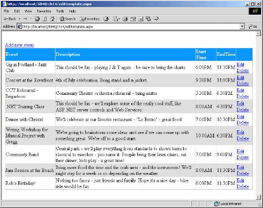
There’s nothing very special about this — it’s a standard looking grid, with options to add and edit data.
4. Now hit the Edit link for the first row:
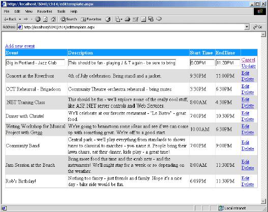
Notice how the row has changed — instead of just text, we now have text boxes allowing us to edit the text. The links in the last column have also changed, now indicating we can either cancel the changes, or update the data with our changes.
5. Try making some changes to the text and hitting the Cancel button. Notice how the changes you typed in are ignored. Try the Edit link again, and this time the Update link — the changes are now saved.
6. Now try the Add new event link:
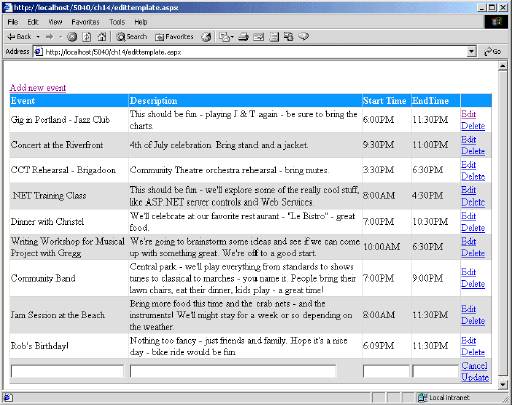
Notice how an extra row has been added, with empty values for you to type in the new data. Try pressing Cancel, and you see that the empty row disappears. Add another row and this time press Update to save the changes.
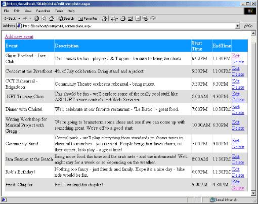
7. For the row you have just added, press the Delete link to test this function out. Let’s see how all of this works.
How It Works– Using the EditItem Template
Let’s first look at the controls. We start with the server form, and a label to be used for displaying any error messages that might occur:
<html>

  <body>

    <form runat="server">


      <asp:Label id="ErrorMessage" runat="server" /><br/>
Next, we add a LinkButton which is used as the link that adds new rows to the data. You could use an ordinary button here, but I think this looks neater:
      <asp:LinkButton OnClick="DEDR_Add" Text="Add new event"

            runat="server"/><br/>
Now we start on the DataGrid. The first thing to note, is that we have set the AutoGenerateColumns attribute to false, telling the DataGrid not to generate any columns automatically. One of the great features of the DataGrid is that when you bind data to it, it cycles through the rows and columns of the data and generates the HTML table accordingly. In this example, we don’t want that, as we want to create the columns ourself:
    <asp:DataGrid id="EventData"

        AutoGenerateColumns="false" width="100%" runat="server"
Also, on the DataGrid, are some command properties. The DataGrid understands the concept of editing data, and has some special properties that allow us to tell it which event procedures are to be run when a set command is selected. You’ll see how these commands are defined a little later:
        OnEditCommand="DEDR_Edit"

        OnUpdateCommand="DEDR_Update"

        OnCancelCommand="DEDR_Cancel"

        OnDeleteCommand="DEDR_Delete">
Next, we define some style properties of the DataGrid object. We could have done this using the attributes of the grid itself, but I thought it would be worthwhile showing a different way to do it. For example, we could do this:
    <asp:DataGrid id="EventData" HeaderStyle-ForeColor="White"

        HeaderStyle-BackColor="DodgerBlue"/>
There’s no difference in the way the two methods of declaring these attributes work, so you can pick a style that you prefer. All we are doing here is defining the style properties for the various templates (the Header, Item and AlternatingItem).
      <HeaderStyle ForeColor="White" BackColor="DodgerBlue"

                       Font-Bold="true"/>

      <ItemStyle BackColor="White"/>

      <AlternatingItemStyle BackColor="Gainsboro"/>
Now comes the bit where we define our columns. Remember, that it’s us that’s defining them, not the grid. For each column we are going to use a TemplateColumn (this is just a column type that allows you to customize the layout of controls in the column), denoting that the column is to have a template applied. Earlier in the chapter you saw some code like this:
  <asp:DataList id="DataList1" runat="server">

      <FooterTemplate>

        'Items to be affected by this template

      </FooterTemplate>

      <SeparatorTemplate>

        'Items to be affected by this template

      </SeparatorTemplate>

  </asp:DataList>
This defined a template and then, within the template, the columns. The DataGrid works the other way round, defining the columns first, and then the templates within each column. This is sensible because the grid is inherently columnar. So, we have our first template column, with some text to be placed in the header:
<Columns>

  <asp:TemplateColumn HeaderText="Event">
Now, for this new column, we define the templates, the first being the ItemTemplate, which just shows the data:
    <ItemTemplate>

      <%# Container.DataItem("ShortDesc") %>

    </ItemTemplate>
The line in the template is an advanced form of data binding. You’ve seen how we use the DataSource property of a server control (such as a DataGrid or Repeater) to identify where the data comes from. When you are defining the columns yourself, you need to specify which fields in the data are shown. To do this we have to refer to the Container, since this is where the data is stored. In our case the Container is the DataSet that the grid is bound to. We use the DataItem collection to point to a specific item — it’s ShortDesc in the example above, but could be the name of any field. ASP.NET knows this is advanced databinding because we have surrounded the binding details with <%# %>. This is very similar to the <% %> ASP tags, but it’s the # which is the important bit — it’s that that switches on the binding features.
The grid will automatically put the HTML table tags (the TR and TD tags) in for us, so all we have to do is output the data using the databinding syntax described above. For the EditItemTemplate, which comes into effect when we are editing this row, we need some way to type in text, so we use a TextBox. In this case, we set the Text property of the text box to contain the data that we showed in the ItemTempate:
  <EditItemTemplate>

    <asp:TextBox id="txtShortDesc" Size="25" Text='<%#

   Container.DataItem("ShortDesc") %>' runat="server"/>

  </EditItemTemplate> </asp:TemplateColumn>
So that’s the definition of one column. It’s a TemplateColumn with two templates: one for just displaying the data, and one for editing the data. The ItemTemplate is normally used, until the row is put into edit mode (you’ll see how in a while). When this happens ASP.NET automatically displays the EditItemTemplate for the selected row.
The other columns are exactly the same as this, just getting their data from different columns in the data set. The final column is different however, as it’s here that we have out edit links. Again, there are two templates. For the ItemTemplate we have a link to Edit and a link to Delete. When we are in edit mode (the EditItemTemplate) we want different buttons — to Update and Cancel. I’ve again used LinkButtons as I think they look nicer in this sample, but you could easily use standard buttons:
<asp:TemplateColumn>

  <ItemTemplate>

    <asp:LinkButton CommandName="Edit" Text="Edit"

      runat="server"/>

    <asp:LinkButton CommandName="Delete" Text="Delete"

      runat="server"/>

  </ItemTemplate>

  <EditItemTemplate>

    <asp:LinkButton CommandName="Cancel" Text="Cancel"

      runat="server"/>

    <asp:LinkButton CommandName="Update" Text="Update"

      runat="server"/>

  </EditItemTemplate>

     </asp:TemplateColumn>
The key thing about this is the CommandName property, which identifies which command this button is associated with. Remember how when we defined the grid we identified event procedures with commands – well it’s these commands that we were defining the procedures for. So the button with CommandName="Edit" will call the event procedure defined by OnEditCommand="DEDR_Edit".
Now let’s look at the code.
When the page is first loaded, we use the LoadMyCalendarData routine to load the calendar details from the XML file. This is exactly the same routine as we used earlier in the MyCalendar.aspx example, so we won’t look at that again here.
Now let’s look at the event procedures for editing, starting with the one for directly editing an entry. This is run when we select the Edit link, and its job is to tell the grid which row is being edited. It does this by setting the EditItemIndex property on the grid. Whenever this is set to a row, the EditItemTemplate for that row is displayed instead of the ItemTemplate. To identify the correct row, we use the arguments of the event procedure – these arguments are defined by ASP.NET, and provide information on which object called the event, along with various other sorts of information. In this case, the other information is the index number of the row that we are editing, as defined by the ItemIndex property. This is provided automatically by ASP.NET, because we have the link button in a row on the grid, whenever that link button is pressed the index number is supplied to the event procedure, thus allowing us to identify the correct row. As soon as the EditItemTemplate appears, we can make our changes:
Sub DEDR_Edit(Sender As Object, E As DataGridCommandEventArgs)


  EventData.EditItemIndex = CInt(e.Item.ItemIndex)

  EventData.DataSource = LoadMyCalendarData

  EventData.DataBind()


End Sub
To update a row, we have to extract the data we have inserted into the text boxes on the row. We once again obtain the current row number, and this will be used to index into the rows in the DataSet:
Sub DEDR_Update(Sender As Object, E As DataGridCommandEventArgs)

  Dim dataSet As DataSet = LoadMyCalendarData

  Dim row As Integer = CInt(e.Item.ItemIndex)
To find the information in the DataSet text boxes, we have to use the FindControl method. Although we have given our text boxes names, because they are used within a grid, these names could be ambiguous. So, when generating a grid, ASP.NET uses this name as part of a unique name for the controls on the grid. We don’t know what the rest of this unique name is, therefore we have to use FindControl to find the correct control. Once we have found the row, we then update the data in the DataSet:
Dim EditText As TextBox
EditText = E.Item.FindControl("txtShortDesc")
dataSet.Tables(0).Rows(row).Item("ShortDesc") = EditText.Text
EditText = E.Item.FindControl("txtDetailDesc")
dataSet.Tables(0).Rows(row).Item("DetaiLDesc") = EditText.Text
EditText = E.Item.FindControl("txtStartTime")
dataSet.Tables(0).Rows(row).Item("StartTime") = EditText.Text
EditText = E.Item.FindControl("txtEndTime")
dataSet.Tables(0).Rows(row).Item("EndTime") = EditText.TextAt this stage the
DataSethas been updated, but the data hasn't been written back to the XML file, so we useWriteXmlto write the file out to disk:
dataSet.WriteXml(Server.MapPath("MyCalendar.xml"))
When we initially read the XML we placed it inSessionstate, to save having to read it again. Now that the data has changed it needs to be reloaded into theSession, however, so we remove the copy currently in theSession:
Session("MyCalendarData") = Nothing
We then set theEditItemIndexof the grid to –1, which takes the grid out of edit mode. When this happens theEditItemTemplateis no longer used, and the row reverts back to using theItemTemplate:
EventData.EditItemIndex = -1
Finally, we reload the data into the grid:
EventData.DataSource = LoadMyCalendarData
EventData.DataBind()
End Sub
That takes care of changing existing data, but what about canceling changes? When in edit mode, we have theCancellink, which calls the following procedure. This is quite simple, first setting theEditItemIndexto –1, to take the grid out of edit mode. We then invalidate theSessionstate, and reload the data. Strictly speaking we don't always need to invalidate theSessionvariable here. For example, when editing a row, the changes are only available as part of the form – it's theUpdateprocedure that updates theDataSet. So, we could just rebind to the cached data, which hasn't changed. When we add a row, however, we do update theDataSet– in this case just rebinding wouldn't work – we actually have to invalidate theSessionstate, and reload the data from the file:
Sub DEDR_Cancel(Sender As Object, E As DataGridCommandEventArgs)
EventData.EditItemIndex = -1
Session("MyCalendarData") = Nothing
EventData.DataSource = LoadMyCalendarData
EventData.DataBind()
End Sub
To delete a row, we just have to identify the row number selected (using theItemIndex), and then use this to delete the selected row in theDataSet. Once deleted, we write the data to the XML file and invalidate theSessiondata because, the data has changed:
Sub DEDR_Delete(Sender As Object, E As DataGridCommandEventArgs)
Dim dataSet As DataSet = LoadMyCalendarData
Dim row As Integer = CInt(e.Item.ItemIndex)
dataSet.Tables(0).Rows(row).Delete
dataSet.WriteXml(Server.MapPath("MyCalendar.xml"))
Session("MyCalendarData") = Nothing
We then take the grid out of edit mode, and rebind the data:
  EventData.EditItemIndex = -1


  EventData.DataSource = LoadMyCalendarData

  EventData.DataBind()

End Sub
Adding data is slightly different to the other methods of changing data, because there is no specific Add command. What we have to do is add the row to the dataset, and then rebind the data. First, we load the data from the Session:
Sub DEDR_Add(Sender As Object, E As EventArgs)

  Dim dataSet As DataSet = LoadMyCalendarData
Then we use the NewRow method of the table to create a new row object.
  Dim newRow As DataRow

  newRow = dataSet.Tables(0).NewRow()
Now we have the new row, we can set the data for it. You can use any date here (perhaps the date selected from a Calendar), but I used similar dates to the previous entries. The other data is set to empty strings:
  newRow.Item("EventDate") = "2001/07/15"

  newRow.Item("ShortDesc") = ""

  newRow.Item("DetailDesc") = ""

  newRow.Item("StartTime") = ""

  newRow.Item("EndTime") = ""
Once the data is set, we add the new row the to the table.
dataSet.Tables(0).Rows.Add(newRow)
Now we save the data to its file , invalidate the Session, and reload it:
  dataSet.WriteXml(Server.MapPath("MyCalendar.xml"))

  Session("MyCalendarData") = Nothing

  EventData.DataSource = LoadMyCalendarData

  EventData.DataBind()
Now the data is reloaded, we set the EditItemIndex of the new row, so that the row is put into edit mode. You don’t have to do this, but it saves the user from having to click the Edit link on the new row. We use the Items collection of the Datagrid to identify how many rows it has. The Count property tells us how many rows, and since the rows are indexed from 0, we subtract 1 from this count, and then rebind the data (thus forcing the switch of templates):
  EventData.EditItemIndex = EventData.Items.Count - 1

  EventData.DataSource = LoadMyCalendarData

  EventData.DataBind()

 End Sub

</script>
That’s all there is to it. It seems a lot, but there’s not actually much code. The key things to remember are:
Use ButtonorLinkButtoncontrols to provide the edit commands- Link these edit command buttons with event procedures using the
On...Commandattributes of theDataGrid - Set the
EditItemIndexto the required row and rebind the data to put the grid into edit mode - Set the
EditItemIndexto –1 to cancel from edit mode
This example used an XML file, but in each of the event procedures that updated data you could easily update a database. This could be done by either using the built in commands of the DataSet, or by issuing SQL commands directly. There are several examples in the ASP.NET QuickStart that show this.
AutoGenerating the Columns
As an alternative solution to writing the column information yourself, you can let the DataGrid do most of the layout for you. In our code above we used the AutoGenerateColumns attribute to tell the grid not to automatically create columns from the bound data. That enabled us to provide the exact layout we required. If you let the grid generate the columns, however, you can also add columns using the Columns tag. The following code shows how this is done – it lets the grid handle the columns for the data, while we add the extra columns for the edit links:
<asp:DataGrid id="EventData"
width="100%" runat="server"
OnEditCommand="DEDR_Edit"
OnUpdateCommand="DEDR_Update"
OnCancelCommand="DEDR_Cancel"
OnDeleteCommand="DEDR_Delete">
<HeaderStyle ForeColor="White" BackColor="DodgerBlue"
Font-Bold="true"/>
<ItemStyle BackColor="White"/>
<AlternatingItemStyle BackColor="Gainsboro"/>
<Columns>
<asp:TemplateColumn>
<ItemTemplate>
<asp:LinkButton CommandName="Edit" text="Edit"
runat="server"/>
<asp:LinkButton CommandName="Delete" Text="Delete"
runat="server"/>
</ItemTemplate>
<EditItemTemplate>
<asp:LinkButton CommandName="Cancel" Text="Cancel"
runat="server"/>
<asp:LinkButton CommandName="Update" Text="Update"
runat="server"/>
</EditItemTemplate>
</asp:TemplateColumn>
</Columns>
</asp:DataGrid>
This would create a grid like so:
Having the edit links in the first column isn't a big issue, although I personally prefer them at the end. What's more of a problem is that the headings now reflect the names of the columns, rather than some neat text. In the long run, I think defining your own templates is better, as you have finer control over what your data will look like.
The
EditItemTemplatetechnique is also available with theDataList, which is particularly useful when you require a more free-form approach to your layout, as opposed to the more columnar layout of the grid. Whichever way you choose to display your data, templating makes it really easy.Summary
This chapter introduced a variety of ASP.NET server controls available to use within any web form. Numerous examples were provided to illustrate how to use ASP.NET server controls within an ASPX page, as well as specific examples for working with these controls programmatically. By now you should have a good basic understanding of ASP.NET server controls, including:
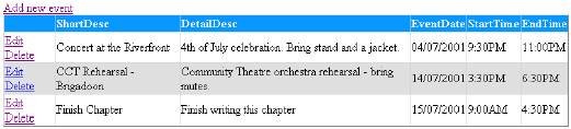
- The syntax for declaring an ASP.NET server control
- The benefits of ASP.NET server controls, such as the rich object model, automatic browser detection, a variety of properties, events, and re-usability
- The various ASP.NET server control families (intrinsic, validation, rich, and data rendering controls)
ASP.NET server controls derive their methods, properties and events from the various classes and objects that make up the .NET Framework and provide an object-oriented way to write dynamic web forms. All ASP.NET server controls are declared using same tag element naming conventions, similar to well-formed XML, and provide a uniform way to declare properties, and assign event handler methods.
Some insight into the ASP.NET page lifecycle, in relation to ASP.NET server controls was provided. The Page object's Page_Load and Page_Unload methods were explained to provide a context for when and why these methods are implemented. We also covered the basics of event handling as related to the Page object's IsPostback property.
The ASP.NET validation controls covered in this chapter, and the examples herein, should serve to open a gateway to understanding the tools you have at your disposal for creating web forms that are capable of validating data. Although we only scratched the surface of the possibilities of the various data rendering controls, such as the DataGrid, DataList and Repeater, you should be able to see their advantages in rendering a variety of types of data.
Frequently Asked Questions (FAQs) about ASP.NET Server Controls
What are the different types of ASP.NET server controls?
ASP.NET server controls are components that run on the server and encapsulate user-interface and other related functionality. They are categorized into four types: HTML server controls, Web server controls, validation controls, and user controls. HTML server controls are standard HTML tags, Web server controls are special ASP.NET tags understood by the server, validation controls are used to validate user input, and user controls are snippets of ASP code that are encapsulated into custom server controls.
How do I use ASP.NET server controls in my web application?
To use ASP.NET server controls in your web application, you need to include them in your ASP.NET page. This can be done by adding the appropriate tag for the control in the page’s HTML. For example, to add a button control, you would include the tag <asp:Button runat=”server” /> in your HTML.
What is the purpose of the ‘runat’ attribute in ASP.NET server controls?
The ‘runat’ attribute in ASP.NET server controls specifies where the control should be run. If the ‘runat’ attribute is set to ‘server’, the control will be run on the server. This is necessary for ASP.NET server controls, as they need to be processed on the server in order to function correctly.
How can I handle events in ASP.NET server controls?
Events in ASP.NET server controls can be handled using event handlers. An event handler is a subroutine that handles an event. In ASP.NET, you can create an event handler for a server control by creating a subroutine with the correct signature and associating it with the event using the control’s event property.
What are validation controls in ASP.NET?
Validation controls in ASP.NET are a set of server controls that allow you to validate user input. They provide an easy way to check whether the data entered by the user is valid before it is processed. There are several types of validation controls, including RequiredFieldValidator, RangeValidator, CompareValidator, RegularExpressionValidator, and CustomValidator.
How can I create a custom server control in ASP.NET?
To create a custom server control in ASP.NET, you need to create a new class that inherits from the Control class or from another control class. You can then override the methods and properties of the base class to provide the functionality you need. Once your custom control class is created, you can use it in your ASP.NET pages just like any other server control.
What is the difference between HTML server controls and Web server controls?
HTML server controls and Web server controls are both types of server controls in ASP.NET, but they have some differences. HTML server controls are standard HTML tags that have been made programmable by adding the ‘runat=”server”‘ attribute. Web server controls, on the other hand, are special ASP.NET tags that provide more functionality than standard HTML tags.
Can I use ASP.NET server controls in an MVC application?
ASP.NET MVC is a framework that uses a different approach to web development than ASP.NET Web Forms, which is where server controls are typically used. In an MVC application, the focus is on controlling the application flow through controllers, rendering HTML in views, and passing data between the two using models. While it is technically possible to use server controls in an MVC application, it is not recommended as it goes against the MVC pattern.
How can I bind data to a server control?
Data binding in ASP.NET server controls is the process of connecting a server control to a data source, such as a database, and making the data available for the control to use. This can be done using the control’s ‘DataSource’ property and calling the ‘DataBind’ method.
What are user controls in ASP.NET?
User controls in ASP.NET are reusable page segments that can be used as server controls in your ASP.NET pages. They are similar to complete ASP.NET pages, but they are encapsulated into a single, reusable object. User controls can include all the same types of content as a regular page, including HTML, client-side script, server controls, and static text.
 Wrox Press