Every designer has a set of fonts that they like to use for most projects. Most of these typefaces are versatile and can be used in a wide variety of applications. You can use them in headlines and in large bodies of text as well. A great example of a general-purpose font would be Helvetica. But, there are also fonts that — despite their obvious beauty — are only used for very specific purposes. These fonts were made for specific applications and contexts. While these typefaces suit their specific roles extremely well, designers should be well aware of when, where, and why those fonts excel. And, it’s equally important to know when not to use them.
Edwardian Script and Scriptina Pro
 These two typefaces are great for formal applications. They are popular choices for wedding invitations and holiday cards. The swishes and swirls of the script typefaces add a sense of elegance that you just can’t achieve with any other typeface. Weddings are meant to be formal, so the classy and sophisticated styles of Edwardian Script and Scriptina Pro make them perfect fits. It would be hard to justify the use of these fonts in other applications. For example, you wouldn’t see Edwardian Script on the side of a football helmet, or any aggressive application. It’s also unlikely that you’d see Scriptina Pro on a toolbox brand logo, or a product that is being marketed for its durability.

Stencil
The Stencil typeface is another font with a very specialized purpose. Stenciling is meant to be bold. Because of its rugged constructivist nature, it is usually used on something that has to do with buildings or structures. You might see Stencil used on the side of a sheet metal tool box, but it’s not likely that you would see it on a wedding invitation, or something that is designed to be formal or elegant. Stencil is thick with sharp edges, and it is very masculine in nature. It isn’t inviting or warm, and its overall purpose is not so much decorative as it is utilitarian.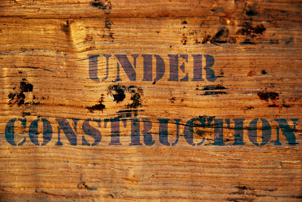 With Stencil’s thick stroke and harsh edges, you immediately begin to make the connection between, the typeface and stone, rock, metal, and durability. You could easily see Stencil or any font like it used to brand a durable tool company’s products. See the toolbox shown below.

Blackletter
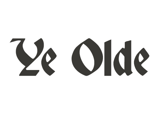 Blackletter, or Gothic fonts have specific purposes as well. They have an old style look and are fairly difficult to read. You wouldn’t find a blackletter typeface used in a logo for a new, modern technology company. It works better for products that are supposed to portray age or very old tradition. An example where you’ll see blackletter typefaces a lot is on Bar-B-Que sauce. You’ll see these and Wood type, which we’ll discuss later. Some additional examples of blackletter fonts are Lucida Blackletter, or Deutsch Gothic.
Collegiate
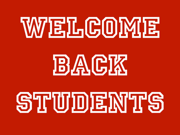 The collegiate fonts are probably the most specific that a font can be, as they are used almost exclusively in academic applications. Most of the time you will see these fonts used in advertisements in the late summer to attract students who are returning to school. You can spot one of these fonts easily, because they don’t have round or straight corners on the lettering. They will have diagonal corners. Generally these types of fonts have thick outlines with no fill.
Wood Type
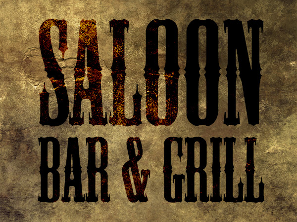 Wood type is a very distinct typeface that is ornamental in nature. It beckons to days of old where intricate type was used in the old west. The characteristics that you will find in wood type are extra points and exaggerated thick and thin strokes. These typefaces are commonly found when designing Western saloon signage, or for a retro circus or carnival as shown below.
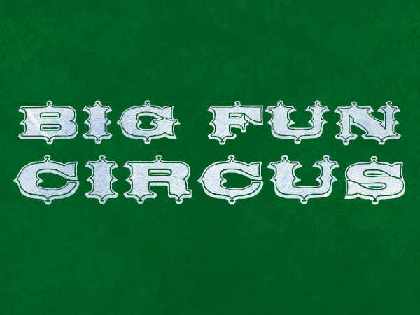 Notice the points at the top and bottom of each letter. Mesquite and Circus Ornate are among some common wood type typefaces that you will find available for these purposes.
Chalk
 Chalk typefaces are definitely an example of very specific font applications. Chalk typefaces are directed at children and are used to sell school supplies to young students. They are also directed at teachers, who are often the ones buying these supplies. Chalk typefaces have the appearance of being hand-written and organic. They are usually distressed and are meant to look imperfect due to their intended emulation of natural handwriting. The strokes are usually medium, like the thick edge of a piece of chalk. This kind of typeface is typical when appealing to children and younger generations. Good examples of these fonts would be Chalkboard and Chalkduster.
Typewriter and Digital Fonts
 Digital fonts and typewriter fonts are generally used in technological design applications. You will find digital fonts used for technology products and gadgets. When you see these typefaces, you immediately think of computers and anything digital, such as a clock or a watch. The easiest example would be the movie “The Matrix”. As technologically deep as the movie is, the typeface that they chose for the screen font is a variation of a digital font.
Conclusion
Certain typefaces are meant for specific purposes. Knowing these fonts and being able to identify them will help you to create professional design work with proper type choices. You don’t always have to use these fonts for their exactly intended purposes, but being aware of their roles can make your designs more thoughtful and deliberate. Having said that, you should always strive to create unique designs using a creative and innovative approach. Do you have any other highly-specialized fonts to add to the list? Would you support using fonts only for their intended purposes, or would you rather experiment with fonts and try them in unusual roles?Frequently Asked Questions about Specialized Fonts
What are some examples of fonts with specialized purposes?
Fonts with specialized purposes are designed to serve a specific function or evoke a particular emotion. For example, the ‘Chalkduster’ font is designed to mimic the look of text written in chalk on a blackboard, making it ideal for educational or informal settings. The ‘Saloon’ font, on the other hand, is reminiscent of old western signage, making it perfect for projects that require a vintage or rustic feel. Other examples include the ‘S-Works’ font used by Specialized Bicycle Components, which is sleek and modern, reflecting the company’s focus on innovation and design.
How do I choose the right specialized font for my project?
Choosing the right specialized font depends on the message you want to convey. Consider the context and audience of your project. For instance, if you’re designing a poster for a children’s event, a playful, colorful font might be appropriate. If you’re creating a logo for a high-end brand, a sophisticated, minimalist font could be more suitable. It’s also important to ensure the font is legible and fits well with other design elements.
Can I use multiple specialized fonts in one project?
While it’s possible to use multiple specialized fonts in one project, it’s generally recommended to limit your use to two or three at most. Using too many different fonts can make your design look cluttered and confusing. Instead, try to create contrast and hierarchy by varying the size, weight, and style of a single font or pair complementary fonts.
Where can I find specialized fonts?
There are numerous online resources where you can find specialized fonts. Websites like FontSpace, Adobe Stock, and FFonts offer a wide range of fonts for various purposes. Some fonts are free to download and use, while others require a purchase or subscription.
Are there any legal considerations when using specialized fonts?
Yes, it’s important to be aware of the legal considerations when using specialized fonts. Many fonts are protected by copyright law, which means you need permission or a license to use them, especially for commercial purposes. Always check the terms and conditions before downloading and using a font.
How can I install a specialized font on my computer?
Installing a specialized font on your computer is usually a straightforward process. After downloading the font file, you can typically install it by double-clicking the file and then clicking ‘Install’. The exact process may vary depending on your operating system.
Can specialized fonts be used in digital and print media?
Yes, specialized fonts can be used in both digital and print media. However, it’s important to ensure the font is clear and legible in the medium you’re using. Some fonts may look great on a computer screen but become blurry or distorted when printed, and vice versa.
How can I pair specialized fonts effectively?
Pairing specialized fonts effectively requires a balance of contrast and harmony. Choose fonts that complement each other without being too similar. For example, you might pair a bold, decorative font with a simple, clean font for contrast.
Can I create my own specialized font?
Yes, creating your own specialized font is possible, but it requires a good understanding of typography and design principles. There are software programs and online tools available that can help you design and create your own fonts.
How can I ensure my specialized font is accessible to all users?
To ensure your specialized font is accessible, make sure it’s legible and easy to read. Avoid fonts that are too decorative or complex, as they can be difficult for some people to read. Consider the size, spacing, and color contrast of your text. Additionally, make sure your font is compatible with screen readers and other assistive technologies.
 James George
James George is a professional web developer and graphic designer. James is an expert in design, and a professional web developer, with a special interest in WordPress. Founder of Design Crawl, James has been a professional designer since 2005.


