Personality transforms a basic site into an engaging, entertaining one. It’s what convinces first-time visitors to keep clicking and repeat visitors to come back. However, once you’ve added personality in all the obvious places – like your copy, visuals, fonts, and color scheme – you might not know what else to personalize.
If that’s the case, check out these five places you can give your site a little personality.
1. The Error Page
Whether it’s your fault or theirs, your site visitors will understandably be a little dismayed when they’re shown an error page. But with a helpful, visually compelling, even amusing 404 or 500 page, you can make them forget their dismay-and build your brand in the process.
Let’s look some well-designed error pages for inspiration.
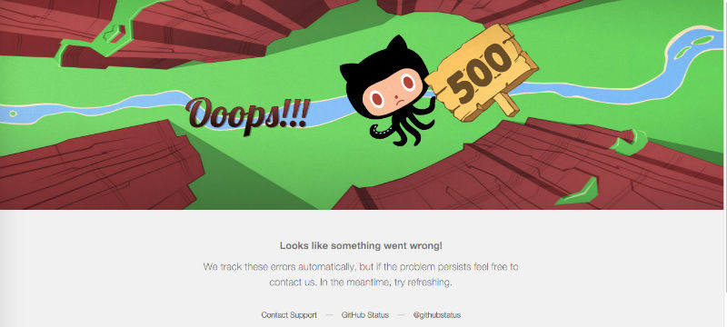
Every detail of GitHub’s 500 is great.
First, the illustration perfectly conveys the personality of GitHub: quirky, off-beat, not too serious. As you move your mouse around, the illustration shifts in response – a nice little piece of coding.
The copy is also on-brand, from the “Oops!!!” with not one but three exclamation marks and the helpful suggestion at the bottom.
The Muse’s 404 page is similarly well-executed.
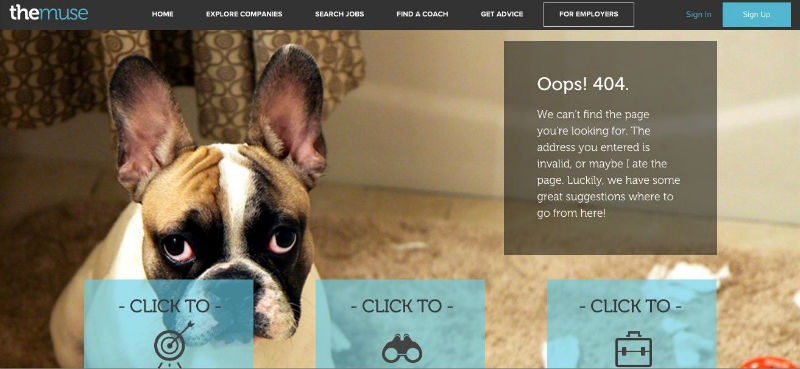
It’s hard not to smile at the doleful puppy, and his explanation (“The address you entered is invalid, or maybe I ate it,”) is pretty cute.
Rather than simply presenting links to various sections of the site, it says, “We have some great suggestions for where to go from here!”
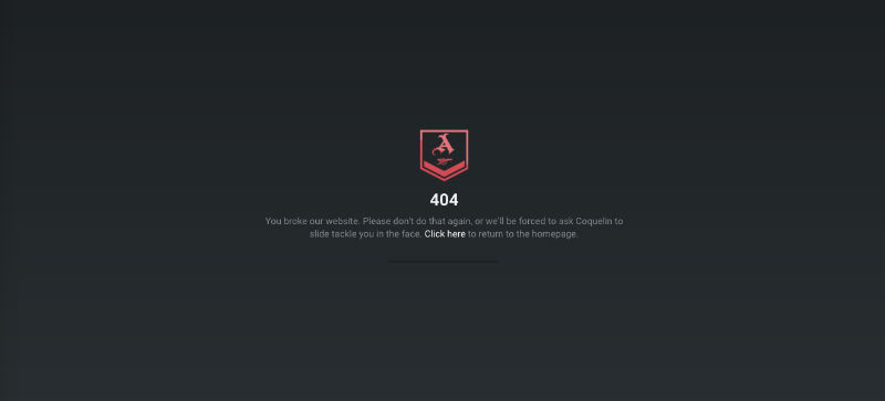
Even NASA has crafted a creative error page.
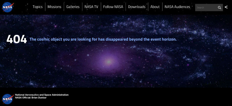
Since a variety of audiences use the site-from young kids to professionals-it was wise to keep the message playful and space-themed without going overboard. (The space porn doesn’t hurt, either.)
2. The FAQ
FAQ pages tend to be a little dry. That’s understandable: they need to communicate lots of information as clearly, concisely, and matter-of-factly as possible.
Yet if you can do that while also putting some personality in, your visitors will thank you.
Casper has one of the best FAQ pages I’ve seen.
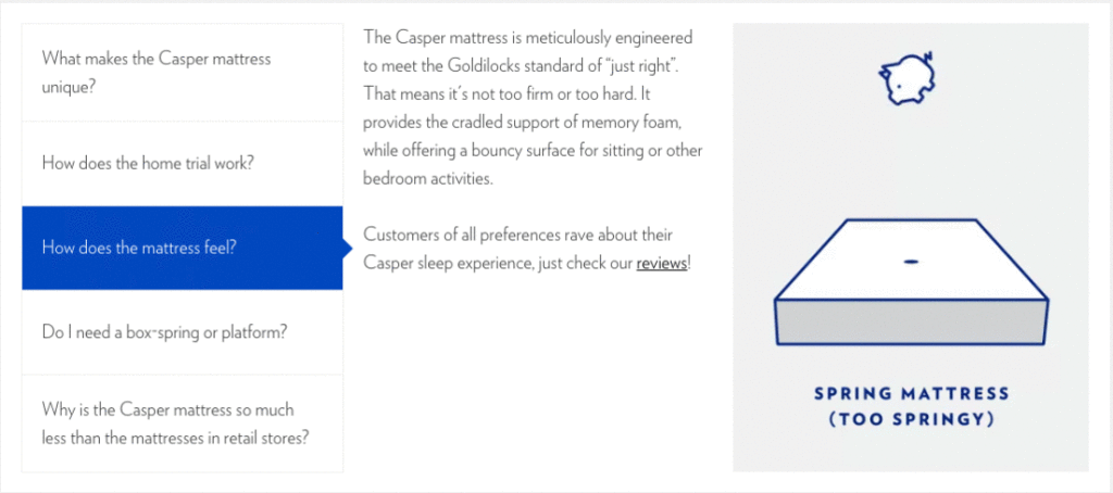
There are five main topics-each with its own adorable illustration. This makes reading about the “special blend of three types of foam” of a Casper mattress fun, rather than boring.
To enliven its support center, Squarespace competitor Jimdo used descriptive icons.
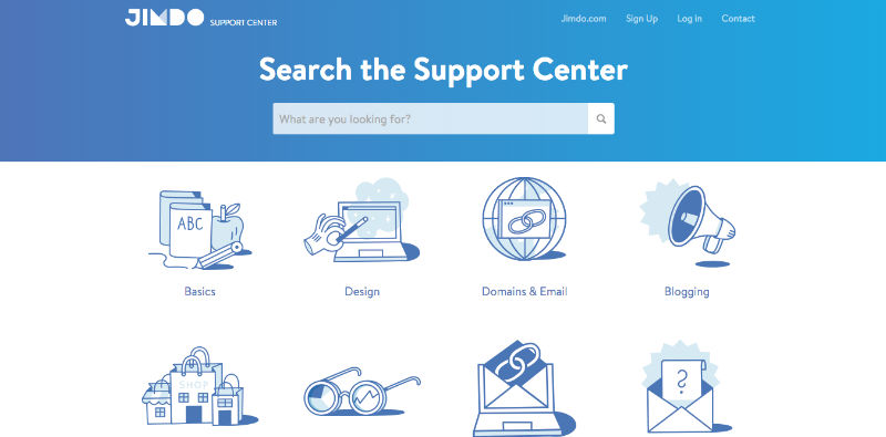
Not only does this design technique make finding the right section intuitive, but it’s also in-keeping with how visual the rest of the Jimdo site is.
Product Hunt used a different approach. The styling of the Product Hunt FAQ is relatively traditional (although it maintains the overall look of the site), but there’s personality in the copy.
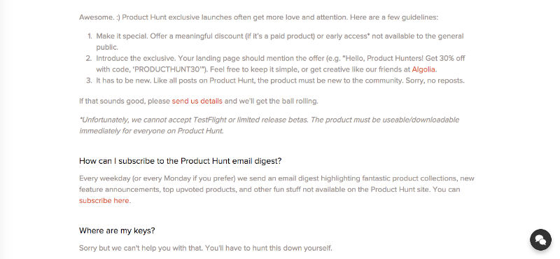
For example, the first question is, “What’s going on here?” This answers “What is Product Hunt?” in a more human way. There’s also some easter egg questions, such as, “Where are my keys?”
Product Hunt is a user-moderated site with user-generated content–and as such, it’s very communal. A generic FAQ would feel oddly formal.
3. The Pop-Up
Site pop-ups get a really bad rap. However, if you’re giving your visitors something of value (a discount code, a free guide, a cool newsletter, etc.), then they’re not evil at all.
And they’re also another opportunity to show your brand personality.
Check out this pop-up from Stick in a Box, a jerky subscription service.
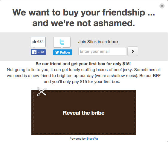
The Stick in a Box guys are unapologetically goofy (their company is called Stick in a Box, after all.) This pop-up is definitely goofy.
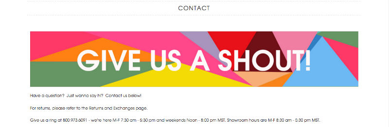
Deny Designs, a furniture and decor company, is appealing to a totally different audience: 16 to 28-year-old women.
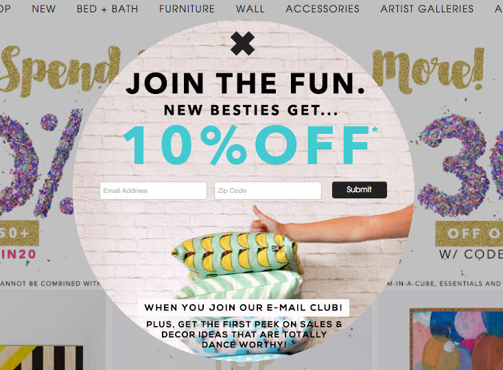
Their pop-up is perfectly tailored to this audience, from the cutesy copy (note “ideas that are totally dance-worthy” and “besties”) to the bold colors and youthful thumbs-up. When you browse through the rest of the site, you’ll find this high-energy, friendly approach repeated everywhere. For example, the Contact Us page says:
Greatist, a fitness and health site, used a different strategy.
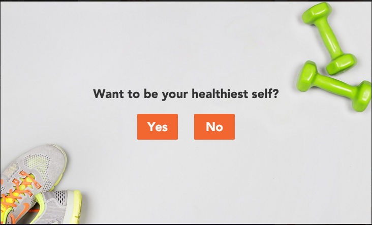
Their popup is relatively stark: one line and two buttons. Not only is the photo well-styled and thematically consistent, but the simplicity of the question implies that becoming healthier is simple.
Casper get its second shoutout for its awesome popup.
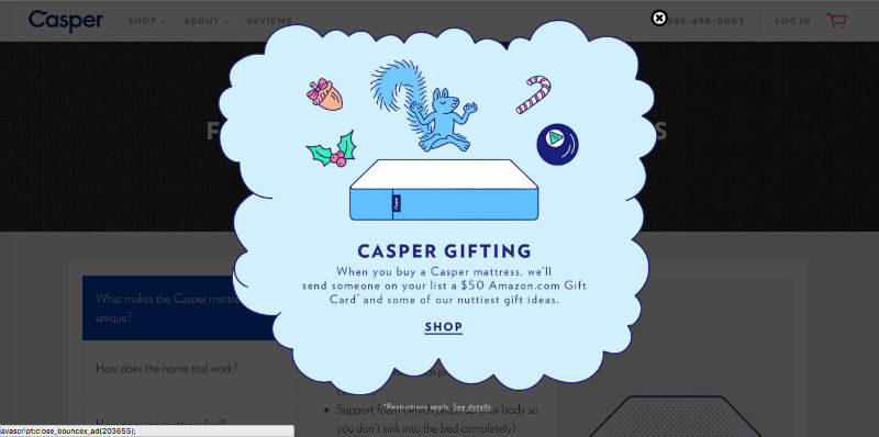
Even though it’s easy to get frustrated with popups for interrupting your browsing experience, this one is too amusing to be annoying. I especially like the tie-in of the squirrel with the “nuttiest” gift ideas.
This Arsenal example is really simple, but it makes you feel like one of team with its inside jokes and purposefully over-macho tone.
Finally, this exit pop-up from Brad S. Knutson’s portfolio is one of the best I’ve seen on a personal website.
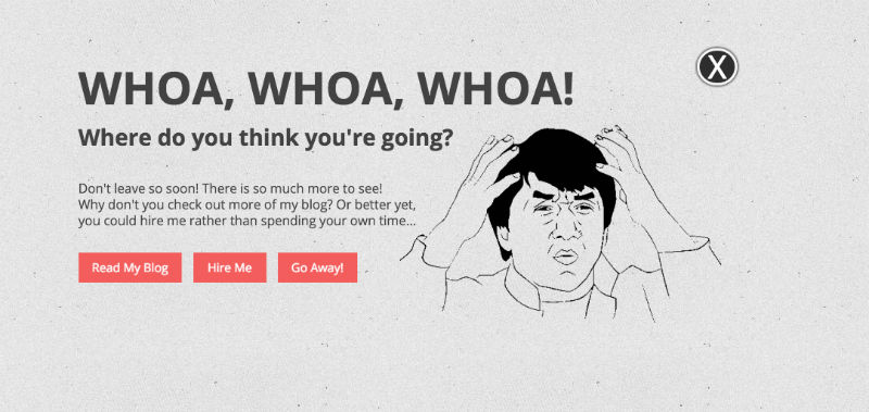
Knutson clearly knows he’s speaking to a certain subset of people-hence the well-known Internet meme.
4. The Loading Icon
The loading icon is definitely an under-utilized area when it comes to injecting personality. But if you stick with a normal pinwheel or bar, you’ll be losing out on the chance to entertain your visitors while they wait.
While Google’s Santa Tracker loads, a grinning Santa waves at you.
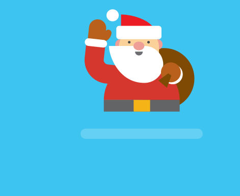
Once you enter the site, you see how closely the design of the user interface matches this illustration. It’s a good way to make the journey feel continuous.

European airline Ryanair updates the circular loading icon by adding an airplane, which is a nice nod to the site’s function.
And the icon’s colors are taken from Ryanair’s brand colors.
Check out the Digital Kitchen site for another cool variation.
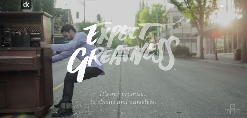
“Expect Greatness,” the agency’s motto, appears on an all-black background. As the site loads, a gray veil is stripped away from the slogan to reveal a colorful montage of past campaigns.
This loading device ties in everything that’s most important about DK: its work, its tagline, and its design philosophy. By the time you actually enter the site, you’re already primed to work with the agency (or for it).
The Charles is another digital agency; however, its loading page is much subtler.

This choice makes sense when you experience The Charles site. It’s definitely minimal and features a one-page set-up, ample white space, and black, stark text. If you used Digital Kitchen’s loading page for The Charles, visitors would be thrown off by the jarring transition.
5. The Team Page
Showing your visitors the people behind the website is a great way to create an authentic connection. But remember, this page needs to be just as – if not more so-on-brand than the others. So even though it’s technically “about you,” make sure that you’re describing your team, mission, history, and so forth in a style that’s cohesive with the rest of the site.
Kickstarter has a fantastic “Team” page.
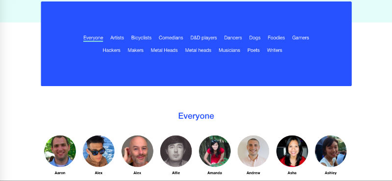
You can literally filter employees by their interests, from poetry to Dungeon & Dragons. This makes total sense, considering Kickstarter is designed to fund passion projects. The filter feature is also nice because it recalls Kickstarter’s Discovery section, which allows you to browse live campaigns by category.
When you hover over individual employees, you learn how many projects they’ve backed, along with their favorite category. It’s a subtle but effective way of demonstrating that the Kickstarter team eats its own dogfood (i.e. uses its own product).
Kittie’s Cakes, a small bakery in Ohio, also has a well-executed “Story” page.
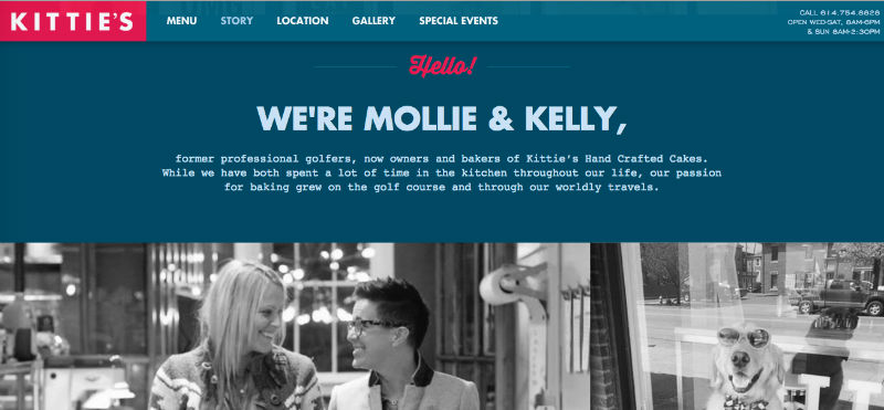
It’s got a scrapbook-style design; not only does this add to the cute factor, but it goes with the classic American baked goods Kittie’s offers.
The photos of the owners, Mollie and Kelly, and the blurb about their shared history, give this page even more personality.
Lastly, look at Munchery’s “About” page.
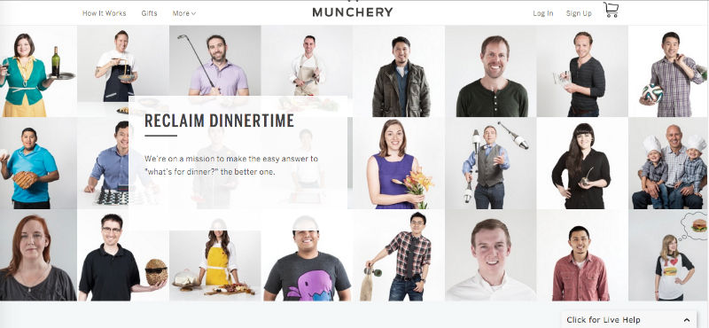
The header image is a collage of Munchery employees being goofy: a fun way to show company culture without using up a lot of real estate.
The copy on this page strengthens the intimate, friendly vibe. For example, one section reads, “You’re overcommitted, under caffeinated and inbox zero seems like a cruel joke. At some point, you’ve gotta figure out what’s for dinner.”
Some things are best in moderation – but when it comes to your site, personality usually isn’t one of them. The more engaging, entertaining, and alive it feels, the more your visitors will love it.
 Aja Frost
Aja Frost is a writer, tech/design geek, and podcast addict. Check out her site or say hi on Twitter.