Psychology plays a pivotal role in interaction design. In order to offer an optimal user experience, you have to empathize with the user and understand their intentions before they do. With this information, you can conveniently pave a direct path to where they want to go and insert your best content in their line of sight.
Let’s discuss 5 ways that brick and mortar stores increase their sales by making (sometimes very small) changes to their store layouts, changes that can also be made to e-commerce stores.
1. Point Of Sale Add-Ons
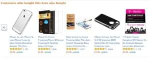
Generally speaking, retailers will often front you with their most expensive items first (to play on your sense of comparison), making the cheaper items towards the end of your shop seem like more of a bargain. In retail stores, this is the usually confectionary stand by the checkout, or the “one-time-only” discount on selected CDs and DVDs before being asked to pay.
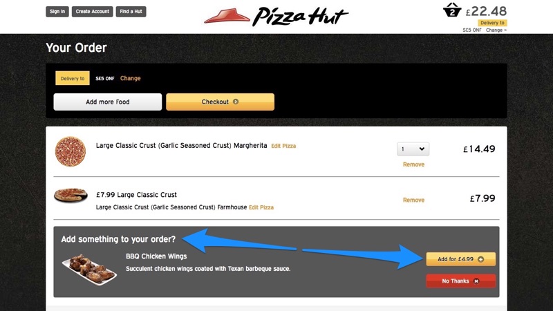
In e-commerce stores this is the “would you like to add [item] to your basket for only $0.99”? It may seem like trickery, but if the user walks away with what they feel is a bargain, they’ll walk away satisfied – and they didn’t even have to browse for it!
Fun-fact: when asked if a customer wants to upgrade (for example medium to large fries in McDonald’s), 47% will say yes.
2. Store Layouts and Your Line of Sight
Many stores invest time and money in user testing, both online and offline. As a result, they’re more aware of how customers tend to navigate themselves in their store; they can insert advertising between where the customer is, and where they might be going. In brick and mortar shops, advertising appears in your line of sight as you enter the shop, wait for an elevator, use an escalator or queue to checkout – this isn’t by accident.
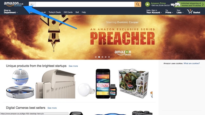
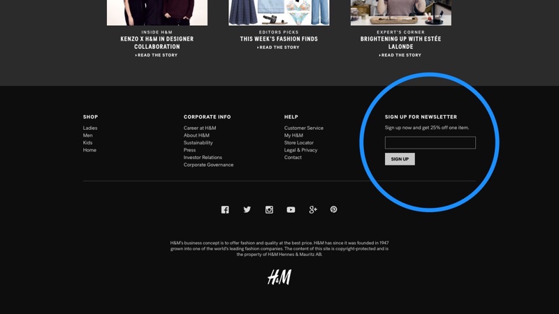
As with brick and mortar shops, ads are sometimes used near the online checkout (basket, cart, etc) interface as well, so that the user is sure to see it as they pay for their items – let’s take Amazon (UK) for example.
When shoppers first enter a brick and mortar shop, known as the “transition zone”, they tend to start on the right-hand side (based on US research). However, with e-commerce stores, users tend to start from the top-left corner according to eye-tracking studies.
Amazon has also taken notice of this and advertised their Amazon Prime service near the basket, as well as underneath the logo.

3. “Look Here, Look Here! Do This, Do This!”
You can’t retain a user if you never acquired them, which is why “subscribe for more” modals as soon as you enter a website, or “table for two?” before you’ve barely laid eyes on the menu outside a restaurant is a terrible idea. Restaurants aren’t strictly a brick-and-mortar establishment (or are they?) but this example certainly makes us feel awkward and/or annoyed.
Here are two ways that you can handle this user flow:
- No: “request” that the user subscribes, reward them with access
- Yes: offer content first, suggest to subscribe after
You shouldn’t reward users with basic web content for subscribing to your newsletter, instead you should reward users for reading the web content and reward them even more for subscribing – create incentives to engage further, offering the user free/discounted items or a higher level of subscription over time.
Let the user trust your content and see value first.
4. Fake It ‘Til You Make It
Back to restaurants again. Have you ever wondered why, despite there being a ton of better seating options, the hostess seats you by the window? Well, this is actually so the restaurant seems busier, and therefore more desirable than it actually is. If the restaurant has no customers at all, waiting-staff will sit by the windows themselves, trying their best to look like a customer.
In e-commerce stores, we can portray customer validation with ratings and reviews. Now I wouldn’t suggest faking ratings and reviews (although I’m sure many online stores do this!), but instead offer free trials and testers in exchange; fake it (in a more honest way) until you begin to receive real, earned sales.
5. Personalising Products
Brick and mortar shops are absolute wizards at making sure customers remain in the store as long as is humanely achievable because, at that stage, they’re kind of committed to having a look around. However, in an online context, it’s far easier to leave a shop by clicking the back button and selecting option #2 in the Google results – indeed, the techniques are lacking in comparison.
One trick that really engages customers (both in the online and offline space) is the option to personalize products. Build-A-Bear built (see what I did there?) their entire customer experience centered around letting the customer craft a unique bear.
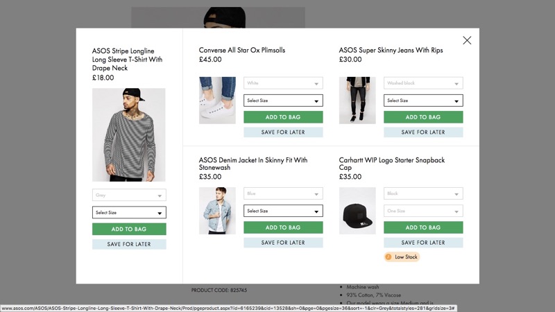
Retailers have long known that there’s more value in a unique item, or at the very least, an item with (for example) various color and size options. ASOS (and many other brands lately) take it a step further with their “Shop the look” button. Essentially, you find an item that you like and ASOS recommends a set of garments to go with it – you’re not just customizing an item, you’re customizing an entire outfit.
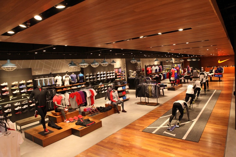
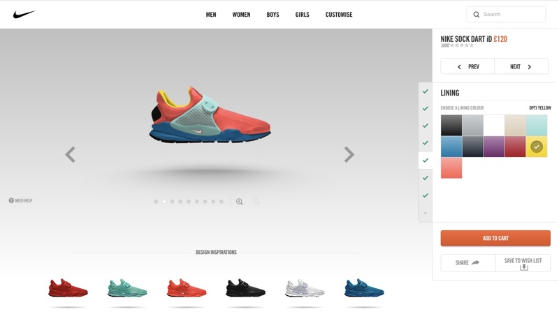
Here’s another example by Nike that lets you tweak your trainers to the max!
Conclusion
According to this study by Baymard, almost 69% of online shoppers abandon their shopping cart. Why? Maybe the shopper isn’t spending enough money to meet the free delivery requirements, or their items aren’t unique enough, or there weren’t enough reviews to warrant buying the item. Perhaps the customer became frustrated by a pop-up and never really started shopping.
E-commerce is a very difficult UX to master but by following these 5 tips you could drastically improve the rate of which your customers reach the finish line.
Frequently Asked Questions about UX Lessons from Brick-and-Mortar Store Design
What are the key UX lessons that can be learned from brick-and-mortar store design?
Brick-and-mortar store design offers several valuable UX lessons. Firstly, the importance of first impressions cannot be overstated. The store’s layout, lighting, and overall ambiance play a crucial role in attracting and retaining customers. Secondly, the customer journey should be seamless and intuitive, with clear signage and easy navigation. Thirdly, personalization is key. Just as store associates tailor their service to individual customers, online experiences should be personalized to meet user needs and preferences. Lastly, the importance of feedback in improving the user experience is a lesson that can be learned from physical stores.
How can these UX lessons be applied to online platforms?
These UX lessons can be applied to online platforms in several ways. For instance, the website design should be visually appealing and easy to navigate, similar to a well-designed physical store. Personalization can be achieved through personalized recommendations, tailored content, and user-friendly interfaces. Feedback can be collected through user surveys, reviews, and ratings.
What is the importance of personalization in UX design?
Personalization in UX design is crucial as it enhances user engagement and satisfaction. By tailoring the user experience to individual needs and preferences, businesses can improve user retention and conversion rates. This can be achieved through personalized content, recommendations, and user-friendly interfaces.
How can feedback be used to improve the user experience?
Feedback is a valuable tool for improving the user experience. It provides insights into user needs, preferences, and pain points, which can be used to refine and optimize the UX design. Feedback can be collected through user surveys, reviews, and ratings.
What role does the store layout play in the user experience?
The store layout plays a crucial role in the user experience. It influences how customers navigate the store, find products, and interact with the store associates. A well-designed store layout is intuitive, easy to navigate, and enhances the overall shopping experience.
How can the lessons from brick-and-mortar store design be used to improve e-commerce platforms?
The lessons from brick-and-mortar store design can be used to improve e-commerce platforms in several ways. For instance, the website design should be visually appealing and easy to navigate, similar to a well-designed physical store. Personalization can be achieved through personalized recommendations, tailored content, and user-friendly interfaces. Feedback can be collected through user surveys, reviews, and ratings.
What is the importance of first impressions in UX design?
First impressions are crucial in UX design as they influence user perceptions and behaviors. A positive first impression can enhance user engagement, satisfaction, and loyalty. This can be achieved through visually appealing website design, intuitive navigation, and personalized user experiences.
How can the customer journey be optimized in UX design?
The customer journey can be optimized in UX design by ensuring that it is seamless and intuitive. This involves providing clear and concise information, easy navigation, and personalized experiences. Feedback can also be used to identify and address any pain points in the customer journey.
What are some common mistakes in UX design?
Some common mistakes in UX design include lack of personalization, poor navigation, and ignoring user feedback. These can lead to a poor user experience, resulting in lower user engagement and conversion rates.
How can UX design influence user behavior?
UX design can influence user behavior in several ways. For instance, a well-designed website can encourage users to spend more time exploring the site, increasing the chances of conversion. Personalized experiences can enhance user engagement and satisfaction, leading to increased user retention. Feedback can also be used to refine the UX design, further influencing user behavior.
 Daniel Schwarz
Previously, design blog editor at Toptal and SitePoint. Now Daniel advocates for better UX design alongside industry leaders such as Adobe, InVision, Marvel, Wix, Net Magazine, LogRocket, CSS-Tricks, and more.