While coming up with this research, I struggled with the concept of “retro.” What is retro, really? Retro is the Beach Boys, World War II posters, psychedelic designs, and vintage 1940s and 50s Chevy ads. While I can’t put it into so many words, I can definitely show you what I think the idea of retro is in terms of web design. This collection of retro website designs is just one perspective on the retro genre. You could go in many different directions with lots of different retro concepts, and this collection hopefully touches on most of the main themes. What kinds of retro elements do you reach for when you want to give something an older look and feel?
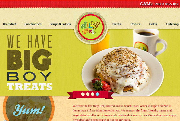
1. Dilly Deli
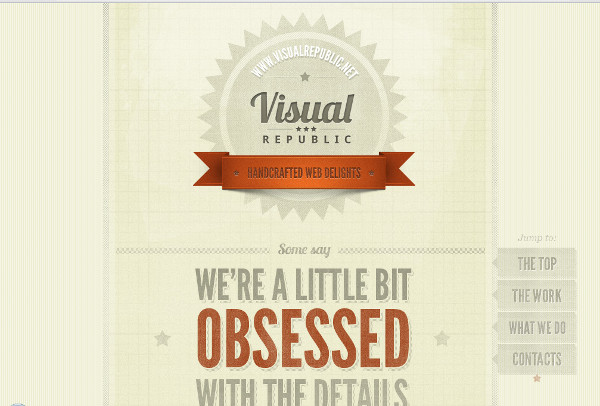
2. Visual Republic
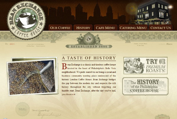
3. Bean Exchange
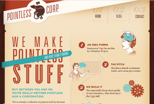
4. Pointless Corp
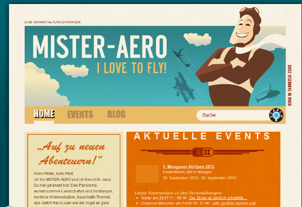
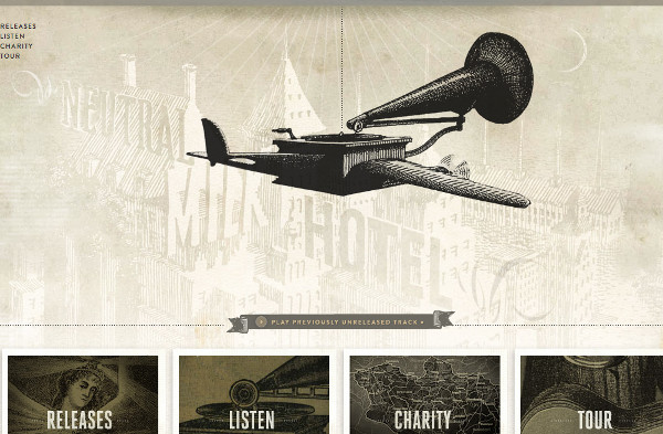
5. Mister Aero
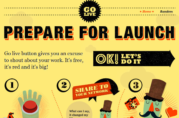
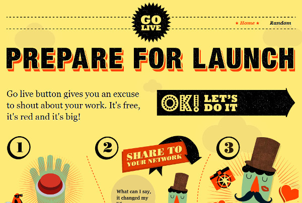
6. Go Live Button
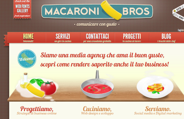
7. Macaroni Bros
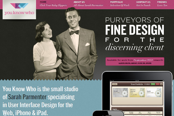
8. You Know Who Design
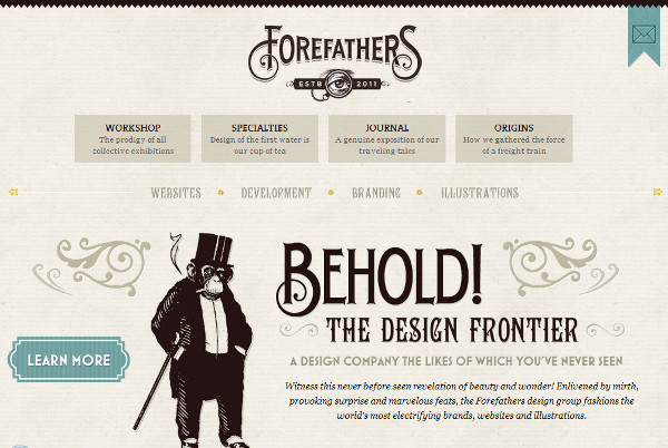
9. Forefather’s Group
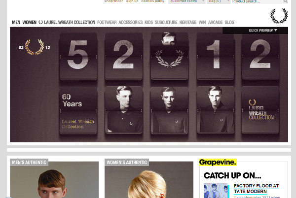
10. Fred Perry
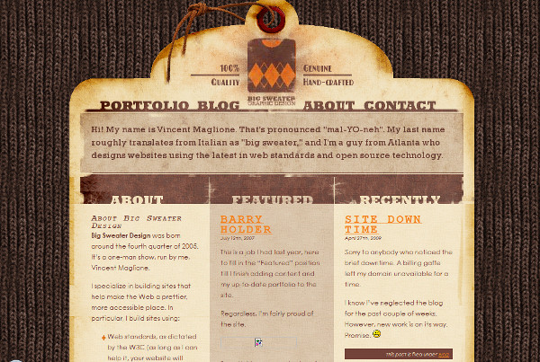
11. Big Sweater Design
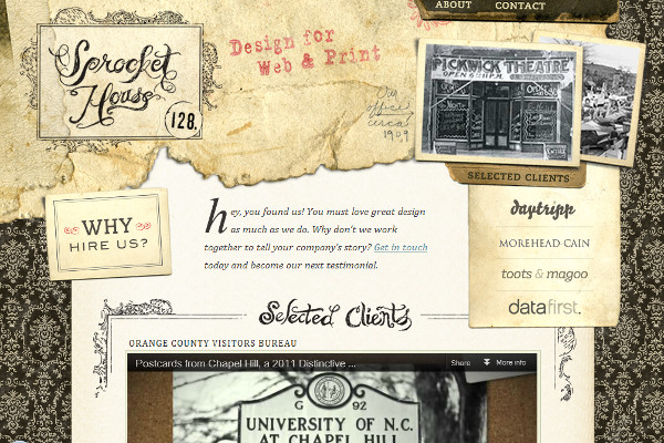
12. Sprocket House
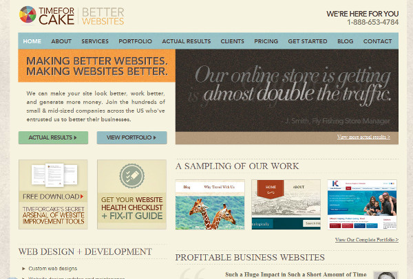
13. Time For Cake
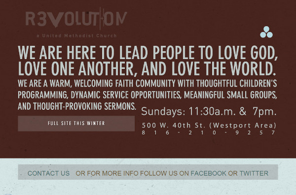
14. Revolution Church
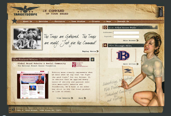
15. Target Scope
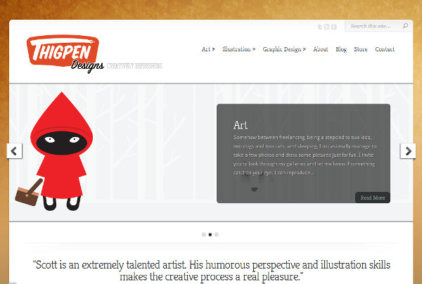
16. Thigpen Designs
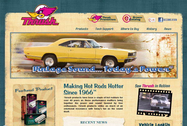
17. Thrush Exhaust
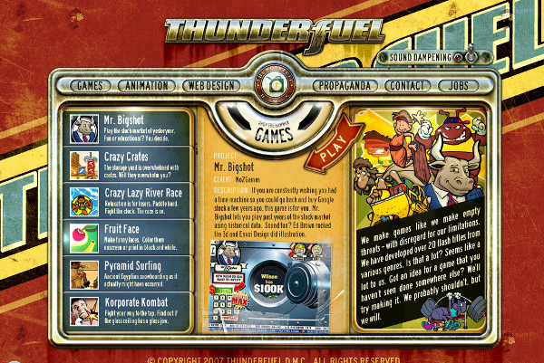
18. Thunderfuel
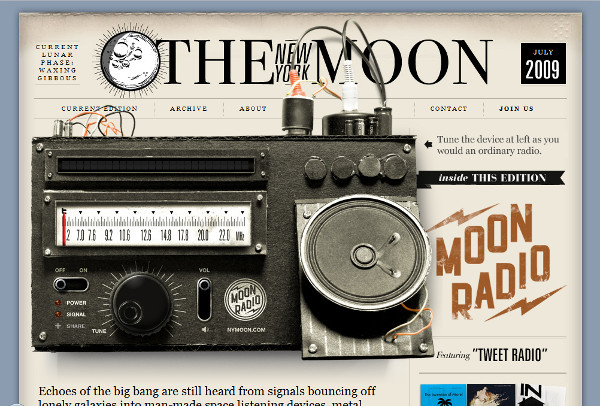
19. Radio: The New York Moon
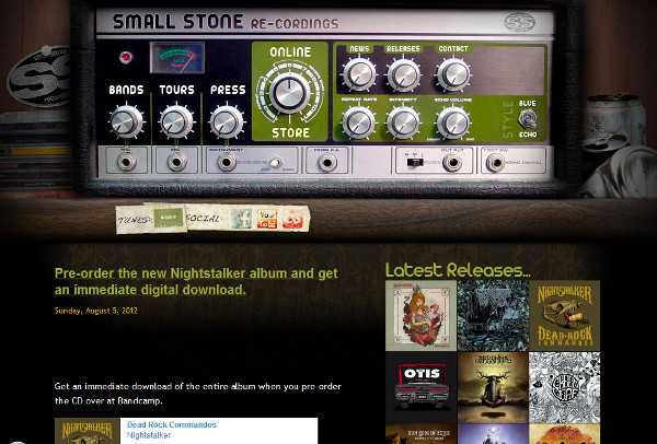
20. Small Stones Recordings
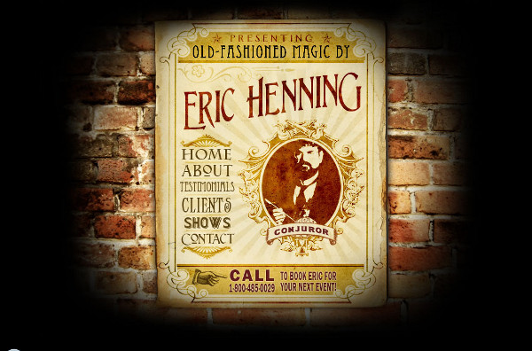
21. Eric Henning
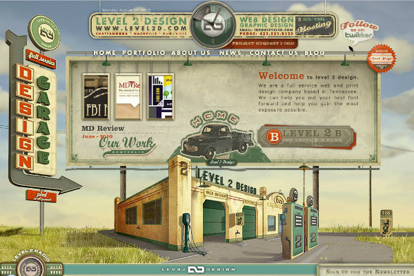
22. Level 2 Design
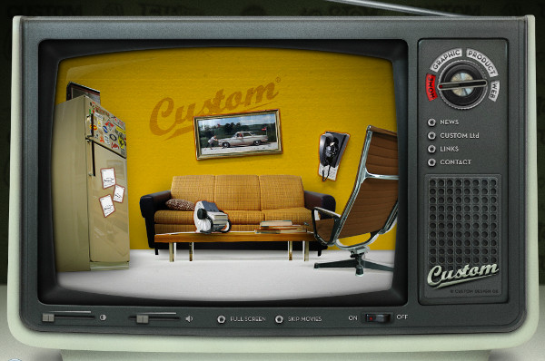
23. Custom Design
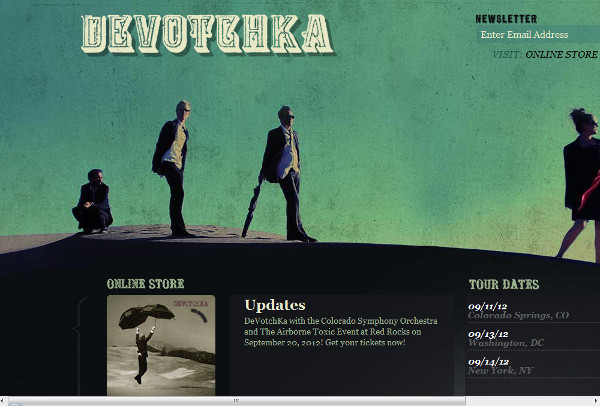
24. Devotchka
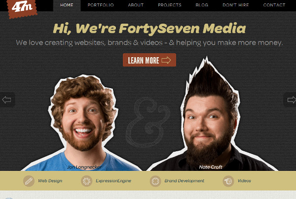
25. Forty Seven Media
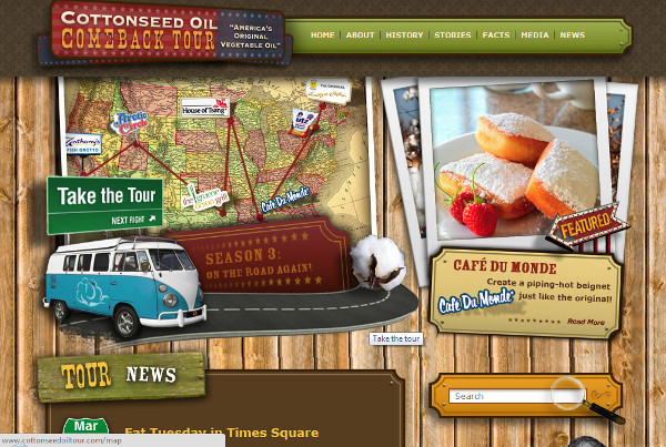
26. Cotton Seed Oil Tour
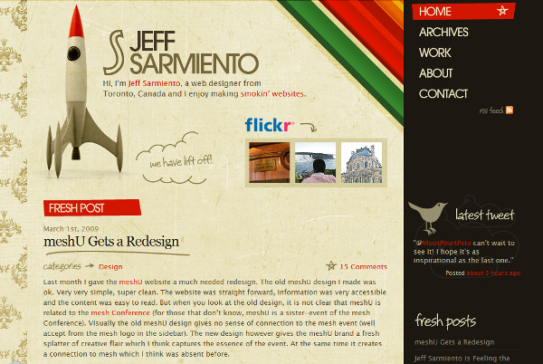
27. Jeff Sarmiento
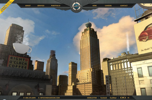
28. Media Boom
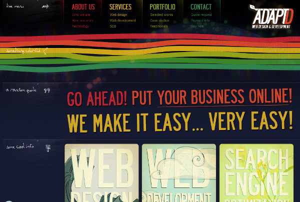
29. AdaptD
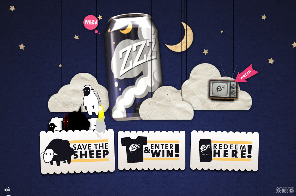
30. ZZZ Drink
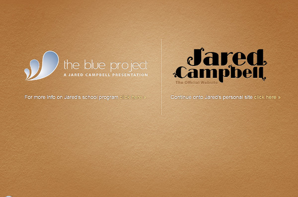
31. Jared Campbell
32. Walking Wall of Words
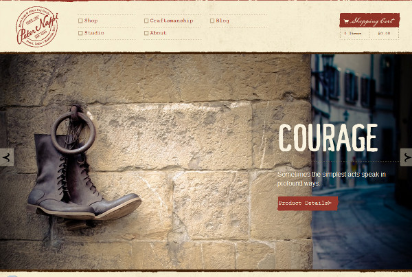
33. Peter Nappi
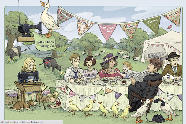
34. Jolly Duck Hunting
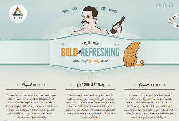
35. Forever Heavy
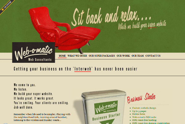
36. Web-O-Matic
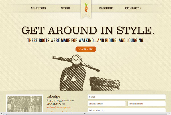
37. Cabedge
38. Brock Kenzler
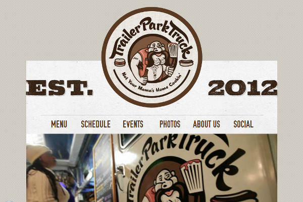
39. Trailer Park Truck
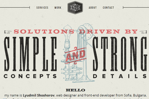
40. Shoshorov
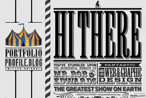
41. Robedwards
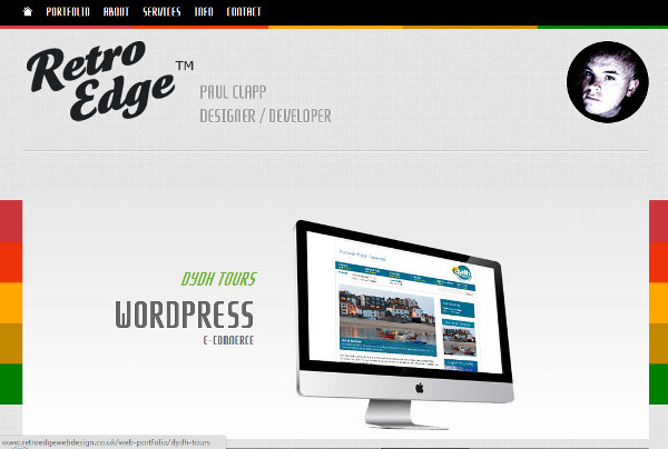
42. Retro Edge Design
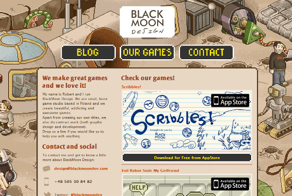
43. Black Moon Design
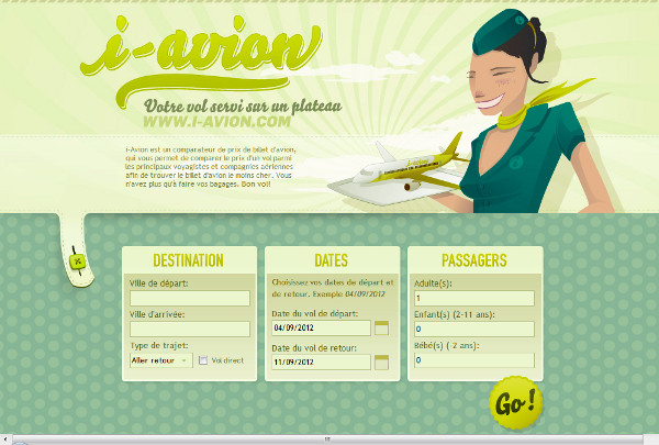
44. i Avion
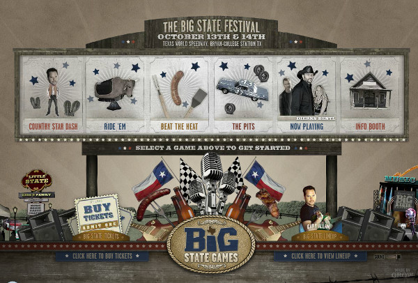
45. Big State Festival
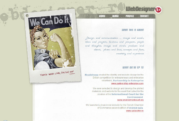
46. Web Designer
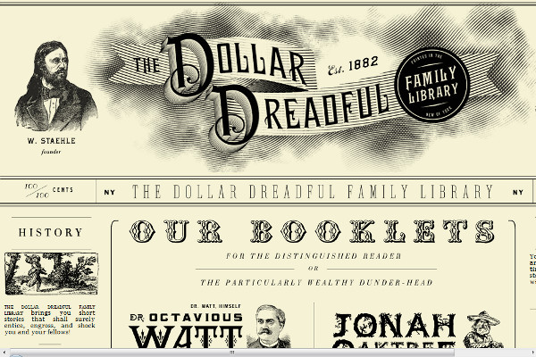
47. Dollar Dreadful
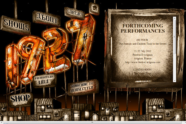
48. 1927
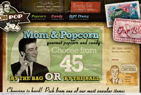
49. Mom and Popcorn
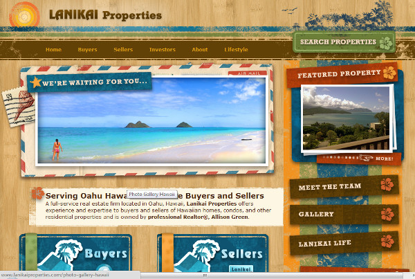
50. Lanikai Properties
Do you have any retro web designs to share? What does “retro” mean to you?
Frequently Asked Questions about Retro Website Designs
What are the key elements of a retro website design?
Retro website design is characterized by certain key elements that give it a nostalgic and vintage feel. These elements include typography, color schemes, textures, and imagery. Typography in retro designs often includes fonts that were popular in the 50s, 60s, and 70s. Color schemes are usually bold and vibrant, often using colors that were popular in those decades. Textures such as grainy or scratched surfaces, paper textures, and vintage patterns are also common. Imagery often includes vintage illustrations, photographs, and icons.
How can I incorporate retro elements into a modern website design?
Incorporating retro elements into a modern website design can be done subtly or more overtly, depending on the desired effect. You could use a retro color palette, vintage typography, or old-school icons and graphics. However, it’s important to balance these elements with modern design principles to ensure the website is still user-friendly and functional. For example, you could use a vintage font for headings, but stick to a modern, easy-to-read font for body text.
What are some examples of successful retro website designs?
There are many successful retro website designs that beautifully incorporate vintage elements. Some examples include the website for the film “The Shape of Water”, which uses vintage typography, a muted color palette, and old-school illustrations to create a nostalgic feel. Another example is the website for the restaurant “Big Daddy’s”, which uses bold, vibrant colors, retro fonts, and vintage diner imagery to create a fun, nostalgic atmosphere.
How can I ensure my retro website design is still user-friendly?
While it’s important to incorporate retro elements into your design, it’s equally important to ensure your website is user-friendly. This means ensuring the website is easy to navigate, with clear headings, easy-to-read text, and intuitive navigation. It also means ensuring the website is responsive, so it looks good on all devices.
What are some common mistakes to avoid when designing a retro website?
Some common mistakes to avoid when designing a retro website include overloading the design with too many vintage elements, which can make the website look cluttered and confusing. It’s also important to avoid using too many different fonts or colors, as this can make the website look messy and unprofessional. Finally, it’s important to ensure the website is still modern and functional, despite its vintage aesthetic.
How can I make my retro website design stand out?
To make your retro website design stand out, it’s important to use unique and original vintage elements. This could include using rare vintage fonts, unique vintage illustrations, or creating your own vintage-inspired graphics. It’s also important to have a clear and compelling message, as this will help to engage visitors and keep them on your website.
What are some resources for finding vintage elements for my website design?
There are many online resources for finding vintage elements for your website design. These include stock photo websites, font websites, and graphic design websites. Some popular resources include Dribbble, Adobe Stock, and Google Fonts.
Can I use retro design for any type of website?
While retro design can be a fun and unique aesthetic, it may not be suitable for all types of websites. For example, a corporate or professional website may not benefit from a retro design. However, for creative businesses, personal websites, or websites for vintage products or services, a retro design can be a great choice.
How can I learn more about retro website design?
There are many resources available for learning more about retro website design. These include online tutorials, design blogs, and design books. Websites like SitePoint, Webflow, and Awwwards often feature articles and tutorials on retro design.
What are some trends in retro website design?
Some current trends in retro website design include the use of bold, vibrant colors, vintage typography, and grainy textures. There’s also a trend towards using vintage illustrations and icons, as well as incorporating vintage elements into modern, minimalist designs.
 Tara Hornor
Tara Hornor has a degree in English and has found her niche writing about marketing, advertising, branding, graphic design, and desktop publishing. She is a Senior Editor for Creative Content Experts, a company that specializes in guest blogging and building backlinks. In addition to her writing career, Tara also enjoys spending time with her husband and two children.