I came across this interesting project called “You Took My Name” by art and design collective Dorothy. The project is a series of paintings that strip famous logos back to their basic graphic forms. It’s amazing how recognizable all of the pieces are and it made me think about how familiar and powerful some branding actually is. Here’s a few samples from the Dorothy project, do you recognize them?


 All images by Dorothy.
Logos can be roughly categorized into three areas:
All images by Dorothy.
Logos can be roughly categorized into three areas:
- Typographic logos which feature the name of the company or brand, for example Harrods and Calvin Klein.
- Type and symbol logos which consist of some sort of symbol combined with the company name, for example Jaguar, Ferrari and Mercedes Benz.
- Symbol only logos. These are the big boys of the branding world, so famous they don’t need a company name to be recognized, examples include Nike, Shell and Apple.


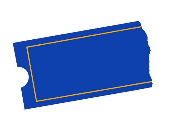


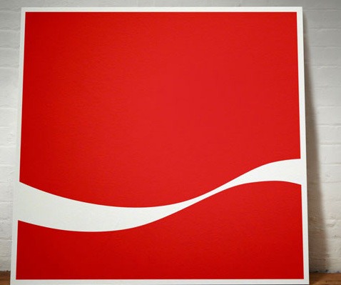
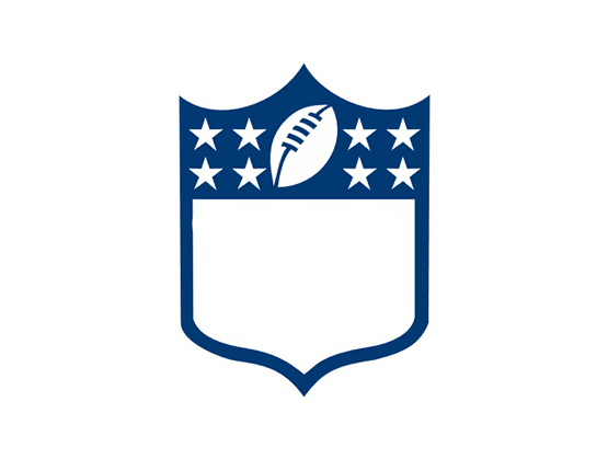 In case you didn’t recognize them, they are the logos for Harley Davidson, CAT, Blockbuster, GE, National Geographic and NFL. You might find this a useful exercise for looking at how to simplify your own logo designs.
Frequently Asked Questions about Nameless Logos
Why do some brands choose to have a nameless logo?
Brands often choose to have a nameless logo to create a sense of familiarity and recognition among their audience. A nameless logo, also known as a logomark, relies on visual representation rather than text. This can be particularly effective in international markets where language barriers may exist. Brands like Apple, Nike, and McDonald’s have successfully used nameless logos to create a global identity.
What are the benefits of a nameless logo?
Nameless logos can be incredibly powerful in terms of brand recognition. They can transcend language barriers and are often more memorable than text-based logos. They also offer more flexibility in terms of design and can be adapted to fit different contexts and mediums more easily than logos with text.
How can a brand transition to a nameless logo?
Transitioning to a nameless logo is a strategic decision that requires careful planning. Brands typically start by gradually reducing the prominence of the text in their logo while increasing the prominence of the visual element. Over time, the text is removed entirely. This process can take several years and requires consistent branding efforts to ensure that the audience continues to associate the visual element with the brand.
What are some examples of successful nameless logos?
Some of the most successful nameless logos belong to global brands like Apple, Nike, and McDonald’s. These logos are instantly recognizable around the world, demonstrating the power of a well-designed nameless logo.
Can a nameless logo work for any brand?
While a nameless logo can be a powerful branding tool, it’s not the right choice for every brand. Brands that are new or less well-known may struggle with recognition if they opt for a nameless logo. Additionally, a nameless logo may not be suitable for brands in industries where a visual symbol may not clearly represent what the company does.
How can a brand ensure its nameless logo is effective?
An effective nameless logo should be simple, memorable, and representative of the brand. It should be easily recognizable and distinctive from other logos. Brands should also ensure that their logo is versatile and can be adapted to different mediums and contexts.
What are the risks of a nameless logo?
The main risk of a nameless logo is that it may not be immediately recognizable, especially for newer or less well-known brands. There’s also a risk that the logo may not clearly represent the brand or its products or services, which could lead to confusion among the audience.
How can a brand test the effectiveness of its nameless logo?
Brands can test the effectiveness of their nameless logo through market research. This could involve conducting surveys or focus groups to gauge audience recognition and perception of the logo. Brands can also monitor their brand recognition and reputation over time to assess the impact of their logo.
Can a nameless logo evolve over time?
Yes, a nameless logo can and should evolve over time to stay relevant and effective. Brands like Apple and Nike have subtly updated their logos over the years to keep them fresh and modern.
What role does color play in a nameless logo?
Color can play a significant role in a nameless logo. Different colors can evoke different emotions and associations, so it’s important to choose colors that align with the brand’s identity and values. Additionally, color can help to make a logo more distinctive and memorable.
 Jennifer Farley
Jennifer Farley is a designer, illustrator and design instructor based in Ireland. She writes about design and illustration on her blog at Laughing Lion Design.


