Firefox 3 Release Candidate 1 was revealed to the world last week, which means the final release is only about a month away. If you haven’t yet checked that your site works smoothly in the new browser, now’s the time!
A few (understandably) angry Linux users aside, the consensus seems to be that Firefox 3 represents a huge leap forward for end-users. The browser is much faster, better looking, and sports some awesome new end-user features over its predecessor.
For us developers, much has been said about the main improvements coming in Firefox 3. Stuff like built-in support for features web applications that work offline with locally cached data, and full-page zoom that makes it easier to design for visually impaired users, are all great to see, but in this post I’m going to take the opportunity to look at a couple of features that could be easily overlooked.
Soft Hyphens
Tucked away in the list of CSS improvements in Firefox 3 is this innocuous-looking feature: “HTML soft hyphens (­) are now supported.”
Soft hyphens are one of those obscure gems that HTML has always supported on paper, but that no one has taken any notice of because browser support has been spotty. With the imminent release of Firefox 3, however, soft hyphens will be supported by all major browsers including Internet Explorer, Safari, and Opera.
So, what is a soft hyphen, anyway?
A soft hyphen is a character of text that is usually invisible. It signals a spot in the text (usually in the middle of a long word) where it would be acceptable to break the line with a hyphen.
When a browser that supports soft hyphens encounters a long word or other long piece of text with no obvious wrap point that doesn’t fit horizontally inside a block on the page, it will look for a soft hyphen within the text and display it as a normal hyphen followed by a line break.
Take a look at this code sample:
<div style="width: 10em; border: 1px solid red;">
  Supercalifragilisticexpialidocious
</div>
Display this in any browser, and the long word will protrude from the side of the div.

This situation arises all the time in real-world web design. Say you’ve got a navigation menu that occupies 25% of the width of the page. At small enough browser window sizes, a particularly long word in one of your menu items will either protrude messily from your menu into another part of the page, or force the menu to increase its width, possibly breaking your page layout.
Soft hyphens to the rescue!
<div style="width: 10em; border: 1px solid red;">
Supercalifragilistic­expialidocious
</div>
Firefox 3 will be the last major browser to add support for soft hyphens, but you don’t have to wait for it to be released to start using them! Firefox 2 simply ignores the character, leaving it invisible (and leaving your text protruding from its box). Not bad as a fallback, especially compared to Safari, which used to display it as a normal hyphen! Thankfully, Safari 2 or later gets it right.
Depending on how you edit your HTML, you may simply want to insert the soft hyphen character itself rather than the HTML character entity reference (­). It’ll save a few bytes, and good code editors (jEdit, for example) will display soft hyphens as normal hyphens, so you can see them in your code. Some are even smart enough to ignore soft hyphens when checking your spelling!
You can type a soft hyphen in Windows by holding down the Alt key and then typing either 0173 on the number pad, or the plus key on the number pad followed by 00AD, before releasing Alt. If you can’t remember that (I sure can’t), or if you’re on a Mac, you can find the soft hyphen in the Character Map (the Character Palette in Mac OS X).
If you do decide to use actual soft hyphen characters in your code, make sure you know your character encodings, because unlike most Latin-1 characters, soft hyphens are encoded differently in UTF-8, so you need to save your code with the right encoding for the soft hyphens to work.
Inline Blocks
Another obscure-but-useful new feature making its way into Firefox 3 after all the other major browsers support it (mostly) is the inline block. When assigned to an element, a display type of inline-block causes the element to be positioned inline (like a span), but the element’s contents are laid out as if the element were a block.
This feature will come in handy in a number of situations in which the float property is currently being used for lack of a better option. Consider, for example, a thumbnail gallery layout based on this HTML code:
<ul class="gallery">
  <li>
    <div class="caption">A short caption</div>
    <div class="thumb"><img src="thumb1.jpg"/></div>
  </li>
  <li>
    <div class="caption">A short caption</div>
    <div class="thumb"><img src="thumb2.jpg"/></div>
  </li>
  …
</ul>
Using a technique familiar to many designers, we can lay out the list items (li) in a grid by giving them all a specific width and floating them to the left:
.gallery li {
  float: left;
  width: 100px;
}
The list items are stacked horizontally against the left-hand margin, and when the available page width is consumed, the browser moves the next list item down until there is room for it. This produces the neat grid layout shown here:

Now, that’s all well and good as long as the image captions are all the same length. As soon as we factor in the real-world need for captions of varying lengths, this technique runs into problems:

As shown, if one of the list items is taller than the others, it can disrupt the grid layout. Since the browser will only move a list item down the page as far as is necessary to find room for it, list items can end up stacking against earlier list items that stick out from the bottom of the row.
To solve this problem while still using floats is messy at best. You could set the clear property on the list item at the start of each row of the grid to force it clear of the preceding list items. Not only is this messy to code, but it assumes you know which list item will start each row. One of the nice features of this grid-like layout is that it automatically arranges the list items into rows based on the available space—which can change in a stretchy page layout.
display: inline-block is what’s needed here. Like floated blocks, inline blocks stack horizontally across the page. Unlike floats, however, inline blocks are neatly arranged into horizontal lines—not stacked wherever they’ll fit.
Here’s what the code looks like:
.gallery li {
  display: inline-block;
  width: 100px;
}

/* In an IE-only style sheet */
.gallery li {
  display: inline;
}
The second rule is necessary due to a bug in IE7 and earlier. Setting display: inline-block correctly causes the contents of the list items to behave as if the list items are blocks, but to get the list items to behave as inline elements you must subsequently (and in a different rule) set display: inline. Since doing this would remove the inline-block display mode in other browsers, the second rule must be placed in an IE-only style sheet (or targeted with a CSS hack).
We must also make a slight tweak to the markup. Since the list items will now be treated as inline elements, the whitespace between them will become significant, and add extra space between the list items on the page. This can be avoided simply by getting rid of the whitespace:
<ul class="gallery">
  <li>
    <div class="caption">A short caption</div>
    <div class="thumb"><img src="thumb1.jpg"/></div>
  </li><li>
    <div class="caption">A short caption</div>
    <div class="thumb"><img src="thumb2.jpg"/></div>
  </li><li>
  …
</ul>
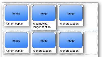
And here is the result, with the invisible line boxes shown as dotted outlines:

Not bad, eh? The one difference that sticks out is that the list items are aligned against the bottom of each line box, so that their bottom edges line up. This actually works well in this example, since the captions are above the images, but if the captions were below the images it would look pretty ugly.
It turns out this is a feature, not a bug. You can control the alignment of inline blocks within a line using the vertical-align property. Simply set vertical-align: top on your list items, and you can get something like this:
As you can see, inline blocks provide a much neater and more flexible alternative to floats in many situations. With Firefox 3 likely to see rapid uptake amongst existing Firefox users, and with the other major browsers all having decent support for display: inline-block, you’ll be able to use techniques like this in production in just a few months’ time!
 Kevin Yank
Kevin Yank is an accomplished web developer, speaker, trainer and author of Build Your Own Database Driven Website Using PHP & MySQL and Co-Author of Simply JavaScript and Everything You Know About CSS is Wrong! Kevin loves to share his wealth of knowledge and it didn't stop at books, he's also the course instructor to 3 online courses in web development. Currently Kevin is the Director of Front End Engineering at Culture Amp.