 If you work on the web, you probably already understand that most readers don’t diligently read every word of your content. Instead, they begin by scanning across it almost unconsciously – similar to the way you might scan passing food labels in a supermarket aisle.
Why do we scan?
Simple. We scan because it demands much less mental effort and we prefer to save our focus for the important stuff. We ‘skim across’ content until we find something that really captures out attention – when we activate our “slow thinking”.
The supermarket is a classic example of a place where we scan. Our eyes might take in 50 different varieties of pasta sauce without properly reading any of the labels.
However, when we turn on our “slow, focused thinking” – perhaps reading the ingredients on a sauce jar – our brain starts consuming a lot more mental energy – which is a limited resource.
Interested in learning the secret to great prototypes? Check out Designing UX: Prototyping – a new book from from Ben Coleman & Dan Goodwin.
Introducing ‘Focus Points’
So, let’s gamify this idea and call this brain energy ‘Focus Points (FP)’. The more focus points we spend, the more tired we feel and the more our thinking power weakens.
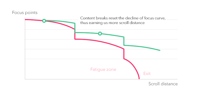
When a user scans a long page of content, they are spending these ‘focus points’ each time they pay attention to pieces of content they find interesting. The longer they scroll, the more fatigued they get.
Of course, this means the content offerings they discover further down the page get less attention. Like trying to entice a shopper with an overstuffed trolley, they simply have less ‘FPs’ left to spend. Therefore even high-quality content options become less visible and engaging. We call this phenomenon a scrolling fatigue. Let’s draw some lines to visualize all this focus economy. If you are scanning a content without committing any effort, you just gradually burning your focus until you get tired and eventually quit.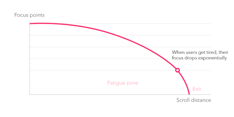
Readability and Focus
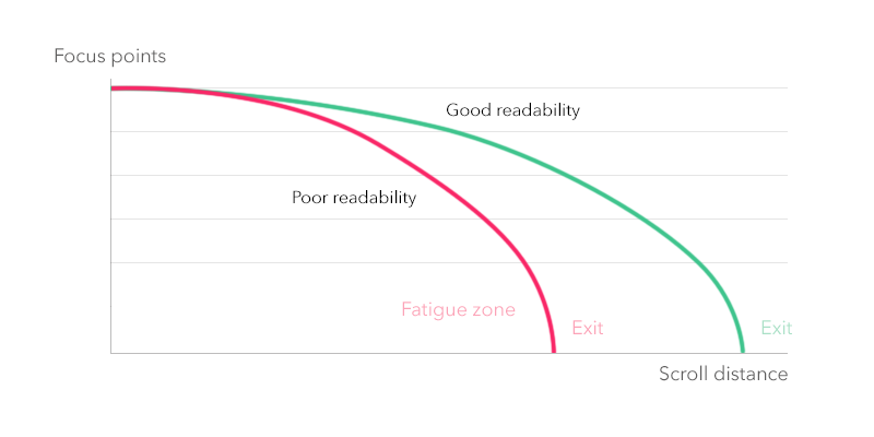
Another factor you should keep in mind is readability. If your content is hardly readable, it requires more effort to digest, burning focus points faster. So unless you intentionally want to hurt your users, don’t make your list difficult and expose only essential information. Do you really need the publish date? Do you need the topic on every listing?
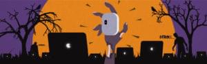
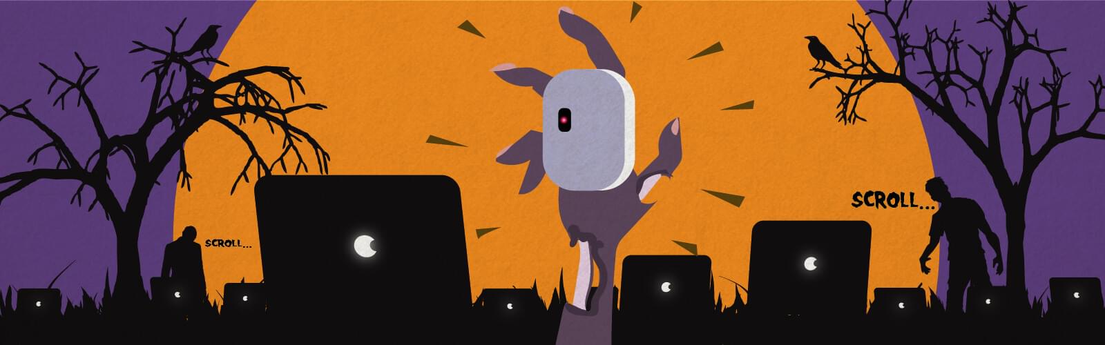
Rage-quits and Zombies

Generally, as users move into the zone of scrolling fatigue, their brain becomes less susceptible to standard hooks and reward mechanisms (the curve of focus points drops exponentially). This automatically lowers any motivation to put any effort into digesting information end eventually they quit.
It’s almost as if scrolling fatigued users become zombified. To avoid this situation we have to minimize the consumption of focus points.
How Does Fatigue Impact on Different Types of Content Collections
If you are designing a large content collection with large scroll range – you also face fatigue problem. You must expose as much content as possible at the same time keep your users conscious enough to engage it.
To understand how to deal with this, you should know how users scan different list layouts. Let’s get a little bit practical here. Today, there are three main types of content lists:
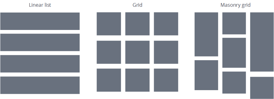
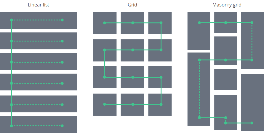
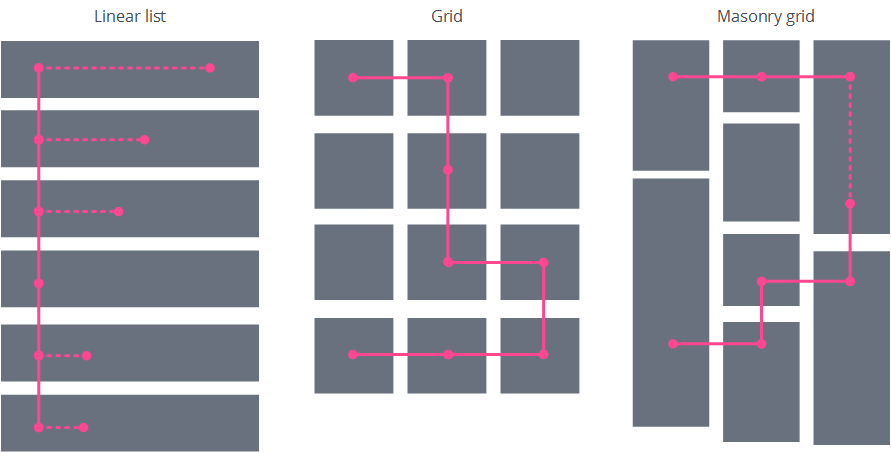
Linear lists
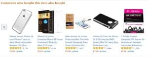
The most natural and common way to display chunks of content is just put them into rows. Google search results and eBay listings fit this classic pattern. Linear lists are the easiest to scan, it’s hard to miss any content item and users can compare items side-by-side because they are all aligned together. The downside of linear lists tends to be mostly aesthetic. Typically they take more space and can be visually boring (and I’m not talking about Excel here).Classic Grids
The second most common option is to place your items in a 2D grid. This is a brilliant way to squeeze more content into the viewport – especially if your content is more graphical than text. Photo galleries and shopping sites love this pattern. And this is perfectly fine – until you need your users to pay attention to every item. Since scanning a grid pattern is much more demanding than a linear list, you will burn through your user’s focus points more quickly. Also, after a short time, users will typically start skipping chunks of content and your grid usability will fail.The Masonry Grid
Masonry grids are a variation on the classic grid – but with much more unit-size variation. Many would argue that the Masonry grid is the most aesthetically pleasing way to display graphical content. It lets you tile the entire viewport and makes each content item a different size. Pinterest is probably the most famous Masonry grid layout, but you’ll find masonry widely-used in mood boards and showcases. However, on the downside, it is pure visual chaos. It has no obvious visual order and no clear eye lead pattern. So if you are trying to use masonry to represent some kind of IA structure, you will likely just end up confusing your users.Scanning pattern for each grid
Remember, fresh minded users have more focus points to spend. Their scrolling behavior is consistent and well-ordered, like a police search team.
But what happens when users move into the ‘fatigue zone’ in each case? In short, they switch into zombie autopilot and their scanning pattern changes to a more chaotic nature.
Focus enhancement concept
So, does this mean it’s futile to try to influence exhausted users? Not quite.
Remember, I mentioned that fatigued users scroll in autopilot mode? It turns out that we can ‘hack’ this autopilot and exploit it to our own benefit.
Our brain has automatic mechanisms that can be still influenced by external stimulus, when in autopilot mode. This is the same mechanism that helped our prehistoric ancestors avoid danger and is called unconscious selective attention.
Basically, this process allows our brain to cruise in dormant mode, but at the same time keep an eye (or an ear) out for the unexpected. And when the unexpected happens, it fires a reaction that forces us into slow thinking. If you’ve ever spotted a spider out of the corner of your eye, you know how this works.Ok, what it has to do with content lists and scrolling?
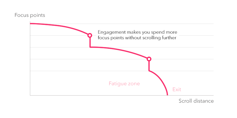
This unexpected reaction is exactly what we are aiming at – to override the autopilot. By creating unexpected content breaks in our otherwise monotonous list, we can make user stop scrolling and re-focus for a millisecond. And this break opens us an opportunity for a call for action or to focus users attention on a desired highlight.
Re-fuelling our Focus Points
Content breaks also have another useful side effect. They raise the attention level of the users and lower the threshold of scrolling fatigue. To put it simply – if you don’t let your users meander into full autopilot mode, they’ll stay longer on your list.
Practical applications
We want to apply content breaks to keep users more motivated and digest/engage more content. Here I give you some practical example how you can use them in the real world.Food, Sex & Danger
Let’s begin from instinct oriented triggers. They don’t require to change your content format, just a content itself. These triggers are targeting the most basic human instincts: sex, food and danger/offense. Injecting some content that includes these topics should give you some pretty interesting results.
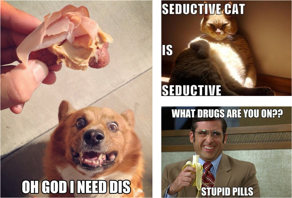
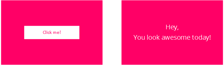
Food, Sex and Danger break users out of autopilot. Reward Systems
Triggers that target our users reward reactions also work well. Especially when you want to achieve some kind of engagement. To do this, you mix in a unique call to actions that provides a reward and required commitment. This will create a temporary flush of happiness that will provide fuel for your user to scroll further.
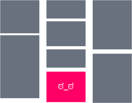
The Visual Change-up
Another category is unexpected visual changes in layout or graphics. Like applying a bright color or switching the number of columns. This makes users break their scanning patterns and re-establishes their focus. However, it is worth noting that this is not generally a trait of good usability, so you shouldn’t use such breaks on shorter lists or at the beginning of lists.
-
Temporal breaks
You know, when you scroll and scroll… And then you get so into the momentum of scrolling that you unintentionally ignore all the content spinning past? If you have an infinite scroll, this is a quite common behavioral pattern.
To break this behavior and return users to the real world, you need to stop them. I mean actually stop loading and scrolling. Put a “Load more” button or even a fake preloader to get them thinking about what’s coming next and to get re-focused. Of course, after this, there is a chance you user will turn… But hey, you don’t need a zombie browsing your website anyways ;)
For a few more practical tips, you can drop by at Abbas’ 5 min read on 6 ways to improve scrollable content.
And the big takeaways?
As you might guess, there is no guarantee that all these practices will work for you. It strongly depends on your business case, goals and target audience. However, experimenting is the best way to find it out. So do not be afraid to introduce content breaks to your lists and if you have an opportunity try them out.
And if you just scrolled to the bottom here, here’s a TLTR version to summarize everything:
- Users have limited ‘focus resources’
- All users gradually lose focus and attention when scrolling long lists
- When users get fatigued they stop engaging and inevitably quit
- Fatigue also makes users to miss important relevant content
- Users do react to unexpected changes in content (content breaks)
- You can add artificial triggers to your content to snap your users out of ‘zombie mode’
- Try experimenting with content breaks
- Cheers!
Frequently Asked Questions (FAQs) about Zombie Scrolling
What is the psychological impact of zombie scrolling?
Zombie scrolling, also known as doomscrolling, can have a significant psychological impact. It can lead to increased levels of stress, anxiety, and depression. This is because the constant influx of negative news and information can overwhelm the brain, leading to feelings of helplessness and hopelessness. Moreover, it can disrupt sleep patterns and contribute to insomnia, further exacerbating mental health issues.
How can I stop zombie scrolling?
There are several strategies to stop zombie scrolling. First, set specific times for using your devices and stick to them. Second, turn off notifications for social media apps to reduce the temptation to check them constantly. Third, use apps or features that limit screen time or block certain websites during specific hours. Lastly, engage in activities that don’t involve screens, like reading a book, going for a walk, or practicing mindfulness exercises.
What is the difference between regular scrolling and zombie scrolling?
Regular scrolling involves browsing through digital content at a leisurely pace, often for entertainment or relaxation. On the other hand, zombie scrolling refers to the compulsive and endless scrolling through negative news or distressing content, often leading to feelings of anxiety and despair.
How does zombie scrolling affect productivity?
Zombie scrolling can significantly affect productivity. The constant checking of news feeds and social media updates can lead to procrastination and distraction, reducing focus and efficiency. Moreover, the stress and anxiety caused by doomscrolling can also impair cognitive function, making it harder to concentrate and complete tasks.
Can zombie scrolling become an addiction?
Yes, zombie scrolling can become an addiction. The constant need to stay updated and the fear of missing out can lead to compulsive behavior, where individuals feel an uncontrollable urge to keep scrolling. This can result in spending excessive amounts of time on digital devices, often at the expense of other important activities.
How does zombie scrolling affect sleep?
Zombie scrolling can negatively impact sleep. The blue light emitted by digital devices can disrupt the body’s natural sleep-wake cycle, making it harder to fall asleep. Moreover, the stress and anxiety caused by the constant influx of negative news can also lead to insomnia.
Are there any health risks associated with zombie scrolling?
Apart from mental health issues like stress and anxiety, zombie scrolling can also lead to physical health problems. These include eye strain, headaches, and neck and back pain due to poor posture. Moreover, the sedentary nature of scrolling can contribute to obesity and related health issues.
How can I manage my digital consumption?
Managing digital consumption involves setting boundaries for device use, using apps or features that limit screen time, turning off notifications, and engaging in activities that don’t involve screens. It’s also important to be mindful of the type of content you consume and to take regular breaks from screens.
Can zombie scrolling affect relationships?
Yes, zombie scrolling can affect relationships. The excessive time spent on devices can lead to neglect of personal relationships and reduced face-to-face interaction. Moreover, the stress and anxiety caused by doomscrolling can also impact a person’s mood and behavior, potentially leading to conflict in relationships.
What is the role of social media platforms in zombie scrolling?
Social media platforms play a significant role in zombie scrolling. Their algorithms are designed to keep users engaged for as long as possible, often by showing them more of the content they interact with. This can lead to a cycle of negative news consumption, contributing to the phenomenon of zombie scrolling.
 Petras Baukys
Petras is an UX designer and Front-end developer passioned about creating user interfaces backed by science. He experiments with bleeding-edge front-end technologies and is obsessed with neurodesign. Currently works at Dragdis in Vilnius, Lithuania.