Continuing on from the last instalment in “Surviving logo design in the real world,” Felix writes about designing logos for application.
Most of the time as a designer, you will walk around with your logo radar on and find some intriguing logos — some very nice and some not so nice. On a rare occasion, you will see a really beautiful logo that is just not quite right. Could it be incorrectly applied or was it missing an intrinsic methodology during the design phase that limits the application potential?
Designers should be thinking of how a potential design can be applied before inking any pencilled thumbnails. Designing with some self imposed guidelines to accomodate a standard set of applications or designing a set of logo elements (to be used together and separately) will increase the potential effectiveness of a logo in any given application situation.
Applications are so easliy overlooked by the busy designer that sometimes, it can be too late to further ‘massage’ the design – and the logo is applied to a difficult or even unworkable situation.
Ebony Quill Logo
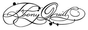
Recently my logo-radar picked up the logo of a food store called Ebony Quill. The logo is really beautiful and incredibly decorative. Plenty of effort seems to have gone into the capturing of the essence of what the owner of the cafe/restaurant wants to convey.
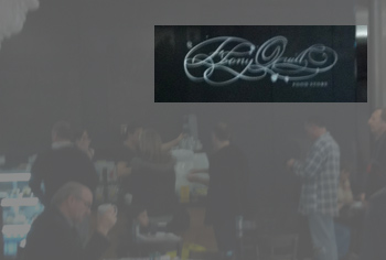
Not knowing much about this logo and just seeing it (standing to the left hand side of the store) the logo looks really great. However, the effectivness of applying the logo in the circular signage (on the opposite side of the store) shows a limit of versatility.
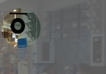
There is potential for developing a simplified version of the logo which would increase the number of effective applications. We don’t know if a simplified version of the logo was ever done, or if this was mis-applied by accident. We can only judge what we see.
The Manningham Medical Center Logo
![]()
The Manningham Medical Center have used this logo (or a very similar version of it) for many years.
However, early on, the logo included the wordmark title on a single line and it seems that it was delivered as a whole logo with wordmark built in. This made any potential street signage difficult and an early attempt at applying it as signage was removed quite some time back. The logo on the website has had some tweaking (by dropping the words “Medical Centre” down a line) which increases the number of potential applications of the logo – this could now potentially be used for large street signage.
However, as a shape, the symbol is still quite tall, which may cause limitations for other applications. A possible solution is to take the wordmark and put it in three lines on the right and increase the font. This would change the aspect ratio of the whole logo, allow the decrease in size of the symbol and increase the number of applications for it.
Stand out logos
Both the above are two stand out logo examples of how lush, complex and beautiful a logo can be. However, before designing logos such as these, the scope of logo application might have been more strongly considered. These logos are sucessful in so many ways, but the for varying reasons due to shape and layout, the number of applications are either limited or have been made more difficult.
Applications to be considered
Let’s look at some basic applications that should be considered when thumbnailing.
- Letterhead
- Businesscard
- DL Envelope
- Product label
- Product Ticket
- Signage
This is a very basic list of applications that most designers have produced and as you know, some applications could be really big and some really small. If we look to some standards for the biggest and smallest applications, we could be applying the logo as small as 15mm h x 20mm w for a business card, to maybe as big as at 300mm w x 400mm h (or as big as the whole board!) for an A-frame footpath sign. These are very basic examples and of course, the sizes could easily vary in the aforementioned applications.
If using a workmark based logo, it is a heavy consideration to ensure readability at a long distance as well as legibility at the very small. Signs are there for a customer to find you. If they cannot recognise your logo or name, the logo has limited its duties in one of its applications. When a logo is being used at a small size such as a business card and the logo is too fine and too hard to read due to printing issues, its mission is to convey the meaning and feeling to the user might be hampered.
Even if your brief does not include listed applications, or the client does not yet know what applications a logo might be used for, ensure that you design with at least a standard set of logos in mind, and that the logo is still clean, clear and recognisable in its large and small forms.
 Felix Mak
Felix Mak, a graphic designer for 20 or so years, has been working quietly in the suburbs of Melbourne - and has more recently been delving into the art of web design and development and the wonders of shivs and javascript libraries. A strong proponent of simple design and simple communication, he has a love of the lushness of art nouveau design.