Often, much of what we do as designers is subconscious. We can usually tell you on a choice-by-choice basis why we made specific decisions, but it doesn’t come naturally to verbalize the procedures we follow. Sometimes the best way to explain how to apply graphic design principles is by walking through the design process of an actual client website.
Enter: Southern Savers, a real web design project for a real client. In June of 2008, Jenny Martin started Southern Savers on Blogger.com to share the best grocery deals she found with her friends. After a few short months, the site grew too big for Blogger and her husband James migrated it to a self-hosted WordPress install. Neither Jenny nor James had any design experience, so they purchased a WordPress theme, created a header graphic, and Jenny carried on blogging. A little over two years since starting out, the site now receives over three million hits a month and has over 60,000 fans on Facebook—all with the basic design template you see here:
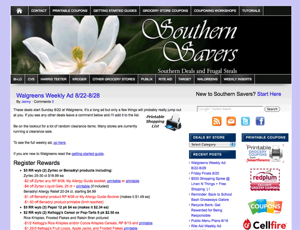 The old Southern Savers design
Jenny knew a redesign was long overdue, and hired the rock-star design agency Squared Eye to do the job. Being a friend of Jenny and of Matthew Smith of Squared Eye, it’s been interesting to see the design process unfold from both the client and agency perspective. I knew that following this process through each chapter of this book would be insightful for you as well, and am extremely grateful that both Jenny and Matthew agreed to let me use the project as an example.
The old Southern Savers design
Jenny knew a redesign was long overdue, and hired the rock-star design agency Squared Eye to do the job. Being a friend of Jenny and of Matthew Smith of Squared Eye, it’s been interesting to see the design process unfold from both the client and agency perspective. I knew that following this process through each chapter of this book would be insightful for you as well, and am extremely grateful that both Jenny and Matthew agreed to let me use the project as an example.
Getting Started
Usually, clients have specific ideas about what their site should look like and how it should work. Depending on the client, these preconceptions can either help or hinder the design process—more often, the latter. However, on this project, Squared Eye was given free rein to completely redesign and rebrand the site. Matthew knew it was important that he and his team not only understand how the website worked, but who the Southern Savers visitors were and why they were there. Freelance web strategist Emily Smith, the information architect for the project, explains, “Before design could start, we went through a discovery phase to find out what the goals were. We also went to one of Jenny’s Couponing 101 workshops and talked to attendees. We evaluated how recurring visitors use the site—watching over their shoulders, talking about what features and functionality they depend on, and observing how they navigate.”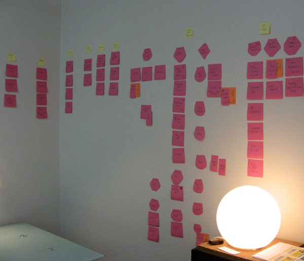 Sticky-note information architecture
Once Emily had all the pages grouped into appropriate navigation sections, it was time to start working on a layout. She knew the layout for the site was going to be 960px wide, and that for most of the pages, a two-column layout would be necessary. Because there were so many navigation elements to work with, she designed the layout structure as a wireframe in a Mac application called Omnigraffle. The figure below shows her proposed wireframe for the home page.
Sticky-note information architecture
Once Emily had all the pages grouped into appropriate navigation sections, it was time to start working on a layout. She knew the layout for the site was going to be 960px wide, and that for most of the pages, a two-column layout would be necessary. Because there were so many navigation elements to work with, she designed the layout structure as a wireframe in a Mac application called Omnigraffle. The figure below shows her proposed wireframe for the home page.
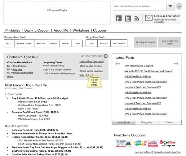 Proposed home page wireframe for Southern Savers
Notice that there are no colors, no real images, and no actual HTML elements in this example. The goal of a wireframe is simply to establish the layout structure and the positioning of elements. Earlier in the chapter, I said that in a good design, users “recognize each page as belonging to the site.” That doesn’t necessarily mean that the layout of each page has to be exactly the same. In fact, it’s good to work in some contrast between the home page and other pages in the site. As Emily created the wireframes for the rest of the site, she spiced it up by planning alternate layouts for some sections, like the “Learn to Coupon” section shown below.
Proposed home page wireframe for Southern Savers
Notice that there are no colors, no real images, and no actual HTML elements in this example. The goal of a wireframe is simply to establish the layout structure and the positioning of elements. Earlier in the chapter, I said that in a good design, users “recognize each page as belonging to the site.” That doesn’t necessarily mean that the layout of each page has to be exactly the same. In fact, it’s good to work in some contrast between the home page and other pages in the site. As Emily created the wireframes for the rest of the site, she spiced it up by planning alternate layouts for some sections, like the “Learn to Coupon” section shown below.
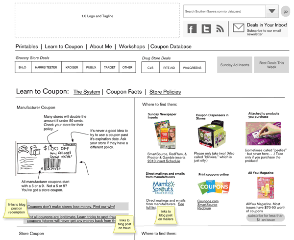 Wireframe for the “Learn to Coupon” section of Southern Savers
Okay, maybe “spiced things up” was a bit of an overstatement when talking about colorless wireframes, but the design ball is certainly rolling here.
Is this process similar to the way you create layouts and comps for the sites you work on? We’d love to hear your tips and advice in the comments below!
Wireframe for the “Learn to Coupon” section of Southern Savers
Okay, maybe “spiced things up” was a bit of an overstatement when talking about colorless wireframes, but the design ball is certainly rolling here.
Is this process similar to the way you create layouts and comps for the sites you work on? We’d love to hear your tips and advice in the comments below!
Frequently Asked Questions about Layout and Composition in Web Design
What is the importance of layout and composition in web design?
Layout and composition are crucial elements in web design as they determine how information is organized and presented on a webpage. A well-designed layout enhances user experience by making it easy for visitors to navigate the site and find the information they need. It also helps to engage users and guide them towards taking the desired action, such as making a purchase or signing up for a newsletter. Composition, on the other hand, refers to the arrangement of visual elements on a page. It plays a key role in creating a balanced, harmonious design that is pleasing to the eye.
How can I improve the layout and composition of my website?
There are several strategies you can use to improve the layout and composition of your website. First, consider the hierarchy of information. The most important information should be placed in prominent positions. Second, use grid systems to create a structured, organized layout. Third, use white space effectively to avoid clutter and enhance readability. Fourth, ensure that all visual elements are balanced and harmonious. Lastly, keep in mind the principles of design such as contrast, repetition, alignment, and proximity.
What are some common mistakes in web design layout and composition?
Some common mistakes in web design layout and composition include cluttered design, lack of white space, poor use of typography, inconsistent design elements, and lack of visual hierarchy. These mistakes can make a website difficult to navigate and unappealing to visitors. It’s important to avoid these pitfalls by following best practices in web design.
How does layout and composition affect user experience?
Layout and composition greatly affect user experience. A well-designed layout makes it easy for users to navigate the site and find the information they need, while a poorly designed layout can be confusing and frustrating. Similarly, a good composition can make a website visually appealing and engaging, while a bad composition can make it look unprofessional and unattractive.
What is the role of color in layout and composition?
Color plays a significant role in layout and composition. It can be used to create contrast, highlight important information, guide the user’s eye, and evoke certain emotions. Choosing the right color scheme is crucial as it can greatly affect the overall look and feel of the website.
How can I use typography effectively in layout and composition?
Typography is a key element in layout and composition. It can be used to create hierarchy, guide the user’s eye, and enhance readability. To use typography effectively, choose a font that is easy to read, use different font sizes to create hierarchy, and ensure that the line spacing and letter spacing are appropriate.
What is the role of images in layout and composition?
Images play a crucial role in layout and composition. They can be used to convey information, create visual interest, and evoke emotions. However, it’s important to use images judiciously as too many images can make the design look cluttered and distract from the main content.
How can I create a balanced layout and composition?
Creating a balanced layout and composition involves arranging visual elements in a way that evenly distributes visual weight. This can be achieved by using symmetry or asymmetry, ensuring that elements are proportionate to each other, and using color, size, and position to create balance.
What is the role of white space in layout and composition?
White space, also known as negative space, plays a crucial role in layout and composition. It helps to separate different elements, enhance readability, and create a clean, uncluttered design. Using white space effectively can make a website look professional and sophisticated.
How can I ensure that my layout and composition are responsive?
To ensure that your layout and composition are responsive, you need to design your website in a way that it adapts to different screen sizes and devices. This can be achieved by using flexible grids, flexible images, and CSS media queries. It’s also important to test your design on different devices to ensure that it looks good and functions well on all of them.
 Jason Beaird
Jason Beaird is a designer and front-end developer with over ten years of experience working on a wide range of award-winning web projects. With a background in graphic design and a passion for web standards, he’s always looking for accessible ways to make the Web a more beautiful place. When he’s not pushing pixels in Photoshop or tinkering with markup, Jason loves sharing his passion for the Web with others.