Accessibility is a hard topic for many web developers, raising questions of whether features must be removed or color palettes changed. The truth is that accessibility enhances your web site, allowing your visitors access on their terms – and if you follow other guidelines for creating accessible web sites, the United States Government’s Section 508 should feel very familiar.
Section 508 is an amendment to the US Government’s Rehabilitation Act, and is designed to standardize the accessibility of information technology. The amendment was passed in 1998, and requires all US federal agencies to make their products accessible for all users. Also, these agencies must purchase goods and services that meet the 508 standard, which makes this law important for anyone contracting for the federal government.
While specifications like Section 508 help drive developers down the correct path, accessibility is a matter of finding the best way to make the most of your site. Section 508 is a portion of a larger law in the United States dealing with all aspects of information technology – not just the Web. But the paragraphs within this law help truly define the best practices for developing web sites.
The most direct part of this law, as it applies to the Web, is very similar to the Web Accessibility Initiative’s WCAG 1.0; in fact, 13 of the 16 paragraphs in Section 508 have equivalents in WCAG. To be compliant with Section 508, though, your site must also meet the last three paragraphs.
Let’s examine some of the basics that are covered by both sets of standards and take a look at how some government sites currently fare.
Text Alternative
One of the basic principles to understand about web site accessibility is that there should be a text equivalent for all non-text content. In most cases, you can include this text version right there in the same document, and with some forethought should require minimal extra work.
Ideally, you’re already familiar with providing one of the most basic text equivalents: alternate text in the the alt attribute on image tags. To check if the alternate text of your images is helpful, disable images the next time you visit your site. The text you see should help you understand the image or what it represents: if you’ve presented anything relevant to the content of the page, including text within the image, it should be present here.
Alternate text should be helpful. If a graphical element is used only for decoration, alternate text is unnecessary (in XHTML it does need an empty alt attribute though!). The White House Web site uses several graphic elements with the alt attribute of “diamond image,” which is hardly accommodating.
If your image is going to form a hyperlink, I recommend providing the specific text in the image of your alt text when you are describing graphics, rather than the intention of the link. So, instead of “Images from the President’s trip to Africa – Click to view the slideshow,” the text could convey what the graphic actually says: “Africa Slideshow: February 15-21, 2008.” Hence, move the original text to the title attribute.
Rich media, like Flash and video, provide a unique set of issues for developers. Users who lack access to Flash or opt out of using it should still be able to access the information you present in Flash.
If you have Flash navigation, you should provide all of the links in the text file as textual links on the page. When using SWFObject, for example, you can easily provide a list of links that can be replaced by your Flash movie.
More complex examples of Flash should display some information that’s accessible without Flash – arguably the same content. Provide a link to a page with all the key information from the movie.
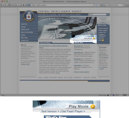
When you use video on your site, it’s important to provide a text-based transcript of any dialogue that takes place. It’s also encouraged to use captioning when available. The Central Intelligence Agency’s site has a good example of how to simply link to a text version of a Flash video.
Provide skip navigation links and other links to navigate around a page. If you provide a mechanism for users to bypass repeated information (like your site’s menu), they can more easily (and with less aggravation) access your content.
Color
Color and accessibility are sticky subjects when it comes to designing a web site. Section 508 guides developers to create designs where meaning is conveyed through other means beyond color. This is to avoid ambiguity for the meaning of a given element on a screen. If you are displaying an error message, for example, there should be some clue that it’s an error message, or at least an important message.
It’s also important to note that Section 508 stipulates that your site must be readable without a style sheet. If you’re using CSS, this means that through the use of semantic markup or context, you should be able to communicate any information regardless of whether color conveys meaning. This is because your color choices may be unavailable to your user when they view your site – perhaps they have different browser preferences, or a color vision deficiency.
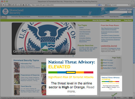
A simple example of this is the Homeland Security Advisory System, which conveys the threat level for the United States. The Homeland Security site uses adjectives, as well as color, to relay the current threat level.
When designing a site, it may feel like you have limited choices for color usage, but the important issue for color selection and accessibility is tonal contrast. Fortunately, in recent years, designers have been creating accessible sites that are still graphically appealing. A recent contest in the UK showcased well-designed sites that achieved a level of accessibility; here the use of contrasting color still provided a usable experience for all sighted users.
Data Tables
Displaying information in tables can be tedious, but using proper semantic markup and some forethought can really aid visitors to your site. Some points to note are:
- Be sure to use table headers where appropriate (
th), rather than just styled text. Sites like Transportation Security Administration site shown in the image above use tables to display information; for example, what you can and can’t bring onto an airplane. Yet the TSA’s use of headers is poor, which makes accessing that information more difficult. - When using headers, consider adding attributes like
scopeto the table element. This helps with the readability of your table in screen readers. Commonly, table headers relate to a column (scope="col"), but you can use headers with table rows as well (scope="row"). HTML also provides more advanced means of tying table data to a specific header. - If you need to limit a table header to fit information onto a page, consider using the
abbrattribute on thethelement to display a shorter alternative.
Scripts
Section 508 and WCAG both agree that scripts can be an issue with assistive technology, so you may need to take extra care when using them for functionality on your web site. Be wary when you’re providing applications that will only work with JavaScript enabled. Explain to your visitors that this is the case and link them to any alternative ways to use the application if JavaScript is not an option.
Section 508 explains that all information should be accessible when using assistive technology, even content created by scripts. Inform visitors that updates are made to the page dynamically and provide a means for them to stop this if necessary.
The Remainder
Where Section 508 differs from WCAG 1.0 are three items dealing with scripting, forms, and navigation. The information about Section 508 claims that the last five paragraphs differ from WCAG 1.0, but in practice they are pretty similar to WCAG’s existing guidelines or checkpoints. To that end, here are the considerations you should make to be compliant with Section 508:
- If a page or a form requires a timed response, make sure the user is aware of this, and how much time they have. This can be important for systems where timing may affect availability, such as some online ticket purchasing systems. For a scenario like a quiz or a game, give the user the ability to extend the time if needed.
- If you use Flash or any other applets, you must link to the page where the user can obtain those plugins. This includes plugins or readers for Flash, Java, or even for reading PDFs.
- Forms should be practical and created using the appropriate semantic markup. Clearly label required fields and make all directions or other cues accessible, using text or proper image techniques as necessary.
Testing: Tools of the Trade
To test the accessibility of your site, the most simple tool to use is your browser. Firefox extensions like the Web Developer Toolbar allow you to manipulate your site and turn off browser features like JavaScript, images, or CSS. It includes simple ways to test standards compliance and accessibility compliance.
Online tools like Cynthia Says and the Functional Accessibility Evaluator enable easy checking of some of the basics while pointing out areas you need to test manually. Sites like Vischeck allow you to simulate certain types of color blindness, but I recommend using desktop-based solutions like Color Oracle; that way, you can integrate the tool into the whole design process, rather than just the production.
Following best practices of accessibility is often similar to the best practice of creating web sites. With a little consideration, you can help ensure that your web site is accessible to all users in the way they like to view the Web.
 Rob Ballou
Rob Ballou is a technical director for Paradigm New Media Group. He spends most of his time creating content management systems and web applications and various other projects which can be seen on his site.