Every layout begins with a blank page or empty space. When we add an element, its placement can be determine how successful the design will be. Effective design initiates communication and an interest from the viewer whether it’s in print or on the web.
In a typical web layout, a designer needs to place a logo, text, photographs or illustration. By making a conscious effort to work on the relationship between these elements to produce an eye catching design.
Balance in design is very much like balance in life. It tends to be a good thing. An often used example of real life balance is the see-saw (which I believe is also called the teeter-totter in distant lands). A see-saw is not much fun when only one person sits on it. Balance is achieved when two people of equal weight sit on each side. Balance can also be achieved when one heavier person sits on one side and two lighter people site on the other side. And balance can be achieved if a heavier person slides closer to the center of see saw, while a lighter person sits on the end of the other side.
As humans we’re balanced physically. We have an arm and a leg on each side of our spine and head that balances top center of that spine. We’re able to stand and move despite being different sizes and weights. In design we try to achieve a balance between elements because it is pleasing on the eye. But balance isn’t always achieved through symmetry. Take a look at the boxes below.
 The white line in box 1 and 2 is symmetrically balanced while in boxes 3 and 4 the line is asymmetrically balanced.
Symmetry
Symmetrical balance is mirror image balance. If you draw a line through the centre of the page, the elements on one side of the line are mirrored on the other side. We can achieve it by placing elements fairly evenly in the design.
 Symmetry in nature
A typical example of this occurs on the web, where blocks of text mirror each other in buckets or columns. Symmetry can also be achieved using colors and typography.
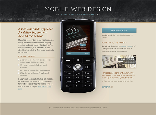
Mobile Web Book – on this web site, the mobile phone image divides the page in two, with the blocks of text on either side balancing each other out.
 On the poster for the movie The Day I Became A Woman, the block of large white text in the top right corner is mirrored in the bottom left corner both in terms of colour and shape.
 The very colorful Florida Flourish site could be almost be cut in half down the center. It has a very strong sense of symmetrical balance.
 The Havoc poster below is balanced left and right using similar shapes (and body parts). The red text above and below the title is balanced in color and size above and below the title.
 Asymmetry
Asymmetrically balanced layouts have elements that don’t mirror each other across a centerline. These layouts can be more difficult to design but can be appealing to viewers. We can create an asymmetrically balanced layout by placing several small items on one side, and one large item on the other side. If you have one dark item on one side, you may place several light colored items on the other side. An asymmetrical balanced design can create tension, drawing the viewer in.
MattWeb has a large graphic filling the left side of the homepage. A sense of asymmetrical balance is achieved here using matching colors and a sans-serif font which is in keeping with the spirals in the graphic.
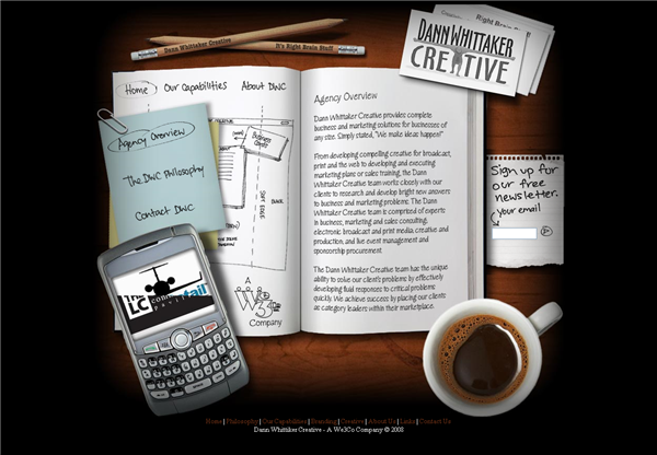
 Dann Whitaker’s site has several elements that don’t reflect each other symmetrically, but do balance each other in terms of color, texture and content.
 Off-Balance
Ok, so it could be boring if ALL of your design work involved balance. If you know the rules, then you can break them of course, and lack of balance can convey action and motion. It can make people feel a little uneasy or even disturbed. An off-balance design can make people think. Just don’t let it happen by accident.
 Poster by Barbara Kruger
Next week, we’ll take a look at Proximity. In the meantime have you come across any websites showing strong symmetrical or asymmetrical balance?
Frequently Asked Questions on Principles of Good Design: Balance
What is the importance of balance in design?
Balance is a fundamental principle in design that ensures visual stability and harmony. It’s the distribution of elements of the design, which creates a visual equilibrium. This equilibrium is essential as it provides structure and enhances the user experience. Without balance, designs may appear chaotic, confusing, or overwhelming to the viewer. It’s the balance that helps guide the viewer’s eye to the intended focal point without distraction.
How can I achieve balance in my design?
Achieving balance in design can be done through three primary methods: symmetrical, asymmetrical, and radial balance. Symmetrical balance is achieved when elements are mirrored on either side of a central axis. Asymmetrical balance uses different elements that have equal visual weight, while radial balance involves elements radiating from a central point. The choice of balance depends on the message you want to convey with your design.
What is the difference between symmetrical and asymmetrical balance?
Symmetrical balance, also known as formal balance, is achieved when elements are mirrored on either side of a central axis. It often conveys a sense of tranquility and formality. Asymmetrical balance, on the other hand, uses different elements that have equal visual weight. It’s more dynamic and interesting, often conveying a sense of modernity and movement.
Can a design be balanced without symmetry?
Yes, a design can be balanced without being symmetrical. This is known as asymmetrical balance. It involves using different elements that have equal visual weight. Asymmetrical designs are often more dynamic and interesting, creating a sense of movement and excitement.
How does color impact balance in design?
Color plays a significant role in achieving balance in design. Different colors carry different visual weights. For instance, darker colors tend to weigh more than lighter ones. Therefore, a smaller object in a darker color can balance a larger object in a lighter color. Understanding color theory and how different colors interact with each other can greatly help in achieving balance in design.
What role does white space play in design balance?
White space, or negative space, plays a crucial role in design balance. It helps to highlight and separate different elements in a design, making it easier for the viewer to process the information. Proper use of white space can create a balanced, harmonious design even when the elements themselves are not symmetrical.
How does balance affect the overall aesthetic of a design?
Balance greatly affects the overall aesthetic of a design. A well-balanced design is pleasing to the eye and easy to understand. It creates a sense of harmony and cohesion, guiding the viewer’s eye across the design. On the other hand, a poorly balanced design can feel chaotic and confusing, making it difficult for the viewer to understand the message.
How can I use balance to improve my design skills?
Understanding and applying the principle of balance can greatly improve your design skills. Start by practicing with simple designs, using symmetrical, asymmetrical, and radial balance. Experiment with different elements and see how they affect the balance of the design. Over time, you’ll develop an intuitive sense of balance, which will help you create more effective and visually pleasing designs.
Can balance be subjective in design?
While there are certain rules and guidelines when it comes to balance in design, there is also a degree of subjectivity. Different people may perceive balance differently. What seems balanced to one person might seem off-balance to another. Therefore, it’s important to consider your target audience and their preferences when designing.
How does balance relate to other design principles?
Balance is closely related to other design principles such as contrast, emphasis, and unity. For instance, contrast can be used to create visual interest and guide the viewer’s eye to the focal point, while maintaining balance. Emphasis involves making one element stand out, which needs to be balanced with other elements. Unity refers to the overall cohesion of the design, which is achieved when all elements are balanced and work together harmoniously.
Jennifer Farley is a designer, illustrator and design instructor based in Ireland. She writes about design and illustration on her blog at Laughing Lion Design.

