![]() This year’s US election cycle brought us a number of interesting web sites to track election news, polls, and results. From the amazingly complete and stunningly accurate Five Thirty Eight poll analysis web site, to the elegant election night map from the visualization wizards at the New York Times, there was a lot to satiate our appetite for data consumption. One of the most useful new sites to emerge was the short on vowels news dashboard Perspctv.
This year’s US election cycle brought us a number of interesting web sites to track election news, polls, and results. From the amazingly complete and stunningly accurate Five Thirty Eight poll analysis web site, to the elegant election night map from the visualization wizards at the New York Times, there was a lot to satiate our appetite for data consumption. One of the most useful new sites to emerge was the short on vowels news dashboard Perspctv.
Launched in June by developer Vineet Choudhary, the mashup drew in news from multiple sources about presidential candidate Senators Barack Obama and John McCain and packaged it all into an attractive and easy to read dashboard. The site created real-time graphs of news mentions, blog mentions, tweets, web site traffic, and Google search volume for the candidates. It also drew on election specific information, such as electoral maps, polling data, and futures market predictions, and created timelines of much of the data. In addition, Perspctv scrolled news, blog posts, and tweets as they rolled in and packaged up the main graphs in a embeddable widget.
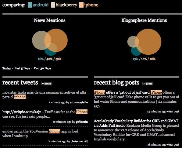
In all, Perpsctv provided a very useful way to easily digest a massive amount of election data. But now that the election is over, the site’s election page is obsolete. Choudhary, though, has smartly relaunched the site as a comparison dashboard for anything.

Because the dashboards are made on the fly about any topic, the amount of information isn’t nearly as impressive as the original election dashboard. They are nonetheless useful, however. The new Perspctv displays data on blog mentions, news mentions, Twitter tweets, and Google search volume. For example, this page comparing Yahoo! to Microsoft to Google lets users see how often those terms are talked about in the blogosphere and the mainstream press over the past day, week, and month.
Even though the current dashboard is a little less impressive than the election dashboard, there is nothing stopping Choudhary from adding more data points in the coming months — and we hope he does. We also hope that the site expands to allow different views of the data — i.e., the ability to generate different types of charts to compare data over time would be extremely useful.
Techcrunch reports that the business model for Perspctv is to create custom dashboards for corporate users, which means that the possibility for impressive dashboards like the one that Choudhary created for the election that bring together many sources of data for a specific topic are not only possible, but they are likely to appear on the site.
 Josh Catone
Before joining Jilt, Josh Catone was the Executive Director of Editorial Projects at Mashable, the Lead Writer at ReadWriteWeb, Lead Blogger at SitePoint, and the Community Evangelist at DandyID. On the side, Josh enjoys managing his blog The Fluffington Post.


