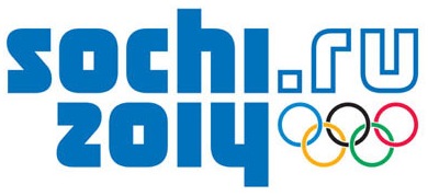
The official logo for the Sochi 2014 Winter Olympics was revealed last week. This is the first winter games to be held in Russia and it is the first Olympic logo to include an internet URL.

According to the official blurb on the brand,
The Sochi 2014 emblem maintains a dialogue between the past and the future. Fusing various dimensions of Russian culture, the brand can promote several images of our vibrant country:
- A country rich in history, embarking on a successful future
- A country open to opportunities and the passion to make dreams a reality
- A country that is committed to equality and celebrates diversity.
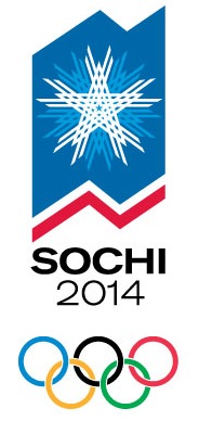
During the initial bidding process, every city provides a logo which is sometimes changed by the winning city. You can see the original bid logo below. Should they have stuck with this one rather than replace it with the new official logo?

The new official typographic logo has been designed to appear as a reflection of the word Sochi on top with the year underneath. The city of Sochi sits at the meeting point of the sea and the mountains and this was part of the reasoning behind the design. The sea acting as a mirror to reflect the mountains. The logo was designed by Interbrand and an Expert Brand Council established by the Sochi 2014 Organizing Committee.

I’m not sure if the new official logo almost seems like a relief after the London 2012 logo which got a universal kicking when it was revealed a few years ago. I like the reflected typography on the left hand side but it seems a bit busy on the right hand side.
Brand Republic have an excellent in-depth article on the new logo as well as reviews and discussion of the logo by a number of London design agencies.
What do you think about the official logo? Is there a need to have a url in the logo?
Jennifer Farley is a designer, illustrator and design instructor based in Ireland. She writes about design and illustration on her blog at Laughing Lion Design.

