Masking is a technique that lets you display selected portions of an element or an image on the screen while hiding the rest. Web developers can use this technique in the browser via the mask property and the SVG mask element. These features allow you to display masking effects on images and other elements in the browser without using any kind of image editing software.
In this article, I’m going to show CSS and SVG masking capabilities in action, also making sure to include some info about current browser support issues.
At the time of writing, most code samples work only in WebKit browsers while SVG-based masks seem to enjoy wider browser support. Therefore, if you’d like to try out the examples, I recommend you use a WebKit browser like Chrome.
Masking on the Web
You can achieve masking effects on the web using clipping or masking.
Clipping involves laying a closed vector shape, like a circle or a polygon, on top of an image or an element. Any parts of the image behind the shape will be visible, while any parts outside the boundaries of the shape will be hidden. The shape’s boundary is called the clip path, and you create it using the clip-path property.
Masking is done using a PNG image, CSS gradient, or an SVG element to hide some parts of an image or other element on the page. You can accomplish this using the CSS mask property.
In this article, I will focus exclusively on masking with the CSS mask property and the SVG <mask> element.
The CSS mask Property
mask is the CSS shorthand property for a whole bunch of individual properties. Let’s take a closer look at some of them in more detail.
The mask-image Property
You can use the mask-image property to set the mask layer image of an element.
The value none is not the same as setting no value at all. On the contrary — it still counts as a transparent black image layer.
You can set mask-image to a URL value. This can be the path to a PNG image file, an SVG file, or a reference to an SVG <mask> element. You can set more than one mask image layer by adding a corresponding number of URL values separated by a comma.
Here are a few examples:
/* masking with two comma-separated values */
.masked-element {
  mask-image: url(mask.png), none;
}


/* using external svg graphic as mask */
.masked-element {
  mask-image: url(mask.svg);
}
This is how you reference an SVG <mask> element with an id of mask1:
.masked-element {
  mask-image: url(#mask1);
}
A gradient image is also a suitable value for the mask-image property:
.masked-element {
  mask-image: linear-gradient(black 0%, transparent 100%);
}
The mask-mode Property
With mask-mode you can set the mask layer image to be either an alpha mask or a luminance mask.
An alpha mask is an image with an alpha channel. In more detail, the alpha channel is the transparency information contained in each pixel’s data. Masking operations with the mask-mode property set to alpha will use the image’s alpha values as the mask values.
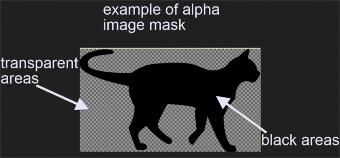
A handy example of an alpha channel is a PNG image with black and transparent areas. The masked element will show through the black portions of the mask image, which have an alpha value of one. Everything else beneath the transparent portions, which have an alpha value of zero, will be hidden.
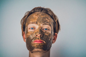
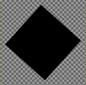
I’m going to use this PNG image as my alpha mask:
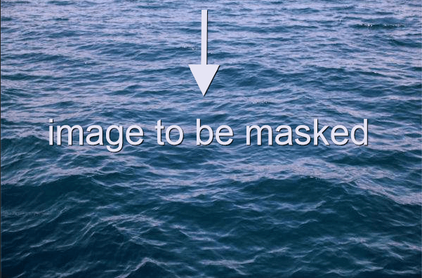
and perform a masking operation on the JPG image below:
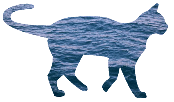
This is where the magic happens:
.masked-element {
  mask-image: url(alpha-mask.png);
  mask-mode: alpha;
}
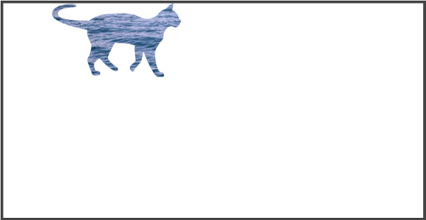
and here’s what the result looks like in the browser:
A luminance mask uses an image’s luminance values as mask values. A PNG image like the one above — but in white — is a good example of a luminance mask:
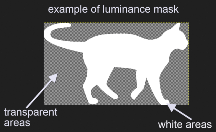
The areas of the element you want to mask, which are covered by the mask’s white pixels, will show through. The portions of the masked element covered by the mask’s transparent pixels will be hidden.
Setting the mask-mode property to luminance and using the image above as my mask, will display the same result as before.
Here’s the code:
.masked-element {
  mask-image: url(luminance-mask.png);
  mask-mode: luminance;
}
The mask-repeat Property
mask-repeat works pretty much like the background-repeat property. It controls the tiling of mask layer images after you’ve set their size and position.
Possible values are:
no-repeat: the mask layer image is not repeated across the available space.repeat-x: the mask layer image is repeated along the X coordinate.repeat-y: the mask layer image is repeated down the Y coordinate.space: the mask layer image is repeated and spaced out throughout the available area.round: the mask layer image is repeated a whole number of times across the available area. If a whole number doesn’t fit in the available space, the image is scaled until it does.
For instance, this is the image I intend to use as my mask:
The code snippet below sets the mask-repeat property to a value of space:
.masked-element {
  mask-image: url(imgs/trapeze.png);
  mask-repeat: space;
}
resulting in the following masking effect:
The mask-position Property
You can position a mask layer image using the mask-position property. You can set this property to the same values you would use for the more familiar CSS background-image property. Its initial value is center.
For instance, if you want to place the mask image layer on the top left corner of the viewport, set the mask-position property to a value of 0 0:
.masked-element {
  mask-position: 0 0;
}
This is what the code above looks like in the browser:
Changing the value of the mask-position property above to 100% 100%, displays the mask layer image on the bottom right of the viewport:
The mask-size Property
You can quickly set the size of your mask layer image using the mask-size property, which accepts the same values as the more familiar CSS background-size property.
For example, setting mask-size to 50% displays the mask layer image at 50% of its full width:
Setting mask-size to contain will scale the mask layer image to the largest size so that both its width and height can fit inside the mask positioning area:
You can see these demos live in action on CodePen below:
See the Pen CSS Mask Examples by SitePoint (@SitePoint) on CodePen.
Compositing Mask Layers
As explained above, you can use more than one mask layer on the same element by separating each value of the mask-image property with a comma. The layers get stacked one on top of the others with the last layer displaying first on the screen.
For instance:
.masked-element {
  mask-image: url(mask1.png), url(mask2.png);
}
In the snippet above, mask2.png is layered on top of mask1.png.
The mask-composite property lets you combine different mask layers according to the value of the following keywords:
add: mask2.png is painted on top of mask1.pngsubtract: displays portions of mask2.png that don’t overlap mask1.png. Browsers don’t support the standard keyword yet, therefore, at least for the time being, you’ll need to use the corresponding compositing operator keywordsource-outintersect: displays portions of mask2.png that overlap mask1.png. However, WebKit browsers, which are the only kind of browsers supporting CSS masks, seem to display nothing on the screen, even when the non-standard compositesource-inkeyword is used.exclude: displays portions of mask1.png and mask2.png that don’t overlap. Once again, because the standard keyword has no support yet, you’re much better off using the compositing operatorXOR.
You can check out the live demos in the CodePen demo below too:
See the Pen CSS Mask Compositing by SitePoint (@SitePoint) on CodePen.
The mask Shorthand Property
You can set all the properties that control CSS masking operations in one go using mask.
Here’s the full mask shorthand:
.masked-element {
  mask: image mode position / size repeat origin clip composite;
}
mask-origin and mask-clip work like the more familiar background-origin and background-clip properties.
Although you can reorder the properties in the mask shorthand, you need to set the mask-size property after the mask-position property, separated by the “/” symbol. Also, setting mask-size without setting mask-position will result in an invalid declaration.
Finally, since any value you fail to specify on the mask property is set back to its initial default value, using mask comes really handy when you need to reset any of the individual properties.
The SVG mask Element
Scalable Vector Graphics, or SVG for short, is an XML-based language to mark up graphics.
You can use a <mask> element inside an SVG document to add masking effects to HTML elements and other SVG graphics.
One more cool thing you can do with SVG is masking other elements on the page using text.
Let’s look closer into each of these possibilities.
Using the SVG <mask> Element on a HTML Element
At the time of writing, using the <mask> element inside an inline SVG graphic to mask a HTML element only works in Firefox browsers. Here’s an example:
<!-- SVG markup -->
<svg class="svg-mask">
<defs>
<mask id="mask1" maskUnits="objectBoundingBox" maskContentUnits="objectBoundingBox">
<linearGradient id="grad" gradientUnits="objectBoundingBox" x2="0" y2="1">
<stop stop-color="white" offset="0"/>
<stop stop-color="black" stop-opacity="0" offset="1"/>
</linearGradient>
<circle cx="0.50" cy="0.50" r="0.50" id="circle" fill="url(#grad)"/>
</mask>
</defs>
</svg>
<!-- masked HTML img element -->
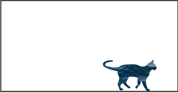
<img class="masked-element" src="backdrop.jpg" alt="masked element">With the following CSS:
/* CSS */
.masked-element {
  mask: url(#mask1);
  ...more styles
}
In the code above, I’ve included a <mask> element with an id of mask1. Inside the mask I’ve placed a black and white gradient with an id of grad and a circle shape which uses the gradient as its fill color.
Finally, I’ve referenced the SVG <mask> element’s id value in the CSS mask property. This applies the masking effect to the image on the page.
Just by adding a few other style declarations for the page background and the masked image, you can achieve a pretty dramatic effect like the one below:
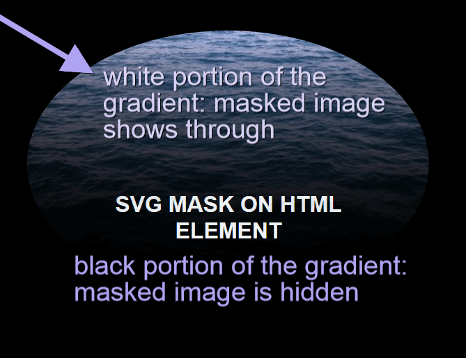
Notice how the portion of the circle mask filled with the white shade of the gradient lets the masked image show through. Conversely, the portion filled with the black hue of the gradient hides the masked image.
Here’s a live demo of this on CodePen (remember, it will only work on Firefox!).
See the Pen Masking with an Inline SVG mask Element by SitePoint (@SitePoint) on CodePen.
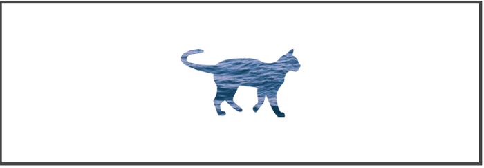
Using the SVG <mask> Element on an SVG Graphic
You can use the same SVG <mask> element from the previous example, but this time to mask an SVG graphic rather than a HTML element. The advantage is that browser support is way better, including WebKit browsers and the latest IE.
In the snippet below, I’m going to place the image I want to mask inside an SVG element and apply the CSS mask property to it. The CSS mask property references the SVG <mask> element with the id of mask1, like in the previous example. Here’s the code for the masked SVG graphic:
<svg class="masked-element" width="300" height="200" viewBox="0 0 300 200">
 <image xlink:href="backdrop.jpg" width="300" height="200" />
</svg>
And this is the snippet that takes care of the masking operation in CSS:
.masked-element image {
  mask: url(#mask1);
}
The result is pretty much similar to the previous example, only this time you can view it on all major browsers.
Have a look at the CodePen demo:
See the Pen SVG Mask on an SVG Element by SitePoint (@SitePoint) on CodePen.
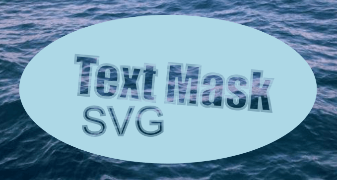
Masking with SVG Text
You can perform masking operations using a text element inside your SVG mask:
<svg class="text-demo" viewBox="0 0 600 400" width="600" height="400">
  <defs>
    <mask id="myMask">
      <rect width="100%" height="100%" fill="#fff" />
      <text x="125" y="200" id="myText" transform="rotate(5)">Text Mask</text>
      <text x="125" y="293" id="mySubtext">SVG</text>
    </mask>
  </defs>
  <ellipse class="masked" cx="300" cy="200" rx="300" ry="150" fill="rgba(173, 216, 230, 0.8)" />
</svg>
/* Adding background image to body element in CSS */
body {
background: url('backdrop.jpg') center center / cover no-repeat;
}
/* CSS for text element */
#myText {
font-size: 100px;
font-family: impact;
stroke: #F59DD9;
stroke-width: 5px;
fill: #000;
transform: rotate(5deg);
}
/* CSS for masking */
.masked {
mask: url("#myMask");
}The snippet above adds a black SVG text element inside the SVG mask and applies it to a light blue SVG ellipse shape using the CSS mask property. Whatever lies behind the ellipse shape (in this case it’s the body‘s background image) will show through the text. The result looks something like this:
The full code is available on CodePen:
See the Pen SVG Text Mask by SitePoint (@SitePoint) on CodePen.
Animating Masks
You can animate mask-position and mask-size using CSS transition and keyframe animation.
Below is a basic keyframe animation example of a star-shaped PNG mask image.
Here are the relevant code snippets:
The masked element is a HTML <img> tag:
<img src="masked.jpg">The masking operation uses the shorthand mask property:
img {
  mask: url(star.png) 50% 10% / 80% no-repeat;
}
The .animate class on the <img> element adds movement to the star-shaped image using CSS transform and animation:
.animate {
 transform: rotate(360deg);
 animation: move 0.5s ease;
}
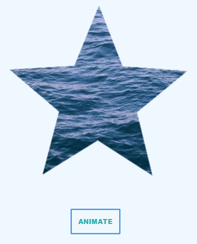
Launch a WebKit browser like Chrome and check out the following live demo on CodePen:
See the Pen Animating with CSS Mask by Maria Antonietta Perna (@antonietta) on CodePen.
Animating an SVG Mask Element with CSS
You can add masking effects on an <img> tag using the SVG <mask> element and then animate it with CSS.
Here’s a quick CodePen demo: the animation is visible on any browser, however the masking is only rendered in Firefox:
See the Pen Animate SVG Mask on HTML Element by SitePoint (@SitePoint) on CodePen.
The good news is that, if you apply your SVG mask on an inline SVG graphic, browser support immediately sky-rockets. Check out the same animation demo using only SVG:
See the Pen Animating SVG mask on SVG Element by SitePoint (@SitePoint) on CodePen.
Browser Support for the mask Property
I’ve touched on browser support issues throughout this article. A simple breakdown of the situation at the time of writing looks like this:
- PNG or external SVG image masks on HTML elements using the CSS
maskproperty work on WebKit browsers only with the-webkit-vendor prefix. - Inline SVG mask element on a HTML element is supported only in Firefox.
- Inline SVG mask element on an SVG element is supported in WebKit browsers, as well as Firefox and latest Internet Explorer.
This great CodePen demo by Yoksel offers a visual illustration of the state of the art as far as browser support goes.
Alan Greenblatt makes available a GitHub repository where he goes into the details of which CSS graphics-related property is supported by which browser.
The browser support compatibility table on the Can I Use website offers further details and links to more resources.
Although current browser support for CSS mask is not great, if you use this feature as an enhancement on a few decorative elements, users of non-supporting browser won’t even notice they’re missing out.
Finally, applying masking effects on an SVG graphic with the SVG <mask> element enjoys the widest support on modern browsers and looks great on the web.
Resources
- CSS Masking Module Level 1 – W3C Editor’s Draft
- Clipping and Masking in CSS on CSS-Tricks
- Codrops CSS Reference on Masking with
mask-image - SVG
<mask>on MDN - SVG Masks by Jakob Jenkov
- CSS Masking by Dirk Schulze.
Do you know of a cool masking effect on the web you’d like to share? Hit the comments box and let me know.
Frequently Asked Questions (FAQs) on CSS and SVG Masking
What is the difference between CSS and SVG masking?
CSS and SVG masking both allow you to hide or reveal portions of an element. However, they differ in their approach and capabilities. CSS masking uses an image as a mask layer where the alpha channel of the mask image determines the visibility of the element. On the other hand, SVG masking uses a vector graphic as a mask layer, which provides more flexibility and control over the shape and size of the mask. SVG masking also supports color and gradient masks, which are not possible with CSS masking.
How can I create a gradient mask with SVG?
SVG masking allows you to create gradient masks, which can add a unique visual effect to your web elements. To create a gradient mask with SVG, you need to define a linearGradient or radialGradient element inside the mask element. The gradient element should have at least two stop elements that define the color and opacity at different points along the gradient.
Can I use CSS and SVG masking together?
Yes, you can use CSS and SVG masking together to create complex masking effects. You can apply a CSS mask to an element and then apply an SVG mask to the same element. The final visibility of the element is determined by the combination of the two masks.
Why is my CSS mask not working in Internet Explorer?
CSS masking is not supported in Internet Explorer. If you need to support Internet Explorer, you should use SVG masking instead. SVG masking is supported in all major browsers, including Internet Explorer.
How can I animate a mask with CSS or SVG?
Both CSS and SVG masking support animation. For CSS masking, you can animate the mask-image property using CSS animations or transitions. For SVG masking, you can animate the mask element using SVG animations.
Can I use a text as a mask with CSS or SVG?
Yes, you can use a text as a mask with both CSS and SVG. For CSS masking, you can use a text image as the mask image. For SVG masking, you can use a text element as the mask element.
How can I create a circular mask with CSS or SVG?
To create a circular mask with CSS, you can use a radial-gradient function as the mask image. To create a circular mask with SVG, you can use a circle element as the mask element.
How can I create a complex mask with multiple shapes?
To create a complex mask with multiple shapes, you can use SVG masking. SVG masking allows you to use multiple shape elements (like rect, circle, polygon, etc.) as the mask element. You can position and size these shapes independently to create a complex mask.
Can I use a video as a mask with CSS or SVG?
CSS masking supports video masks. You can use a video as the mask image by setting the mask-image property to a video URL. SVG masking does not support video masks.
How can I adjust the opacity of a mask with CSS or SVG?
For CSS masking, the opacity of the mask is determined by the alpha channel of the mask image. You can adjust the opacity by editing the mask image. For SVG masking, the opacity of the mask is determined by the fill-opacity and stroke-opacity properties of the mask element. You can adjust the opacity by changing these properties.
 Maria Antonietta Perna
Maria Antonietta Perna is a teacher and technical writer. She enjoys tinkering with cool CSS standards and is curious about teaching approaches to front-end code. When not coding or writing for the web, she enjoys reading philosophy books, taking long walks, and appreciating good food.


