The world is a vortex of logos swirling around trying to get the public’s attention. There are so many businesses and organisations trying to grip you — some with well-thought out logos and some that are not so well considered. Unfortunately, some are knockoffs — knowingly or unknowingly.
Olaf Leu, an old school German graphic designer of renown said:
There are countless adaptations of William Golden’s “eye” for CBS. In every town there’s an optician boasting a “similar” logo.
If such a high profile logo can get “knocked off” so easily, what hope is there for protection?
There is nothing you, as a graphic designer, can do to stop the copying of a logo that you have researched and designed — that arena is for the lawyers to prove. However you can from the outset, prepare a logo for registration and even include a trademarkable version of a logo in your logo style guide that you supply to your client.
It is legal for any logo owner to add ™ to their logo and it affords some protection. However, the protection does depend on how well known it is in the public domain. If you are launching a new logo, you should always add ™ to the logo in order to mark a date and set a role for it.
Bring in the Lawyers!
It is important to say from the outset that the best and strongest advice you could receive on this subject is from a lawyer versed in trademark law — they will be able to advise on a particular logo and its specific registration needs. For example, specific colors that may be needed or logo series. This article can be viewed as general information and a starting point.
Simplicity vs Complexity
Looking at the two ends of the spectrum, there are simplistic logos and complex logos — it is not truly any sort of battleground for arguments, but it is certainly a topic of discussion and where protection of that logo could be viewed as easier or more difficult.
The idea here is to be able to prepare any logo for trademark registration.
Below are two examples (one simple and one complex) which we will use as examples to attempt to prepare them for trademark registration.
BHP-Billiton

When BHP and Billiton merged, it was a chance for the company to remarket and rebrand themselves with among other things, a new logo. The logo is comprised of four elements of liquid metal. The meaning behind the logo is – two mining companies merging into one. While that meaning is now lost, the logo’s meaning of molten metals is still very relevant to the company.
One important aspect of preparing a logo is to start stripping away at a logo and leaving the most basic essence of the mark you have designed.

Removing color is very important as if you leave color in, you may still be copied and a different color may be enough to justify a difference between your orginal and a knock off!

The work that we have done seems so basic but it is important work towards registering a trademark.
AMP

The latest AMP logo is an example of quite a complex logo, with many forms. The complex design paired with the gradient color highlights across each part of the logo is quite beautiful with light rays in the background in the television advert. The symbol is a representation of a spark. The spark can be taken in many contexts — spark of life, spark of inspiration, and so on.
The printable or even the normal media version does not include this ray of light, so there is already a reduction of complexity from the ‘video’ form to the regular form. However, the regular form does come in many flavours – some with varying colours, some with gradients and some without.
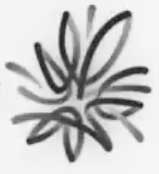
As we did with the BHP-Billiton logo, we remove the color of the logo so that the logo can now represent any color. The logo has been simplified, but is still complex (the example we have is the spark on a black surface. I have inverted it so the spark is on a white or blank surface and appears grayscale).
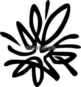
One last step is to reduce any last complexities and simplify the shape by putting the logo in sillouette. By doing this, the very basic shape of the logo is actually protected and any color or effect variation built on top of this basic shape would infringe on this protection. The one above is a facsimile created in Illustrator as an example. It is better to register the symbol separately from the wordmark to afford some extra flexibility if the company decided to change fonts for their wordmark.
Just a quick note: it would be ridiculous for you to ‘reverse design’ your logo, but we have done this to illustrate the idea of removing decoration and getting to the most basic shape of the symbols.
Designing FOR Protection?
While it seems that simple logos are easier to protect, it is obvious to all designers that the primary goal of a logo is to convey meaning and context. If a designer starts working on a symbol with the primary idea of protection, it might detract from the actual logo itself and if it is too simple, or includes a wordmark that is not quite unique enough, you might have your registration application rejected!
Maximising Protection
The importance of logo protection does begin with the graphic designer. It is important to add that little ™ to any logo you deliver to your client — big or small. It is also important that you deliver a stripped down version for trademarking in your logo style guide. Make sure you include a very important line of information stating that while the logo has been prepared for registration, client needs to consult with a trademark lawyer. If your client does register the logo you designed, it is quite nice to have a little ® next to one of your designs in your folio!
If you do get asked to help a client trademark a logo, there is plenty of information on the internet and some starting points might be the United States Patent and Trademark Office if in the USA or IP Australia if in Australia.
 Felix Mak
Felix Mak, a graphic designer for 20 or so years, has been working quietly in the suburbs of Melbourne - and has more recently been delving into the art of web design and development and the wonders of shivs and javascript libraries. A strong proponent of simple design and simple communication, he has a love of the lushness of art nouveau design.