Myth is a CSS preprocessor that will allow you to use new and experimental CSS features in your projects.
Why Use Myth?
With Myth, you can use proposed CSS features even if their W3C specifications are still in development and even if most browsers don’t currently support them.
A big advantage of using Myth over other CSS preprocessors is that you can write your stylesheets using native CSS. You don’t need to learn a new stylesheet language such as Less or Sass.
When these new CSS features gain wide native support in web browsers, you won’t need to manually update your stylesheets because Myth will do it for you. You’d only need to recompile your development stylesheets, and that will only take a couple of seconds.
Here are some CSS features that Myth can implement today:
- CSS variables
- Custom media queries
- The
color()function - The
calc()function without dynamic calculations at run time - Automated browser-vendor prefixing
A Myth Syntax Example
Here’s a quick taste of Myth. The following contains some CSS that’s not yet supported by most browsers:
:root {
  --bgcolor: #0072bc;
  --textcolor: color(var(--bgcolor) lightness(85%));
}

.button {
  display: block;
  width: 90%;
  max-width: 220px;
  padding: 10px;
  background: var(--bgcolor);
  color: var(--textcolor);
  border-radius: 6px;
  transition: background-color 0.4s ease-out,
              color 0.3s ease-out;
}
When compiled, Myth will translate the above into standard CSS that most browsers can understand:
.button {
  display: block;
  width: 90%;
  max-width: 220px;
  padding: 10px;
  background: #0072bc;
  color: rgb(179, 224, 255);
  border-radius: 6px;
  -webkit-transition: background-color 0.4s ease-out,
                      color 0.3s ease-out;
  transition: background-color 0.4s ease-out,
              color 0.3s ease-out;
}
Installing Myth
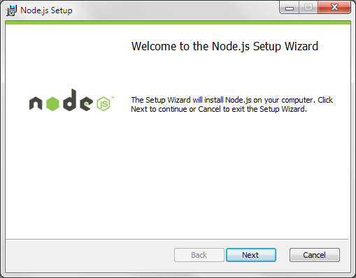
To set up Myth, you’ll need Node.js. Don’t get turned off; it has installation wizards with graphical user interfaces for Windows and Mac OS users.
For Windows users, I wrote a tutorial on how to install Node.js on Windows over at my site. The steps for installing Myth on Mac OS are almost identical. Linux users will have to install binaries on their machines.
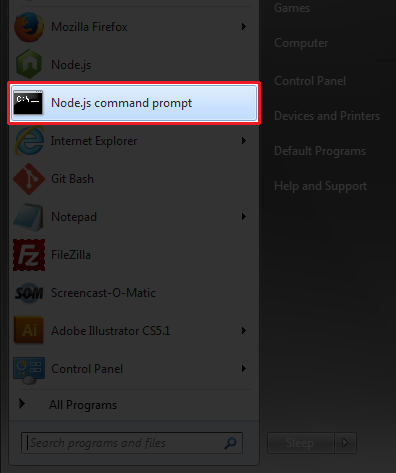
Once Node is installed, launch the Node.js command prompt.
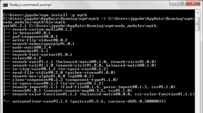
To install Myth, use npm (Node’s default package manager) by executing this command from your command prompt:
npm install -g myth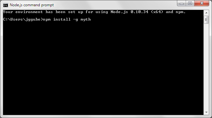
Once Myth’s setup is complete, you should see something like this in the command prompt:
Creating a Responsive Design with Myth
Let’s build a simple responsive layout using Myth.
From time to time, SitePoint removes years-old demos hosted on separate HTML pages. We do this to reduce the risk of outdated code with exposed vulnerabilities posing a risk to our users. Thank you for your understanding.
Details
This is the directory structure of the demo page:
/demo/
|-- /css/
  |-- dev.css
  |-- styles.css
  |-- styles.min.css
|-- /images/
|-- index.html/css/contains the project’s stylesheets and stylesheet assetsdev.cssis the development stylesheet and where we’ll code our input CSSstyles.cssis the Myth-compiled stylesheet. This is the stylesheet that will be used when the site is ready to be deployed.styles.min.cssis a minified version ofstyles.css.
/images/holds the images for our project.index.htmlis, of course, the page we’re building.
Linking the Input and Output Stylesheets
Use the Node.js command prompt to issue the appropriate command in order to navigate the location of your stylesheets.
cd /path/to/your/folder/cssWhere /path/to/your/folder/css would be the location of your stylesheets on your computer or web server.
The next thing you need to do is tell Myth that our development stylesheet is dev.css and that our compiled stylesheet is styles.css. We’d also like it to watch out for changes to dev.css so it updates and compiles styles.css automatically whenever we change our development stylesheet.
myth --watch dev.css styles.cssIf you want to compile manually, just leave out the --watch option:
myth dev.css styles.cssNote that dev.css must already be created for the command to work. However, styles.css will be automatically created if it doesn’t exist. Also, these stylesheets can have whatever file name you want.
Adding Myth’s CSS
You can view the markup in the demos files to see how the example site is laid out. Once the HTML is in place, below is the CSS we’ll use inside dev.css. It liberally uses experimental, future and proposed CSS specs like variables, custom media queries, color functions, and so forth.
(Use the vertical scroll bar to see all the code.)
:root {
  --max-width: 960px;
  --gutter: 2%;
  --base-size: 17px;
  --small-size: 14px;
  --base-lineheight: 1.4;
  --default-color: #464646;
  --default-bgcolor: #fff;
  --link-color: #0072bc;
  --dark-bgcolor: #759ea1;
  --dark-bgcolor-text-color: color(var(--dark-bgcolor) lightness(85%));
  --highlight-color: firebrick;
}

@custom-media --small-devices (max-width: 400px);
@custom-media --medium-devices (min-width: 401px) and (max-width: 750px);

* {
  margin: 0;
  padding: 0;
}

body {
  background: var(--default-bgcolor);
  color: var(--default-color);
  font: normal var(--base-size)/var(--base-lineheight) "Roboto", sans-serif;
  text-align: center;
}

img {
  width: 100%;
  height: auto;
}

/* Typography */
h1, h2, h3, p {
  margin: 5px auto 20px auto;
}

h1 {
  font-size: calc(var(--base-size) * 3);
  line-height: calc((var(--base-size) * 3) * var(--base-lineheight));
}

h2 {
  font-size: calc(var(--base-size) * 2);
  font-weight: 400;
  line-height: calc((var(--base-size) * 2) * var(--base-lineheight));
  color: color(var(--highlight-color) saturation(-20%));
}

h3 {
  font-size: calc(var(--base-size) * 1.2);
  font-weight: 400;
  line-height: calc((var(--base-size) * 1.2) * var(--base-lineheight));
  color: color(var(--highlight-color) saturation(+50%));
}

a {
  color: var(--link-color);
  text-decoration: none;
  transition: color 0.2s ease-in;
}

a:hover {
  color: color(var(--link-color) lightness(-10%));
  transition: color 0.4s ease-out;
}

/* Layout */
header {
  display: block;
  width: 100%;
  min-height: 500px;
  padding-top: 100px;
  background: var(--dark-bgcolor)
              url(header-bg.jpg) no-repeat center center;
  background-size: cover;
  background-attachment: fixed;
  color: var(--dark-bgcolor-text-color);
}

.container {
  position: relative;
  width: 96%;
  max-width: var(--max-width);
  margin: 0 auto;
}

.fullcol, .halfcol, .fourthcol {
  float: left;
  box-sizing: border-box;
  margin-left: var(--gutter);
}

.container .fullcol,
.container .halfcol:first-child,
.container .fourthcol:first-child  {
  margin-left: 0;
}

.fullcol {
  width: 100%;
  text-align: center;
}

.halfcol {
  width: calc((100% - var(--gutter)) / 2);
}

.fourthcol {
  width: calc(((100% - (var(--gutter) * 3)) / 4));
}

section {
  float: left;
  width: 100%;
  padding-top: 80px;
  padding-bottom: 80px;
}

/* Special */
.logo {
  margin-top: 0;
  font-family: "Montserrat", sans-serif;
  font-weight: 400;
  letter-spacing: 2px;
  text-transform: uppercase;
  text-shadow: rgba(0, 0, 0, 0.5) 2px 2px 2px;
}

.tagline {
  text-transform: uppercase;
}

.button {
  display: block;
  width: 90%;
  max-width: 220px;
  margin: 30px auto 50px auto;
  background: var(--link-color);
  color: var(--dark-bgcolor-text-color);
  border-radius: 6px;
  padding: 10px;
  transition: background-color 0.4s ease-out, color 0.3s ease-out;
}

.button:hover {
  background: color(var(--link-color) tint(50%));
  color: color(var(--dark-bgcolor-text-color) whiteness(100%));
  transition: background-color 0.3s ease-in, color 0.2s ease-in;
}

.credits {
  margin: 80px auto 20px auto;
  font-size: calc(var(--base-size) * 0.75);
  color: color(var(--dark-bgcolor-text-color) hue(+120%));
}

#work {
  background: color(var(--dark-bgcolor) lightness(+30%));
}

#contact {
  background: color(var(--highlight-color) saturation(-30%));
  color: var(--dark-bgcolor-text-color);
}

#contact h2 {
  color: color(var(--dark-bgcolor-text-color) saturation(+20%));
}

/* Media Queries */
@media (--small-devices) {
  .fullcol, .halfcol, .fourthcol {
    width: 100%;
    margin-left: 0;
    text-align: center;
  }

  .button, .tagline {
    font-size: var(--small-size);
  }

  .logo {
    margin-top: 0;
    font-size: calc(var(--base-size) * 1.8);
    line-height: calc((var(--base-size) * 1.8) * var(--base-lineheight));
  }
}

@media (--medium-devices) {
  .fourthcol {
    width: calc((100% - var(--gutter)) / 2);
    margin-left: var(--gutter);
    margin-bottom: 20px;
  }

  .container .fourthcol:nth-child(odd) {
    margin-left: 0;
    clear: left;
  }
}
The CSS Output
Here is the compiled output in styles.css. You can see that Myth translates our CSS so that today’s browsers can render it. Also notice that Myth will automatically format and indent the CSS output, ignoring our preferred indentation scheme.
(Use the vertical scroll bar to see all the code.)
/* Basic */

* {
  margin: 0;
  padding: 0;
}

body {
  background: #fff;
  color: #464646;
  font: normal 17px/1.4 "Roboto", sans-serif;
  text-align: center;
}

img {
  width: 100%;
  height: auto;
}

/* Typography */

h1,
h2,
h3,
p {
  margin: 5px auto 20px auto;
}

h1 {
  font-size: 51px;
  line-height: 71.39999999999999px;
}

h2 {
  font-size: 34px;
  font-weight: 400;
  line-height: 47.599999999999994px;
  color: rgb(159, 56, 56);
}

h3 {
  font-size: 20.4px;
  font-weight: 400;
  line-height: 28.559999999999995px;
  color: rgb(214, 0, 0);
}

a {
  color: #0072bc;
  text-decoration: none;
  -webkit-transition: color 0.2s ease-in;
  transition: color 0.2s ease-in;
}

a:hover {
  color: rgb(0, 83, 138);
  -webkit-transition: color 0.4s ease-out;
  transition: color 0.4s ease-out;
}

/* Layout */

header {
  display: block;
  width: 100%;
  min-height: 500px;
  padding-top: 100px;
  background: #759ea1 url(header-bg.jpg) no-repeat center center;
  background-size: cover;
  background-attachment: fixed;
  color: rgb(209, 223, 224);
}

.container {
  position: relative;
  width: 96%;
  max-width: 960px;
  margin: 0 auto;
}

.fullcol,
.halfcol,
.fourthcol {
  float: left;
  box-sizing: border-box;
  margin-left: 2%;
}

.container .fullcol,
.container .halfcol:first-child,
.container .fourthcol:first-child {
  margin-left: 0;
}

.fullcol {
  width: 100%;
  text-align: center;
}

.halfcol {
  width: 49%;
}

.fourthcol {
  width: 23.5%;
}

section {
  float: left;
  width: 100%;
  padding-top: 80px;
  padding-bottom: 80px;
}

/* Special */

.logo {
  margin-top: 0;
  font-family: "Montserrat", sans-serif;
  font-weight: 400;
  letter-spacing: 2px;
  text-transform: uppercase;
  text-shadow: rgba(0, 0, 0, 0.5) 2px 2px 2px;
}

.tagline {
  text-transform: uppercase;
}

.button {
  display: block;
  width: 90%;
  max-width: 220px;
  margin: 30px auto 50px auto;
  background: #0072bc;
  color: rgb(209, 223, 224);
  border-radius: 6px;
  padding: 10px;
  -webkit-transition: background-color 0.4s ease-out, color 0.3s ease-out;
  transition: background-color 0.4s ease-out, color 0.3s ease-out;
}

.button:hover {
  background: rgb(128, 185, 222);
  color: rgb(228, 228, 228);
  -webkit-transition: background-color 0.3s ease-in, color 0.2s ease-in;
  transition: background-color 0.3s ease-in, color 0.2s ease-in;
}

.credits {
  margin: 80px auto 20px auto;
  font-size: 12.75px;
  color: rgb(224, 209, 223);
}

#work {
  background: rgb(209, 223, 224);
}

#contact {
  background: rgb(148, 66, 66);
  color: rgb(209, 223, 224);
}

#contact h2 {
  color: rgb(202, 230, 232);
}

/* Media Queries */

@media (max-width: 400px) {
  .fullcol,
  .halfcol,
  .fourthcol {
    width: 100%;
    margin-left: 0;
    text-align: center;
  }

  .button,
  .tagline {
    font-size: 14px;
  }

  .logo {
    margin-top: 0;
    font-size: 30.6px;
    line-height: 42.839999999999996px;
  }
}

@media (min-width: 401px) and (max-width: 750px) {
  .fourthcol {
    width: 49%;
    margin-left: 2%;
    margin-bottom: 20px;
  }

  .container .fourthcol:nth-child(odd) {
    margin-left: 0;
    clear: left;
  }
}
Debugging
When you compile your development stylesheets, Myth will issue error notifications in the Node.js command prompt, so it’s a key debugging tool.
For instance, if a custom media query wasn’t defined, you will see this:
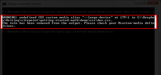
Myth’s error notifications will tell us:
- What went wrong.
- The line number where the problem if found.
- What Myth did in response to the error.
- The suggested fix.
Optimizing CSS for Better Performance
When you’re ready to deploy the project to a web server, a simple thing you can do to improve your site’s performance is to minify your stylesheets. Myth can do this for you if you use the --compress option:
myth --compress dev.css styles.cssIn our example, the stylesheet’s file size decreased by 20% simply by using the --compress option.
Other Myth Command Options
There are shortcuts for Myth command options. For example:
myth --compress --watch dev.css styles.cssCan instead be issued as:
myth -c -w dev.css styles.cssHead over to the Myth’s README on GitHub for the most updated list of commands.
Conclusion
Myth is a great CSS preprocessor for developers who can’t wait to use some of the experimental CSS features. It’s easy to set up and use, and, unlike other options, you don’t need to learn a new stylesheet language syntax to be able to use it.
Once again, here are the links to the demo and the files to download:
View demo (From time to time, SitePoint removes years-old demos hosted on separate HTML pages. We do this to reduce the risk of outdated code with exposed vulnerabilities posing a risk to our users. Thank you for your understanding.)
 Jacob Gube
Jacob Gube is a front-end web developer, and the founder of Six Revisions. Connect with him on GitHub, Facebook, and Twitter.