They glide beneath the waves of the web, silent, ferocious and seemingly just waiting for the opportunity to strike. They come in all shapes, sizes and levels of annoyance, and they almost always attack when you least expect it.
Error messages are a part of the digital world and, like it or not, everyone has come across them before, from the technologically-challenged housewife to the hardcore gamer.
As developers we likely see them more often than most. They’re inevitable, but the way we present these errors to the user can either have a positive effect (well, as positive as can be expected) or a decidedly negative one.
Let’s look at ways that we can approach handling error messages so that they convey meaning and provide a good user experience. Also, I feel it’s important to note that all the examples posted here have beenchosen without bias. I only chose them because they illustrated some point.
Prevention is Better Than Cure
Before going into handling error messages, it may be good to see how we can prevent the error from happening in the first place by guiding users in the right direction ahead of time.
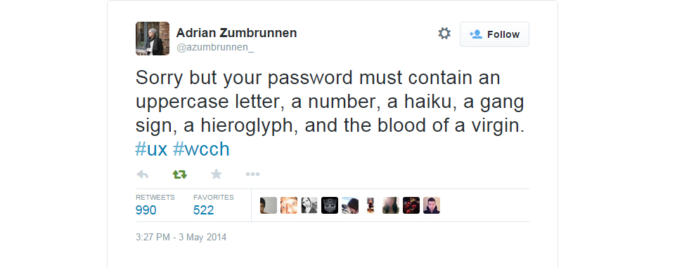
New passwords, for instance, are classic candidates for this method. The tweet above is funny, but it speaks to an issue that in many cases could’ve been avoided completely: letting users know about bad passwords after the fact. See how much attention that tweet got? It’s a sign, industry.
A better approach would be to inform the user about what your password validation requirements, or advice on to make a good password, before they hit submit. Better yet, educate them as they type it.
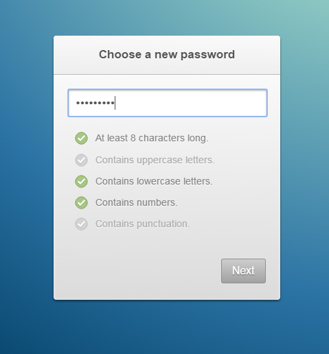
The above, an idea by the very awesome Paul Lewis which you can find here, is one such example of live feedback. Here, each tick activates as soon as the password meets the condition, meaning the user never receives annoying error messages.
If you’re using data-binding frameworks like AngularJS or EmberJS, this kind of instant feedback isn’t even difficult to implement and goes a long way to good user experience.
A Helping Hand
When the inevitable happens, though, it’s important to make sure that errors are helpful and lead users to where they likely want to go. Don Norman, of the somewhat legendary Nielsen Norman Group, advocates a collaborative approach when it comes to error messages, giving users helpful guidelines on how to get their task done.
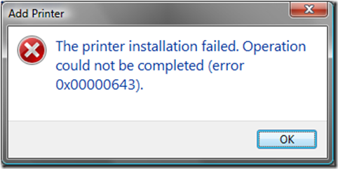
Wow. This error message would be great if I knew what a ‘0x000000643’ was, but as I’m neither a machine nor the programmer who composed the error message, I don’t. And neither will your user.
If I come across this error I don’t know how to continue. I’m pretty much stuck where I am in this process and am offered no indication as to how to proceed. And while this kind of error may seem dated and laughable to some, in many ways it’s not too different from what we see today on the web.

This error gives me about as much information as the previous one, and if I didn’t work in web I wouldn’t have a clue as to what it means. Your users likely don’t work on the web and they definitely won’t know what it means.
So how do we give users more meaningful error messages?
Perhaps the best way is to home in on what the user is actually trying to accomplish when they come across your errors, and then help them to achieve that. The Android styleguide actually presents a good approach to handling errors in this way.
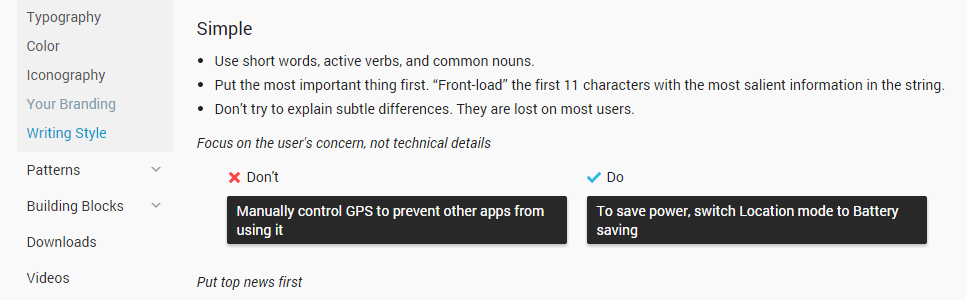
There’s actually nothing technically incorrect about the message in the “don’t” column; it tells you exactly what you need to do in order to handle your device’s GPS, however vaguely.
But it’d be rare that I specifically want to “manually operate my GPS”; the message on the right is better, because it cuts to the very human root of the issue (that your GPS is killing your battery life) and helps the user by directing them to the precise and clear solution.
Again, the idea here is to create an environment that doesn’t punish the user for what are actually ‘machine problems’, keeping in mind that machine processes exist to serve human needs. As people, we’re not meant to conform to the way machines do things, it’s supposed to be the other way around.
Just for the Lulz
If an error is common and well-known enough, there is also another way to handle its presentation to the user: humour. Applications for this approach are incredibly rare, with the best known example probably being the infamous 404 error.
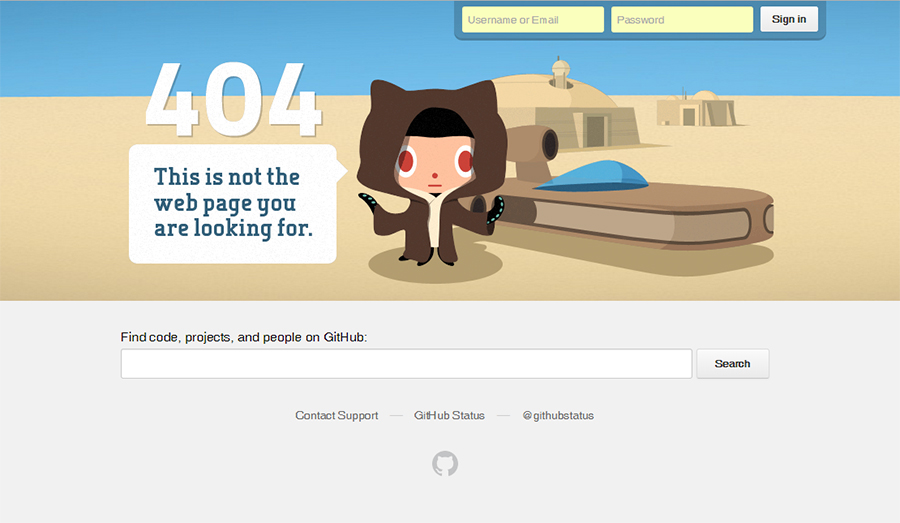

There are a tonne of good 404 examples out there. Github’s page is, in particular, very good because it capitalizes on the fact that the vast majority of its users are likely to know Star Wars and thus know exactly what the image is a reference to.
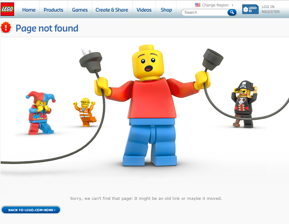
In fact there are a number of companies that use their 404 page as a means to extend their brand voice by presenting effective and appropriate messages to their users, despite the fact that a 404 is an unplanned, irritating outcome.
Again, though, note that almost every 404 page also contains information to help the user get back on their original task, whether that’s with a convenient search bar or a link or two to take you somewhere appropriate.
Conclusion
Preventing errors from happening is always the best course of action, but when that’s not a possibility, a good error message can be the difference between a returning user and a disgruntled, even angry, phone call to you or some poor soul in your company.
Making your error messages helpful, collaborative and even funny can help keep that user or customer and, if you’re lucky, even create a stronger connection to your site or brand.
Further Reading
 Byron Houwens
Byron Houwens is a designer and developer who enjoys focusing on front end technologies and UX. He currently works as a front end developer in the burgeoning edtech environment, and lives in sunny Cape Town, South Africa.