(A)
We need to clarify a couple of things…
Pages may be extended down (most commonly) or to the right, but not to the top or left. To position an element off-page, it must be positioned to the top “above the fold” or to the left. The missing negative sign positioned the last content box off-screen to the right which did not negate the vertical space originally occupied by the third box, it just moved it over - waaaaay over to the right. Had you noticed the horizontal scrollbar at the bottom and scrolled to the right, you would have found it, too. The scrollbar and the empty space were the giveaways. Like you said, experience (understanding how the elements were supposed to behave) led me to check for a missing negative sign preceeding the large {left:value}.
No, the positive value does not affect the parent container of the targeted div.
(1)
Just for clarification: “cover” sizes the image so its container is fully covered by the image. If the aspect ratio of the image differs from that of its container, the overflow is “trimmed”. “contain” fits the entire image into its container. An image whose aspect ratio differs from that of its container will show white space along the edge(s) that do not reach the edges of the container. When in doubt, use “cover” to assure full coverage. A pixel or two trimmed from from an edge or two will not be noticed.
(2)
Although border-image-outset applies 5px to the width of the green content border box (adding a total of 10px to its width), that width is compensated for (negated) by {margin:0 5px} in the same element for a net increase in width of zero, so your math is correct and the effect is the same. 
(3)
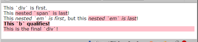
Let’s read the code.
article :last-of-type {
  background-color: pink;
}

<article>
    <div>This `div` is first.</div>
    <div>This <span>nested `span` is last</span>!</div>
    <div>This <em>nested `em` is first</em>, but this <em>nested `em` is last</em>!</div>
    <b>This `b` qualifies!</b>
    <div>This is the final `div`!</div>
</article>
The first thing to notice is the space between article and :last-of-type in the CSS.
If there were no space, the entire block <article> would be pink because <article> is the first and last (only) <article> in the html.
If the selector were written article div:last-of-type, then only the last <div> would be pink.
But because the selector has that space, article :last-of-type examines all of the elements inside <article> like so:
<article>
<!-- the first <div> is not targeted -->
    <div>This div is first.</div>
<!-- the last (and only) <span> inside this next <div> *is* targeted -->
    <div>This <span>nested `span` is last</span>!</div>
<!-- the second (last) <em> inside this next <div> *is* targeted -->
    <div>This <em>nested `em` is first</em>, but this <em>nested `em` is last</em>!</div>
<!-- the only (first and last) <b> element within <article> *is* targeted -->
    <b>This `b` qualifies!</b>
<!-- the last <div> element in <article> *is* targeted -->
    <div>This is the final `div`!</div>
</article>
(4)
There are sooo many ways to skin that cat…
The absence of graphical content is irrelevent.
The links are given {display:table} because tables shrink to fit and you want the clickable area limited to the width of the text. Because tables are blocks, they can also can be centered very easily by assigning .footer a {margin:0 auto}. I could have easily used {display:inline-block} because .footer {text-align:center} centers the text in the paragraphs and header and would center {display:inline-block} anchors, but I didn’t. I put the divs around the anchors because I like to put a container around an anchor, just like I like to put a container around images (most of the time). In the case of anchors the box around them is helpful for screen readers. Both {display:table} and {display:inline-block} allow the dimensions of the anchor to be expanded with padding, thus increasing their clickable area and potentially their visible area.
My casual intent with that change was to keep the CSS intact by modifying the HTML slightly. The result was “busy” but it worked correctly. This current version changes the CSS and HTML and is cleaner. For the demo I used grayish, blue and red coloring on the anchors. You may wish to add JS or another method to make the links mobile-friendly since touch devices do not respond to :hover.
Demo. Even this can be improved.
<!doctype html>
<html lang="en">
<head>
<meta charset="utf-8">
<meta name="viewport" content="width=device-width,initial-scale=1.0">
<title>footer anchors demo</title>
<!--
for etidd
-->
<style>
footer * {outline:1px dashed red;} /* TEST Outline. To Be Commented Out or DELETED */
body > p {
text-transform:uppercase;
margin-top:3rem;
}
.footer {
text-align:center; /* is inherited by descendants */
}
/* properties that do not change */
.footer a {
display:table;
border-width:1px;
border-style:solid;
border-color:transparent; /* a color here is optional */
border-radius:0.375rem;
padding:0.5rem;
margin:1rem auto;
}
/* properties that change */
.footer a:link, .footer a:visited {
border-color:#888; /* specify initial color here */
color:#222;
background-color:white;
}
.footer a:hover, .footer a:focus {
box-shadow:0 0 0.25rem 0.0625rem;
border-color:inherit; /* remaining color changes are inherited */
color:blue;
background-color:#f8f8ff;
}
.footer a:active {
color:red;
background-color:#fff8f8;
}
</style>
</head>
<body>
<p>unstyled divs around anchors</p>
<footer class="footer">
<p class="thanks">Thanks for Reading Our Page!</p>
<div><a href="#">Contact Us!</a></div>
<div><a href="#">Read Our Shipping Guide</a></div>
<h4>©2018, First Rate Logistics. All rights reserved.</h4>
</footer>
<p>no divs around anchors</p>
<footer class="footer">
<p class="thanks">Thanks for Reading Our Page!</p>
<a href="#">Contact Us!</a>
<a href="#">Read Our Shipping Guide</a>
<h4>©2018, First Rate Logistics. All rights reserved.</h4>
</footer>
</body>
</html>
(5)
Yes!!!
(Last Goal)
I apologize. My information was correct, but the presentation was very unclear/misleading. Let me have another go at it.
You wrote the .content child selector .right:last-of-type in the first media query with which you intended to target the last .content <div class="right"> and send it off-screen left.
Then along comes  . To help solve a problem with the links in the “footer”, I added a containing
 <div> around the “footer” elements which promptly changed the target of the .right:last-of-type selector. So I changed the CSS so you just needed to add the class “last” to the element to be moved off-screen.
But you didn’t understand why .right:last-of-type didn’t work any more. So, in post #64, I explained the reason, made a demo, and provided links to resources. BUT, ALSO in post #64 changed the <div> surrounding the .footer elements to <footer> with a className of .footer and in the next paragraph told you that .right:last-of-type should work now without specifying that it would work where you had it originally because now the last <div> in .content would be targeted by .right:last-of-type as desired. I think that leap caused the discussion about :last-of-type to jump the track. Sorry.
I hope that you understand that because the “footer” is surrounded by a <footer> element and is no longer surrounded by a <div>, the className .right will target the last <div> in .content, and because that <div> has a className of right your original .right:last-of-type selector should now work.
(Footer Code)
First, because it is the semantically appropriate choice. Screen readers recognize the footer element and identify it accordingly to the visually impaired user.
Second, it is no longer the last div in the .content section, the div above it is; so your .right:last-of-type selector should work again.
You had asked whether the .anchorwrap divs around the anchors were necessary. The answer is not necessarily. The demo in question 4 above shows that the centering and spacing of the anchor elements does not change using either method. Then why add <div class="anchorwrap">? In this case, it’s personal preference. I do not like to leave anchors and images outside of a containing element unless it is prudent to do so. I routinely assign borders around images to a wrapping container rather than to the image itself, too, but there is a practical reason for that. There are always exceptions, and the sky won’t collapse if I break training and forget my routine. But if it mattered, it could be seen or measured during testing.
This is my latest version of the footer code for your currently active page. I don’t think adding the images beside the top link is a good idea because they add to the width of the content and they don’t play nice at narrow widths. You would probably want to assign {display:none} to them to reduce the width required of the top anchor. Personally, I don’t think they add any appeal to the page whereas the “Thanks for reading our page” imparted a personal touch. Tastes differ. Be sure to check for typos or errors. Have fun!
EDIT (about 3 hours later)
I seem to have forgotten to add the code for the footer for the current page. So, I’ll just include the whole page. Check carefully for errors.
FirstRateFreight65a.html (5.2 KB)
homepage65a.css (8.3 KB)
Whew!

 Maybe I’ll remove that property as an experiment and see how the arrows respond.
 and driving me to pull all my hair out, trying to find out why that empty space existed at the closing of

 , to be proficient with these CSS properties, it requires much experience and practice. That’s life. Fortunately, with the combination of reading material and threads like this one, I know that I am becoming more equipped to do this on my own as I have a couple of other small web projects to complete after this freight biz page is laid to rest. I feel my confidence is rising greatly.
 using a background gradient, i.e.:
 on this, but your explanation that it would work now because it is the last div before the footer is easy to follow.
 is what is on the front burner
  for completion.