How come the top header is off by 1px and how do I fix that?

I just noticed this after looking at it.

Changing the width to 462 doesn’t seem to fix it. What would fix it?

2nd Question:

How come when I put the code into jsfiddle it looks like this?

<style type="text/css">

.outer {
  max-width:463px;  /*475*/
  border:solid 6px #38761d;
border-bottom:none;
  background-color: #000;
  margin: 0 auto;  /* top+bottom  left+right */
  position: relative;
}

.hr3 {
  color: #38761d;
  font-style: normal;
  font-size: 50px;
  font-family: georgia;
  text-align: center;
padding-bottom:25px;
  margin-top:6px;
  margin-bottom: -27px;

}

.hr3 span {
  display: block;
  height: 5px;
  background-color: #15c;
  transform: rotate(-.9deg);
  margin-top: 0px;
  margin-left: 26px;
  margin-right: 20px;
}

  .hr4 {
  display: block;
 

  margin-top: 27px;
}

div.gridcontainer {
margin-left: 386px;
margin-bottom: 0px;
  width: 468px;
  line-height: 0;
  border-right: 6px solid red;
  border-bottom: 6px solid red;
}

div.griditem {
  display: inline-block;
  border-left: 6px solid red;
  border-top: 6px solid red;
  width: 150px;
  height: 120px;
}

</style>

</head>
<body>

<div class="outer">
    <p class="hr3">text text text text<span></span></p>
<div class="hr4"></div>
</div>
<div class="gridcontainer">
  <div class="griditem"></div><div class="griditem"></div><div class="griditem"></div><div class="griditem"></div><div class="griditem"></div><div class="griditem"></div><div class="griditem"></div><div class="griditem"></div><div class="griditem"></div>
</div>

</div>
</body>
</html>

I just fixed that.

Now how do I input it into jsfiddle?

.outer {
  max-width: 462px;
  /*474*/
  border: solid 6px #38761d;
  border-bottom: none;
  background-color: #000;
  margin: 0 auto;
  /* top+bottom  left+right */
  position: relative;
}

.hr3 {
  color: #38761d;
  font-style: normal;
  font-size: 50px;
  font-family: georgia;
  text-align: center;
  padding-bottom: 25px;
  margin-top: 6px;
  margin-bottom: -27px;
}

.hr3 span {
  display: block;
  height: 5px;
  background-color: #15c;
  transform: rotate(-.9deg);
  margin-top: 0px;
  margin-left: 26px;
  margin-right: 20px;
}

.hr4 {
  display: block;
  margin-top: 27px;
}

div.gridcontainer {
  margin-left: 387px;
  margin-bottom: 0px;
  width: 468px;
  line-height: 0;
  border-right: 6px solid red;
  border-bottom: 6px solid red;
}

div.griditem {
  display: inline-block;
  border-left: 6px solid red;
  border-top: 6px solid red;
  width: 150px;
  height: 120px;
}


<div class="outer">
  <p class="hr3">text text text text<span></span></p>
  <div class="hr4"></div>
</div>
<div class="gridcontainer">
  <div class="griditem"></div>
  <div class="griditem"></div>
  <div class="griditem"></div>
  <div class="griditem"></div>
  <div class="griditem"></div>
  <div class="griditem"></div>
  <div class="griditem"></div>
  <div class="griditem"></div>
  <div class="griditem"></div>
</div>

I just got up this far.

I don’t understand why the lines aren’t connecting.

This is a perfect empty grid.

Done!

My only other question would be, is there a way I can connect/attach the top header to the bottom so this doesn’t happen?

asasass,

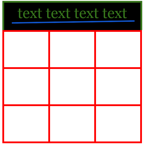
The main intent of this demo is that you should consider the value of parent containers and how they relate their contents. In this example, the value of a common outer container.

The header box and the grid box should be within the same .outer container. That .outer container should set the width to which the inner boxes adapt.

There are several ways to construct the grid. The table method is the least flexible of the methods of constructing a grid but the most fundamental. I am using it in the theory that you will be able to concentrate on realizing the value/purpose of the outer container as a device to set a common width for its children. The use of the table also does not require me to calculate borders. I like avoiding fixed widths and minimizing math. :wink:

<!doctype html>
<html lang="en">
<head>
    <meta charset="utf-8">
    <meta name="viewport" content="width=device-width,initial-scale=1.0">
    <title>outer container</title>
<!--
https://www.sitepoint.com/community/t/how-come-the-top-header-is-off-by-1px-and-how-do-i-fix-that/275715/5
asasass
-->
    <style type="text/css">
/* The .outer container is around both the .header and .gridcontainer.  It permits them to extend to the same width. */
.outer {
  max-width: 671px;  /* changed from 471px for this demo.  Change back to return to your original size */
  margin: 0 auto;  /* top+bottom  left+right */
}
.header {
  border:solid 6px #38761d;
  border-bottom: none;
  background-color: #000;
}

.hr3 {
  color: #38761d;
  font-style: normal;
  font-size: 50px;
  font-family: georgia;
  text-align: center;
  padding-bottom: 25px;
  margin-top: 6px;
  margin-bottom: -27px;
}

.hr3 span {
  display: block;
  height: 5px;
  background-color: #15c;
  transform: rotate(-.9deg);
  margin-top: 0px;
  margin-left: 26px;
  margin-right: 20px;
}

.hr4 {
  display: block;
  margin-top: 27px;
}

.gridcontainer {
  display:table;
  width:100%;  /* the table adapts to the full width of its container */
  table-layout:fixed;  /* this creates equal width columns */
  border-spacing:6px;   /* this creates the look of "borders" */
  background-color:red;  /* this colors the "borders" */
}
.trow {
  display:table-row;  /* required to create related rows of cells */
}
.griditem {
  display:table-cell;
  vertical-align:middle;  /* contents are vertically aligned within the cell */
  text-align:center;  /* inline and inline-block contents are center aligned within the cell */
  height:120px;  /* in a table, height is treated as minimum height */
  background-color:#fff;
}

    </style>
</head>
<body>

<div class="outer">  <!-- the focus of this demo -->
    <div class="header">
        <p class="hr3">text text text text<span></span></p>
        <div class="hr4"></div>
    </div>
    <div class="gridcontainer">
        <div class="trow">
            <div class="griditem">top left</div>
            <div class="griditem">top center</div>
            <div class="griditem">top right</div>
        </div>
        <div class="trow">
            <div class="griditem">middle left</div>
            <div class="griditem">middle center</div>
            <div class="griditem">middle right</div>
        </div>
        <div class="trow">
            <div class="griditem">bottom left</div>
            <div class="griditem">bottom center</div>
            <div class="griditem">bottom right</div>
        </div>
    </div>
</div>

</body>
</html>
2 Likes

Yes, much better. Thanks!!!

1 Like

This topic was automatically closed 91 days after the last reply. New replies are no longer allowed.