Help Creating CSS Tables with ROWSPAN

Hi friends. I’m trying to understand how to convert a table with ROWSPANS into a Flexbox. I want to be able to style select cells – and eventually entire ROWS and COLUMNS – with different fonts and thus my need to move away from tables (in this one little project).

As usual I like to begin with a graphic of what this should look like and a modest one follows. I admit near zero experience with ROWSPAN.

In the little graphic you see that first cell is ROWSPANNING the three rows to its right.

What prompted me to explore this tip of what has grown to be an iceberg was that I had this silly table all set up only to read on various sites that I couldn’t substitute any selected cells’ fonts: I had to pick one font and that was (essentially) for the entire table.

Dejected, I began Googling the subject and stumbled on Chris Coyier’s 2013 seminal article “ A Complete Guide to the Table Element” with the beguiling 8/2021 anchor update “Making Semantic Elements Behave Like a Table” just disproving more than one thread I read saying it couldn’t be done!

Massimo Cassandro’s 8/2015 “Layout Secret Weapon #1: The CSS Table Property” and Kevin Yank’s older 9/2008 “Rowspans & Colspans in CSS Tables” – right here, on Sitepoint – finally reeled me in.

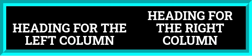
I need to be able to style select cells and do things fontish with some of them – eventually, entire columns and select rows. This is what I’m asking for help in: take the little table I’ve uploaded as a graphic and show me how to represent it as a FLEXBOX. The pale green block should be the first row/column followed by rows 2, 3 & 4 to its right. Expand it to show other arrangements (eg., what if the pale green cell were on the other side of the table) and then help me understand how & where to insert styling: should it be inline? Can I put it in the CSS? Then how to style entire column banks and consecutive rows. Even if you feel strongly that a table such as this cries out GRID! humor me and Flex it first. :wink:

I did a very simplified graphic of (what should be viewed as) one row, below. Disregard the background colors: I put them in to aid in referring to specific cell blocks. Speaking of . . .

I don’t even know how to refer to that first cell – the pale green one: Is it a ROW or is it a COLUMN? I’m guessing . . . ROW? And note the slimmer borders on the actual cells.

For an example – suppose I wanted that orange cell to use the monospace (Google) font “COURIER PRIME". How would I do it when I do it for that one cell and none of the other three? Following is a ‘Font Sampler’ you can refer to for double checking that your table is showing the right font. Copy & paste my styles to use in your table – simple! Thanks for the help! –semicodin

<!DOCTYPE html>
<HTML LANG="en">
<HEAD>
<meta charset="UTF-8">
<meta name="viewport" content="width=device-width, initial-scale=1">
<link rel="preconnect" href="https://fonts.googleapis.com"> 
<link rel="preconnect" href="https://fonts.gstatic.com" crossorigin>

<link href="https://fonts.googleapis.com/css2?family=Courier+Prime:ital,wght@0,400;0,700;1,400;1,700&display=swap" rel="stylesheet">
<link href="https://fonts.googleapis.com/css2?family=Crete+Round:ital@0;1&display=swap" rel="stylesheet">
<link href="https://fonts.googleapis.com/css2?family=Henny+Penny&display=swap" rel="stylesheet">
<link href="https://fonts.googleapis.com/css2?family=Metal+Mania&display=swap" rel="stylesheet">
<link href="https://fonts.googleapis.com/css2?family=Roboto+Slab:wght@100;200;300;400;500;600;700;800;900&display=swap" rel="stylesheet">
<link href="https://fonts.googleapis.com/css2?family=Roboto:ital,wght@0,400;0,500;0,700;0,900;1,400;1,500;1,700;1,900&display=swap" rel="stylesheet">
<link href="https://fonts.googleapis.com/css2?family=Roboto+Condensed:ital,wght@0,400;0,700;1,400;1,700&display=swap" rel="stylesheet">

<TITLE>99 STYLIN&rsquo; TABLE FONTS &#7172; by semicodin</TITLE>

<STYLE>

* {
        margin: 0;
        padding: 0;
        border: 0;
        outline: 0;
        font-size: 1rem;
        vertical-align: TOP;
}
HTML, BODY {
        font-size: 16px;
        line-height: 16px;
}
BODY {
        margin-left: 10%;
        margin-right: 10%;
        margin-top: 2.5rem;
        margin-bottom: 2.5rem;
        padding: 0;
        text-align: left;
        font-size: .88rem;
        line-height: 1.05;
        font-weight: 400;
        font-family: 'Roboto Slab', serif;
}
.CRIMB {color: CRIMSON; font-weight: 700;}
.NORMLC {
        color: CRIMSON;
        font-weight: normal;
}

.INTRO {
        font-size: 1rem;
        line-height: 1.05;
        font-weight: 300;
        font-family: 'Roboto Slab', serif;

/* ▬▬▬▬▬▬▬▬▬  FOUR FONTS, SAMPLED:  ▬▬▬▬▬▬▬▬▬ */

.COU {
margin-top: 1rem;
line-height: 1.05;
font-weight: 700;
font-size: 1rem;
font-family: 'COURIER PRIME', monospace;
}
.CRE {
margin-top: 1rem;
font-style: ITALIC;
line-height: 1.1;
font-weight: 400;
font-size: 1rem;
font-family: 'CRETE ROUND', serif;
}
.HEN {
margin-top: 1rem;
line-height: 1.5;
font-weight: 400;
font-size: 1rem;
font-family: 'HENNY PENNY', display;
}
.MET {
margin-top: 1rem;
line-height: 1;
font-weight: 400;
font-size: 1rem;
font-family: 'METAL MANIA', display;
}

</style>
</head>

<body>

<div class"INTRO">
Here are quick visuals of four fonts chosen for their disparateness: I want them to stand out (to make sure they’re displaying)! <B>Plug the styles I created for you in wherever you want to display them in the CSS TABLE <span class="CRIMB"><i>you</i> post</span>.</B></div>
<BR>
━  ━  ━  ━  ━  ━  ━  ━  ━  ━  ━  ━  ━  ━  ━  ━  ━<BR>
<div class="COU">
This is a sample of the (bolded) Google Font &ldquo;COURIER PRIME&rdquo; &ndash; a Monospace font developed by Mozilla!</div>

<div class="CRE">
This is a sample of the Google Font <B><i>&ldquo;CRETE ROUND&rdquo;</i></B> &ndash; shown here italicized</div>

<div class="HEN">
This is a sample of the Google Font <B>&ldquo;HENNY PENNY&rdquo;</B>
&ndash; a playful display font by the font developer &ldquo;brownfox&rdquo;</div>

<div class="MET">
This is a sample of the Google Font <B>&ldquo;METAL MANIA&rdquo;</B>
&ndash; a Gothic font particularly suited to Shakespeare excerpts I have found.</div>

</body>
</html>

I like to use the word ‘BUCKET’ for my Flex Container but feel free to use your own.

You do not need to move away from tables. You can style table cells, rows and columns using CSS as here:

3 Likes

That would not be true as you can change the font on any td or th and it will only affect that element (and it’s children of course).

If your font is not changing then it’s likely a specificity issue and there are rules with greater weight overriding it.

Whether you use the table element or divs the issues will be the same as you still have to target the correct elements.

If you apply styles to a parent then all it’s children will inherit those font styles but if you apply styles to the child then only the child and it’s contents are affected.

To isolate one cell or a group of cells is really a matter of selecting the correct element to style.

This is the same for tables or divs although if you use css grid there is less nesting of divs required.

The first question to ask though is whether or not the data is tabular? If it is not tabular then don’t use tables :slight_smile: If it is tabular then you really should use a table (as @Archibald has shown).

2 Likes

I like it. And I’m giving you your own directory Archibald (high praise indeed lol).

1 Like

Guys . . . Okay for reasons I don’t particularly understand I could never get this to work. In fact, going into it I just wanted something “quick” and settled on a Table. No, it’s not tabular data (and no, I will not share the purpose of this little table, it’s private).

Just something quick. But it wouldn’t recognize the styles. It allowed for COLOR but that’s about it.

Then came the string of articles which leads me to pose this question for the both of you:

If styling the cells of a table were that routine why did those 3 gentlemen go to such lengths to provide a workaround? Right now I feel like a yo-yo!

I’ll paste in my latest iteration of a table below. It’s got border issues so please correct them for me? They are

  1. losing the middle border between the 2 headings
  2. Making the main border surrounding the 3 remaining sides a solid 8px black (mirroring the header), and
  3. making the interior borders 2px solid black

And I have one more request: may I please know how the code for this table would look as a FLEXBOX? I can’t find examples anywhere of how the ROWSPAN would be expressed in FLEX and I genuinely want to know so I can put it in my box of snippets. I may have more questions but that’s it for now!

<!DOCTYPE html>
<HTML LANG="en">
<HEAD>
<meta charset="UTF-8">
<meta name="viewport" content="width=device-width, initial-scale=1">
<link rel="preconnect" href="https://fonts.googleapis.com"> 
<link rel="preconnect" href="https://fonts.gstatic.com" crossorigin>

<link href="https://fonts.googleapis.com/css2?family=Courier+Prime:ital,wght@0,400;0,700;1,400;1,700&display=swap" rel="stylesheet">
<link href="https://fonts.googleapis.com/css2?family=Crete+Round:ital@0;1&display=swap" rel="stylesheet">
<link href="https://fonts.googleapis.com/css2?family=Henny+Penny&display=swap" rel="stylesheet">
<link href="https://fonts.googleapis.com/css2?family=Metal+Mania&display=swap" rel="stylesheet">
<link href="https://fonts.googleapis.com/css2?family=Roboto+Slab:wght@100;200;300;400;500;600;700;800;900&display=swap" rel="stylesheet">
<link href="https://fonts.googleapis.com/css2?family=Roboto:ital,wght@0,400;0,500;0,700;0,900;1,400;1,500;1,700;1,900&display=swap" rel="stylesheet">
<link href="https://fonts.googleapis.com/css2?family=Roboto+Condensed:ital,wght@0,400;0,700;1,400;1,700&display=swap" rel="stylesheet">

<TITLE>97 TABLE FONTS &#7172; by semicodin</TITLE>

<STYLE>

* {
        margin: 0;
        padding: 0;
        border: 0;
        outline: 0;
}
BODY {
        margin-left: 10%;
        margin-right: 10%;
        margin-top: 2.5rem;
        margin-bottom: 2.5rem;
        font-size: 1rem;
        line-height: 1;
        font-weight: 500;
        font-family: 'Roboto Slab', sans-serif;
}
TD {
        border: 2px;
        vertical-align: TOP;
}
TH {
        margin-bottom: 1rem;
        vertical-align: BOTTOM;
        padding: .25rem;
        color: WHITE;
        background-color: BLACK;
        border: 8px GROOVE #00FFFF;
}

/* ▬▬▬▬▬▬▬▬▬  FOUR FONTS, SAMPLED  ▬▬▬▬▬▬▬▬▬ */

.COU {
        
        line-height: 1;
        font-weight: 700;
        font-size: 1rem;
        font-family: 'COURIER PRIME', monospace;
}

.CRE {
        
        font-style: ITALIC;
        line-height: 1.1;
        font-weight: 400;
        font-size: 1rem;
        font-family: 'CRETE ROUND', serif;
}

.HEN {
        
        line-height: 1.5;
        font-weight: 400;
        font-size: 1rem;
        font-family: 'HENNY PENNY', display;
}

.MET {
        
        line-height: 1;
        font-weight: 400;
        font-size: 1rem;
        font-family: 'METAL MANIA', display;
}

</style>
</head>

<body>

<TABLE border="2px SOLID BLACK">

<TR>
<TH style="border-right: none">HEADING FOR THE LEFT COLUMN</TH>
<TH style="border-left: none">HEADING FOR THE RIGHT COLUMN</TH>
</TR>

<TR>
<TD class="COU" rowspan="3">
This is a sample of the (bolded) Google Font &ldquo;COURIER PRIME&rdquo; &ndash; a Monospace font developed by Mozilla!</TD>
</TR>

<TR>
<TD class="CRE">
This is a sample of the Google Font <B>&ldquo;CRETE ROUND&rdquo;</B> &ndash; shown here italicized</td>
</TR>

<TR>
<td class="HEN">
This is a sample of the Google Font &ldquo;HENNY PENNY&rdquo; &ndash; <B>a playful display font</B> by font developer &ldquo;brownfox&rdquo;</td>
</TR>

<TR>
<td class="MET">
This is a sample of the Google Font &ldquo;METAL MANIA&rdquo; &ndash; a Gothic font rendered in small caps, particularly suited to <B>SHAKESPEARE EXCERPTS</B> I have found.</td>
</TR>

</table>

</body>
</html>

You have missed the crux of the problem and was mentioned in the last line of my post. :slight_smile:

Historically the table element was abused to create layouts that were not tabular. A table is a semantic element and meant for tabular data. In the olden days you had no choice but to use tables for layout to create the complex shapes required as no other tools were available.

As css became more mature people moved away from tables for layout and used html more semantically.

The links you posted were basically showing how to create layouts without using the table element. That is in essence very easy unless you want to imitate the rowspan and colspan behaviours. Kevin’s article shows one way to do this but is very limited and relies on magic numbers and is a very fragile construct that I would not use in production.

These days flex makes layouts easier but flex is one dimensional. It does not have explicit relationships to maintain rows and columns in alignment unless you fix widths in some way.

On the other hand css grid is 2 dimensional and can if required create explicit integrity of rows and columns and indeed mimic rowspan and colspan where required.

I’m only on a mobile at the moment so can’t show code examples but I think the above answers the ‘why’ of your question :slight_smile:

(You may be interested in my codepen at the end of a recent thread that shows a similar css grid layout I know you didn’t want a grid layout but this shows how simple the html becomes when grid is used.)

2 Likes

Alright Paul. For me the key is in (what Kevin Yank acknowledged all those years ago were) the “complex possibilities [of] a simple table, enabling cells to span columns and rows.” Of the two ROWSPAN is the most powerful in my opinion.

I was dreading your mention of GRIDS! :see_no_evil: My god I hate math lol. I avoided responding to you in my last thread which I think I’d hoped might just . . . go away lol.

So I’ll wait for (yours, Archibald’s or anyone’s) GRID solution because it is somewhat pathetic to continue this project as a table when it is most definitely not a spreadsheet.

And my code isn’t even correct as a Table tsk. Okay. Light the fuse and let’s go there.

You say the data is not tabular. So there is no tabular relationship between the two colums so they don’t have to remain side-by-side.

Here is how your table could look using CSS Flexbox:

There are some things I need to point out.

The overall flex container has ID of “bucket”. By default its flex direction is row.

The overall flex container contains two flex containers with class=“column”. The CSS is setting flex direction to column as otherwise it would be row by default.

The first of these two flex containers contains <h3> and <p> elements. The <p> element has CSS flex: 1; to allow the height of the element to grow.

The second of these two flex containers contains a <h3> element and three <p> elements (and some questionable <hr> elements :grinning:).

Now this is where the Flexbox fun starts!

For the CSS of the overall ‘bucket’ flex container I have included flex-wrap: wrap; which will allow the second column to go under the first column when the screen width is small, such as on a smartphone held in portrait orientation.

Each of the two columns has this CSS:

flex: 1 1 400px;
max-width: 500px;

That allows the widths of the columns to grow and shrink with a flex-basis of 400px and a maximum width of 500px. If you gradually reduce the width of my Codepen you will find that the widths of the columns reduce (equally) to 400px. At this point the second column will wrap under the first column. If you continue reducing the width of the Codepen (if possible), you will find the columns widths can reduce below 400px, as may be required for smartphones.

You don’t have to allow this wrapping but it shows what is possible with Flexbox.

2 Likes

Archibald what a great post! Loathe though I am to burst your bubble I need to emphasize that my graphic is the project, and the project will never be anything but that layout. The background colors are nice but they’ll be removed for the final product (I put them in as visual aids for referring to specific cells): White this table will be, with a black background for the header – and the turquoise groove border around it – then continuing the border but in plain black around the remaining 3 sides. Only the interior blocks get the 2px black borders.

Off to stitch this together and have at least one damn thing accomplished with this little devil . . .

I was fully expecting you to wish to keep the columns side-by-side and I suspect this is a private project that will never be viewed on a smartphone. However website designers need to take into account that the width of smartphone screens can be as little as 320 pixels (CSS pixels). If you have two columns with margins, border widths and paddings, that doesn’t leave much space within each column for text.

As mentioned, if you use Flexbox you do not need to allow wrapping.

1 Like

Archibald . . . I tried adapting your code to my four font specimens and couldn’t get it to work. Here is my effort:

<!DOCTYPE html>
<HTML LANG="en">
<HEAD>
<meta charset="UTF-8">
<meta name="viewport" content="width=device-width, initial-scale=1">
<link rel="preconnect" href="https://fonts.googleapis.com"> 
<link rel="preconnect" href="https://fonts.gstatic.com" crossorigin>

<link href="https://fonts.googleapis.com/css2?family=Courier+Prime:ital,wght@0,400;0,700;1,400;1,700&display=swap" rel="stylesheet">
<link href="https://fonts.googleapis.com/css2?family=Crete+Round:ital@0;1&display=swap" rel="stylesheet">
<link href="https://fonts.googleapis.com/css2?family=Henny+Penny&display=swap" rel="stylesheet">
<link href="https://fonts.googleapis.com/css2?family=Metal+Mania&display=swap" rel="stylesheet">
<link href="https://fonts.googleapis.com/css2?family=Roboto+Slab:wght@100;200;300;400;500;600;700;800;900&display=swap" rel="stylesheet">
<link href="https://fonts.googleapis.com/css2?family=Roboto:ital,wght@0,400;0,500;0,700;0,900;1,400;1,500;1,700;1,900&display=swap" rel="stylesheet">
<link href="https://fonts.googleapis.com/css2?family=Roboto+Condensed:ital,wght@0,400;0,700;1,400;1,700&display=swap" rel="stylesheet">

<TITLE>97 TABLE FONTS &#7172; including  Archibald</TITLE>

<STYLE>

* {
        margin: 0;
        padding: 0;
        border: 0;
        outline: 0;
}
BODY {
        margin-left: 10%;
        margin-right: 10%;
        margin-top: 2.5rem;
        margin-bottom: 2.5rem;
        font-size: 1rem;
        line-height: 1;
        font-weight: 500;
        font-family: 'Roboto Slab', sans-serif;
}

.COU {
        
        line-height: 1;
        font-weight: 700;
        font-size: 1rem;
        font-family: 'COURIER PRIME', monospace;
}

.CRE {
        
        font-style: ITALIC;
        line-height: 1.1;
        font-weight: 400;
        font-size: 1rem;
        font-family: 'CRETE ROUND', serif;
}

.HEN {
        
        line-height: 1.5;
        font-weight: 400;
        font-size: 1rem;
        font-family: 'HENNY PENNY', display;
}

.MET {
        
        line-height: 1;
        font-weight: 400;
        font-size: 1rem;
        font-family: 'METAL MANIA', display;
}


table { border-collapse: collapse; }
th { border: 8px GROOVE #00FFFF; }
td { border: 2px solid black; height: 30px; }
tr:first-child { background-color: black; color: white; }

.span1 { 
        background-color: #e2ff9e;
        line-height: 1;
        font-weight: 700;
        font-size: 1rem;
        font-family: 'COURIER PRIME', monospace;
}
.type1 { 
        background-color: #ffa3d3; 
        font-style: ITALIC;
        line-height: 1.1;
        font-weight: 400;
        font-size: 1rem;
        font-family: 'CRETE ROUND', serif;
}
.type2 { 
        background-color: #96e2ff; 
        line-height: 1.5;
        font-weight: 400;
        font-size: 1rem;
        font-family: 'HENNY PENNY', display;
}
.type3 { 
        background-color: #ffda7e; 
        line-height: 1;
        font-weight: 400;
        font-size: 1rem;
        font-family: 'METAL MANIA', display;
} 

table {
  border-collapse: collapse;
}

td, th {
  border: 2px solid black;
  height: 30px;
}

tr:first-child {
  background-color: black;
  color: white;
}

.span1 {
  background-color: #e2ff9e;
}

.type1 {
  background-color: #ffa3d3;
}

.type2 {
  background-color: #96e2ff;
}

.type3 {
  background-color: #ffda7e;
}

</style>
</head>

<BODY>

<TABLE>
<TR>
<TD class="COU" rowspan="3">
This is a sample of the (bolded) Google Font &ldquo;COURIER PRIME&rdquo; &ndash; a Monospace font developed by Mozilla!</TD>
</TR>

<TR>
<TD class="CRE">
This is a sample of the Google Font <B>&ldquo;CRETE ROUND&rdquo;</B> &ndash; shown here italicized</td>
</TR>

<TR>
<td class="HEN">
This is a sample of the Google Font &ldquo;HENNY PENNY&rdquo; &ndash; <B>a playful display font</B> by font developer &ldquo;brownfox&rdquo;</td>
</TR>

<TR>
<td class="MET">
This is a sample of the Google Font &ldquo;METAL MANIA&rdquo; &ndash; a Gothic font rendered in small caps, particularly suited to <B>SHAKESPEARE EXCERPTS</B> I have found.</td>
</TR>

</TABLE>

<table>
  <tbody>
    <tr>
      <th>HEADER FOR COLUMN 1</th>
      <th>HEADER FOR COLUMN 2</th>
    </tr>
    <tr>
      <td class="span1" rowspan="3">
      <td class="type1"></td>
    </tr>
    <tr>
      <td class="type2"></td>
    </tr>
    <tr>
      <td class="type3"></td>
    </tr>
  <tbody>
</table>

</body>
</html>

Just to restate the obvious, I (sort of) attempted placing my HTML into Archibald’s outline. I’ll keep tweaking it but would be very grateful if someone would do it the right way.

There’s a turquoise border around the header, and I’ve whittled down the plain black borders. The code is below.

At last – some PROGRESS!

I went about as far as I could go plugging in my content and you’ll get a better idea of the whole. I’m running into problems with my borders. The Turquoise Header border doesn’t show. I’m giving the table 5% margins to let it breathe a bit. So here’s the code, warts & all!

<!DOCTYPE html>
<HTML LANG="en">
<HEAD>
<meta charset="UTF-8">
<meta name="viewport" content="width=device-width, initial-scale=1">
<link rel="preconnect" href="https://fonts.googleapis.com"> 
<link rel="preconnect" href="https://fonts.gstatic.com" crossorigin>

<link href="https://fonts.googleapis.com/css2?family=Courier+Prime:ital,wght@0,400;0,700;1,400;1,700&display=swap" rel="stylesheet">
<link href="https://fonts.googleapis.com/css2?family=Crete+Round:ital@0;1&display=swap" rel="stylesheet">
<link href="https://fonts.googleapis.com/css2?family=Henny+Penny&display=swap" rel="stylesheet">
<link href="https://fonts.googleapis.com/css2?family=Metal+Mania&display=swap" rel="stylesheet">
<link href="https://fonts.googleapis.com/css2?family=Roboto+Slab:wght@100;200;300;400;500;600;700;800;900&display=swap" rel="stylesheet">
<link href="https://fonts.googleapis.com/css2?family=Roboto:ital,wght@0,400;0,500;0,700;0,900;1,400;1,500;1,700;1,900&display=swap" rel="stylesheet">
<link href="https://fonts.googleapis.com/css2?family=Roboto+Condensed:ital,wght@0,400;0,700;1,400;1,700&display=swap" rel="stylesheet">

<TITLE>93 TABLE FONTS &#7172; including by Archibald</TITLE>

<STYLE>

* {
        margin: 0;
        padding: 0;
        border: 0;
        outline: 0;
}
BODY {
        margin-left: 5%;
        margin-right: 5%;
        margin-top: 54px;
        margin-bottom: 54px;
        font-size: 1rem;
        line-height: 1;
        font-weight: 500;
        font-family: 'Roboto Slab', sans-serif;
}

.COU {
        
        line-height: 1;
        font-weight: 700;
        font-size: 1rem;
        font-family: 'COURIER PRIME', monospace;
}

.CRE {
        
        font-style: ITALIC;
        line-height: 1.1;
        font-weight: 400;
        font-size: 1rem;
        font-family: 'CRETE ROUND', serif;
}

.HEN {
        
        line-height: 1.5;
        font-weight: 400;
        font-size: 1rem;
        font-family: 'HENNY PENNY', display;
}

.MET {
        
        line-height: 1;
        font-weight: 400;
        font-size: 1rem;
        font-family: 'METAL MANIA', display;
}


table { 
        border-collapse: collapse;
        border: 6px SOLID BLACK;
}

TH {
        vertical-align: bottom;
        border: 4px GROOVE #00FFFF;
        border-collapse: collapse;
        padding: .38rem;
        text-align: CENTER;
        color: WHITE;
        background-color: BLACK;
        line-height: 1;
        font-weight: 600;
        font-size: 1rem;
        font-family: 'Roboto Slab', sans-serif;
}
td {border: 2px solid black;}
tr:first-child { background-color: black; color: white; }

.span1 { 
        background-color: #e2ff9e;
        vertical-align: TOP;
        line-height: 1;
        font-weight: 700;
        font-size: 1rem;
        font-family: 'COURIER PRIME', monospace;
}
.type1 { 
        background-color: #ffa3d3; 
        vertical-align: TOP;
        font-style: ITALIC;
        line-height: 1.1;
        font-weight: 400;
        font-size: 1rem;
        font-family: 'CRETE ROUND', serif;
}
.type2 { 
        background-color: #96e2ff; 
        vertical-align: TOP;
        line-height: 1.5;
        font-weight: 400;
        font-size: 1rem;
        font-family: 'HENNY PENNY', display;
}
.type3 { 
        background-color: #ffda7e; 
        vertical-align: TOP;
        line-height: 1;
        font-weight: 400;
        font-size: 1rem;
        font-family: 'METAL MANIA', display;
} 

table {
  border-collapse: collapse;
}

td, th {
  padding: .38rem;
  border: 2px solid black;
  height: 30px;
}

tr:first-child {
  background-color: black;
  color: white;
}

.span1 {
  background-color: #e2ff9e;
}

.type1 {
  background-color: #ffa3d3;
}

.type2 {
  background-color: #96e2ff;
}

.type3 {
  background-color: #ffda7e;
}

</style>
</head>

<body>

<TABLE border="8px BLACK">
<TBODY>

<TR>
<TH>HEADING FOR THE LEFT COLUMN</TH>
<TH>HEADING FOR THE RIGHT COLUMN</TH>
</TR>

<TR>
      <td class="span1" rowspan="3">
This is a sample of the (bolded) Google Font &ldquo;COURIER PRIME&rdquo; &ndash; a Monospace font developed by Mozilla!

      <td class="type1">
This is a sample of the Google Font <B>&ldquo;CRETE ROUND&rdquo;</B> &ndash; shown here italicized</td>
    </tr>

<TR>
      <td class="type2">This is a sample of the Google Font &ldquo;HENNY PENNY&rdquo; &ndash; <B>a playful display font</B> by font developer &ldquo;brownfox&rdquo;
</td>
    </tr>

<TR>
      <td class="type3">This is a sample of the Google Font &ldquo;METAL MANIA&rdquo; &ndash; a Gothic font rendered in small caps, particularly suited to <B>SHAKESPEARE EXCERPTS</B> I have found.</td>
    </tr>
  <tbody>
</table>

</body>
</html>

Here is my progress:

Note column headers are now within <div> elements with turquiose borders.

2 Likes

Very handsome Archibald. I made some changes to my code: made the margins smaller, made the primary table border slimmer, added some padding, and vertically aligned the content to the TOP.

What I’d like to see is the middle turquoise border collapsed so we are looking at the one rectangle, not two boxes. It’s hard to see where this is going so I’ll get some better content in the cells (and some nth-child striping) and you’ll like the result I think. This is a color scheme I’ve used before and been complimented!

Paul, you’d better get in here – me and Archibald will have solved the world’s problems, we’re on a tear I’m warning you! lol :laughing:

1 Like

Ah! The header border! Good. Good. Got it.

Header borker style inset looks better than groove in my view. I’ve updated the Codepen above.

Crashing out on the turq header border Archibald. Here’s what I’m getting:

And here’s what the header block looks like:

TH > div {
        vertical-align: bottom;
        border: 6px GROOVE #00FFFF;
        border-collapse: collapse;
        padding: .38rem;
        text-align: CENTER;
        color: WHITE;
        background-color: BLACK;
        line-height: 1;
        font-weight: 600;
        font-size: 1rem;
        font-family: 'Roboto Slab', sans-serif;
}

Sorry I got that screwed up. Here is what turquoise should look like. Note the headings vertical align BOTTOM. The (now) 6px black border eminate from the turquoise on either end for a straight edge.

And here’s a bigger view (not uh, perfectly to scale ahem). So the idea is that this block represents one row. When I append the next block it should maintain that thicker bottom border . . . so that the rows are easily discernable. Then the thinner 2px lines appear inside each block (as we generally have it now).

No need. You are in safe hands :slight_smile:

1 Like

I think you may need to have the heading row as a separate table in order to get the borders to meet up nicely. If you do that you will need to constrain column widths to be the same for both tables.

For accessibility, we ought to be thinking about how a screenreader would read this.