I’m in the process of designing a “software support” type website where the main purpose will be its FAQ section with lots of tips, step-by-step guides, screenshots, explanations and so on. This is just a personal/unpaid project, but I aim for a professional looking, user-friendly website nevertheless
I’m going for a Bootstrap 4 site and I’ve sketched out the general layout. The text/image contents are more or less written (plain text), but where to go from here?
How big should the section header titles be, font types/sizes to use, text-spacing, how should images, illustrations, tables etc. be placed alongside the text and so on?
And what kind of layout options can I take advantage of in Bootstrap to accomplish this?
I’ve looked at other sites for inspiration, but there’s so much and I think I basically just need some starter advice. Perhaps a guide that explains what type of presentation/layout is well suited for site such as mine, and with example on how the content can best be organized within a responsive Bootstrap site.
I use a 3 level approach. Main menu, sub menus and then accordions.
Note that you can have screenshots and movies inside the accordions. It makes it cleaner.
There is a rule of thumb that no text should be smaller than 16px, but I prefer 18px. And another rule of thumb is that the optimal line length for your body text is considered to be 50-60 characters per line, including spaces. Read about usability
Neat! I looked into accordions too, but for my use opted against it since there will be so much opening/closing. And I think a lot of visitors will just browse through the FAQ and stop wherever they find something interesting, so I’ve decided to use a nested-sidebar nav like the one used on the documentation pages of the Bootstrap 3 site, but converted to Bootstrap 4 standards and stylized a little differently:
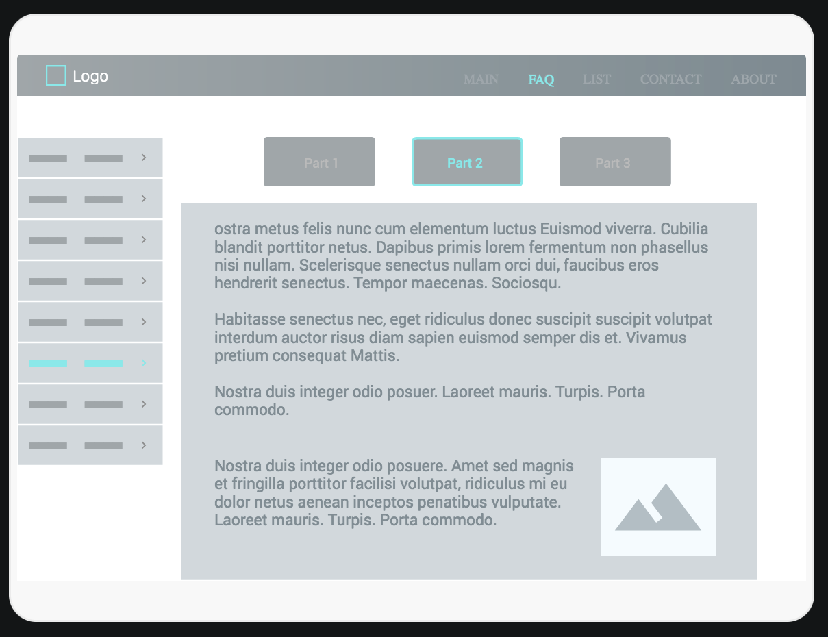
The FAQ section looks to be quite long, and I’m not sure what’s acceptable and not when it comes to content length/amount on a page. I’m also worried that the sidebar will be too long (high) for everything to be shown at once (even though it contains nested items which will be hidden once another section is chosen).
So I’ve been toying with ideas to split the FAQ into 3 parts. Perhaps with 3 buttons on the top, and of course the sidebar nav corresponding to the contents of the selected part:
…then click on the various sections there (Features, Specs, Accessories, Downloads, Support) the contents move aside and make way for new information, but without removing/changing the contents above it, nor the header and footer. I see that Adorama (scroll down to the overview, specs, reviews etc. section) for instance uses the same technique (but without the fancy smooth sideways and up auto-scrolling that Roland has).
Could I adapt something similar for my 3 FAQ parts, and how can this be done in Bootstrap 4?
Is this basically a carousel and AJAX loading of the contents?
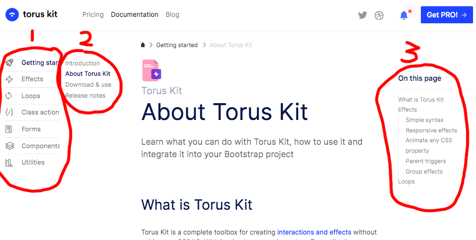
I also found another site (Torus kit) where they use sidebar navs on both left and right sides in order to split up the huge amount of content. Very nice and similar to what I’m looking for, but I prefer a more visual approach as IMHO makes for a better overview of what’s going on:
Thanks. Good suggestions about the text size. I see there’s a lot of reading to be done and visibility being a huge subject itself.
I suppose I can start by “dumping” the pre-written text content for my FAQ into its <div> box I’ve made for the contents, then place additional <div> boxes within for things like illustrations (with comments) so that they reorganize correctly when resized for mobile etc.
Most of this is in theory and some simple codepen excercises, so if someone knows of a guide which explains this part of designing a Bootstrap-based site it would be of great help.
Perhaps I’ve just used the wrong search-words when trying to find something like that myself.
Opening/Closing vs Scrolling. Plague vs cholera. Long menus are often hard to use on a mobile. So in my case I had the mobility in mind. I think accordion works better than a long side nav on a mobile.
It is doable. Basically it is a 4-level menu. My experience is that most people are most comfortable with 2-level menus. 4-level menus are 4-dimensional sort of. The more levels, the harder to navigate.
I am not a Bootstrapper, so I do know. Maybe anyone else on this forum can assist you…
My advice is to make a few live dummy pages and ask your target group which they find the information fastest. You can narrow down all your questions into one: How do people find the information they need as fast as possible?
There is no best way. It is only personal preferences
You’ve got a point there.
I see some options with the sidebar though:
I was initially thinking about auto-hiding the sidebar nav completely on small screens. That would mean browsing through the FAQ to find stuff.
Alternatively I could have the sidebar nav move to the top of the screen on mobile devices. That would mean scrolling to the top in order to navigate. But I also share your concerns with a long nav menu.
Another alternative would be to auto-hide the sidebar nav as first planned, BUT… with a small tab sticking out on the left hand side (“sticky” as in staying in the same place regardless of where the user is on the page). Clicking (or hovering) on that tab would put the sidebar nav back in place (and overlap the main content window of course on mobile devices), but once a section in the sidebar nav has been clicked it would automatically hide it again, while scrolling to the selected section.
I see what you mean. But if it’s laid out logically in a clear, tidy manner it might still be useful.
I think I’ll have to finish the entire FAQ content and first try it out in a single page, and if it’s too long I should look closer into this.


